Page 4 of 39

Posted:
Wed Dec 05, 2007 9:17 amby Coleman
nagerous wrote:Sorry but I really don't want to see the British Isles Map changed.
Coleman wrote:I think gimil is getting a lot of unnecessary attention here. The original author wants the map redone. If the original author wanted we would have to pull their map from the site, not just redo it. All the maps we get to play on belong to users who let lack use them through an agreement.
We've had complaints about the inaccuracy of British Isles for a long time. The goal of this revamp from my point of view is to improve the graphics and the accuracy of the map.
If you don't want this map redone pm Nobunaga and look at the topic he made :
http://www.conquerclub.com/forum/viewtopic.php?t=35358
Posted:
Wed Dec 05, 2007 9:37 amby RjBeals

Gimil, nice start...
I'm kinda feeling a little nostalgic for the original British Isles map though, the same as some other folks. Even though the original is not accurate, once you play it so many times, it doesn't matter - you get familiar with the game play. I like the British Isles 2.0 idea someone mentioned.
When I look at this map, I just see a washed out blue-green image, and it's hard to pickup borders and bonus regions. I would prefer you color the regions the same colors as the original (at least a shade of that color). Then maybe the very thin borders would stand out a bit more. The flags are really distracting when looking at the map as a whole. Sure I can tell where borders start/stop and I can see the thicker glow on borders to signify bonus regions, It's just a little too hard.
I also think you shouldn't tilt the Sea names, but keep them straight. All the other names are straight. I like the call-out box on the right side. I'm not sure about the font choice either. I know it's got an Old English feel to it, but it's kind of hard to read. Anyway, I'll be interested to see where this goes. I know you've got the skills Gimil - good luck taking on this revamp of a CC classic map.
Posted:
Wed Dec 05, 2007 10:01 amby reverend_kyle
the title and legend remind me of a font that a 15 year old girl would use on every assignment. I think you should use one like you did when you were trying to do united kingdom.
Posted:
Wed Dec 05, 2007 10:20 amby wicked
Coleman wrote:I think gimil is getting a lot of unnecessary attention here. The original author wants the map redone.
Not unnecessary attention at all. This map has been played on here for longer than most of you have even been here, so is well-liked by many. This is the kind of map that'll bring more people into the foundry for the first time, so it should be welcome attention, which gimmie understands. Since it is so old and well-liked, you're going to get a lot of very opinionated people in here commenting, e.g. me.

There will be a fine line between increasing accuracy and maintaining the same gameplay. And sorry, but ya have to find another way to do it than giving half the countries two names.

It's an old map, so look back perhaps at old names of areas, not just current ones.
Posted:
Wed Dec 05, 2007 10:24 amby Coleman
wicked wrote:Coleman wrote:I think gimil is getting a lot of unnecessary attention here. The original author wants the map redone.
Not unnecessary attention at all. This map has been played on here for longer than most of you have even been here, so is well-liked by many. This is the kind of map that'll bring more people into the foundry for the first time, so it should be welcome attention, which gimmie understands. Since it is so old and well-liked, you're going to get a lot of very opinionated people in here commenting, e.g. me.
There will be a fine line between increasing accuracy and maintaining the same gameplay. And sorry, but ya have to find another way to do it than giving half the countries two names.
It's an old map, so look back perhaps at old names of areas, not just current ones.
I wasn't saying your post was unnecessary. I was saying the several posts complaining about the fact a revamp was happening at all were unnecessary here because gimil is fulfilling the desires of the original cartographer.
If I was writing that personally to you I'd say that it's up to gimil and the original author how much they care about accuracy. They are now fully aware you'd rather have simpler inaccurate names. This may influence them it may not. I personally don't care either way because I blatantly insult English people at every available opportunity and have a history of defending the old map myself.
Posted:
Wed Dec 05, 2007 10:49 amby gimil
God so much information lol.
I will read through it again and do what i can to please BUT if i miss you out dont get offended
Posted:
Wed Dec 05, 2007 11:15 amby gimil
wicked wrote:There will be a fine line between increasing accuracy and maintaining the same gameplay. And sorry, but ya have to find another way to do it than giving half the countries two names.
It's an old map, so look back perhaps at old names of areas, not just current ones.
I have managed to maintain the same gameplay. Also the names used in t current map and og british counties which havent changed for 100's of years. If i was to go about finding old names i would have to essentially change all te names to whaever era in time i pick. I know your not font of double names, but you seem to be the only one that has a problem with this.
Posted:
Wed Dec 05, 2007 11:41 amby Risktaker17
Its Ok but I have trouble seeing the territories, we need a darker color. Its burning my eyes to look at it.
Posted:
Wed Dec 05, 2007 11:49 amby Balsiefen
Gimil, i love what you are doing. Graphics may still need a bit of attention but on the whole i like the font and dont find it difficult to read
-you seem to have essexs instead of essex
-although i personally quite like the coloured lines round regions, some people may find it a bit confusing. Not sure what to use instead however as i quite like the flags. Mabye have the flags lighter in the background with the main continent colour taking prominence.
-You live in scotland, i dont but i think tayside and fife can be shortened into central. i think thats its region name anyway. That could get confsed with central england so call that the midlands.
Posted:
Wed Dec 05, 2007 12:36 pmby wicked
gimil wrote:I have managed to maintain the same gameplay. Also the names used in t current map and og british counties which havent changed for 100's of years. If i was to go about finding old names i would have to essentially change all te names to whaever era in time i pick. I know your not font of double names, but you seem to be the only one that has a problem with this.
That's because everyone's so focused on the fugly flags for now.

Slapping two names on there is downright lazy. Find a way to make it work with one name. If it was one country with two names, it wouldn't be a big deal, but it's half the frickin map! It's tacky and ugly and needs to be cleaned up. You can't read the gazillion names anyway with that font, and to make it readable, you'd probably need to make it bigger, which you can't do b/c of double names.
Posted:
Wed Dec 05, 2007 12:45 pmby gimil
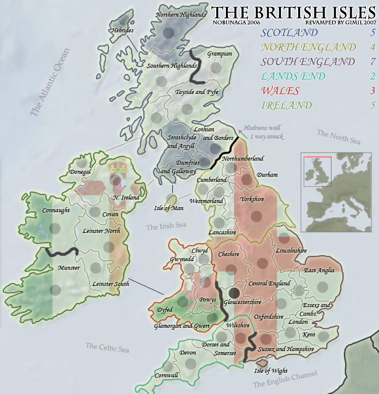
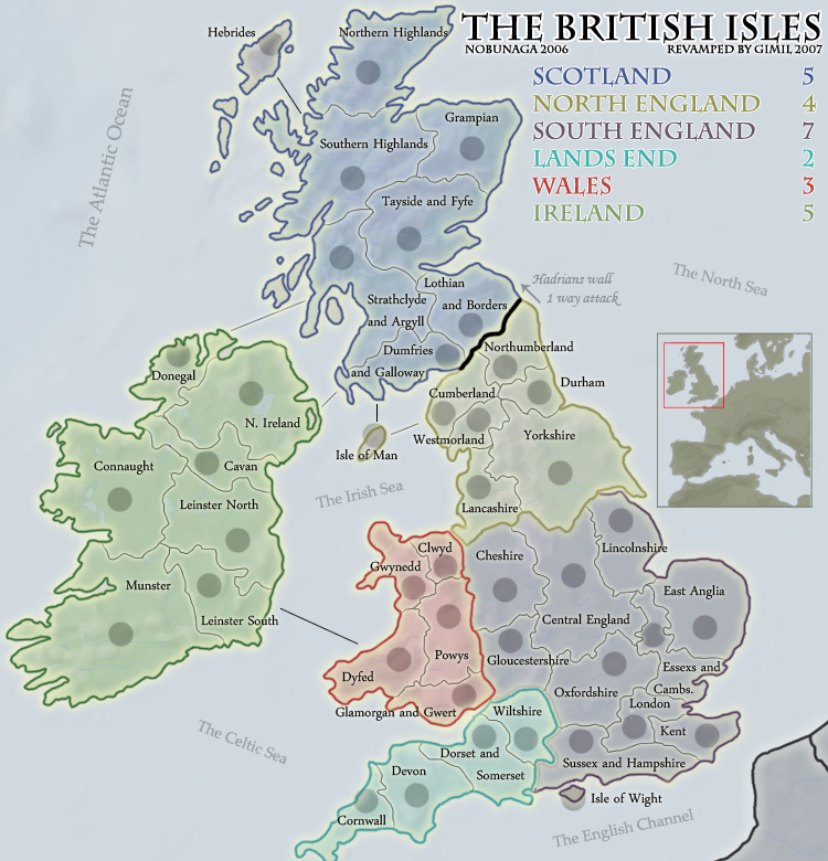
Here a sample without flags.
Posted:
Wed Dec 05, 2007 12:46 pmby spinwizard
I love it

Posted:
Wed Dec 05, 2007 12:51 pmby rebelman
as I said earlier Cavan needs to be Cavan / Monaghan and please place the north / south ahead of leinster not after it
looks much better with those flags gone
my single biggest remaining issue is the inaccurate "British Isles" Title
Posted:
Wed Dec 05, 2007 12:56 pmby Telvannia
i prefer non-flags to be honest. I think you should work in that style A bit like portugal very simple and nice.
Posted:
Wed Dec 05, 2007 12:56 pmby wicked
Need a connection line from Isle of Wight.
Posted:
Wed Dec 05, 2007 12:57 pmby lord voldemort
i liked the flags but i think this is better...
now for the names. i aint from england but what wicked says bout the 2 names, it does look tacky
Posted:
Wed Dec 05, 2007 12:58 pmby rebelman
Outside of the very very very dodgy geography on the original it still looks much better than the revamp
Posted:
Wed Dec 05, 2007 1:00 pmby Rictus
Gimli, that is really lovely work, and I really like it without the flags - IMO that's the way to go - also, by keeping the same colour scheme as the old map there's a nice feeing of continuity.
Good luck with the names thing - personally I'm from the UK and couldn't care less, but there you go...

Posted:
Wed Dec 05, 2007 1:45 pmby Coleman
I'm not sure how you choose to do the flags but I am in favor of you not throwing away all that work and making them a barely (but still) noticeable watermark inside those territories.
Great Lakes has the flags still if you look hard enough. That or I'm crazy. ... Or both.
Posted:
Wed Dec 05, 2007 1:51 pmby Optimus Prime
Love the newest version without the flags gimil, I think that is a much better path to follow.
Posted:
Wed Dec 05, 2007 1:53 pmby wicked
An issue with making them visible at all is there are three continents with the same flag, which can lead to confusion IMO. Each continent should appear different, not have the same background. So while the idea is a good one if done properly, it's not for this particular map IMO.
Posted:
Wed Dec 05, 2007 1:59 pmby Balsiefen
I dont think i agree wicked but we'll have to wait untill he tries it out to know for sure. I think he could do it really effectivly.
Anyway, as for your double barreled names, i think solutions like my earlier ones would work quite well if they can be found
Posted:
Wed Dec 05, 2007 2:00 pmby Risktaker17
I think it looks fantastc without the flags.
Posted:
Wed Dec 05, 2007 2:44 pmby alex_white101
nooooooo what have u done!?!?! the retro funkiness of the original has all been removed

this is the only time ive ever preferred the older version but im sad to say the newer just isnt as good

Posted:
Wed Dec 05, 2007 2:51 pmby hulmey
i strongly disagree with this map. Leave British Isles alone, this map is a joke!!!
Does the Map foundry know what its doing??? Maybe it needs a few more MODs and brain cells!! You have a map called "puget" which has passed final forge and its graphicall a disaster! This map needs a revamp not the british isles LOL LOL