Hey, I didn't notice my thread was moved. This is the first foundry stamp I earn and I think it was too quick  .
.
Now, about the suggestions for the upcoming 4th Version:
2. Answered on 1.
3. OK, I'll fix that.
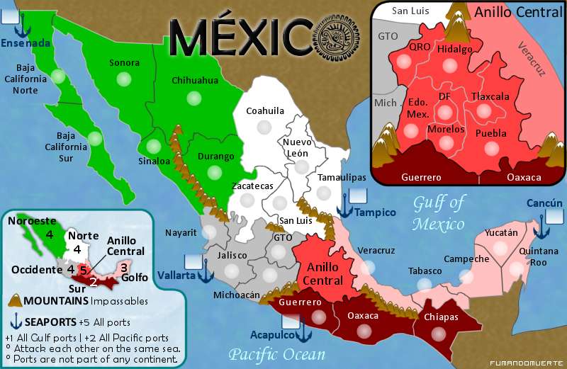
4. Oh no, that wouldn't be very close to the real political division.
5. Thinking of fog games that wouldn't make the map interesting.
6. Love it, be sure i'm incluiding a little map on next version.
Thanks 4 the suggestions!
Now, about the suggestions for the upcoming 4th Version:
I agree with you because of the small amount of terits.edbeard wrote:I think your bonuses are a bit too high in a few places. My recommendations:
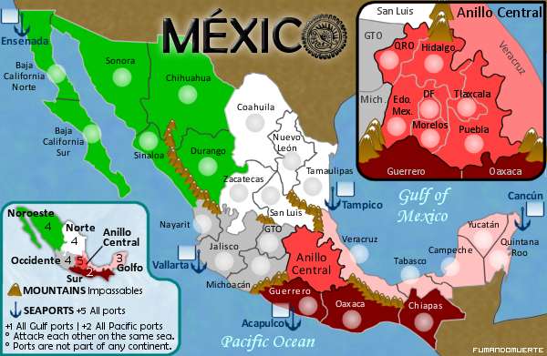
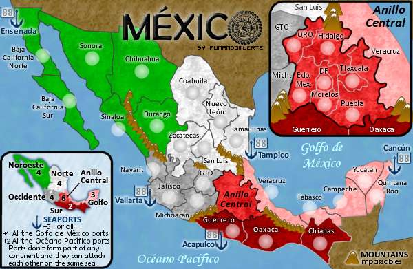
Sur - 2
Norte - 4
Golfo - 3
Occidente - 4
1. I like more 3.0 because the importance of central Mexico.tenio wrote:1. I don't like mexico 3.0
2. I Love mexico 2.0
3. The colors and everything on 2.0 are just so much better then 3.0
4. Maybe break mexico city into 2 territories or something
5. Also the airport was a great idea
6. Instead of a legend maybe you should have a mini-map?
2. Answered on 1.
3. OK, I'll fix that.
4. Oh no, that wouldn't be very close to the real political division.
5. Thinking of fog games that wouldn't make the map interesting.
6. Love it, be sure i'm incluiding a little map on next version.
You are right. I'll change all the army containers to circles.cairnswk wrote:why are you using sqaure and round army circles...consistency shoudl be a priority.
I'll add some darker shadows.yeti_c wrote:Also - your army shadows aren't good on a white background...
Thanks 4 the suggestions!
