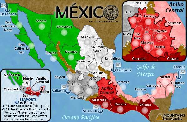
RjBeals wrote:The mountains could you some work.
yes, they look like bird droppings at the moment, hehe
RjBeals wrote:The ocean is a little bland.
yes, maybe a filter or two? maybe another colour in there would to the trick?
RjBeals wrote:I like the textures in the lands. Leave those be.
...love the textures...
RjBeals wrote:But I would like to see a little more depth, if possible,to the entire land area. Not a hard bevel, but something to make it stand out a little more.
hmm...yes i agree - a bevel would not suit thhis map but im strugging for ideas on what would make it stand out? maybe an outer glow on the land? i dont know...
RjBeals wrote:Why are there 88's next to all the seaport anchors?
no idea! oh they have terit names on the anchors so im guessing that theyre a terit? thats a little confusing...
RjBeals wrote:fonts look good. Colors are superb. This map screams mexico.
yes - i think fund has done very well with this so far,
 i deleted it cause gimil was getting after me for spamming, and i saw that u had basically said everything i had said in your last post so i deleted it.