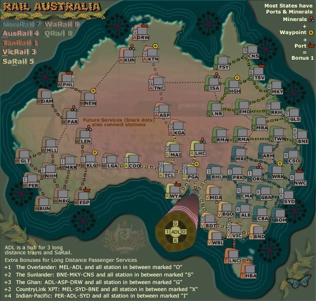
I don't like the description of minerals and ports. That, and viapoint is a very awkward word if it is a word at all. Perhaps an image-assisted description?
"Transport minerals to ports via connected stations."
(image) (image) (image)
Rail Australia [Quenched]
Moderator: Cartographers
Re: RAIL AUSTRALIA V18 (p13) [I] - Min/port pairs
![]() by TaCktiX on Fri Aug 01, 2008 11:07 pm
by TaCktiX on Fri Aug 01, 2008 11:07 pm
-

 TaCktiX
- Posts: 2392
- Joined: Mon Dec 17, 2007 8:24 pm
- Location: Rapid City, SD


Re: RAIL AUSTRALIA V18 (p13) [I] - Min/port pairs
![]() by cairnswk on Fri Aug 01, 2008 11:37 pm
by cairnswk on Fri Aug 01, 2008 11:37 pm
TaCktiX wrote:I don't like the description of minerals and ports. That, and viapoint is a very awkward word if it is a word at all. Perhaps an image-assisted description?
"Transport minerals to ports via connected stations."
(image) (image) (image)
Oh dear. how remiss of me. I have used the wrong word.
it should have been waypoint.
n. A point between major points on a route, as along a track.
Corrected above. Please refresh.
I fear your offering would be a regression.

* Pearl Harbour * Waterloo * Forbidden City * Jamaica * Pot Mosbi
-

cairnswk
- Posts: 11510
- Joined: Sat Feb 03, 2007 8:32 pm
- Location: Australia


Re: RAIL AUSTRALIA V18 (p13) [I] - Min/port pairs
![]() by whitestazn88 on Sat Aug 02, 2008 3:55 pm
by whitestazn88 on Sat Aug 02, 2008 3:55 pm
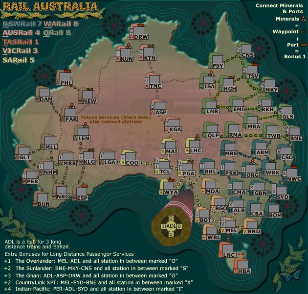
not a big fan of the new pictures... i prefered the m,p,w or whatever it was.... stupid people should just figure out how to play the map or just not play it in my opinion....
it looked good with the little letters next to the stations to me.
maybe its just the colors for the minerals thing is turning me off, cuz it kinda is too...
it looked good with the little letters next to the stations to me.
maybe its just the colors for the minerals thing is turning me off, cuz it kinda is too...
-
whitestazn88
- Posts: 3128
- Joined: Mon Feb 05, 2007 2:59 pm
- Location: behind you


Re: RAIL AUSTRALIA V18 (p13) [I] - Min/port pairs
![]() by AndyDufresne on Sat Aug 02, 2008 3:57 pm
by AndyDufresne on Sat Aug 02, 2008 3:57 pm
Ahoy Cairnswk,
It seems like you've got two graphic styles competing in this map...and I surely prefer one over the other! The look of title, legend, the ADL hub, and the surrounding ocean all looks and feels similar...very graphic art...ish. I'm not sure the word at the moment..but I like all that.
But the rest of the colors and the blurry background image seem out of place when compared to the above style. Maybe too realistic for the graphic art idea?
Just some random thoughts, I'll be back.
--Andy
It seems like you've got two graphic styles competing in this map...and I surely prefer one over the other! The look of title, legend, the ADL hub, and the surrounding ocean all looks and feels similar...very graphic art...ish.
But the rest of the colors and the blurry background image seem out of place when compared to the above style. Maybe too realistic for the graphic art idea?
Just some random thoughts, I'll be back.
--Andy
-

AndyDufresne
- Posts: 24919
- Joined: Fri Mar 03, 2006 8:22 pm
- Location: A Banana Palm in Zihuatanejo


Re: RAIL AUSTRALIA V120 (p14) [I] - Rail lines
![]() by cairnswk on Sat Aug 02, 2008 6:59 pm
by cairnswk on Sat Aug 02, 2008 6:59 pm
AndyDufresne wrote:Ahoy Cairnswk,
It seems like you've got two graphic styles competing in this map...and I surely prefer one over the other! The look of title, legend, the ADL hub, and the surrounding ocean all looks and feels similar...very graphic art...ish.
But the rest of the colors and the blurry background image seem out of place when compared to the above style. Maybe too realistic for the graphic art idea?
Just some random thoughts, I'll be back.
--Andy
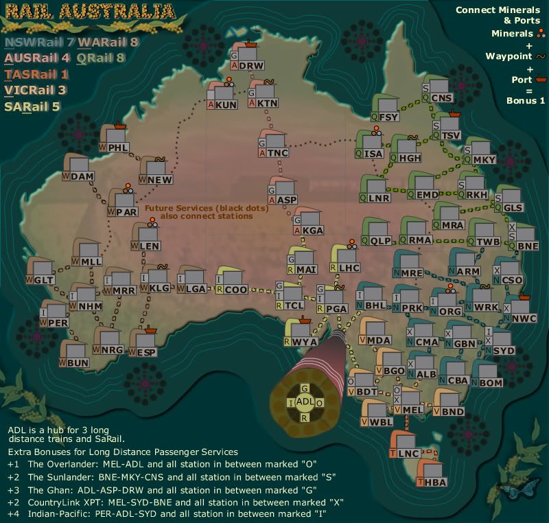
Thanks Andy for the comments....
I've changed a couple of colours to make them more in line with the overall feel, and reduced the opacity of the background image.
New are the imagery of the rail lines.
- Click image to enlarge.
whitestazn88 wrote:not a big fan of the new pictures... i prefered the m,p,w or whatever it was.... stupid people should just figure out how to play the map or just not play it in my opinion....
it looked good with the little letters next to the stations to me.
maybe its just the colors for the minerals thing is turning me off, cuz it kinda is too...
whitestazn88...may i point out that we all have capacity to be stupid people...some just do it better than others. If this was the case then no-one would play the maps.
the object is to find a suitable remedy to the symbols of the m v p. the colours in the symbols represent gold, copper and lead and ore, which australia has plenty of.
* Pearl Harbour * Waterloo * Forbidden City * Jamaica * Pot Mosbi
-
cairnswk
- Posts: 11510
- Joined: Sat Feb 03, 2007 8:32 pm
- Location: Australia
Re: RAIL AUSTRALIA V10 (p14) [I] - Rail Lines
![]() by ZeakCytho on Sat Aug 02, 2008 7:22 pm
by ZeakCytho on Sat Aug 02, 2008 7:22 pm
I must say, I prefer the graphical style of the two other rail maps to this one. The dark land with lighter background works very well - the blurry image, though better than before, just don't work for me. The darker colors for the background around Australia is nice, but then that ends, and there's the lighter color around it. To me, this implies land, as if Australia were in one large lake. So I'd suggest using just one color for the water background, not two, and preferably making it light and the land color dark, so it's more in line with the other two maps.
I realize you may not be looking to replicate the other two, but the graphics on those are very nice, whereas this one just strikes me as okay, not great.
I realize you may not be looking to replicate the other two, but the graphics on those are very nice, whereas this one just strikes me as okay, not great.
-

ZeakCytho
- Posts: 1251
- Joined: Wed Sep 12, 2007 4:36 pm


Re: RAIL AUSTRALIA V10 (p14) [I] - Rail Lines
![]() by cairnswk on Sun Aug 03, 2008 3:17 am
by cairnswk on Sun Aug 03, 2008 3:17 am
ZeakCytho wrote:I must say, I prefer the graphical style of the two other rail maps to this one. The dark land with lighter background works very well - the blurry image, though better than before, just don't work for me. The darker colors for the background around Australia is nice, but then that ends, and there's the lighter color around it. To me, this implies land, as if Australia were in one large lake. So I'd suggest using just one color for the water background, not two, and preferably making it light and the land color dark, so it's more in line with the other two maps.
I realize you may not be looking to replicate the other two, but the graphics on those are very nice, whereas this one just strikes me as okay, not great.
I'm sorry that you don't like the current style, but this is an art map, and probably aboriginal artwork style you're not familiar with.
The outside background i can do something about.
Perhaps i may change the rail lines also, but the overall style won't change.
* Pearl Harbour * Waterloo * Forbidden City * Jamaica * Pot Mosbi
-
cairnswk
- Posts: 11510
- Joined: Sat Feb 03, 2007 8:32 pm
- Location: Australia
Re: RAIL AUSTRALIA V10 (p14) [I] - Rail Lines
![]() by oaktown on Sun Aug 03, 2008 1:14 pm
by oaktown on Sun Aug 03, 2008 1:14 pm
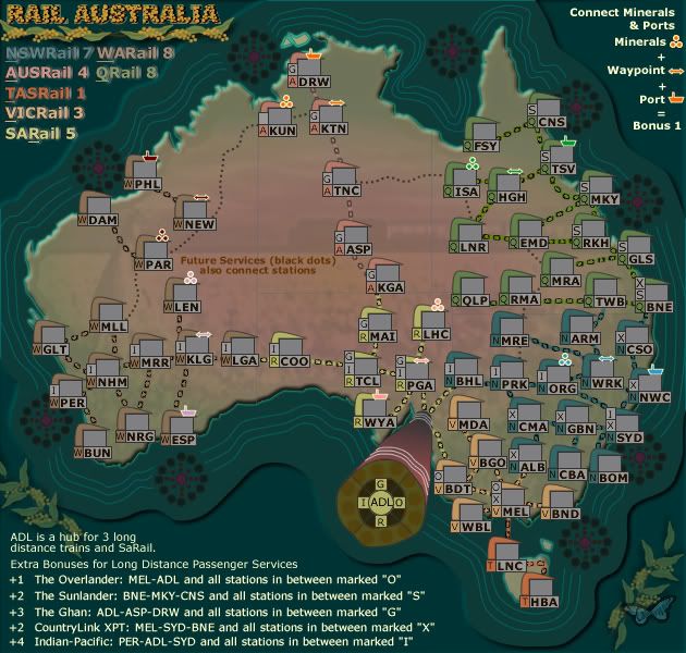
personally I find the map far easier to follow with the graphics for the minerals, etc. Those might not be the right graphics to match the overall look of this map, but I really think it is the right direction. Now when I look at it, I can more easily figure out what is going on.
For instance, I now see that the AusRail region is six territories with three borders. If you hold the region you get +4 for the region bonus, and +1 for the mineral bonus. That's +5 for a region that is exactly the size of Africa in Classic (a +3) and from which you can easily expand into not one but two three-territory bonuses.
The text for the minerals/etc. bonus doesn't need to say that bit about most states having such a bonus... it doesn't add any valuable information. You could simply replace all of that with the word "Connect:"
-

oaktown
- Posts: 4451
- Joined: Sun Dec 03, 2006 9:24 pm
- Location: majorcommand


Re: RAIL AUSTRALIA V10 (p14) [I] - Rail Lines
![]() by cairnswk on Thu Aug 07, 2008 6:18 pm
by cairnswk on Thu Aug 07, 2008 6:18 pm
oaktown wrote:personally I find the map far easier to follow with the graphics for the minerals, etc. Those might not be the right graphics to match the overall look of this map, but I really think it is the right direction. Now when I look at it, I can more easily figure out what is going on.
For instance, I now see that the AusRail region is six territories with three borders. If you hold the region you get +4 for the region bonus, and +1 for the mineral bonus. That's +5 for a region that is exactly the size of Africa in Classic (a +3) and from which you can easily expand into not one but two three-territory bonuses.
The text for the minerals/etc. bonus doesn't need to say that bit about most states having such a bonus... it doesn't add any valuable information. You could simply replace all of that with the word "Connect:"
Thanks oaktown.
Changes made:
1. Waypoint symbol changed to a tilde
2. Stations tidied up
3. outside borders re-worked so that the continent still looks like a continent
4. suggestion for Connect implemented.
Version 22 small and large below:
- Click image to enlarge.
* Pearl Harbour * Waterloo * Forbidden City * Jamaica * Pot Mosbi
-
cairnswk
- Posts: 11510
- Joined: Sat Feb 03, 2007 8:32 pm
- Location: Australia
Re: RAIL AUSTRALIA V22 (p14) [I] - Graphic changes
![]() by whitestazn88 on Thu Aug 07, 2008 11:33 pm
by whitestazn88 on Thu Aug 07, 2008 11:33 pm
i think i noticed what you did w/ continents, by putting the letter of that station as close to the border as possible right?
it think it looks more defined now too with the colored dots, if those are new as well... and i think the waypoint symbol is still lacking... a tilde? i guess it works because it is also the symbol for about... but i dunno, maybe an arrow or something would work
it think it looks more defined now too with the colored dots, if those are new as well... and i think the waypoint symbol is still lacking... a tilde? i guess it works because it is also the symbol for about... but i dunno, maybe an arrow or something would work
-
whitestazn88
- Posts: 3128
- Joined: Mon Feb 05, 2007 2:59 pm
- Location: behind you
Re: RAIL AUSTRALIA V22 (p14) [I] - Graphic changes
![]() by cairnswk on Thu Aug 07, 2008 11:41 pm
by cairnswk on Thu Aug 07, 2008 11:41 pm
whitestazn88 wrote:i think i noticed what you did w/ continents, by putting the letter of that station as close to the border as possible right?
it think it looks more defined now too with the colored dots, if those are new as well... and i think the waypoint symbol is still lacking... a tilde? i guess it works because it is also the symbol for about... but i dunno, maybe an arrow or something would work
I've tried an arrow....it looks stupid and doesn't fit the format of the other symbols.
I'll try something else. Thanks for feedback.
* Pearl Harbour * Waterloo * Forbidden City * Jamaica * Pot Mosbi
-
cairnswk
- Posts: 11510
- Joined: Sat Feb 03, 2007 8:32 pm
- Location: Australia
Re: RAIL AUSTRALIA V22 (p14) [I] - Graphic changes
![]() by Night Strike on Thu Aug 07, 2008 11:47 pm
by Night Strike on Thu Aug 07, 2008 11:47 pm
You might want a different color on the waypoint symbol as well. That brown doesn't show up the best against the background on the small map key, as well as being a bit hidden on the two Western uses.
Also, from ADL, it's unclear on the small map whether the R connection comes through WYA or PGA (which is where G goes).
Also, from ADL, it's unclear on the small map whether the R connection comes through WYA or PGA (which is where G goes).

-

Night Strike
- Posts: 8512
- Joined: Wed Apr 18, 2007 2:52 pm


Re: RAIL AUSTRALIA V10 (p14) [I] - Rail Lines
![]() by cairnswk on Fri Aug 08, 2008 12:27 am
by cairnswk on Fri Aug 08, 2008 12:27 am
Version 22 small and large below:
- Click image to enlarge.
* Pearl Harbour * Waterloo * Forbidden City * Jamaica * Pot Mosbi
-
cairnswk
- Posts: 11510
- Joined: Sat Feb 03, 2007 8:32 pm
- Location: Australia
Re: RAIL AUSTRALIA V22 (p14) [I] - Graphic changes
![]() by cairnswk on Sat Aug 09, 2008 12:49 am
by cairnswk on Sat Aug 09, 2008 12:49 am
Version 22 Test Armies
XML is written.
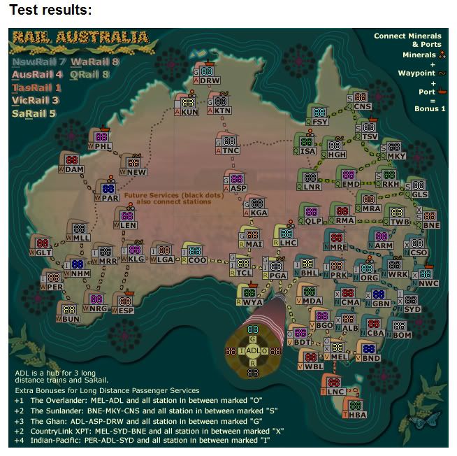
XML is written.
* Pearl Harbour * Waterloo * Forbidden City * Jamaica * Pot Mosbi
-
cairnswk
- Posts: 11510
- Joined: Sat Feb 03, 2007 8:32 pm
- Location: Australia
Re: RAIL AUSTRALIA V23 (p14) [I] - Graphic changes
![]() by cairnswk on Sat Aug 09, 2008 6:42 pm
by cairnswk on Sat Aug 09, 2008 6:42 pm
Night Strike wrote:You might want a different color on the waypoint symbol as well. That brown doesn't show up the best against the background on the small map key, as well as being a bit hidden on the two Western uses.
Also, from ADL, it's unclear on the small map whether the R connection comes through WYA or PGA (which is where G goes).
WYA cleared from ADL, so that should be clearer.
Waypoint symbol changed to Arrow...don't know is this is better, i don't think it is but...
also changed to the border on mineral-port symbols to lighter color.
* Pearl Harbour * Waterloo * Forbidden City * Jamaica * Pot Mosbi
-
cairnswk
- Posts: 11510
- Joined: Sat Feb 03, 2007 8:32 pm
- Location: Australia
Re: RAIL AUSTRALIA V23 (p15) [I] - Graphic changes
![]() by whitestazn88 on Sat Aug 09, 2008 7:10 pm
by whitestazn88 on Sat Aug 09, 2008 7:10 pm
i like the waypoint symbol a lot more now, but it's a smidge large... maybe make it a little smaller?
-
whitestazn88
- Posts: 3128
- Joined: Mon Feb 05, 2007 2:59 pm
- Location: behind you
Re: RAIL AUSTRALIA V23 (p15) [I] - Graphic changes
![]() by cairnswk on Sat Aug 09, 2008 8:10 pm
by cairnswk on Sat Aug 09, 2008 8:10 pm
whitestazn88 wrote:i like the waypoint symbol a lot more now, but it's a smidge large... maybe make it a little smaller?
Height or width?
* Pearl Harbour * Waterloo * Forbidden City * Jamaica * Pot Mosbi
-
cairnswk
- Posts: 11510
- Joined: Sat Feb 03, 2007 8:32 pm
- Location: Australia
Re: RAIL AUSTRALIA V23 (p15) [I] - Graphic changes
![]() by whitestazn88 on Sat Aug 09, 2008 8:24 pm
by whitestazn88 on Sat Aug 09, 2008 8:24 pm
height
-
whitestazn88
- Posts: 3128
- Joined: Mon Feb 05, 2007 2:59 pm
- Location: behind you
Re: RAIL AUSTRALIA V23 (p15) [I] - Graphic changes
![]() by cairnswk on Sat Aug 09, 2008 8:42 pm
by cairnswk on Sat Aug 09, 2008 8:42 pm
whitestazn88 wrote:height
How does that look now? Reduced from 7 to 5.
Last edited by cairnswk on Sat Aug 09, 2008 8:45 pm, edited 1 time in total.
* Pearl Harbour * Waterloo * Forbidden City * Jamaica * Pot Mosbi
-
cairnswk
- Posts: 11510
- Joined: Sat Feb 03, 2007 8:32 pm
- Location: Australia
Re: RAIL AUSTRALIA V23 (p15) [I] - Graphic changes
![]() by whitestazn88 on Sat Aug 09, 2008 8:44 pm
by whitestazn88 on Sat Aug 09, 2008 8:44 pm
much better, before it just looked overwhelming
-
whitestazn88
- Posts: 3128
- Joined: Mon Feb 05, 2007 2:59 pm
- Location: behind you
Re: RAIL AUSTRALIA V23 (p15) [I] - Graphic changes
![]() by cairnswk on Sat Aug 09, 2008 8:45 pm
by cairnswk on Sat Aug 09, 2008 8:45 pm
whitestazn88 wrote:much better, before it just looked overwhelming
Excellent
* Pearl Harbour * Waterloo * Forbidden City * Jamaica * Pot Mosbi
-
cairnswk
- Posts: 11510
- Joined: Sat Feb 03, 2007 8:32 pm
- Location: Australia
Re: RAIL AUSTRALIA V23 (p15) [I] - Graphic changes
![]() by TaCktiX on Wed Aug 13, 2008 10:27 pm
by TaCktiX on Wed Aug 13, 2008 10:27 pm
When describing the long-distance routes, it says just "station" when I believe you mean "stations". But yes, this is much improved from when I said it wasn't doing justice to the other two Rails.
-
TaCktiX
- Posts: 2392
- Joined: Mon Dec 17, 2007 8:24 pm
- Location: Rapid City, SD
Re: RAIL AUSTRALIA V23 (p15) [I] - Graphic changes
![]() by cairnswk on Sat Aug 16, 2008 4:29 am
by cairnswk on Sat Aug 16, 2008 4:29 am
TaCktiX wrote:When describing the long-distance routes, it says just "station" when I believe you mean "stations". But yes, this is much improved from when I said it wasn't doing justice to the other two Rails.
Good pickup TaCktiX, thanks. i've changed the same version 23. please refresh.
* Pearl Harbour * Waterloo * Forbidden City * Jamaica * Pot Mosbi
-
cairnswk
- Posts: 11510
- Joined: Sat Feb 03, 2007 8:32 pm
- Location: Australia
Re: RAIL AUSTRALIA V23 (p15) [I] - Graphic changes
![]() by whitestazn88 on Sat Aug 16, 2008 12:35 pm
by whitestazn88 on Sat Aug 16, 2008 12:35 pm
does kun connect to new in the upper middle/right area of the map via the future service lines? because it looks like it could, but it's not definite. you could move that dotted line nearer to the middle of new.
-
whitestazn88
- Posts: 3128
- Joined: Mon Feb 05, 2007 2:59 pm
- Location: behind you
Re: RAIL AUSTRALIA V23 (p15) [I] - Graphic changes
![]() by cairnswk on Sat Aug 16, 2008 1:27 pm
by cairnswk on Sat Aug 16, 2008 1:27 pm
whitestazn88 wrote:does kun connect to new in the upper middle/right area of the map via the future service lines? because it looks like it could, but it's not definite. you could move that dotted line nearer to the middle of new.
i thought that would have been obvious, but i can do that for you.
* Pearl Harbour * Waterloo * Forbidden City * Jamaica * Pot Mosbi
-
cairnswk
- Posts: 11510
- Joined: Sat Feb 03, 2007 8:32 pm
- Location: Australia
Who is online
Users browsing this forum: No registered users
|
|||||||
| Conquer Club is not associated with RISK online in any way. Copyright © 2006-2024 by Big Wham LLC | |||||||