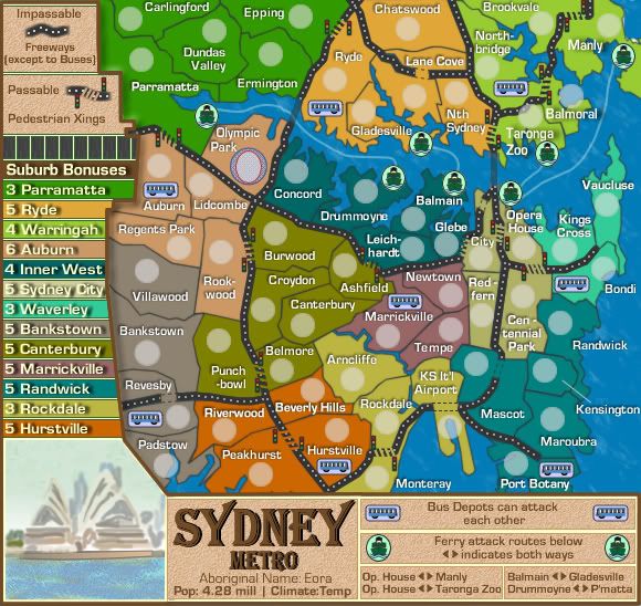
oaktown wrote:I agree - the bus depot thing is confusing. Can the Bondi bus attack the Northbridge bus depot?
Yes
Is that a freeway between them, or a bridge? Or both? And if it's a crossable bridge, why can't Opera House use it to cross and attack the Zoo?
Opera House can't attack Northbridge or Zoo because they have no bus depots, read the impassable instructions on the map, that's what they are there for.

Surely i don't have to tell you that.
If bus depots can attack other bus depots, it should just say that - don't add a level of confusion trying to figure out if Bondi is along the same freeway as Revesby.
It doesn't matter if they are on the same Freeway, what matters is that the instructions say Bus Depots can attack each other via the Freeways as in Freeways being a utility to get around.
At some point in this whole discussion, and i believe you were included in that, there was discussion about the use of the freeways and bridges....i added the bus depots to validate the use of the freeways & bridges and made it so they could attack each other. I think Oaktown it is you who confuses yourself sometimes by questioning things at a higher level that what it written. Simply accept that the Impassables say freeways are out of bounds to most attacks except the buses, and then connect the dots via the bus depots being able to use the freeways to attack each other. It really is that simple. You don't have to take it extraordinary lengths of interpretation.
Opera House... you should totally add it, since that's what most non-Australians think of when they think of Sydney. After you've done that, could you add some Koala bears climbing eucalyptus trees, kangaroos wearing boxing gloves, and Crocodile Dundee drinking a Fosters?

If this is supposed to be a tourist map, add it. But I think this is supposed to be a transit system map, which doesn't need the opera house.
Now that's a level of sarcasim (my interpretation) i don't like from you in particular. i would have thought you know better than that.
It is not just a transit map, but a map of the layout of Sydney Metro, same as NYC is layout of the map of NY but it still uses the rail system on that map to make gameplay.I choose to use the freeways and ferries on this map. Most people world-over associate that Opera House with Sydney so why not use it. I could have used Macquarie Tower, or the Olympic Stadium, or Bondi Beach, or Central Station or Circular Quay or Kirribili House, and most player would question "what's that?" Same on the Valley of the Kings map, i used the Sphinx and Pyramid.
I think the Opera House plays on perfect image association myself. So it stays.


 [/quote]