YEAH, its back.
Keep up the good work,
dont tell the shire people though.
Sydney Metro [Quenched]
Moderator: Cartographers
Re: Sydney Metro V3 (P4) - New additions
![]() by LLLUUUKKKEEE on Wed Apr 09, 2008 1:44 am
by LLLUUUKKKEEE on Wed Apr 09, 2008 1:44 am
It's your turn...................................
-
 LLLUUUKKKEEE
- Posts: 791
- Joined: Wed Dec 27, 2006 12:07 am
- Location: Trying to stay out of Join a Tournament forum


Re: Sydney Metro V3 (P4) - New additions
![]() by cairnswk on Wed Apr 09, 2008 3:56 am
by cairnswk on Wed Apr 09, 2008 3:56 am
LLLUUUKKKEEE wrote:YEAH, its back.
Keep up the good work,
dont tell the shire people though.
HEhehehehe! maybe i will re-work that yet.

* Pearl Harbour * Waterloo * Forbidden City * Jamaica * Pot Mosbi
-

cairnswk
- Posts: 11510
- Joined: Sat Feb 03, 2007 8:32 pm
- Location: Australia


Re: Sydney Metro V3 (P4) - New additions
![]() by LLLUUUKKKEEE on Wed Apr 09, 2008 4:12 am
by LLLUUUKKKEEE on Wed Apr 09, 2008 4:12 am
Why?
Nothing better then seeing them left out.
I do beleive its big enough. It would be to hard to include all of sydney, Im just glad you got where i live - Revesby.
Nothing better then seeing them left out.
I do beleive its big enough. It would be to hard to include all of sydney, Im just glad you got where i live - Revesby.
It's your turn...................................
-
LLLUUUKKKEEE
- Posts: 791
- Joined: Wed Dec 27, 2006 12:07 am
- Location: Trying to stay out of Join a Tournament forum
Re: Sydney Metro V3 (P4) - New additions
![]() by cairnswk on Wed Apr 09, 2008 4:30 am
by cairnswk on Wed Apr 09, 2008 4:30 am
LLLUUUKKKEEE wrote:Why?
Nothing better then seeing them left out.
I do beleive its big enough. It would be to hard to include all of sydney, Im just glad you got where i live - Revesby.
Oh sorry...i was thinking that i might re-work the shire "continent" areas, that's all.
Of course there is another larger map that can be done of the Blue Mtns etc to inclulde the Hawkesbury and Warragamba Dam, i think it would make great gameplay, but that is for another day.
This is Sydney metro.
* Pearl Harbour * Waterloo * Forbidden City * Jamaica * Pot Mosbi
-
cairnswk
- Posts: 11510
- Joined: Sat Feb 03, 2007 8:32 pm
- Location: Australia
Re: Sydney Metro V3 (P4) - New additions
![]() by cairnswk on Wed Apr 09, 2008 4:32 am
by cairnswk on Wed Apr 09, 2008 4:32 am
BTW....if you've got some aussie mates, drag them in here to vote for support to get this going....we don't have as much interest as New York with the US population on this CC site. 
* Pearl Harbour * Waterloo * Forbidden City * Jamaica * Pot Mosbi
-
cairnswk
- Posts: 11510
- Joined: Sat Feb 03, 2007 8:32 pm
- Location: Australia
Re: Sydney Metro V3 (P4) - New additions
![]() by onbekende on Fri Apr 11, 2008 4:46 am
by onbekende on Fri Apr 11, 2008 4:46 am
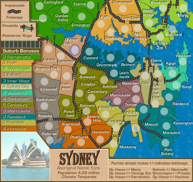
good thing I kept the bonus excel sheet from Sydney 2000 
Bonusses:
Parramatta: 5 terr, 2 def/att, 3 cont => Bonus of 3 (2 is indeed better, keep it at 2)
Ryde: 5 terr, 3 def/att, 3 cont => Bonus of 4 (3 is indeed good enough)
Warringah: 5 terr, 2 def/att, 2 cont => Bonus of 3 (2 is more then fine)
now I want to make a note, if you hold the above 3 with 2 territories to defend (Auburn and Opera House) you get alot of army's!! (6 from 18 terr + 7 from bonusses => 12 army's!!!!)
Perhaps an extra attack route is needed from the south to the north? I have no sggestion thou.
Auburn: 5 terr, 4 def/att, 3 cont => Bonus of 4 (3 is well, as 4 would make the above continent set too powerfull)
Inner West: 4 terr, 2 def/att, 2 cont => Bonus of 3 (Perhaps a bonus of 2 is better now, only 2 to defence and easely enough taken continent if you got already 2 terr)
Sydney City: 3 terr, 3 def/att, 7 cont => Bonus of 4 (Make it 3, unless something is done about the upper continent strip)
Waverly: 3 terr, 2 def/att, 2 cont => Bonus of 2 (agreed!)
Bankstown: 4 terr, 4 def/att, 3 cont => Bonus of 4 (I tend to agree with 4)
Cantebury: 6 terr, 5 def/att, 6 cont => Bonus of 6 (5 is good)
Marrickville: 3 terr, 3 def/att, 4 cont => Bonus of 3 (agreed)
Randwick: 5 terr, 3 def/att, 4 cont => Bonus of 4 (3 is good enough)
Rockdale: 4 terr, 3 def/att, 4 cont => Bonus of 4 (3 is more then enough)
Hurstville: 4 terr, 4 def/att, 3 cont => Bonus of 4 (Make it 3, continent will be taken together with Bankstown to turtle)
My bonus analysis
Continents:
Parramatta:
- Move the army shade of Dundas Vallay a bit to the north
Ryde:
- You can complete the name of "Nth Sydney" to North Sydney I believe
Warringah:
- Think about merging Taronga Zoo and Balmoral, isn't needed but will help viewability and gameplay I believe
Auburn:
- Move "Auburn" to the right
Inner West:
- I believe switching the name and amry shade ot Drummoyne will add to the viewability of the map
- Concord seems to be messed up on he first letter
Sydney City:
- Think agout removing the traffic lights from the City <=> Opera House crossing, same goes for the other inner-City crossing
Waverly:
- Drop both army shade and name of Vaucluse to the south a bit
Bankstown:
No comments
Cantebury:
No comments
Marrickville:
- space out the army shande and name of Tempe a bit
Randwick:
No comments
Rockdale:
- whats the full name of "KS It'l Airport" and perhaps drop the International?
Hurstville:
No comments
General comments:
Smoothen out the line around the Bonusses place and the map, specifically at the Auburn <=> Parramatta crossing and at the "Ryde" bonus legend
What is that white at the back of the bonus legend?
Make the Pedestrian Crossing with normal gaps (thus showing the color of the below texture) instead of the color of Randwick continent
Spce te ferry line between Opera House <=> Manly a bit to the north when it passes Vaucluse, people might thing its attackable
my concerns for now
Emperor of the Benelux
Founder of the Commonwealth of Planets
Founder and CEO of JF
Founder of the Commonwealth of Planets
Founder and CEO of JF
-

onbekende
- Posts: 1530
- Joined: Fri Apr 14, 2006 10:19 am
- Location: Belgium


Re: Sydney Metro V3 (P4) - New additions
![]() by cairnswk on Fri Apr 11, 2008 10:38 am
by cairnswk on Fri Apr 11, 2008 10:38 am
Thanks onbekende....this is current version 3...i'll attend to your changes later thanks.

* Pearl Harbour * Waterloo * Forbidden City * Jamaica * Pot Mosbi
-
cairnswk
- Posts: 11510
- Joined: Sat Feb 03, 2007 8:32 pm
- Location: Australia
Re: Sydney Metro V3 (P4) - New additions
![]() by onbekende on Fri Apr 11, 2008 1:12 pm
by onbekende on Fri Apr 11, 2008 1:12 pm
you asked for themm he
Emperor of the Benelux
Founder of the Commonwealth of Planets
Founder and CEO of JF
Founder of the Commonwealth of Planets
Founder and CEO of JF
-
onbekende
- Posts: 1530
- Joined: Fri Apr 14, 2006 10:19 am
- Location: Belgium
Re: Sydney Metro V3 (P4) - New additions
![]() by gimil on Sat Apr 12, 2008 9:26 am
by gimil on Sat Apr 12, 2008 9:26 am

See ya
What do you know about map making, bitch?
Top Score:2403
natty_dread wrote:I was wrong
Top Score:2403
-

gimil
- Posts: 8599
- Joined: Sat Mar 03, 2007 12:42 pm
- Location: United Kingdom (Scotland)


Re: Sydney Metro V3 (P4) - New additions
![]() by Sir. Ricco on Sat Apr 12, 2008 7:49 pm
by Sir. Ricco on Sat Apr 12, 2008 7:49 pm
I like it so far the colors blend very well. Not so blinding as some maps. I like how you put a lot of defensive points in.


-

Sir. Ricco
- Posts: 4555
- Joined: Tue Oct 02, 2007 2:33 pm
- Location: Making kingdoms burn and bloodshed start.


Re: Sydney Metro V3 (P4) - New additions
![]() by cairnswk on Sun Apr 13, 2008 4:14 pm
by cairnswk on Sun Apr 13, 2008 4:14 pm
gimil wrote:
See ya
Thanks Gimil. Can you pull the poll please when you have a mo.
* Pearl Harbour * Waterloo * Forbidden City * Jamaica * Pot Mosbi
-
cairnswk
- Posts: 11510
- Joined: Sat Feb 03, 2007 8:32 pm
- Location: Australia
Re: Sydney Metro V3 (P4) - New additions
![]() by cairnswk on Sun Apr 13, 2008 4:18 pm
by cairnswk on Sun Apr 13, 2008 4:18 pm
Sir. Ricco wrote:I like it so far the colors blend very well. Not so blinding as some maps. I like how you put a lot of defensive points in.
Thanks Sir Ricco...yeh, i,think the colours are good also. Vibrant reflecting a large metro city, but not too in your face. Glad you like so far.
* Pearl Harbour * Waterloo * Forbidden City * Jamaica * Pot Mosbi
-
cairnswk
- Posts: 11510
- Joined: Sat Feb 03, 2007 8:32 pm
- Location: Australia
Re: Sydney Metro V3 (P4) [I] - Comments?
![]() by gimil on Sun Apr 13, 2008 4:32 pm
by gimil on Sun Apr 13, 2008 4:32 pm
Interested in a classic style map for Sydney in Australia?
Poll ended at Sun Apr 13, 2008 2:43 am
Yes
11
39%
Yes - With some graphic/gameplay touch-ups
14
50%
No
3
10%
Other - please explain in the thread
0
No votes
Total votes : 28
What do you know about map making, bitch?
Top Score:2403
natty_dread wrote:I was wrong
Top Score:2403
-
gimil
- Posts: 8599
- Joined: Sat Mar 03, 2007 12:42 pm
- Location: United Kingdom (Scotland)
Re: Sydney Metro V3 (P4) [I] - Comments?
![]() by cairnswk on Mon Apr 14, 2008 3:05 am
by cairnswk on Mon Apr 14, 2008 3:05 am
^^^^^ Thanks Gimil ^^^^
* Pearl Harbour * Waterloo * Forbidden City * Jamaica * Pot Mosbi
-
cairnswk
- Posts: 11510
- Joined: Sat Feb 03, 2007 8:32 pm
- Location: Australia
Re: Sydney Metro V3 (P4) [I] - Comments?
![]() by Sir. Ricco on Mon Apr 14, 2008 7:09 pm
by Sir. Ricco on Mon Apr 14, 2008 7:09 pm
Ok, here some things I just like to bring up
1. Do you really need those Stop lights? They kind of crowd the map
2. I like how you made a lot of defensives points in the map.
3. The ferry routes are just a little confusing. I get them, but I can see them becoming a problem to the...*Amen* noobs.
4. Inner West I think should be knocked down to 2 bonuses. With only two ways to get into it, it would be pretty easies to defend.
-
Sir. Ricco
- Posts: 4555
- Joined: Tue Oct 02, 2007 2:33 pm
- Location: Making kingdoms burn and bloodshed start.
Re: Sydney Metro V3 (P4) - New additions
![]() by RjBeals on Tue Apr 15, 2008 9:51 am
by RjBeals on Tue Apr 15, 2008 9:51 am
cairnswk wrote:
Fantastic work cairnswk. I love the map. Another beauty. And no gimmicks !!
Couple of picky things -
1) The color bars where the bonus region names are along the left side - could you extend the right side of those bars so they fall underneath the bolder legend border? I also see something between those color bars bleeding through - not sure what it is though.
2) The water routes are a little confusing. since they are so close and all lead to opera house, they get jumbled up around there. What about lines instead of dots - like beveled/flowing lines?
3) I like the traffic lights. Keep them. But I think the road crossings could be a little better than current. Maybe make them slanted instead of horizontal?
4) Your territory font is perfect. What did you use anyway? I love it. Perfect size, perfect amount of drop shadow - well done.
5) Colors are perfect as well.

-

RjBeals
- Posts: 2506
- Joined: Mon Nov 20, 2006 5:17 pm
- Location: South Carolina, USA


Re: Sydney Metro V3 (P4) [I] - Comments?
![]() by gimil on Tue Apr 15, 2008 10:03 am
by gimil on Tue Apr 15, 2008 10:03 am
I agree with everything RJ says except I think the terr names could use the slightest bit of transparency.
Also the Olympic Park is missing a drop shadow.
Also the Olympic Park is missing a drop shadow.
What do you know about map making, bitch?
Top Score:2403
natty_dread wrote:I was wrong
Top Score:2403
-
gimil
- Posts: 8599
- Joined: Sat Mar 03, 2007 12:42 pm
- Location: United Kingdom (Scotland)
Re: Sydney Metro V3 (P4) [I] - Comments?
![]() by bryguy on Tue Apr 15, 2008 10:16 am
by bryguy on Tue Apr 15, 2008 10:16 am
u cant see the upper left corner of the 'H' in opera house cause the stop sign is on it, could u modify that so that u can?
some peoplemight thing that since the army circle is on the other side of a dotted line from the title of KS It'l Airport that it is part of another territory (just felt like pointing that out, it would probably not be that big a problem)
other than that the map looks great except for all the feiry lines converging on one spot (gets a little confusing)
keep up the good work cairns
-
bryguy
- Posts: 4381
- Joined: Tue Aug 07, 2007 8:50 am
- Location: Lost in a Jigsaw

Re: Sydney Metro V3 (P4) [I] - Comments?
![]() by FreeMan10 on Tue Apr 15, 2008 1:43 pm
by FreeMan10 on Tue Apr 15, 2008 1:43 pm
Hey Cairns-
Looking pretty spiffy!
A couple of graphical notes-
1) the Balmoral/Taronga Zoo border runs over the 2nd A in Taronga.
2) I agree with RjB's note about the color bars for the legend - there seems to be uneven spacing between them, and some sort of white vertical stripe shows through on the right side of the bars.
3) Ryde's legend bar doesn't seem to merge well with the brown border.
4) the legend border at Parramatta overruns the text for Auburn
5) it seems odd that the legend has a brown border around the outside of it, while the rest of the actual map doesn't have any border at all. I'd say keep the brown line as a separator, but remove it from the outside border. That'll give you a few more pixels for the actual map.
6) It might make more sense to hyphenate Cen-tenn-i-al than Cent-enn-ial. Then again, that's coming from one who doesn't speak the Queen's English, so opinions may differ...
7) Maybe take the extra few pixels from #5 and stretch the Opera House/Centennial Park area to give yourself a smidge of breathing room there.
FreeMan
-

FreeMan10
- Posts: 152
- Joined: Wed Jan 23, 2008 12:48 pm
- Location: On The Road

Re: Sydney Metro V3 (P4) [I] - Comments?
![]() by greenoaks on Tue Apr 15, 2008 2:59 pm
by greenoaks on Tue Apr 15, 2008 2:59 pm
would Centen-nial fit ?
-

greenoaks
- Posts: 9977
- Joined: Mon Nov 12, 2007 12:47 am


Re: Sydney Metro V3 (P4) [I] - Comments?
![]() by RjBeals on Tue Apr 15, 2008 3:27 pm
by RjBeals on Tue Apr 15, 2008 3:27 pm
FreeMan10 wrote:5) it seems odd that the legend has a brown border around the outside of it, while the rest of the actual map doesn't have any border at all. I'd say keep the brown line as a separator, but remove it from the outside border. That'll give you a few more pixels for the actual map.
Disagree. I like the way the entire legend area has the brown border. My vote is to keep it.
-
RjBeals
- Posts: 2506
- Joined: Mon Nov 20, 2006 5:17 pm
- Location: South Carolina, USA
Re: Sydney Metro V3 (P4) [I] - Comments?
![]() by cairnswk on Tue Apr 15, 2008 4:07 pm
by cairnswk on Tue Apr 15, 2008 4:07 pm
Sir. Ricco wrote:Ok, here some things I just like to bring up
1. Do you really need those Stop lights? They kind of crowd the map
Yes. I think they are needed to highlight the pedestrian xings
3. The ferry routes are just a little confusing. I get them, but I can see them becoming a problem to the...*Amen* noobs.
That should be attended to in V15 below
4. Inner West I think should be knocked down to 2 bonuses. With only two ways to get into it, it would be pretty easies to defend.
i haven't looked at that yet, but please remind me later....if i forget. Thanks for your comments.
RjBeals wrote:1) The color bars where the bonus region names are along the left side - could you extend the right side of those bars so they fall underneath the bolder legend border? I also see something between those color bars bleeding through - not sure what it is though.
2) The water routes are a little confusing. since they are so close and all lead to opera house, they get jumbled up around there. What about lines instead of dots - like beveled/flowing lines?
3) I like the traffic lights. Keep them. But I think the road crossings could be a little better than current. Maybe make them slanted instead of horizontal?
4) Your territory font is perfect. What did you use anyway? I love it. Perfect size, perfect amount of drop shadow - well done.
5) Colors are perfect as well.
Thanks Rj...most of that attended to below in V15
gimil wrote:I agree with everything RJ says except I think the terr names could use the slightest bit of transparency.
Also the Olympic Park is missing a drop shadow.
Fixed in V15 below, thanks Gimil
bryguy wrote:u cant see the upper left corner of the 'H' in opera house cause the stop sign is on it, could u modify that so that u can?
some peoplemight thing that since the army circle is on the other side of a dotted line from the title of KS It'l Airport that it is part of another territory (just felt like pointing that out, it would probably not be that big a problem)
other than that the map looks great except for all the feiry lines converging on one spot (gets a little confusing)
keep up the good work cairns
All should be fixed in V15 below, thanks Bryguy
FreeMan10 wrote:Hey Cairns-
Looking pretty spiffy!
A couple of graphical notes-
1) the Balmoral/Taronga Zoo border runs over the 2nd A in Taronga.
2) I agree with RjB's note about the color bars for the legend - there seems to be uneven spacing between them, and some sort of white vertical stripe shows through on the right side of the bars.
3) Ryde's legend bar doesn't seem to merge well with the brown border.
4) the legend border at Parramatta overruns the text for Auburn
5) it seems odd that the legend has a brown border around the outside of it, while the rest of the actual map doesn't have any border at all. I'd say keep the brown line as a separator, but remove it from the outside border. That'll give you a few more pixels for the actual map.
6) It might make more sense to hyphenate Cen-tenn-i-al than Cent-enn-ial. Then again, that's coming from one who doesn't speak the Queen's English, so opinions may differ...
7) Maybe take the extra few pixels from #5 and stretch the Opera House/Centennial Park area to give yourself a smidge of breathing room there.
FreeMan
All that should be fixed in V15 below, thanks FreeMan
greenoaks wrote:would Centen-nial fit ?
Done greenoaks...thanks
RjBeals wrote:Disagree. I like the way the entire legend area has the brown border. My vote is to keep it.
Me too!
V15 below.
Changes:
1. Tert names plaques in legend fixed.
2. Impassable/Passables moved to top of map above bonuses
3. Ferry lines removed and attack routes notated in the legend at bottom
4. KS I'tnl Airport changed placed wioth army shadow
5. Woollarha changed name to Kings Cross
6. Centennial Park re-hyphenated.
7. Other small tidy-ups

- Click image to enlarge.
* Pearl Harbour * Waterloo * Forbidden City * Jamaica * Pot Mosbi
-
cairnswk
- Posts: 11510
- Joined: Sat Feb 03, 2007 8:32 pm
- Location: Australia
Re: Sydney Metro V3 (P4) [I] - Comments?
![]() by RjBeals on Tue Apr 15, 2008 4:52 pm
by RjBeals on Tue Apr 15, 2008 4:52 pm
Love the update, but I'm not so sure I'm down with totally removing the ferry attack routes. Sure you explain it there, but I think there needs to be a path to follow as well.
-
RjBeals
- Posts: 2506
- Joined: Mon Nov 20, 2006 5:17 pm
- Location: South Carolina, USA
Re: Sydney Metro V3 (P4) [I] - Comments?
![]() by oaktown on Tue Apr 15, 2008 9:39 pm
by oaktown on Tue Apr 15, 2008 9:39 pm
RjBeals wrote:Love the update, but I'm not so sure I'm down with totally removing the ferry attack routes. Sure you explain it there, but I think there needs to be a path to follow as well.
I can live with removing the ferry routes, but it seems that the territories that can attack/be attacked via a ferry route need some type of symbol to indicate this to players. I can just see it now...
2008-05-10 09:14:43 - oaktown: what the... how'd you do that?
2008-05-10 09:12:17 - oaktown: Crap, forgot the damn ferry routes. Cairnswk!! :p

-

oaktown
- Posts: 4451
- Joined: Sun Dec 03, 2006 9:24 pm
- Location: majorcommand

Re: Sydney Metro V3 (P4) [I] - Comments?
![]() by cairnswk on Wed Apr 16, 2008 2:04 pm
by cairnswk on Wed Apr 16, 2008 2:04 pm
oaktown wrote:RjBeals wrote:Love the update, but I'm not so sure I'm down with totally removing the ferry attack routes. Sure you explain it there, but I think there needs to be a path to follow as well.
I can live with removing the ferry routes, but it seems that the territories that can attack/be attacked via a ferry route need some type of symbol to indicate this to players. I can just see it now...
2008-05-10 09:14:43 - oaktown: what the... how'd you do that?
2008-05-10 09:12:17 - oaktown: Crap, forgot the damn ferry routes. Cairnswk!! :p
Ferry routes are back in....only....which version, straight lines or dots or lines with arrowheads.....
Version 16

* Pearl Harbour * Waterloo * Forbidden City * Jamaica * Pot Mosbi
-
cairnswk
- Posts: 11510
- Joined: Sat Feb 03, 2007 8:32 pm
- Location: Australia
Who is online
Users browsing this forum: No registered users
|
|||||||
| Conquer Club is not associated with RISK online in any way. Copyright © 2006-2024 by Big Wham LLC | |||||||