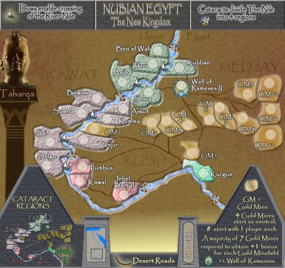
gimil wrote:The region in brown really needs to be a different colour, it blend to much into the bacground and took me a while to realise it was a playable region.
you beat me to it!
that brown doesnt look good to me, i didnt see the gold mines because they're a slightly similar colour
(but that was a quick glance, can see them perfectly now

)
also, the text in the background of the brown looks almost invisible, i know ur trying to make the text look kinda subliminal but i think its a little
too subliminal if you know what i mean.
at the bottom where you have a yellow gradient into nothing i think you should put something there because it looks kinda empty there i think
is Swenet (Elphentine) a terit?
on the mini-map the "4th" with the bright green outer glow looks out of place and i also struggle to read the "Cataract Regions" above the mini-map
p.s. the yellow gradient emplty thing that i was talking about - i think you could move the "Desert Roads" upward so it fills that space
?
but then that space might look empty! ooh i dont know!
well done cairns, lookin' good