Moderator: Cartographers
gimil wrote:The region in brown really needs to be a different colour, it blend to much into the bacground and took me a while to realise it was a playable region.
ZeakCytho wrote:I liked the old colors much better
These seem too dark. Maybe you could settle on an in between color?
t-o-m wrote:gimil wrote:The region in brown really needs to be a different colour, it blend to much into the bacground and took me a while to realise it was a playable region.
you beat me to it!
that brown doesnt look good to me, i didnt see the gold mines because they're a slightly similar colour
(but that was a quick glance, can see them perfectly now )
also, the text in the background of the brown looks almost invisible, i know ur trying to make the text look kinda subliminal but i think its a little too subliminal if you know what i mean.
at the bottom where you have a yellow gradient into nothing i think you should put something there because it looks kinda empty there i think
Does it have an army circle on it?is Swenet (Elphentine) a terit?
on the mini-map the "4th" with the bright green outer glow looks out of place and i also struggle to read the "Cataract Regions" above the mini-map
p.s. the yellow gradient emplty thing that i was talking about - i think you could move the "Desert Roads" upward so it fills that space
?
but then that space might look empty! ooh i dont know!
well done cairns, lookin' good
Kaplowitz wrote:My problem with this map is the theme.
I know what Nubia is, but i know nothing about it.
I know what Egypt is, but i know little about it.
When i see Lower Egypt or Egypt Upper i go "Hey, look- its Egypt!" (more so with Lower)
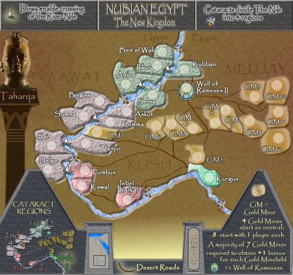
When i see this, it looks like a bunch of circles circles with a river. The thing that gives classic maps a theme is its location. What should draw me to this map is its location, but i have never seen this place before- and therefore it doesnt really interest me.
Maybe I just need a geography lesson, but for I'm not a huge fan of this part of your Egypt Series. Id rather have something with Pyramids, or Egypt against other Ancient Civilizations (like Mesopotamia or something).
Im not trying to sound harsh, its just this one wont be my favorite Cairn's Map.
ZeakCytho wrote:Could you reduce the opacity on the brick lines in the pyramid-things at the bottom of the map, and in the legend/title at the top? They seem a bit strong.
The minimap showing Nubia in relation to the rest of Egypt is good, but the transition from the tower to it is rather abrupt. Could you give it a more substantial border, about the thickness of the design-thing on the other tower?
Why does the 4th Cataract bonus have a glow on it when none of the others do? I think the glow looks good, I'd just add it to the rest.
The colors of the first and second cataract look very similar to me. Could you change one of them to something more different?
I liked Taharqa's pillar better back in v4, where it was light and the designs on it were dark. The dark pillar with light designs just doesn't look good to me.
In the title bar, the picture of the cataract looks kind of thrown in. Could you give it a glow or something like the dow picture?
Coleman wrote:My first suggestion coming back! This is an odd feeling. Thank you cairnswk for making me feel like I can contribute something again.
Anyway, I find the GM repetition really distracting. The gold mines are a very distinct color and the color swatch by the gold mine explination feels like enough.
I kind of know why you did it, just 1, 2, 3... is odd. Maybe if you did letters? I just think seeing GM over and over like that is a bit much.
Hope you find a way to make that work. This looks like a very good map.
Edit: Oh, uh... I didn't read to see if someone else made you add the GMs or not, I just looked at the latest picture and went with what I thought right away. It really hurts to read a lot for me right now. My brain turns to mush, so sorry if I'm repeating something.
cairnswk wrote:What about different names for gold mine territories entirely.
oaktown wrote:seems like a pretty 'advanced' idea to me... I'll give it a more complete look over later.
seamusk wrote:Looks a lot better overall. I couldn't read the number in the gold mines before. The 2nd and 3rd cataract region look very similar to me colorwise though. I also find Nobo-wa confusing. So it isn't part of the 2nd cataracts region? Otherwise looks good.
TaCktiX wrote:The names are great, but there's too much text on the territories again. If you kept the allusion to Nobo in the legend, then made the actual territory names the egyptian for 1-10,10+1, then they'd not look like they were shoved there to alleviate a worse problem (which is what it looks like right now).
onbekende wrote:got time, doing a round.
For the bonusses I see nothing wrong at this point.
1ste:
Space some room between Serra and its armyshade
2nd:
all well
3rd:
space some room between "Jebel" and "Barkal" otherwise people will make it into "Iebel Barkal"
4th:
this blue is getting a bit too flashy for my taste, a softer tone for atleast the left side?
Gold Mines:
looks nice aswell
for gameplay, it is so that for example "Nobo-tala" can attack "Tumbus"? (3rd cataract region)
if so => mkay
if no => rework the roads then he
LOOKS NICE
natty_dread wrote:I was wrong
max is gr8 wrote:Why don't you add a mint in each of the other continents so you get a bonus of 1 army for every mint and mine you own
Users browsing this forum: No registered users