Ah, time for another long list of little tweaks. Cairns, you really make feedback fun.
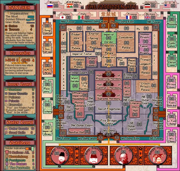
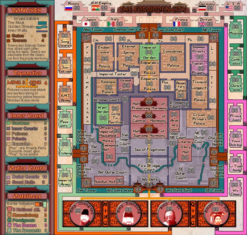
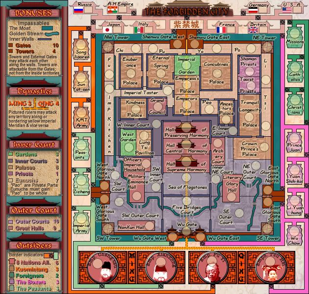
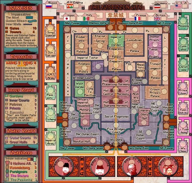
On the legend, all of the text, particularly the drop-shadowed bigger text, seems flat and uninteresting next to the killer scroll texture you've got in place. The Ming and Qing look just fine, for comparison. Also of note is that the drop shadows make almost all the text it applies to harder to read.
The Ming/Qing separator in the legend fades out of existence unless you're paying attention to it. Considering that the orange dotted line you have stated there doesn't separate either dynasty (rather, it joins them through the meridian attack thing), I would suggest switching it to something else. Perhaps a throwback to that ornamental separator you had several versions back.
The border indicator doesn't seem to resolve to anything even though it seems like it should. I'm not sure what to suggest to fix this, but you always come up with something.

Both A-H Empire and Germany look weird directly above their respective border indicators. I know that the entire set of territories up there is standardized width, so I would suggest a full change across them all to make that weird overhang disappear.
With the bridges on NE Outer Court and SW Outer Court, they look like your brush slipped down while trying to draw around the river. Are there actually three bridges across the river on those territories? If not, I would suggest condensing down to one, wider bridge. For comparison, SW Court and SE Outer Court look pretty good. Five Bridges Court could use a similar revamp, but it's kinda...five bridges.
On the right side, both the Boxers (Li Yuan-hung, Yuan Shih-kal) and the Foreigners (Catholics) have an unnecessary border overhang on the left side. On the left side, Sun Yat-sen has the same kind of overhang.
All over the map the outer edges of a lot of territory names end up getting lost due to color changes. This is most evident on the blue-ish palace borders in the city, and the edges of the lanterns on the outside. The subtle outer glow helps, but moving text around would also help.
Finally, the Eunuchs Fu, Li, and Tsi look weird with the solid vertical, but I don't see any way to fix it without being slammed with lack of continuity.
Nice work so far, cairns.