Page 1 of 2

Brazil map revealed!! [Done]

PostPosted: Sun Mar 05, 2006 10:21 am
by Marvaddin
This is the link for the image:

http://i44.photobucket.com/albums/f44/M ... invers.gif

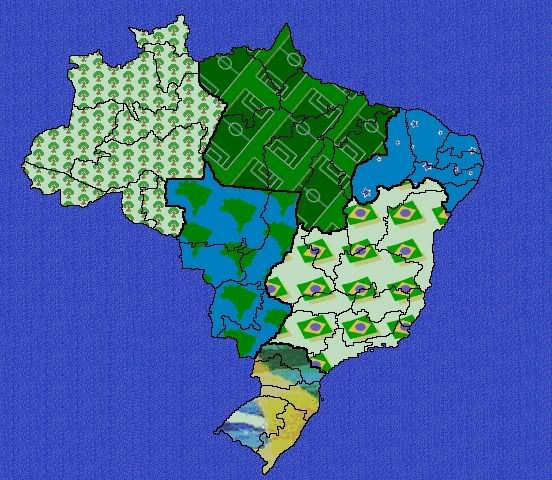
This is the final version for my Brazil map... at least, as I imagined it... from the last update, I added some art, and mainly, added non-crossing borders, making much better the playability (I hope :) ). The map had some problems... for example was almost impossible hold Mato Grosso continent. I studied the classic map, to do my map a more balanced one. I think its now a good map, with continents related to those in classic map:

Central Axis - Asia
Central North - Europe
Northwest - North America
Northeast - Africa
Mato Grosso - South America (more difficult, I know)
South - Oceania

Well, maybe some routes can disappear yet... maybe between Alagoas and Salvador, what do you think? Another routes?

Second, armies bonus for the continents. My suggestions, after the modifications: :wink:
Central Axis - 8
South - 2
Mato Grosso - 3
Northeast - 3
Central North - 5
Northwest - 5

The visualization is good, in my opinion. Do you see any problems? Maybe Northeast frontiers (they are covered), but I think they are pretty obvious. Suggestions? :roll:

What more should be changed? :?: :?: :?:

And, I am having trouble in resizing the image... so, if anyone can help me, I will be very happy.

And thanks to all that feedback me!! 8)

PostPosted: Sun Mar 05, 2006 10:58 am
by dagreatbroomhead
i think the concept of the map is sound, and the troops bonuses are allocated fine, but when i look at it i don't see conquer club, i see simple middle school map.

PostPosted: Sun Mar 05, 2006 11:10 am
by max is gr8
dagreatbroomhead wrote:i think the concept of the map is sound, and the troops bonuses are allocated fine, but when i look at it i don't see conquer club, i see simple middle school map.


It's gr8 don't dis it it's good enough like usa isn't the best i think i's rubbish but it's OK

PostPosted: Sun Mar 05, 2006 11:38 am
by Marvaddin
Dagreatbroomhead, I dont understand your opinion... What do you mean by "middle school map"? If I can correct the problem...

And well, I think we need accustom ourselves to new maps, dont you? :wink:

PostPosted: Sun Mar 05, 2006 11:45 am
by max is gr8
I'll help write the code if you want

PostPosted: Sun Mar 05, 2006 12:09 pm
by dagreatbroomhead
let me rephrase what i meant, it came out wrong before. i meant that i really like the map and all its components and planning, but i just feel that it could be graphically designed in a stronger way.

PostPosted: Sun Mar 05, 2006 12:15 pm
by max is gr8
he has a point it could do with graphical improvement

PostPosted: Sun Mar 05, 2006 12:38 pm
by Marvaddin
Well, I did the map based in the few feedback I had... I was making it with some patterns I created, but people said coloured continents are better, if its you mean.

The following link is to the first version:
http://i44.photobucket.com/albums/f44/M ... /total.jpg

Now, if you are talking about any final art or sort of, I did what I could with my very bad tools. The map was almost all done in paint :x (but Im sure it doesnt seems done in paint :) ). If anyone offers me help, it can be improved.

Hm, I admit, the red background hides the names a bit, and I will try correct it soon.

PostPosted: Sun Mar 05, 2006 12:40 pm
by max is gr8
not patterns no we mean colours they collide a bit dont they

PostPosted: Sun Mar 05, 2006 1:12 pm
by Marvaddin
As I already said, I see a little problem between red background and countries names, and I will correct it putting a lighter red background insteas. I dont see other colour problems. Where are you seeing this?

PostPosted: Sun Mar 05, 2006 1:17 pm
by thegrimsleeper
lackattack wrote:Something that looks like it was designed in Microsoft Paint may not make the cut.


Marvaddin wrote:The map was almost all done in paint :x


I think this is the problem people are having.

Have you thought about downloading a free trial of Photoshop or Paint Shop Pro?

PostPosted: Sun Mar 05, 2006 6:12 pm
by Marvaddin
This post is to show you all, see:

http://i44.photobucket.com/albums/f44/M ... wnumbs.gif

This is my map with the numbers of armies already... This means I already edited and adjusted xml file. Sooooo... my map is already playable.

According to the poll, the problem is with visualization... I want improve it, but I need suggestions, then... maybe some help :wink: About it, I will do by myself:

1) Change red background of North Central continent for another lighter (the countries names will be more visible).
2) Change the numbers little background to another a little lighter, too (because there is a little problem with dark blue numbers).

Beyond that, I think it doesnt hurt the sight ( :) ), and is a pretty legible map (nothing confusing as Siam, and without hidden countries names, as in USA map).

If there is anyone wanting give me a hand (and sign the map, too, why not?), pm me and I send the "skeleton map" (only the frontiers).

Lack, what do you think about my map? Is it good enough?

PostPosted: Sun Mar 12, 2006 6:27 pm
by Marvaddin
Ok, I think this is really the final version:

http://i44.photobucket.com/albums/f44/M ... wnumbs.png

I changed the background of Central North, and the little background for the numbers. Changed the Brazil flag, too, and I think the aspect is very better in the png format.

Im doing the small version yet (is it really necessary??), but the question is, should we put it into test? I think yes, lack can add my map to the options of new games.

Laaaaack, how about it?

not bad marv....

PostPosted: Mon Mar 13, 2006 4:20 am
by YP_Legend
:arrow: I think it looks pretty good Marv.
If you still need a resized map image sir, i can help with that. 8)

YP

PostPosted: Mon Mar 13, 2006 3:01 pm
by daslight
I do not understand the borders between Central, North West, and Mato. Part of the border is a dark black line and part is a big open space. Is the open space a river? (No I do not know my Brazilian geography.) Can armies attack over the empty spaces? For example: from Madiera to Altamira?

If one can make attacks like that then personally I think it needs to be just a black line. If it is more like the U.S. map then not sure if I like it blank might be better to make them blue, if they are rivers. Or somehow showing the borders are not crossable borders.

Just my thoughts otherwise looks like it should be a fun map.

PostPosted: Mon Mar 13, 2006 4:21 pm
by Marvaddin
daslight, the "open space" as you called it, are non-crossing borders, as its described in the legend (duh!). These are not rivers, only non-crossing borders added to increase the map playability.

YP_Legend, yes, if you can resize the map to me (lets say, to 80% of the actual size), thank you very much, I will accept. Pm me with your e-mail, so I will envy you a version of the map without the numbers (and with some little changes).

borders

PostPosted: Mon Mar 13, 2006 7:30 pm
by lilwdlnddude
I think some borders should be changed. I'm guessing you want the south as one of thoes "Oceana" type of countrys. So I think that you should switch the Mato, Central Axis non crossing border. Instead you should make it so the Centeral Axis cannot attack the south so that only Campo Grande can attack the South. Or you could just block off Oeste Paulista from the south to make it harder to defend the Central Axis. But I definatly think that you should get rid of the Mato, Cetral Axis non crossing border. Then the Central Axis will be more worth the 8 your giving it since almost every border is wide open. Then you could also rais the Mato bonus troop count to like 4 or 5. I also think that 5 is to much for the Northwest. Thats all I see. I hope that you may consider some of my suggestions.

PostPosted: Mon Mar 13, 2006 10:39 pm
by Marvaddin
You are right, Im thinking about South as Oceania, but I dont want it with one attack route only. This time it will be a more vulnerable fortress. So I think one route to Mato and one to Central Axis is fine... I could really block the attack route between Curitiba and Oeste Paulista or São Paulo...

About the blocked border between Mato Grosso and Central Axis, I will mantain it. Without it, Mato Grosso, a continent with only 5 countries, would be impossible to hold, because it could be attacked from many places. Central Axis already have 6 border countries, and can be attacked from 4 other continents, so its already very difficult.

5 is just a fine bonus for Northwest: 9 countries, 3 border countries, can be attacked from 3 places... Its my North America :wink: Think about the continents this way:

Central Axis - Asia
Central North - Europe
Northwest - North America
Northeast - Africa
Mato Grosso - South America (more difficult, I know)
South - Oceania

PostPosted: Wed Mar 15, 2006 4:19 pm
by Marvaddin
Hi, guys...

http://i44.photobucket.com/albums/f44/M ... nvers3.png

I now added one non-crossing border between Oeste Paulista and Curitiba (thanks, lilwdlnddude.). Im also thinking about decrease Central Axis bonus to 7...

Yeah, I think Middle East map has lack of colours... I put it in the right place. One guy put there (in the wrong place, because this is the forum for discuss Brazil map) my map has excess of colours... so I reduced the colours scale 15% or sort of. Is it better now? Well, to me its important that the names, numbers, and frontiers are clear, and I believe they are. Any problem?

Hmmm, how can I send Lack the xml file? If someone can help me with its revision...

Some little questions:
- Are there limit of letters in countries / continents names?
- Are there support for signals like "á" and "ã"? (If not, I need edit xml again :wink: )

PostPosted: Wed Mar 15, 2006 5:14 pm
by lackattack
Hi Marv,
You're doing a great job on this Brazil map. I know there are many Brazilians at CC and they're gonna love it.

I think it looks good. My only criticism is that there is no large version, and the 550 px image will be hard for some people with high resolution monitors to read.

PostPosted: Thu Mar 16, 2006 9:47 pm
by oman
If you make the areas that you cant atack across better, then It is perfect!


(P.S. also think about making less places peple can be in

PostPosted: Tue Jun 12, 2007 8:27 am
by yeti_c
2 whole pages for this map...

The Foundry Process has come a long way!!!

C.

PostPosted: Tue Jun 12, 2007 9:06 am
by Wisse
it was the 4 or 5th map that was quenched

PostPosted: Thu Sep 13, 2007 7:12 pm
by Blitzaholic
Wisse wrote:it was the 4 or 5th map that was quenched


5th

the 1st 5 as i understand are

classic
usa
asia
british isles
brazil

this is posted in general discussion of the 1st 5's and top 5's on page 1

PostPosted: Thu Sep 13, 2007 8:33 pm
by unriggable
Asia was done that early? Wow right from the beginning the standards are high.