Re: [Official] Brazil REVAMP [Beta]
Ehhhhhhhh! Finally!!! I ll play when I have a free slot 
Conquer Club, a free online multiplayer variation of a popular world domination board game.
https://www.conquerclub.com/forum/
https://www.conquerclub.com/forum/viewtopic.php?f=358&t=58759
AndyDufresne wrote:REVAMP is live.
--Andy
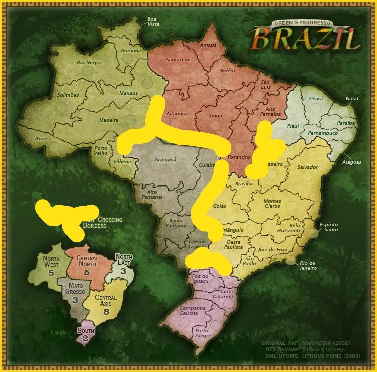
Bruceswar wrote:Nice looking map even if I get the 100 acre woods in my head. I know I am late to the party, but is there anyway we could get the impassables (The green and yellow lines to a different more distinct color? For the people who know the map well it is not such a problem, but many will have issues with it who do not play that map so much. This is given the chosen color scheme of the territories.
2 Reasons
1. It is semi hard to see given the trees so people will not know what it means.
2. Given the fact it looks like a thick border people might mistake it as such and try to cross it.
Sorry if this has been mentioned already, but just completed my first sweep on it. Nice looking map.

RjBeals wrote:
You suggest to change :The green and yellow lines to a different more distinct color?" - what do you mean.
- Click image to enlarge.


RjBeals wrote:here's a previous draft.. like this?
- Click image to enlarge.
Bruceswar wrote:To better get my point across... Say you are driving down the road, and you see Billboards along side it.
This one
and this one
Which one are you more likely to notice?
Personally most would notice the one first with contrasting colors. Same reason Open Signs are Blue and Red etc etc. I think you get the point.
](./images/smilies/eusa_wall.gif "Brick wall")
RjBeals wrote:](*,)
jiminski wrote:RjBeals wrote:](*,)
hahah sorry RJ, FFS just ignore Bruce.
RjBeals wrote:jiminski wrote:RjBeals wrote:](*,)
hahah sorry RJ, FFS just ignore Bruce.
Well, some foundry members do accept all feedback, not that you could tell from the debate in General Discussion right now.
Bruceswar wrote:To better get my point across... Say you are driving down the road, and you see Billboards along side it.
This one
and this one
Which one are you more likely to notice?
Personally most would notice the one first with contrasting colors. Same reason Open Signs are Blue and Red etc etc. I think you get the point.
RjBeals wrote:(EDIT) I get the point sure, but sometimes hard contrast doesn't fit well into the artistic theme of a map