Page 3 of 14
Re: [Official] Brazil REVAMP [I, GP]

Posted:
Sun Aug 10, 2008 4:02 pmby jiminski
Mjinga wrote:jako wrote:wcaclimbing wrote:AndyDufresne wrote:<Andy stuff>
<wcaclimbing stuff>
it doesnt look that bad. but im not american so i dont really care that much, but i still support the tilt.
Precisely. You're not from the country so you don't care.
I really think it's fair to put this one under Marvaddin's decision alone, since he
is from Brazil and
does care. I mean, I see everyone's points about public opinion and suchlike, but it is his map, and he did say that he wouldn't let the tilt go forward from round one. You all could whinge at RJ for misleading you in the polls instead of Marv for vetoing the tilt, if you want to whinge about something.

Hey Mj. We are not wingeing.. please don't say that

.
People are in here because they care about what comes out of the foundry. It is crazy but i am already attached to RJ's map and am truly looking forward to playing on it... but at the moment it looks like i will not get to.
I think i care about beauty and ideas as much as anyone genuinely cares about the angle of pivot along the north south line of longitude!
Re: [Official] Brazil REVAMP [I, GP]
Posted:
Sun Aug 10, 2008 4:06 pmby Mjinga

I don't mean it in a bad way.
Re: [Official] Brazil REVAMP [I, GP]
Posted:
Sun Aug 10, 2008 4:13 pmby jiminski
Mjinga wrote::) I don't mean it in a bad way.
I know MJ, you do not have bad in you!
i am just beginning to feel really sad about this map.
Re: [Official] Brazil REVAMP [I, GP]
Posted:
Sun Aug 10, 2008 6:29 pmby RjBeals
Jeez.. calm down. I can remove the tilt and still make the map look good.
As far as misleading the site with the tilt still in round-2,,, well we only had 3 days to adjust the image. I'm starting to regret winning - and would rather concentrate on iron curtain.
Re: [Official] Brazil REVAMP [I, GP]
Posted:
Mon Aug 11, 2008 4:07 amby pamoa
RjBeals wrote:... I'm starting to regret winning - and would rather concentrate on iron curtain.
Prize of fame, you should be happy under the spotlights...
Re: [Official] Brazil REVAMP [I, GP]
Posted:
Mon Aug 11, 2008 7:39 pmby RjBeals
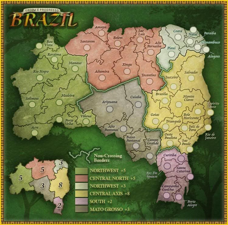
- Click image to enlarge.

Okay - all I've basically done was remove the tilt - however that took a lot of work. I had to redraw every border. But I think the map looks fine this way. I had to "adjust" some of the borders in the top right (NorthEast) blue section in order to fit the names and/or circles the way I did. I hope that's alright.
I also removed the text legend and have just the minimap, since I think that was the preferred legend. With the title in the upper right, and the legend in the lower left, I think the map still feels balanced.
I also changed the color of the impassable borders.
From here I can work on spellings or territ names - Hope you like.
Re: [Official] Brazil REVAMP (Update No Tilt) [I, GP]
Posted:
Mon Aug 11, 2008 7:50 pmby ZeakCytho

I think it looks just as good as before, and probably much better to Brazilians.
Re: [Official] Brazil REVAMP (Update No Tilt) [I, GP]
Posted:
Mon Aug 11, 2008 8:20 pmby jiminski
just to compare
- Click image to enlarge.
Re: [Official] Brazil REVAMP (Update No Tilt) [I, GP]
Posted:
Mon Aug 11, 2008 8:28 pmby whitestazn88
it still looks real good rj... keep up the good work
Re: [Official] Brazil REVAMP (Update No Tilt) [I, GP]
Posted:
Mon Aug 11, 2008 10:03 pmby jako
at least the no-tilt version doesnt look as bad as i imagined. but im still a tilt fan.

Re: [Official] Brazil REVAMP (Update No Tilt) [I, GP]
Posted:
Mon Aug 11, 2008 10:09 pmby Night Strike
Without the tilt, it did lose some of its flair, but it's still an attractive map.
Your Non-Crossing Borders label might look better underneath the mini-map in the "hook" of the map. (Kind of like having it nest down to the bottom left corner from the top right.)
Perhaps you could fit the flag or something in the bottom right.
Re: [Official] Brazil REVAMP (Update No Tilt) [I, GP]
Posted:
Tue Aug 12, 2008 5:43 amby WidowMakers
Tilt still looks good. But 3 things:
1) I like the old legend. But since you cannot tilt, there is no room for that.
2) Bring back the old Non-Crossing borders. The white is better.
3) Do you think you could put the flag or crest in the lower right? Maybe fill up the empty spaces a bit.
Other than that I am fine with it.
WM
Re: [Official] Brazil REVAMP (Update No Tilt) [I, GP]
Posted:
Tue Aug 12, 2008 5:50 amby jiminski
The vetoed map uses space and the confines of the square frame with greater elegance.
Therefore the image is now attempting to catch up to what it was, by cramming flags and legends into various empty corners.
If we could tilt the square frame so that the same composition could hug the diagonals of the board.. then it would be fine .. I assume we we can not(?).. at least without shrinking the map and placing a skew diamond into an additional, conventional square frame.
The Tilt utilises the confines of the Square frame.... if you could somehow recapture the illusion then i would be happy. At present, in the replacement map, we have a reminder of balletic symphony without recreating it.
Re: [Official] Brazil REVAMP (Update No Tilt) [I, GP]
Posted:
Tue Aug 12, 2008 7:17 amby RjBeals
WidowMakers wrote:2) Bring back the old Non-Crossing borders. The white is better.
3) Do you think you could put the flag or crest in the lower right? Maybe fill up the empty spaces a bit.[/list]
1) I can try to put the crest in the lower right. I don't think I want the flag there. The flag's colors are just to gaudy. It doesn't fit the color scheme of the map.
2) Sure I can bring back the white (actually a bit pink) non-crossing borders.
Night Strike wrote: Your Non-Crossing Borders label might look better underneath the mini-map in the "hook" of the map. (Kind of like having it nest down to the bottom left corner from the top right.)
Sure - I can try to flip those 2 around. I'll see how it looks.
jiminski wrote:The Tilt utilizes the confines of the Square frame.... if you could somehow recapture the illusion then i would be happy. At present, in the replacement map, we have a reminder of balletic symphony without recreating it.
I know what you mean jim. I'm not sure I can pull it off, I surely can't angle the maps square border. But I can try to do something different, using some of the culture and colors.
Re: [Official] Brazil REVAMP (Update No Tilt) [I, GP]
Posted:
Tue Aug 12, 2008 7:21 amby Hotdoggie
looks better without the tilt but w.e...just cave into the orquardness to sacrifice a better look.
Re: [Official] Brazil REVAMP (Update No Tilt) [I, GP]
Posted:
Tue Aug 12, 2008 8:20 amby jiminski
Hotdoggie wrote:looks better without the tilt but w.e...just cave into the orquardness to sacrifice a better
look.
It's a fine line between awkwardness and striving for what one thinks is best. All that often differentiates between the two is our initial perspective. The tilt issue is the perfect example of that.. from both sides of the '
debate'.
And genuine, not false debate, is the only correct way to reach the most correct result!
Re: [Official] Brazil REVAMP (Update No Tilt) [I, GP]
Posted:
Wed Aug 13, 2008 3:54 pmby Hotdoggie
jiminski wrote:Hotdoggie wrote:looks better without the tilt but w.e...just cave into the orquardness to sacrifice a better
look.
It's a fine line between awkwardness and striving for what one thinks is best. All that often differentiates between the two is our initial perspective. The tilt issue is the perfect example of that.. from both sides of the '
debate'.
And genuine, not false debate, is the only correct way to reach the most correct result!
lol I typod... *It looks better WITH the tilt.
Now what I said makes sence =]
Re: [Official] Brazil REVAMP [I, GP]
Posted:
Mon Aug 25, 2008 5:06 amby MrBenn
RjBeals wrote:- Click image to enlarge.
The army circles look slightly oval; is that deliberate, or a side-effect of the un-tilting, or just an optical illusion?
Re: [Official] Brazil REVAMP (Update No Tilt) [I, GP]
Posted:
Mon Aug 25, 2008 6:51 pmby edbeard
I only can see a couple of concerns for this map
1. oval army circles
2. border between Vihena and Madeira. Is it supposed to be there? I don't think it is. Seems like the impassable border needs to be extended a bit there. And, speaking of the impassable border...
3. The colour of the impassable border. Maybe it's just me but I think the green and gold is quite ugly for the border. The green works for the map background. The gold works for the frame or trim of the map. Put them together for the impassable border and it looks awful to me. Also, why is the colour different on the legend version? I'd say try the black you used for the regular borders instead of the green for the outline of the impassable.
Re: [Official] Brazil REVAMP (Update No Tilt) [I, GP]
Posted:
Mon Aug 25, 2008 8:31 pmby RjBeals
The oval army circles are deliberate. It's so the 88's fit perfectly centered.
The little border you mentioned ed will be fixed -it must have slipped in there?
And I'll work on the impassables.
Marv was concerned that the upper left area of the map didn't exactly fit to his original map,if you laid them on top of each other. It's true - it's because I used a rounded google earth image to trace my borders, and Marv used a flattened map to trace his. They will not match. I have really not addressed that problem yet. I'm thinking of my next move.
Re: [Official] Brazil REVAMP (Update No Tilt) [I, GP]
Posted:
Mon Aug 25, 2008 10:27 pmby ZeakCytho
RjBeals wrote:Marv was concerned that the upper left area of the map didn't exactly fit to his original map,if you laid them on top of each other. It's true - it's because I used a rounded google earth image to trace my borders, and Marv used a flattened map to trace his. They will not match. I have really not addressed that problem yet. I'm thinking of my next move.
Given the background, I think a flat tracing would work better. If the background were of the surrounding countries and the ocean, then I would be in favor of the round one.
Re: [Official] Brazil REVAMP (Update No Tilt) [I, GP]
Posted:
Tue Aug 26, 2008 7:14 amby RjBeals
ZeakCytho wrote:RjBeals wrote:Marv was concerned that the upper left area of the map didn't exactly fit to his original map,if you laid them on top of each other. It's true - it's because I used a rounded google earth image to trace my borders, and Marv used a flattened map to trace his. They will not match. I have really not addressed that problem yet. I'm thinking of my next move.
Given the background, I think a flat tracing would work better. If the background were of the surrounding countries and the ocean, then I would be in favor of the round one.
Good point Zeak. This will mean reworking the borders one more time, but I'm getting good at it now
An update will come soon I hope. I work in the printing industry (real life) and this is about the time of year we start printing Holiday catalogs, so I'm busier than normal at work. I want to start the xml for Charleston, and then get to this. I'll leave Iron Curtain on hold for a bit.
Re: [Official] Brazil REVAMP (Update No Tilt) [I, GP]
Posted:
Wed Aug 27, 2008 6:04 amby jiminski
that's it then? .. debate is pointless on this map i take it; what Marv says is what will happen anyway!?
hehe, sheesh... i really wish the Foundry had not involved anyone else in this excercise if this is the reality.
Re: [Official] Brazil REVAMP (Update No Tilt) [I, GP]
Posted:
Wed Aug 27, 2008 6:16 amby RjBeals
From what I understand Jim - Marv has final say on the map. Revamps do not follow the normal foundry process - as we can comment on graphics, but within the original makers guidelines. It's hard to do - especially on my end. But if I'm wrong, I would love to know otherwise.
Re: [Official] Brazil REVAMP (Update No Tilt) [I, GP]
Posted:
Wed Aug 27, 2008 6:26 amby jiminski
RjBeals wrote:From what I understand Jim - Marv has final say on the map. Revamps do not follow the normal foundry process - as we can comment on graphics, but within the original makers guidelines. It's hard to do - especially on my end. But if I'm wrong, I would love to know otherwise.
it must be very frustrating for you RJ; The dynamics of the revamp process appear to be fundamentally flawed.
I think many people enjoyed RJ's great work when it was put to the broader community.
If more people are to be included in the map revamp process (and in the foundry in general), as apparently was the desire, their views should not be completely dismissed... heheh it is not good for morale