Re: Route 66: page 7 update
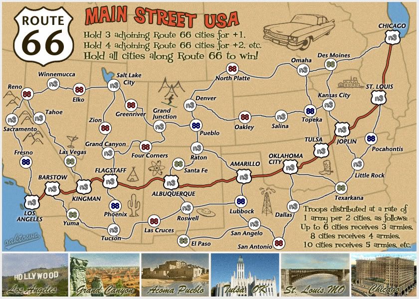
I think you have room to jazz up the title treatment. It looks a bit anemic.
Conquer Club, a free online multiplayer variation of a popular world domination board game.
https://www.conquerclub.com/forum/
https://www.conquerclub.com/forum/viewtopic.php?f=358&t=67910
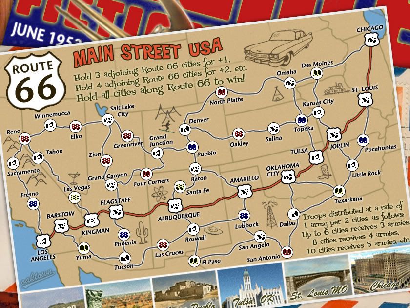
lostatlimbo wrote:I also don't understand San Bernadino. Geographically (and even thematically), that should be Barstow - or at the very least, Victorville. I see that you intended it as the crux between I-15 and I-10, but I think it would be more interesting to have 10 connect with LA and add Palm Springs in between, and then replace San Bernadino with Mojave. I've had the misfortune of spending some time in San Bernadino, so forgive my prejudice.
DJ Teflon wrote:Just an idea - might it be worth having non-route 66 terits as +2s? It would give more incentive for players to take them etc.
iancanton wrote:lostatlimbo wrote:I also don't understand San Bernadino. Geographically (and even thematically), that should be Barstow - or at the very least, Victorville. I see that you intended it as the crux between I-15 and I-10, but I think it would be more interesting to have 10 connect with LA and add Palm Springs in between, and then replace San Bernadino with Mojave. I've had the misfortune of spending some time in San Bernadino, so forgive my prejudice.
if they're both in the song, then why not have both? from los angeles, would it work to have route 66 go east to san bernardino, then exaggerated north to barstow, with yuma connecting to san bernardino instead of to barstow (which links to las vegas instead)? mind u, i notice that all cities that connect to route 66 do so at only one point. is this deliberate and would my suggestion for barstow and las vegas spoil the desired arrangement of start positions?
iancanton wrote:DJ Teflon wrote:Just an idea - might it be worth having non-route 66 terits as +2s? It would give more incentive for players to take them etc.
i second that.
gimil wrote:Just a passing thought but how about apply a filter (I know what one, just don't know where to find it) to reduce the amount of colours used in your photos at the bottom. Try and make them appear a little more (not to much) appearing like the rest of the main map. Sort of detaching from reality a little so that the 'realistic' photos don't clash (not that they do so much) with the not so realistic map.
Does that make sense?


ghirrindin wrote:The tipi doesn't belong in Arizona. Natives inhabiting the Great Plains lived in tipis, not those in the desert Southwest.
ghirrindin wrote:The tipi doesn't belong in Arizona. Natives inhabiting the Great Plains lived in tipis, not those in the desert Southwest.
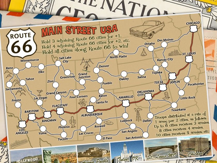
the.killing.44 wrote:1. I'd make it so the edges go off the canvas, but you can still see some of them below? Like, crop through the big "T"
2. Do something with the border/edge? I dunno, might look cool.

RedBaron0 wrote:It looks great oaktown, since you've got the map on a postcard how about adding a stamp & postmark in the top corner, around Chicago?
I like seeing the little bit of the National Geographic logo, but would there be an issue with copyright?
oaktown wrote:Copyright: this was a quick and dirty sample of what I could do to make it look like a stack of mail... I'll have to research what I can legally get away with.