Page 6 of 10

Re: Route 66: mars? pg 9

PostPosted: Sat Jun 20, 2009 9:24 pm
by cairnswk
Mmm. oaktown, i like the map part, but i'm not a big fan of the background. For me, it stands out too much and draw my eyes away from the map itself. something less intense perhaps? ;)

Re: Route 66: mars? pg 9

PostPosted: Sat Jun 20, 2009 9:37 pm
by oaktown
agreed... the national geographic mag worked because it was subtle.

consider it a work in progress.

Re: Route 66: mars? pg 9

PostPosted: Sun Jun 21, 2009 1:45 am
by targetman377
oaktown wrote:agreed... the national geographic mag worked because it was subtle.

consider it a work in progress.


i like the national geographics one two is there really a copyright violation if you do it that way if there is not i think that it would be better the old way.

Re: Route 66: mars? pg 9

PostPosted: Sun Jun 21, 2009 7:31 am
by Teflon Kris
Gameplay

Sorry - yes, in my previous post I was suggesting the non-route 66 regions start with 2 neutrals (as opposed to a bonus).

Your earlier post oak, clears up how the starts would work - it all looks fine to me, and pretty unique gameplay-wise.

You've done a great job of bringing the Route 66 theme back alive again. =D>

Re: Route 66: mars? pg 9

PostPosted: Sun Jun 21, 2009 2:49 pm
by a.sub
a.sub wrote:hmmmmm
just a thought inspired by the mars snippet there
why not put it on top of piles of other maps?
*cough* CC Bank *cough* *cough*

i still stand by this
except i think u shd use more common maps, ie USA, World 2.1, AOR1, Feudal,

Re: Route 66: mars? pg 9

PostPosted: Sun Jun 21, 2009 7:35 pm
by oaktown
a.sub wrote:
a.sub wrote:hmmmmm
just a thought inspired by the mars snippet there
why not put it on top of piles of other maps?
*cough* CC Bank *cough* *cough*

i still stand by this
except i think u shd use more common maps, ie USA, World 2.1, AOR1, Feudal,

I don't see why a postcard in somebody's house in 1952 would be sitting on top of an Age of Realm map made in 2007. :-s

Anyway, the idea is to come up with artwork that I create and therefore can use without obtaining permission. I didn't make any of the maps you mention above. If I want to rip off somebody else's work I'd just go with the national geographic magazine.

Re: Route 66: mars? pg 9

PostPosted: Mon Jun 22, 2009 1:24 am
by RedBaron0
I wasn't sure which side of the postcard it was, but it makes sense to not have the postmark then.

If you're going for the 1950's theme instead of mail, how about a diner? Put a table under the postcard, a cup of coffee, and a menu. Considering the nature of Rt. 66 any diner or drive-in along the route would offer a selection of postcards to advertise to travelers and would fit into the theme quite nicely.

Re: Route 66: mars? pg 9

PostPosted: Mon Jun 22, 2009 2:58 pm
by whitestazn88
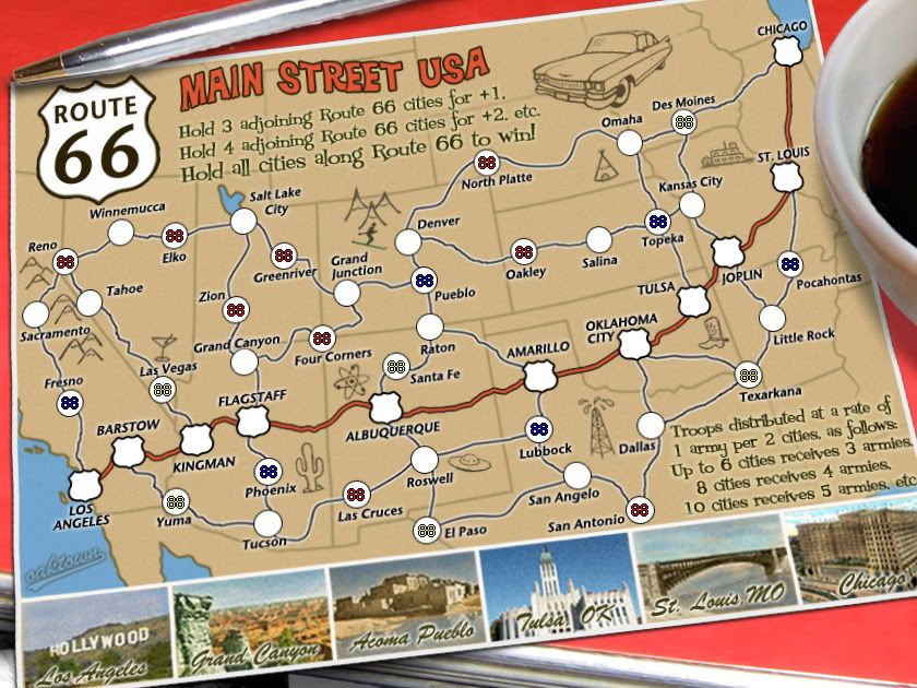
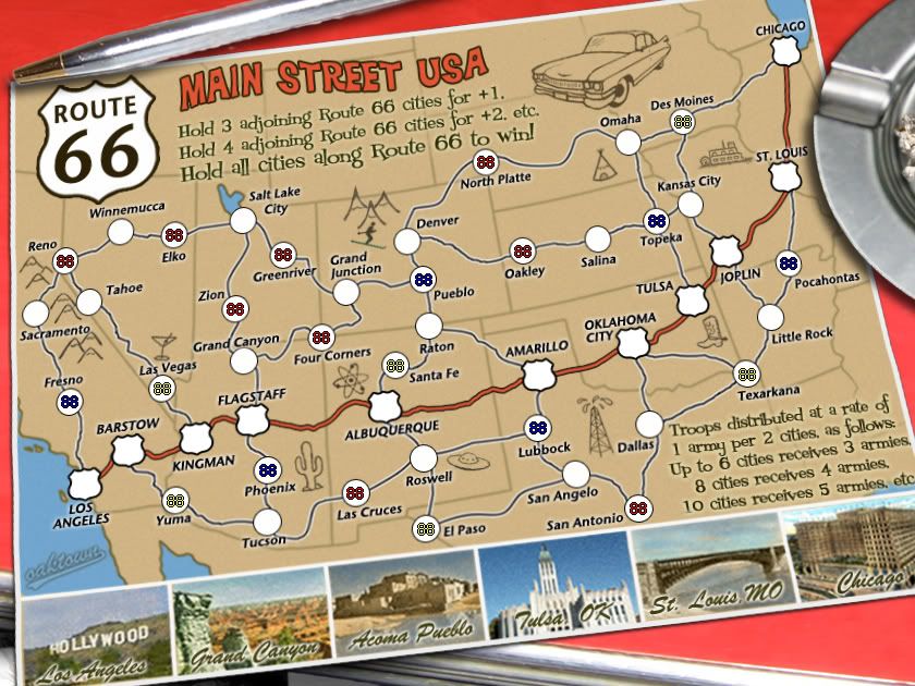
RedBaron0 wrote:I wasn't sure which side of the postcard it was, but it makes sense to not have the postmark then.

If you're going for the 1950's theme instead of mail, how about a diner? Put a table under the postcard, a cup of coffee, and a menu. Considering the nature of Rt. 66 any diner or drive-in along the route would offer a selection of postcards to advertise to travelers and would fit into the theme quite nicely.


pretty good idea if i've ever heard one myself

Re: Route 66: mars? pg 9

PostPosted: Mon Jun 22, 2009 8:06 pm
by lostatlimbo
RedBaron0 wrote:If you're going for the 1950's theme instead of mail, how about a diner? Put a table under the postcard, a cup of coffee, and a menu. Considering the nature of Rt. 66 any diner or drive-in along the route would offer a selection of postcards to advertise to travelers and would fit into the theme quite nicely.


I second this emotion. I can see the cheap, plasticky red & white checkerboard table cloth already.

Re: Route 66: mars? pg 9

PostPosted: Fri Jun 26, 2009 4:28 pm
by targetman377
lostatlimbo wrote:
RedBaron0 wrote:If you're going for the 1950's theme instead of mail, how about a diner? Put a table under the postcard, a cup of coffee, and a menu. Considering the nature of Rt. 66 any diner or drive-in along the route would offer a selection of postcards to advertise to travelers and would fit into the theme quite nicely.


I second this emotion. I can see the cheap, plasticky red & white checkerboard table cloth already.


i thrid this idea its great and really does stick to the them your trying to get at

Re: Route 66: mars? pg 9

PostPosted: Mon Jul 13, 2009 1:59 am
by oaktown
Click image to enlarge.
image


Did somebody say diner table? The table is my own - 1950s red formica table with a chrome edge. (I'm especially proud of my chairs, but there's no room here for them.) I spent some time with the camera this evening - table was easy, the pen was a bitch because a silver pen reflects whatever color its on... bah. If I had a pack of smokes I'd have put them in there as well, but it may be busy enough as is.

Anywho, the postcard itself is now set up as a smart object, warped to both give a bit of perspective and to give the edges some shape. I think it works quite well, though some of my army circles are a bit egg-shaped.

I've had no gameplay comments in, well, months. ??

Re: Route 66: diner, pg 10

PostPosted: Mon Jul 13, 2009 2:18 am
by a.sub
hmm just a thought, why not print it out, take the picture with the pen, then overlay the photoshop on the printed version in the picture (that way the pen reflects well and you still keep the orig image not a photograph of the print-out)

and nice table btw :)

Re: Route 66: diner, pg 10

PostPosted: Mon Jul 13, 2009 2:31 am
by oaktown
a.sub wrote:hmm just a thought, why not print it out, take the picture with the pen, then overlay the photoshop on the printed version in the picture (that way the pen reflects well and you still keep the orig image not a photograph of the print-out)

I thought about it - I even considered printing the card out and taking a shot of the entire thing and using that as the playable map, but that would make updates a bitch!

I played around with shooting the pen on the table (to reflect the red) and on a brown paper that was close to the color of the map. It just looks weird when you drop it into the file... my sense is that reflected color on a pen is something that your brain overlooks in real life, because we just register the color of the pen as silver. But when you blow that same pen and lay it down over a two dimensional image you can't help but notice that the pen is half silver, half red. What we expect from a flat image is different than what we really see and take for granted.

Re: Route 66: diner, pg 10

PostPosted: Mon Jul 13, 2009 2:49 am
by a.sub
all i did was scrunch up the image, rotate it, crop it and used overlay blend option
i reduced the opacity a bit too
it was a bad job but i did it im 5 mins just for proof of concept
you think its any good?
Click image to enlarge.
image

Re: Route 66: diner, pg 10

PostPosted: Mon Jul 13, 2009 3:07 am
by cairnswk
oaktown, i like the table, nice. :)
Not sure about the ashtray :shock:
Perhaps some postage stamps or an envelope with a stamp on it turned upside down? might go with the pen.
Applaude your experimentation btw. :)

Re: Route 66: diner, pg 10

PostPosted: Mon Jul 13, 2009 11:00 am
by danfrank
cairnswk wrote:oaktown, i like the table, nice. :)
Not sure about the ashtray :shock:
Perhaps some postage stamps or an envelope with a stamp on it turned upside down? might go with the pen.
Applaude your experimentation btw. :)


Smoking was in, in the fifties, so an ashtray is suitable to the theme ..

Re: Route 66: diner, pg 10

PostPosted: Tue Jul 14, 2009 3:01 pm
by RedBaron0
danfrank wrote:
cairnswk wrote:oaktown, i like the table, nice. :)
Not sure about the ashtray :shock:
Perhaps some postage stamps or an envelope with a stamp on it turned upside down? might go with the pen.
Applaude your experimentation btw. :)


Smoking was in, in the fifties, so an ashtray is suitable to the theme ..


True enough, I think it'd be better with edge of a coffee cup saucer and change the pen to a spoon, and if you could pull it off, show the head of the spoon with a tiny bit of coffee pooled in center. Either way though, the theme very well satified.

Re: Route 66: diner, pg 10

PostPosted: Tue Jul 14, 2009 4:19 pm
by Teflon Kris
Hi again

I did ask about how the starting territories work- go on, enlighten me. :D

Re: Route 66: diner, pg 10

PostPosted: Tue Jul 14, 2009 11:54 pm
by Elijah S
A good idea I think and I like the whimsical style you've used.
I agree with Cairns about the ashtray though - it seems like another object may say "roadtrip" more effectively... maybe some fuzzy dice, old coke bottle, a 57 Chevy?

Re: Route 66: diner, pg 10

PostPosted: Wed Jul 15, 2009 12:59 am
by oaktown
DJ Teflon wrote:Hi again

I did ask about how the starting territories work- go on, enlighten me. :D

It's explained in the first post. Has been all along.

Maybe a coffee cup to replace the ashtray? The ashtray is the only element of the image I lifted off the web anyway, so I'm happy to lose it.

Re: Route 66: diner, pg 10

PostPosted: Wed Jul 15, 2009 1:22 am
by ender516
I think the reflection on the pen is a nice piece of work. =D> I have no problem with the ashtray per se, but if you feel the need to drop it, try a saucer with some coffee spilled in it (though I wonder if the scale would be right to fit in a saucer whose centre you could see), or perhaps a plate with a bit of food on it (I like pie, but maybe some French fries would be more recognizable.)

Re: Route 66: diner, pg 10

PostPosted: Wed Jul 15, 2009 7:37 am
by Teflon Kris
Sorry :oops: The starting positions are indeed well explained in the first post.

It looks like very interesting - and, on analysis, very fair gameplay. :D

The only slight amendment I would suggest is with the explanation of the territory bonus - maybe it should say "Up to 7 cities receives 3 armies"? Or some other re-wording?

Are you going with the idea discussed earlier: non-route-66 coded neutrals having starting with 2 neutral troops?

Re: Route 66: diner, pg 10

PostPosted: Wed Jul 15, 2009 4:00 pm
by oaktown
Click image to enlarge.
image


I've replaced one legal recreational drug with another - the ashtray has become a cup of coffee.

Right now all neutrals are intended to start as 3s. While the opening drops are set to balance 1v1 games, giving some players quick access to neutrals 2s while other have to slog through 3s would upset the early going and give some players easier expansion and access to cards. Best, I think, to make everything 3 or everything 2.

As for the "up to 7 cities receives three armies" bit I think you have a point, DJ. Right now it is incorrect - I'll change that with the next update.

Re: Route 66: diner, pg 10

PostPosted: Wed Jul 15, 2009 9:39 pm
by ender516
This is all looking really good. What do you have to do to get some stamps around here?

Re: Route 66: diner, pg 10

PostPosted: Wed Jul 15, 2009 10:04 pm
by RjBeals
i say bring back the ashtray, and have a look at the "66" reflection in a.sub's image - it looks good. What a fine piece of art you've created here oak - i could care less about gameplay. The map has evolved into something that is so unique and has so much style - that it could be my fav on cc. Well done.