Page 12 of 13

Re: Gilgamesh; Coordinates on pg 19

PostPosted: Wed Jul 01, 2009 11:23 pm
by oaktown
For starters, porkenbeans: thanks for your last post about the map. Keep it up and you may make it all the way back to my friend list. ;)

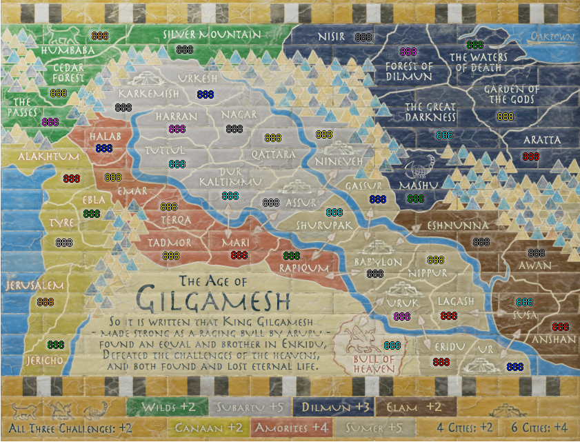
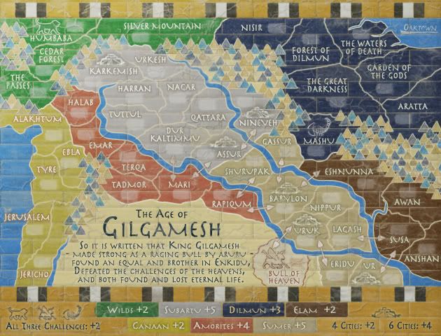
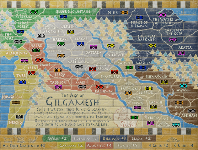
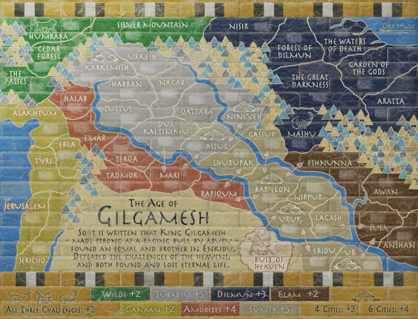
The more I play with the cracks and such the less I like what it looks like. I have, however, taken pork's comment to heart about the clarity of the text on the small version. I've brought it up a half point size (from 13.5 to 14) and lightened the text in most regions.

I've also poured over the coordinates and made some changes. Small and large image captures with three digit counts:

Click image to enlarge.
image

Click image to enlarge.
image


Links to original docs:
code: http://www.fileden.com/files/2008/7/30/ ... gamesh.xml
large: http://i141.photobucket.com/albums/r76/ ... msh31L.jpg
small: http://i141.photobucket.com/albums/r76/ ... msh31S.jpg

Re: Gilgamesh; Coordinates on pg 20

PostPosted: Thu Jul 02, 2009 2:41 am
by porkenbeans
:D

Re: Gilgamesh; Coordinates on pg 20

PostPosted: Mon Jul 06, 2009 11:05 am
by the.killing.44
Firstly, it does seem like you're going down the crack-and-the-like-in-your-face route. I'm against it, but whatever — the only true, non-personal choice issue I see is that on the small map it's made it hard to see the logos, most prominently (that's an ironic word choice is it) the lion and the cities, especially in the gray zone. They now seem to blend in too much — if you added some dark outer glow or the like that'd help it. And I say this more because it's a gameplay concern than a aesthetic one …

Now then:

XML is OK
Co-ordinates are OK

Quickest check I've done :P
Image

.44

Re: Gilgamesh; Coordinates on pg 20

PostPosted: Mon Jul 06, 2009 1:08 pm
by oaktown
thanks .44. I can make the cities pop out a bit more.

not a big change, but a bit better. Also moved the bottom-most border out of the brick cracks...
Click image to enlarge.
image

Click image to enlarge.
image


If we're there, here are the links...
Links to original docs:
code: http://www.fileden.com/files/2008/7/30/ ... gamesh.xml
large: http://i141.photobucket.com/albums/r76/ ... msh32L.jpg
small: http://i141.photobucket.com/albums/r76/ ... msh32S.jpg

Re: Gilgamesh; Coordinates on pg 20

PostPosted: Tue Jul 07, 2009 12:46 am
by porkenbeans
@ 44,
Thats drop shadow, with 0 distance. play with the spread and size, then the opacity.
And yes I agree with you 100%. this will stand the text "up" from the map, and the contrast will make it much easier to read. 8-)

Re: Gilgamesh; Coordinates on pg 20

PostPosted: Wed Jul 08, 2009 11:37 am
by dolomite13
I love this map but find the brick pattern distracting and feel it detracts from the great work done on the map. Maybe it could be softened a bit.

Just my 2 cents worth...

=)

==D

Re: Gilgamesh; Coordinates on pg 20

PostPosted: Fri Jul 17, 2009 11:42 am
by oaktown
dolomite13 wrote:I love this map but find the brick pattern distracting and feel it detracts from the great work done on the map. Maybe it could be softened a bit.

Agreed... I'm making changes in subtle increments since I think it's close. Lightened the bevel and the grout - especially n the small version - and softened some particularly square corners.

Current docs:
code: http://www.fileden.com/files/2008/7/30/ ... gamesh.xml
large: http://i141.photobucket.com/albums/r76/ ... msh33L.jpg
small: http://i141.photobucket.com/albums/r76/ ... msh33S.jpg

Click image to enlarge.
image

Click image to enlarge.
image

Re: Gilgamesh; Coordinates on pg 20

PostPosted: Thu Aug 06, 2009 11:46 am
by oaktown
three weeks, no comments. This should either be quenched or recycled.

Re: Gilgamesh; Coordinates on pg 20

PostPosted: Thu Aug 06, 2009 4:15 pm
by sully800
The softened grout lines look much better Oaktown! The previous versions were difficult for me to look at, and I am somewhat embarrassed to say when I first looked at this map I thought the brick shapes were the territory lines. My mistake became clear when looking at a version with the coordinates in place, and at that moment the white border lines popped out at me. Anyway, there used to be too much competition/commotion with the two different sets of lines, but the lighter grout looks much better.

Coordinates and all look very good. There is lots of space between each army, so there are no overlap or crowding issues that I can see.

I do struggle to read the text below the title, especially on the small map. The second and fourth lines coincide with the grout of the background which makes it hard for me to read. this might be an unusual case where making the text a bit smaller makes it more legible. If you could fit two lines of text within one block vertically I think I would be able to read it more easily.

Finally, I think the arrows could be highlighted better, perhaps with a darker outer shadow. They get lost in the light colors of the map, and are only very clear where half of them overlaps the dark brown region.

Nice work!

Re: Gilgamesh; Coordinates on pg 20

PostPosted: Thu Aug 06, 2009 5:15 pm
by porkenbeans
The only areas that are easy to read are the blue and brown areas. This is the only place where there is any kind of contrast. The rest of the map is all the same, no contrast, no color, no way for me to clearly read it. I know that we have already had this conversation, and I realize that you are stuck on the faded, washed out look. But if you want this map to be popular, you may want to consider the older farts like me, that do not have perfect eyes anymore. :cry:
Anything that you could do to make the map easier to read, will be applauded by those like myself. 8-)

Re: Gilgamesh; Coordinates on pg 20

PostPosted: Thu Aug 06, 2009 5:22 pm
by saaimen
porkenbeans wrote:The only areas that are easy to read are the blue and brown areas. This is the only place where there is any kind of contrast. The rest of the map is all the same, no contrast, no color, no way for me to clearly read it. I know that we have already had this conversation, and I realize that you are stuck on the faded, washed out look. But if you want this map to be popular, you may want to consider the older farts like me, that do not have perfect eyes anymore. :cry:
Anything that you could do to make the map easier to read, will be applauded by those like myself. 8-)

Just because you don't like the faded look doesn't give you the right to rant like that.
It's a very neat looking, original, concept-true map design and I like it very much.
Kudos to you oak. For making this map and for dealing with comments like the above.

Re: Gilgamesh; Coordinates on pg 20

PostPosted: Thu Aug 06, 2009 6:36 pm
by oaktown
Click image to enlarge.
image

Click image to enlarge.
image


thanks, sully... gave a bit more emphasis to the text (which is not gameplay related and thus not a priority) and the arrows (which are).

code: http://www.fileden.com/files/2008/7/30/ ... gamesh.xml
large: http://i141.photobucket.com/albums/r76/ ... msh33L.jpg
small: http://i141.photobucket.com/albums/r76/ ... msh33S.jpg

As for Porkenbeans, as long as his posts are related to making the map better, they are welcome. :D As you say, pork, I'm committed to the washed-out look, as it seems to have more fans than the bright colors. If I cared to spend any more time on this image I'm sure it would eventually look better, but it's been nearly a year already. Remember, this began with the Middle Earth Revamp competition.

Re: Gilgamesh; Coordinates on pg 20

PostPosted: Fri Aug 07, 2009 12:53 am
by porkenbeans
saaimen wrote:
porkenbeans wrote:The only areas that are easy to read are the blue and brown areas. This is the only place where there is any kind of contrast. The rest of the map is all the same, no contrast, no color, no way for me to clearly read it. I know that we have already had this conversation, and I realize that you are stuck on the faded, washed out look. But if you want this map to be popular, you may want to consider the older farts like me, that do not have perfect eyes anymore. :cry:
Anything that you could do to make the map easier to read, will be applauded by those like myself. 8-)

Just because you don't like the faded look doesn't give you the right to rant like that.
It's a very neat looking, original, concept-true map design and I like it very much.
Kudos to you oak. For making this map and for dealing with comments like the above.
You surely do not know me very well, or you would know that I can really put on a rant if I choose. lol.
I also like this map, it is very original and looks to be a map that I might enjoy playing, Its just that it is a bit hard for me to read. Maybe if the text were black, it would be more legible, and still be able to keep the washed out look. I don't know. Its just an idea.
And thanx Oak, for understanding that my comments are NOT meant as some kind of poke or jab at all of your work. You are one of my favorite mapmakers. 8-)

Re: Gilgamesh; Coordinates on pg 20

PostPosted: Fri Aug 07, 2009 12:59 am
by porkenbeans
Hey Oak, I see a big improvement. It looks more legible to me now. and the arrows are much better. :D

Re: Gilgamesh; Coordinates on pg 20

PostPosted: Fri Aug 07, 2009 1:03 am
by Incandenza
The fact that this map hasn't been quenched and loaded is an outrage.

Re: Gilgamesh; Coordinates on pg 20

PostPosted: Tue Aug 11, 2009 4:01 pm
by MrBenn
          Beta - Quenching

---The Final Forge period has concluded for the Gilgamesh map. All objections have had their time. The Foundry and I hereby brand this map with the Foundry Beta Brand. Let it be known that this map is now ready for BETA Play. After an extended period of time in BETA and once all quirks and issues have been resolved, the map will be put into Full Play (barring any Lack vetoes).

Conquer Club, enjoy!
              Image

--MrBenn

Re: Gilgamesh; Coordinates on pg 20

PostPosted: Tue Aug 11, 2009 4:04 pm
by the.killing.44
Bout damn time! =D>

Re: Gilgamesh; Coordinates on pg 20

PostPosted: Tue Aug 11, 2009 4:05 pm
by Incandenza
Right on, congrats oak!

Re: Gilgamesh; Coordinates on pg 20

PostPosted: Tue Aug 11, 2009 4:06 pm
by Danyael
8-[ =D>

Re: Gilgamesh; Coordinates on pg 20

PostPosted: Tue Aug 11, 2009 4:49 pm
by sully800
Now Incandenza will think whatever he says goes :(

Incandenza wrote:Quench this?

Benn wrote:Quenched!

Incandenza wrote:Ohhhh the power


Nice work on the map!

Re: Gilgamesh; Coordinates on pg 20

PostPosted: Wed Aug 12, 2009 6:48 pm
by Incandenza
:lol:

Re: Gilgamesh; Coordinates on pg 20

PostPosted: Tue Aug 18, 2009 1:23 pm
by MrBenn
It looks like the map is up 8-)

Re: Gilgamesh; Coordinates on pg 20

PostPosted: Tue Aug 18, 2009 7:01 pm
by oaktown
Indeed it is!

Here's a private game for any of you foundry rats to get in on...

Game 5452330
pword: foundry

Re: Gilgamesh; Coordinates on pg 20

PostPosted: Tue Aug 18, 2009 7:36 pm
by RjBeals
nice work too short. guess the middle earth revamp got a couple nice maps out of it.

Re: Gilgamesh; Coordinates on pg 20

PostPosted: Wed Aug 19, 2009 7:53 am
by iancanton
congrats, oak!

ian. :)