[Official] Middle East REVAMP [Quenched]
Moderator: Cartographers
![]() by unriggable on Wed Feb 14, 2007 2:53 pm
by unriggable on Wed Feb 14, 2007 2:53 pm
while I do agree with most that the middle east is an ugly map, Don't go happy-go-lucky with crazy additions now. Some maps are really ugly because of the crap in the backgrounds.
-

 unriggable
- Posts: 8037
- Joined: Thu Feb 08, 2007 9:49 pm


![]() by sully800 on Wed Feb 14, 2007 3:22 pm
by sully800 on Wed Feb 14, 2007 3:22 pm
KEYOGI wrote:I'm just wondering... do I have to work from the original image? Also, does changing borders refer to which territories border each other or the physical boundaries that define a territory? It'd be nice if I had some flexibility in moving some borders around as the current map is very restricting.
If I'm going to be the one to take over the project, I want to make sure it's the best it can be, not some compromise that's neither here nor there. I'm not wanting to do anything that would affect gameplay, just have the option of giving territories more room.
I'm pretty sure you don't have to start with the original image or keep the same physical lines on the map. You just have to keep all the names the same and the borders in the XML. Actually, you are really just keeping the XML the same and you can redraw the map however you want and using whatever tools you want, including starting image.
That's my take on the matter at least.
-

sully800
- Posts: 4978
- Joined: Wed Jun 14, 2006 5:45 pm
- Location: Bethlehem, Pennsylvania


![]() by KEYOGI on Sun Feb 18, 2007 8:05 pm
by KEYOGI on Sun Feb 18, 2007 8:05 pm
Original

Mr. K

KEYOGI

My work is far from complete, just thougt I'd offer up a new option. I've been aiming for the old parchment look that the original creator wanted.
Some things to note:
- I realise the colours are quite similar, I've done this on purpose. If it's not a good idea, then no drama it's easy to fix.
- I'm not sure about the continent labels.
- I'm not sure about the font, but after trying so many I decided to go with one that was easy to read and still reflected the design of old maps.
- Army shadows could go or stay, although I prefer them there.
- I still need to add mountains and a key.
Thoughts and opinions?
If people prefer Mr. K's version, then I can work from that one, I just wanted to try something different first.
Mr. K
KEYOGI
My work is far from complete, just thougt I'd offer up a new option. I've been aiming for the old parchment look that the original creator wanted.
Some things to note:
- I realise the colours are quite similar, I've done this on purpose. If it's not a good idea, then no drama it's easy to fix.
- I'm not sure about the continent labels.
- I'm not sure about the font, but after trying so many I decided to go with one that was easy to read and still reflected the design of old maps.
- Army shadows could go or stay, although I prefer them there.
- I still need to add mountains and a key.
Thoughts and opinions?
If people prefer Mr. K's version, then I can work from that one, I just wanted to try something different first.
-
KEYOGI
- Posts: 1632
- Joined: Tue Oct 10, 2006 6:09 am


![]() by sully800 on Sun Feb 18, 2007 8:17 pm
by sully800 on Sun Feb 18, 2007 8:17 pm
Wow, I like the look of the new one a lot.
Also- it doesn't really matter how similar the colors are if you label the continents directly instead of having a color coded key. I like the continent labels a lot for that reason, though they made need to a be a bit darker if you use that instead of a colored key, which I think is the way to go.
Also- it doesn't really matter how similar the colors are if you label the continents directly instead of having a color coded key. I like the continent labels a lot for that reason, though they made need to a be a bit darker if you use that instead of a colored key, which I think is the way to go.
-
sully800
- Posts: 4978
- Joined: Wed Jun 14, 2006 5:45 pm
- Location: Bethlehem, Pennsylvania
![]() by DublinDoogey on Sun Feb 18, 2007 8:19 pm
by DublinDoogey on Sun Feb 18, 2007 8:19 pm
Keyogi, personally I like your version best, I've played a bit tryin' old map looks, and yours is awesome.
-

DublinDoogey
- Posts: 329
- Joined: Tue Feb 28, 2006 7:03 pm
- Location: Wisconsin


![]() by reverend_kyle on Mon Feb 19, 2007 5:11 am
by reverend_kyle on Mon Feb 19, 2007 5:11 am
I like Mr. K's best, not to say I dont like your's I'm just not a big fan of how yours looks. I like Irelands old style but yours doesnt do much for me.
DANCING MUSTARD FOR POOP IN '08!
-

reverend_kyle
- Posts: 9250
- Joined: Tue Mar 21, 2006 4:08 pm
- Location: 1000 post club


![]() by Enigma on Mon Feb 19, 2007 10:11 am
by Enigma on Mon Feb 19, 2007 10:11 am
I definitely like Keyogi's best.
The font seems a little awkward, the "times new roman" type fonts just don't seem to work well on a map in my opinion. But the worst problem are the shadows behind the words, if you're going for an old parchment look I don't think they belong there.
Another idea, is it possible to put a burnt edges look around the edges? And is there another texture which looks more like papyrus paper or something? Not sure if that is what you're going for, just suggestions.
I love the colour similarity, it really makes the map stand out.
Do you need an excuse to have a war? I mean, who for? Can't you just say "You got lots of cash and land, but I've got a big sword, so divy up right now, chop chop."
Terry Pratchet
Terry Pratchet
-

Enigma
- Posts: 367
- Joined: Mon Jul 03, 2006 10:23 pm
- Location: Classified


![]() by Enigma on Mon Feb 19, 2007 10:49 am
by Enigma on Mon Feb 19, 2007 10:49 am
im sorry for the untralong post! ill remove it as soon as you say "yea", "nea", or "holy cow get that crap off of my thread!!" there are a million more options at http://www.dafont.com
jorvik_informal
ritalin
anke_calligraphic
df_temple
gabrielle
jorvik_informal
ritalin
anke_calligraphic
df_temple
gabrielle
Do you need an excuse to have a war? I mean, who for? Can't you just say "You got lots of cash and land, but I've got a big sword, so divy up right now, chop chop."
Terry Pratchet
Terry Pratchet
-
Enigma
- Posts: 367
- Joined: Mon Jul 03, 2006 10:23 pm
- Location: Classified
![]() by Bad Speler on Mon Feb 19, 2007 10:58 am
by Bad Speler on Mon Feb 19, 2007 10:58 am
I like ours best, Keyogi. I was also going to toy around with old map look eventually. One suggestion i'd like to throw out is getting rid of the shadows, both on the text and the map. In my opinion, it should resemble as if it were printed a long time ago, no shading around the land. Also consider labelling the seas.
Highest Score: 2532
Highest Position: 69 (a long time ago)
Highest Position: 69 (a long time ago)
-

Bad Speler
- Posts: 1027
- Joined: Fri Jun 02, 2006 8:16 pm
- Location: Ottawa


![]() by bedplay on Mon Feb 19, 2007 11:40 am
by bedplay on Mon Feb 19, 2007 11:40 am
I like Keyogi's, but I can't help thinking that the textures suck...
I think it would look better, if the textures were a little different to the sea,
the similar coulours are fine to me, i'm not a retard
I slso think you should use the font mr.k has used, but that's pretty debatable.
your' borders, colours and style are good, they just lack... something....
I think it would look better, if the textures were a little different to the sea,
the similar coulours are fine to me, i'm not a retard
I slso think you should use the font mr.k has used, but that's pretty debatable.
your' borders, colours and style are good, they just lack... something....
"It is fatal to enter any war without the will to win it."
- General Douglas MacArthur
- General Douglas MacArthur
-

bedplay
- Posts: 171
- Joined: Fri Jan 19, 2007 2:00 pm
![]() by Wisse on Mon Feb 19, 2007 12:09 pm
by Wisse on Mon Feb 19, 2007 12:09 pm
Enigma wrote:im sorry for the untralong post! ill remove it as soon as you say "yea", "nea", or "holy cow get that crap off of my thread!!" there are a million more options at http://www.dafont.com
jorvik_informal
ritalin
anke_calligraphic
df_temple
gabrielle
[img]http://bp2.blogger.com/_xgIDWrAOAkU/RdnCn3KEjsI/
AAAAAAAAAAc/hdbc9XcG3HA/s1600/gabrielle.JPG[/img]
i don't see any pictures


-

Wisse
- Posts: 4448
- Joined: Fri Oct 13, 2006 2:59 pm
- Location: The netherlands, gelderland, epe
![]() by Enigma on Mon Feb 19, 2007 12:28 pm
by Enigma on Mon Feb 19, 2007 12:28 pm
they come up on several different comps that i can see, did i do sumthing wrong?
Do you need an excuse to have a war? I mean, who for? Can't you just say "You got lots of cash and land, but I've got a big sword, so divy up right now, chop chop."
Terry Pratchet
Terry Pratchet
-
Enigma
- Posts: 367
- Joined: Mon Jul 03, 2006 10:23 pm
- Location: Classified
![]() by Wisse on Mon Feb 19, 2007 2:02 pm
by Wisse on Mon Feb 19, 2007 2:02 pm
Enigma wrote:they come up on several different comps that i can see, did i do sumthing wrong?
if i go to them i get a forbidden message, that i can not see them because i may not look there or something....
-
Wisse
- Posts: 4448
- Joined: Fri Oct 13, 2006 2:59 pm
- Location: The netherlands, gelderland, epe
![]() by spinwizard on Mon Feb 19, 2007 3:39 pm
by spinwizard on Mon Feb 19, 2007 3:39 pm
i like mr. k's map but keogies is gd...i think the 2 colors r TOO simalar...

-

spinwizard
- Posts: 5016
- Joined: Sun Dec 10, 2006 9:52 am

![]() by KEYOGI on Mon Feb 19, 2007 3:41 pm
by KEYOGI on Mon Feb 19, 2007 3:41 pm
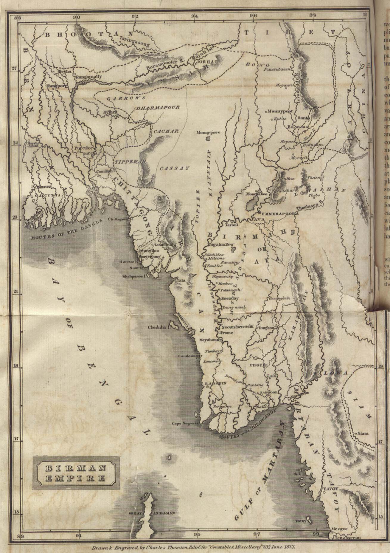
Thanks for all the feedback guys. I'll wait a bit longer to make sure it's okay to continue working on my version. I've been basing my work off maps from the 1800's, using the following link as a bit of a guide for style when I need it:
http://www.lib.utexas.edu/maps/historical/birman_empire_1827.jpg
I can make the sea blue, but I'd prefer to keep it as it is if possible to reflect that old feeling. We'll see what others have to say about it.
I completely agree the font isn't right, it's just what I had to work with. I'll have a good look through that link though Enigma, thanks. On the shadows issue behind the text, my main concern was how easy it would be to read. If there's no sort of effect added it becomes very difficult when text is crossing borders and such. Any further comments or ideas?
The shadows around the land are my quick fix for how old maps represent the coasts. See the link above. We'll see where it goes though and I'll try that with perhaps a new ocean colour next update.
On the texture, I really dislike dominant textures. I chose this one because to me it reflected a paper texture. I can try others though if this really is a problem. I would like to keep it uniform across the whole map though since the idea is it's an old map drawn on an old bit of parchment.
-
KEYOGI
- Posts: 1632
- Joined: Tue Oct 10, 2006 6:09 am
![]() by SS sem0me on Mon Feb 19, 2007 3:43 pm
by SS sem0me on Mon Feb 19, 2007 3:43 pm
KEYOGI wrote:Thanks for all the feedback guys. I'll wait a bit longer to make sure it's okay to continue working on my version. I've been basing my work off maps from the 1800's, using the following link as a bit of a guide for style when I need it:
http://www.lib.utexas.edu/maps/historical/birman_empire_1827.jpg
I can make the sea blue, but I'd prefer to keep it as it is if possible to reflect that old feeling. We'll see what others have to say about it.
I completely agree the font isn't right, it's just what I had to work with. I'll have a good look through that link though Enigma, thanks. On the shadows issue behind the text, my main concern was how easy it would be to read. If there's no sort of effect added it becomes very difficult when text is crossing borders and such. Any further comments or ideas?
The shadows around the land are my quick fix for how old maps represent the coasts. See the link above. We'll see where it goes though and I'll try that with perhaps a new ocean colour next update.
On the texture, I really dislike dominant textures. I chose this one because to me it reflected a paper texture. I can try others though if this really is a problem. I would like to keep it uniform across the whole map though since the idea is it's an old map drawn on an old bit of parchment.
What is that map anyway Keyogi?
-

SS sem0me
- Posts: 39
- Joined: Sat Jan 20, 2007 5:51 pm
- Location: Chicago
![]() by KEYOGI on Wed Feb 21, 2007 2:26 am
by KEYOGI on Wed Feb 21, 2007 2:26 am
Okay, I've come up with some different options. All using a new font, which to me hasn't made much of a difference except to make the Nile label harder to read. The original is on page 7.
Version 2.

- New font
- Removed shadows from water connections
Version 3.

- Same as v2 but removed the text effects
Version 4.

- Same as v3 but changed the sea colour and removed shadow effect from coast.
I personally think the original image was the best. I don't like the blue sea colour at all and I think the effects are needed for both text and coast. The original font wasn't ideal, but I think it's better than the new one and I can continue to pursue a better font if it's a problem.
I'll get around to fixing those continent labels in the background at some point. I'm considering playing around with the colours a bit more. I'll also label the seas to see how that goes in a future update.
Thoughts and opinions again?
I just noticed that Gulf in Gulf States is still the original font, I'll fix that next update.
Version 2.
- New font
- Removed shadows from water connections
Version 3.
- Same as v2 but removed the text effects
Version 4.
- Same as v3 but changed the sea colour and removed shadow effect from coast.
I personally think the original image was the best. I don't like the blue sea colour at all and I think the effects are needed for both text and coast. The original font wasn't ideal, but I think it's better than the new one and I can continue to pursue a better font if it's a problem.
I'll get around to fixing those continent labels in the background at some point. I'm considering playing around with the colours a bit more. I'll also label the seas to see how that goes in a future update.
Thoughts and opinions again?
I just noticed that Gulf in Gulf States is still the original font, I'll fix that next update.
-
KEYOGI
- Posts: 1632
- Joined: Tue Oct 10, 2006 6:09 am
![]() by sully800 on Wed Feb 21, 2007 3:18 am
by sully800 on Wed Feb 21, 2007 3:18 am
Original all the way. The blue ocean doesn't fit with the theme well...and the shadows around your continents look awesome and are a fitting representation of the coast. I don't like either font too much, but they don't look bad either. They just don't strike me as "the one" (that feels like a dating reference).
The text effects look great and I like them a lot, but I'm not completely sold on how they fit with the old world feel. Aesthetically though the text effects help a lot. I would keep looking into changing the edges somehow, even if its applying a small border like around the same map you showed, and maybe having the edges a bit tattered.
The text effects look great and I like them a lot, but I'm not completely sold on how they fit with the old world feel. Aesthetically though the text effects help a lot. I would keep looking into changing the edges somehow, even if its applying a small border like around the same map you showed, and maybe having the edges a bit tattered.
-
sully800
- Posts: 4978
- Joined: Wed Jun 14, 2006 5:45 pm
- Location: Bethlehem, Pennsylvania
Who is online
Users browsing this forum: No registered users
|
|||||||
| Conquer Club is not associated with RISK online in any way. Copyright © 2006-2024 by Big Wham LLC | |||||||