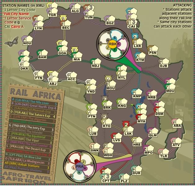
thenobodies80 wrote:As you already know, i'm not a big fan of rail maps, but honestly this one is really nice.
The map is good and i don't see problems.

Thanks!
The inclination of the ticket is a bit annoying, but with the low angle you have chosen I have no problem reading the text.

Yes i thought the ticket would look better offset against the background, but we'll see if anyone else has any commetns on that angle.
I did two test with
vischeck for colorblind issue. Two bonuses in the legend seem to be difficult to read, but i'm not colorblind, Could someone else confirm this?
.
I was hoping someone else might review this but....
Can you identify which bonuses in that legend are hard to read for you. It might involve a colour change completely. I looked at it but that isn't the same thing.
Try to flip the train in the bottom right corner (and maybe rotate it a bit), i think is better. (it's only a personal choice, free not to follow it)
OK, IN the version below, i have gone with a removal of the trains and elephant completely.
I am beginning to think less is more in this respect.
Finally, i think you should code a neutral station for each one of the smaller lines (pharoah express,the blue line and la madagascan) to prevent a lucky drop, specially for 1vs1 games.
Done.
Industrial Helix wrote:Ok, don't really play the Rail maps but I'm starting to think I ought to.
Oh? why is it you think you ought to, jut out of curiosity sake?
I'd like to see the lines have more of a rail look to them. Otherwise It might as well be cities in Africa.
OK, we have might to throw that one to the vote, shortly.
I like the ticket bonus, but I find it a little hard to read... its like the opacity is turned down or something. The colored words don't stand out well against the dark bg, the pattern in the further bg is confusing.
I've cleared out the patterned background and reduced the opacity on the dark background of the ticket, does that make it any clearer and less confusing.
While I like the little illustrations to the right, the elephant looks a tad strange. You've got two trains headed in one direction, then in the middle this elephant headed right at you. While there should be some animal references, that elephant just looks funny. Maybe do the same style illustration with a group of them headed in a similar direction?
Once again, those are now gone completely.
Gamplay looks pretty solid to me, but like I said, I'm a bit unfamiliar with the style of map. I might have to get back to you on that one.
OKies, thanks Industrial Helix
Version 8.
1. Removed the elephant and trains, i think perhaps less is more on this already crowded map.
2. Changed the title font to African - more appealing i think.
3. Removed the patterned background to the ticket and change the opacity of the background boxes the bonuses are written on
4. changed the font for the instructions.
5. Moved the ticket over to the left a fraction so that one can see the background a bit more.

- Click image to enlarge.