Re: RAIL AFRICA (V2) - New Silhouette
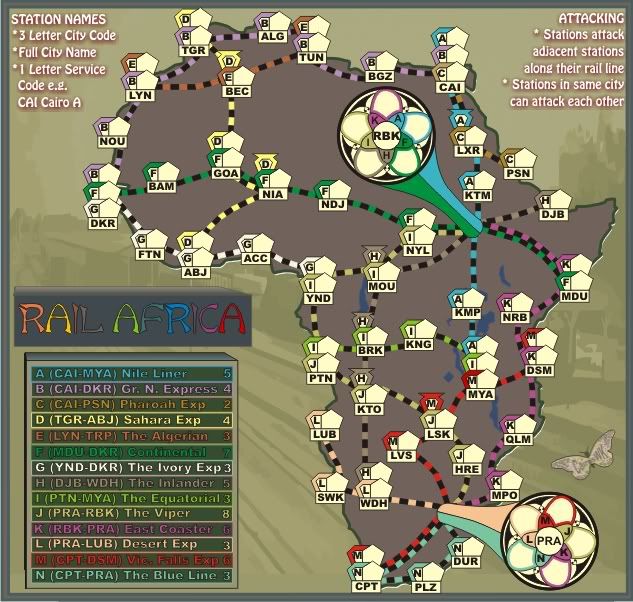
Much clearer cairns, thanks. I still think that H and K lines look almost identical in color and would prefer one of them to be a different color but with the clearer station markings I can certainly figure out what is what.
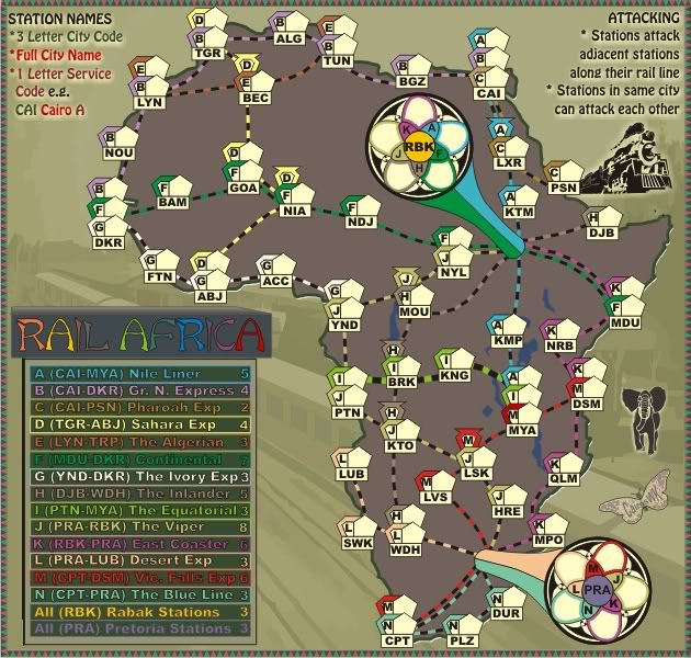
I think I would disagree with those who want to change the coloring substantially in the backgrounds. The tradition of the rail series has been the starker backgrounds. Each of the other three are solid grey/black/brown type maps. I much prefer this background to the one in Australia which I find a little difficult to read (I'm not suggesting to do anything with that one-just comparing the two) and I find this grey to be easier on the eyes that Europe also.
I think I would disagree with those who want to change the coloring substantially in the backgrounds. The tradition of the rail series has been the starker backgrounds. Each of the other three are solid grey/black/brown type maps. I much prefer this background to the one in Australia which I find a little difficult to read (I'm not suggesting to do anything with that one-just comparing the two) and I find this grey to be easier on the eyes that Europe also.