yeah, because clearly all of these maps can be improved a bit. thats what the process of the foundry is for, but this is just sped up to the max
can't wait to vote again
Official Brazil REVAMP competition [Done! - RJbeals wins]
Moderator: Cartographers
Re: Official Brazil REVAMP competition [Pre Round 2]
![]() by whitestazn88 on Mon Jul 28, 2008 1:06 pm
by whitestazn88 on Mon Jul 28, 2008 1:06 pm
-
 whitestazn88
- Posts: 3128
- Joined: Mon Feb 05, 2007 2:59 pm
- Location: behind you


Re: Official Brazil REVAMP competition [Pre Round 2]
![]() by bryguy on Mon Jul 28, 2008 6:29 pm
by bryguy on Mon Jul 28, 2008 6:29 pm
LOL I just knew it!
F I was thinking was probably wm
G definately looked like something rj would do. It looks to me like a brazil version of the iceland map, which made me think it was his
and H I thought was either Oaktown or Cairns.
wow im a good guesser!
cant wait for more voting
F I was thinking was probably wm
G definately looked like something rj would do. It looks to me like a brazil version of the iceland map, which made me think it was his
and H I thought was either Oaktown or Cairns.
wow im a good guesser!
cant wait for more voting
-
bryguy
- Posts: 4381
- Joined: Tue Aug 07, 2007 8:50 am
- Location: Lost in a Jigsaw


Re: Official Brazil REVAMP competition [Round 1]
![]() by AndyDufresne on Mon Jul 28, 2008 7:39 pm
by AndyDufresne on Mon Jul 28, 2008 7:39 pm
oaktown wrote:InkL0sed wrote:There are 100 votes cast.
sure, but with all my multis 15 of those votes are mine, so technically we're still in the 80s.
100 is pretty good for a foundry vote, but i wonder how many votes this would get if it was in GD? It'd be nice if the second round could reach a larger audience.
Now that we have the news feed on the Home Page, we can post when Round 2 starts...to see if we get any stray votes.
--Andy
-

AndyDufresne
- Posts: 24919
- Joined: Fri Mar 03, 2006 8:22 pm
- Location: A Banana Palm in Zihuatanejo


Re: Official Brazil REVAMP competition [Pre Round 2]
![]() by oaktown on Tue Jul 29, 2008 2:03 pm
by oaktown on Tue Jul 29, 2008 2:03 pm
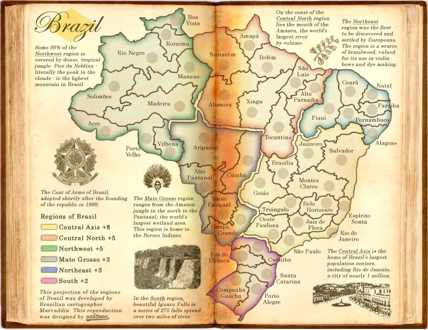
i did a bit of work to my map, and I'm not sure if I've overdone it or not - is it bad form to post an image and ask for feedback at this stage?

-

oaktown
- Posts: 4451
- Joined: Sun Dec 03, 2006 9:24 pm
- Location: majorcommand


Re: Official Brazil REVAMP competition [Pre Round 2]
![]() by MrBenn on Tue Jul 29, 2008 2:16 pm
by MrBenn on Tue Jul 29, 2008 2:16 pm
oaktown wrote:i did a bit of work to my map, and I'm not sure if I've overdone it or not - is it bad form to post an image and ask for feedback at this stage?
I think that WM has already done that?

PB: 2661 | He's blue... If he were green he would die | No mod would be stupid enough to do that
-

MrBenn
- Posts: 6880
- Joined: Wed Nov 21, 2007 9:32 am
- Location: Off Duty


Re: Official Brazil REVAMP competition [Pre Round 2]
![]() by yeti_c on Tue Jul 29, 2008 2:18 pm
by yeti_c on Tue Jul 29, 2008 2:18 pm
oaktown wrote:i did a bit of work to my map, and I'm not sure if I've overdone it or not - is it bad form to post an image and ask for feedback at this stage?
Agreed - post away.
C.

Highest score : 2297
-

yeti_c
- Posts: 9624
- Joined: Thu Jan 04, 2007 9:02 am


Re: Official Brazil REVAMP competition [Pre Round 2]
![]() by mibi on Tue Jul 29, 2008 2:22 pm
by mibi on Tue Jul 29, 2008 2:22 pm
oaktown wrote:i did a bit of work to my map, and I'm not sure if I've overdone it or not - is it bad form to post an image and ask for feedback at this stage?
I don't vote for Rule violators.
-

mibi
- Posts: 3350
- Joined: Thu Mar 01, 2007 8:19 pm
- Location: The Great State of Vermont


Re: Official Brazil REVAMP competition [Pre Round 2]
![]() by oaktown on Tue Jul 29, 2008 2:29 pm
by oaktown on Tue Jul 29, 2008 2:29 pm
alright, how about a compromise of sorts... the link to the latest image is below; take a look if you want, or if you consider it a 'spoiler' you can ignore it.
I'll take any kind of feedback, but I'm most interested in whether or not the image better captures a 1900 feel... new elements, colors muted a bit, some work done to make the center of the book more realistic including better use of light source/shadow and 'squishing' letters together in the crease, etc.
http://i141.photobucket.com/albums/r76/ ... vamp04.jpg
-
oaktown
- Posts: 4451
- Joined: Sun Dec 03, 2006 9:24 pm
- Location: majorcommand
Re: Official Brazil REVAMP competition [Pre Round 2]
![]() by Night Strike on Tue Jul 29, 2008 2:31 pm
by Night Strike on Tue Jul 29, 2008 2:31 pm
I like it Oaktown. Perhaps a bit more off-set on the territory borders when they cross the page seam.

-

Night Strike
- Posts: 8512
- Joined: Wed Apr 18, 2007 2:52 pm


Re: Official Brazil REVAMP competition [Pre Round 2]
![]() by yeti_c on Tue Jul 29, 2008 2:32 pm
by yeti_c on Tue Jul 29, 2008 2:32 pm
Love the middle section - the outer parts of the map are very crisp though... suggest you "grunge" them more.
Otherwise I really like the direction you're heading in.
C.
Otherwise I really like the direction you're heading in.
C.
Highest score : 2297
-
yeti_c
- Posts: 9624
- Joined: Thu Jan 04, 2007 9:02 am
Re: Official Brazil REVAMP competition [Pre Round 2]
![]() by InkL0sed on Tue Jul 29, 2008 2:35 pm
by InkL0sed on Tue Jul 29, 2008 2:35 pm
I don't like the white nothing-ness behind the book that you can see at the corners of the image. Add something, anything behind the book, and I'll feel better about it...
-

InkL0sed
- Posts: 2370
- Joined: Sat Jun 23, 2007 4:06 pm
- Location: underwater

Re: Official Brazil REVAMP competition [Pre Round 2]
![]() by RjBeals on Tue Jul 29, 2008 2:40 pm
by RjBeals on Tue Jul 29, 2008 2:40 pm
Feedback:
I like the overall map, but i think you did overdo the center fold of the book. It's too much now. i also think Yeti is correct about the grunge. See how Widow's map is very hand drawn looking? I think you need to be more in that direction to pull this look off. The map is just too smooth. The Grunge will give it that old feeling. What would be really cool is if you could apply an overall "bend" to the pages so they didn't feel so flat.
Way to go Oak!

-

RjBeals
- Posts: 2506
- Joined: Mon Nov 20, 2006 5:17 pm
- Location: South Carolina, USA

Re: Official Brazil REVAMP competition [Pre Round 2]
![]() by RjBeals on Tue Jul 29, 2008 2:44 pm
by RjBeals on Tue Jul 29, 2008 2:44 pm
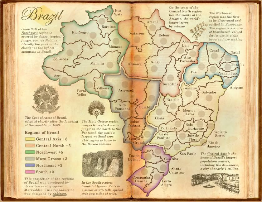
Since everyone else posted theres, here's what I submitted to gim. I also added more texture, and gave the map an overall red hue (instead of the blue before). Tweaked the colors. Added minimap, removed the flag (which Marv may kill me for), changed the title, kept the map tilted so North is no longer straight up (which Marv may also kill me for), and some other small things.
If I win, I will probably add a compass like I did for Italy showing true North. I also had to tilt Italy so the map would fit in these horrible size constraints.
http://www.rjbeals.com/Brazil/Brazil-RjBeals-round2.jpg
[edit]
I guess I have one more day, so any feedback for me and I could possibly get it applied
-
RjBeals
- Posts: 2506
- Joined: Mon Nov 20, 2006 5:17 pm
- Location: South Carolina, USA
Re: Official Brazil REVAMP competition [Pre Round 2]
![]() by Kaplowitz on Tue Jul 29, 2008 2:51 pm
by Kaplowitz on Tue Jul 29, 2008 2:51 pm
I love the old title RJ....

-

Kaplowitz
- Posts: 3088
- Joined: Tue May 01, 2007 5:11 pm
Re: Official Brazil REVAMP competition [Pre Round 2]
![]() by oaktown on Tue Jul 29, 2008 2:52 pm
by oaktown on Tue Jul 29, 2008 2:52 pm
minimap is a great addition - that corner was the one thing that troubled me about the first version.
I like the fact that the country is tilted off of north - it gives you a lot more room to work with, and doesn't at all change the shape of the country. If marv gives you a bad time for that I'll have your back.
Showing a flag or other symbol was one of Marv's stipulations from the start, but I have to admit I like the map much better without it. I'm trying to figure out where it could go, but I'm not feeling it. What if you just ran the "Ordem E Progreso" banner across the map somehow, as a nod to the flag?
edit: looking back i did like the old font on the title... it had some spirit to it.
-
oaktown
- Posts: 4451
- Joined: Sun Dec 03, 2006 9:24 pm
- Location: majorcommand
Re: Official Brazil REVAMP competition [Pre Round 2]
![]() by RjBeals on Tue Jul 29, 2008 2:53 pm
by RjBeals on Tue Jul 29, 2008 2:53 pm
Kaplowitz wrote:I love the old title RJ....
I kind of did also, but some heavy hitters didn't.
-
RjBeals
- Posts: 2506
- Joined: Mon Nov 20, 2006 5:17 pm
- Location: South Carolina, USA
Re: Official Brazil REVAMP competition [Pre Round 2]
![]() by ZeakCytho on Tue Jul 29, 2008 3:05 pm
by ZeakCytho on Tue Jul 29, 2008 3:05 pm
Rj, could you rotate Brazil properly and stick the stuff that would overlap the southern continent in the bottom right corner? The slant is bugging me a bit.
-

ZeakCytho
- Posts: 1251
- Joined: Wed Sep 12, 2007 4:36 pm


Re: Official Brazil REVAMP competition [Pre Round 2]
![]() by edbeard on Tue Jul 29, 2008 3:14 pm
by edbeard on Tue Jul 29, 2008 3:14 pm
oak the center bit is overdone. mostly the redness is too much for me.
rj, you could put the title on top of the flag perhaps?
rj, you could put the title on top of the flag perhaps?
-

edbeard
- Posts: 2501
- Joined: Thu Mar 29, 2007 12:41 am

Re: Official Brazil REVAMP competition [Pre Round 2]
![]() by RjBeals on Tue Jul 29, 2008 3:49 pm
by RjBeals on Tue Jul 29, 2008 3:49 pm
edbeard wrote:rj, you could put the title on top of the flag perhaps?
Tried.. But doesn't look good.
Also tried the coat of arms, but it doesn't fit. If I move on, I'll work on incorporating it somehow.
As far as the tilt - It's not that easy to just rotate it. It would be a ton of work at this point. I would prefer not to unless Marv has a big issue with it.
-
RjBeals
- Posts: 2506
- Joined: Mon Nov 20, 2006 5:17 pm
- Location: South Carolina, USA
Re: Official Brazil REVAMP competition [Pre Round 2]
![]() by edbeard on Tue Jul 29, 2008 3:53 pm
by edbeard on Tue Jul 29, 2008 3:53 pm
also, rj, I preferred the colour of the impassable border in your first version. not sure if it just wasn't possible to fix my issue with that without changing the colours
-
edbeard
- Posts: 2501
- Joined: Thu Mar 29, 2007 12:41 am
Re: Official Brazil REVAMP competition [Pre Round 2]
![]() by RjBeals on Tue Jul 29, 2008 4:51 pm
by RjBeals on Tue Jul 29, 2008 4:51 pm
edbeard wrote:
G:
1. the colours of the continents make the impassable lines look strange and different depending on where they are located. eg: yellow vs grey or light blue vs red. maybe have an outer shadow or stroke to make it uniform
You mean this issue?
You and Pamoa mentioned the same thing, so I futzed around with the impassables. I prefer them now to what they were on the original. It's not hard to switch - but I'll wait for a couple more comments.
-
RjBeals
- Posts: 2506
- Joined: Mon Nov 20, 2006 5:17 pm
- Location: South Carolina, USA
Re: Official Brazil REVAMP competition [Pre Round 2]
![]() by oaktown on Tue Jul 29, 2008 4:54 pm
by oaktown on Tue Jul 29, 2008 4:54 pm
Alright, grunged it up... I love photoshop brushes. Bonus points to the first to find the thumb print.
http://i141.photobucket.com/albums/r76/ ... vamp05.jpg
Rj - I'd suggested just adding the motto, Ordem E Progresso, possibly on a banner as it appears on the flag. That might be enough to satisfy the flag requirement.
http://i141.photobucket.com/albums/r76/ ... vamp05.jpg
Rj - I'd suggested just adding the motto, Ordem E Progresso, possibly on a banner as it appears on the flag. That might be enough to satisfy the flag requirement.
-
oaktown
- Posts: 4451
- Joined: Sun Dec 03, 2006 9:24 pm
- Location: majorcommand
Re: Official Brazil REVAMP competition [Pre Round 2]
![]() by yeti_c on Tue Jul 29, 2008 4:55 pm
by yeti_c on Tue Jul 29, 2008 4:55 pm
Much better Oak - bit worried about your small map.
C.
C.
Highest score : 2297
-
yeti_c
- Posts: 9624
- Joined: Thu Jan 04, 2007 9:02 am
Re: Official Brazil REVAMP competition [Pre Round 2]
![]() by Night Strike on Tue Jul 29, 2008 4:56 pm
by Night Strike on Tue Jul 29, 2008 4:56 pm
The fingerprint is on the right side near Rio de Janero. 
Sorry, that's all I had to say.
Sorry, that's all I had to say.
-
Night Strike
- Posts: 8512
- Joined: Wed Apr 18, 2007 2:52 pm
Re: Official Brazil REVAMP competition [Pre Round 2]
![]() by oaktown on Tue Jul 29, 2008 4:58 pm
by oaktown on Tue Jul 29, 2008 4:58 pm
yeti_c wrote:Much better Oak - bit worried about your small map.
The small map will require a bit of work... I'm not worried about the army circles as I've got more space to work with than marv's original, but I may have to crank up the point size of the font a bit across the map to make everything readable in small. The hardest text to read are the atlas entries, which aren't important to gameplay anyway.
-
oaktown
- Posts: 4451
- Joined: Sun Dec 03, 2006 9:24 pm
- Location: majorcommand
Who is online
Users browsing this forum: No registered users
|
|||||||
| Conquer Club is not associated with RISK online in any way. Copyright © 2006-2024 by Big Wham LLC | |||||||