Central Command and this thread should be merged
viewtopic.php?f=6&t=209894&view=unread#unread
Setting to restore old layout of "My Games"
Moderator: Community Team
44 posts
• Page 2 of 2 • 1, 2
Re: Setting to restore old layout of "My Games"
![]() by willedtowin1 on Fri Jan 02, 2015 2:26 pm
by willedtowin1 on Fri Jan 02, 2015 2:26 pm
-

 willedtowin1
- Posts: 651
- Joined: Thu May 12, 2011 4:32 pm
- Location: Halfway between the Boondocks & Timbucktoo


Re: Setting to restore old layout of "My Games"
![]() by iAmCaffeine on Fri Jan 02, 2015 7:27 pm
by iAmCaffeine on Fri Jan 02, 2015 7:27 pm
Can't say I'm surprised that we have to painstakingly view our a pile of shite design on this site once again. Hire a professional or something.

-

iAmCaffeine
- Posts: 11700
- Joined: Mon Apr 01, 2013 5:38 pm


Re: Setting to restore old layout of "My Games"
![]() by riskllama on Sat Jan 03, 2015 12:06 am
by riskllama on Sat Jan 03, 2015 12:06 am
keep your new layout, if you must...
but please give us the option to use the old one - how hard can it be?
but please give us the option to use the old one - how hard can it be?
-

riskllama
- Posts: 8875
- Joined: Thu Jan 30, 2014 9:50 pm
- Location: deep inside Queen Charlotte.


Re: Setting to restore old layout of "My Games"
![]() by macbone on Sat Jan 03, 2015 12:18 am
by macbone on Sat Jan 03, 2015 12:18 am
JamesKer1 wrote:The old guard of online Risk, ConquerClub has been around for a long time. It's built up a large audience and a lot of maps, but not much else. The gaming interface is so old it almost looks text based. The site hasn't seen a facelift since it started in 2006. It's not an easy site to navigate, but the aging community is still strong and there are strong clans and tournaments organized in the forums. The active users have been trending downward for months, but there is still some fun to be had here.
Found this review written about CC in 2011. Keep it in mind, as this is what "the outside world" perceives us as. Our negatives have been fixed through this update.
Also, know that of the others it was compared to, only one is still "thriving". CC has something good going, and we need to make some tough changes to keep improving it.
I take "Gaming Interface" to mean the UI within the game itself, not the list of games. Back in 2011, the site was still using drop-down menus to attack, wasn't it? I was using Clickable Maps at the time, but when I took turns on my ipod, I'd need to use the drop-down menus. (I still do, actually. The mobile tappable interface is pretty slow.)
However, we're talking about the My Games page here. Information should be laid out so that the most important information is easy to see.
Here are three other game sites' pages where I play regularly:


Two are chess sites, and the other is a play-by-post RPG site. I love how plainly the information is laid out here. The information is easy to see and scans well. I know right away which games have updates or when it's my turn to play.
It would be an excellent idea to take a look at other sites and learn from their layouts.

-

macbone
- Posts: 6217
- Joined: Wed Jun 03, 2009 7:12 pm
- Location: Running from a cliff racer


Re: Setting to restore old layout of "My Games"
![]() by Fewnix on Sat Jan 03, 2015 1:17 am
by Fewnix on Sat Jan 03, 2015 1:17 am
Agreed.
macbone wrote:JamesKer1 wrote:The old guard of online Risk, ConquerClub has been around for a long time. It's built up a large audience and a lot of maps, but not much else. The gaming interface is so old it almost looks text based. The site hasn't seen a facelift since it started in 2006. It's not an easy site to navigate, but the aging community is still strong and there are strong clans and tournaments organized in the forums. The active users have been trending downward for months, but there is still some fun to be had here.
Found this review written about CC in 2011. Keep it in mind, as this is what "the outside world" perceives us as. Our negatives have been fixed through this update.
Also, know that of the others it was compared to, only one is still "thriving". CC has something good going, and we need to make some tough changes to keep improving it.
I take "Gaming Interface" to mean the UI within the game itself, not the list of games. Back in 2011, the site was still using drop-down menus to attack, wasn't it? I was using Clickable Maps at the time, but when I took turns on my ipod, I'd need to use the drop-down menus. (I still do, actually. The mobile tappable interface is pretty slow.)
However, we're talking about the My Games page here. Information should be laid out so that the most important information is easy to see.
Here are three other game sites' pages where I play regularly:
Two are chess sites, and the other is a play-by-post RPG site. I love how plainly the information is laid out here. The information is easy to see and scans well. I know right away which games have updates or when it's my turn to play.
It would be an excellent idea to take a look at other sites and learn from their layouts.
Rule 1
-

Fewnix
- Posts: 1245
- Joined: Sat Apr 25, 2009 2:15 am


 2
2
Re: Setting to restore old layout of "My Games"
![]() by codierose on Sat Jan 03, 2015 1:54 pm
by codierose on Sat Jan 03, 2015 1:54 pm
so disappointing the red hot pawn site 
any way how about change it so their is less information on display, less is more.

when you put mouse over game you want more info on you get a drop down
any way how about change it so their is less information on display, less is more.
when you put mouse over game you want more info on you get a drop down
-
codierose
- Posts: 1561
- Joined: Sun Jul 27, 2008 5:50 pm
- Location: RANDOMBULLSHIT.ORG


Re: Setting to restore old layout of "My Games"
![]() by JamesKer1 on Sat Jan 03, 2015 3:23 pm
by JamesKer1 on Sat Jan 03, 2015 3:23 pm
In an attempt to turn this thread into a constructive piece of work, I want to try and lay everything out clearly. And please bear with me, the few paragraphs below this are very blunt, but I need to get it out of the way so we can move on to bigger and better things.
This is not a change that will likely be reverted. This makes the site less "text-based" and more appealing to a beginning user. Other risk-esque websites that used inferior interfaces have died out, and the few still around have heavily graphic based interfaces. While this may just be a coincidence, anything that may draw in a new user needs to be capitalized on, especially one of the first things they see.
I'm not sure if anyone read through the quotes by BW I posted, but he mentioned a Facebook Tab and Mobile use- these changes make it optimal for a Facebook and Mobile app, so that may be something you can expect. I'm not sure myself, it's merely speculation, but if he mentioned it, there is a reason.
This is not a change that can be optional. For anyone who hasn't switched over to the Panel Interface, they have a series of problems to deal with when any update comes, because it is no longer the main feature of the site and not a huge concern. I'm not sure if those issues are still around as I converted to panels, but a few months ago there were many problems with game info (tournaments, etc) not displaying correctly. Problems such as this will arise with anything we update and allow the old version to be optional- not to mention extra coding to store the option, more lag, and bugs of a wide variety since this is such a key part of the site.
Well why can't we have a mobile and site version? Other sites do! Most small websites don't have a mobile version. Keep in mind, CC has just a handful of programmers- admins and volunteers in the Tech Team. 4 total. We just don't have the manpower to maintain multiple versions of the site. BigWham and blakebowling do all of the work themselves, there are no programmers on their employee list like with past admins. And every second they spend making an announcement or responding to users is a second that the site falls behind in improvements, per a comment made in GD.
So what can we do? Fix the problems it creates. So far, this is what I've seen:
"This doesn't make it any easier on mobile devices!"- Central Command puts the information all on your screen- you may still have to zoom in, but with the old layout you had to zoom in multiple places to gain all of the info. All other aspects of the site still require you to zoom in anyways, and it will be hard to fix this without an app.
"I don't know when it's my turn to play, or how much time I have left."- I don't understand this complaint, because my layout looks like the below
The button turns red when it is your turn, it's grey when it isn't, and the time seems pretty straightforward to me at least, maybe it should be a bit bigger though (added to Solutions). Is this not the same for everyone else?
"The colors clash and it's hard on the eyes" or "I can't see anything as well" - The panels recognize zoom level, and will adjust accordingly, as does the rest of the site. And with Firefox, zoom applies to each website individually- I can have CC at 120% while having Photobucket and Dropbox at 100%. Chrome should be able to do this as well. While this doesn't solve the problem since you will then have too much wasted space, it does help you out if you are truly having a hard time.
"There's not as much information on the screen." - I'll quote the big guy on this one.
Again, you can adjust the zoom to your needs.
"The map is too small." - Well, let's make the name a bit bigger! Posted in Solutions.
This was an add-on, probably BOB. The real site never did this.
If you have anything I missed, please let me know, as I want to make this as all-encompassing as possible.
Solutions:
Solution 1: Codie's Solution in the above post- Allows for more games on the screen, and simple to see extra info
Solution 2: Modify the Boxes
Or a combination of both may work.
As a final note- any problems that are brought up need to be as specific as possible. "The information is hard to read" is a very general statement, and we don't know what needs changing to make it better. Do the colors not fit right, is the text grainy, is the map not clear enough, is the font and color combination too dim, is it too bright, etc. And "This just sucks so much it doesn't need explaining" doesn't help too much either.
And another note- the CC9 Banner caused Central Command to be buggy, so a release was made to fix the problem. I have read this thread and the GD one, but since some posts were made before the release, it is hard to tell what still is relevant.
This is not a change that will likely be reverted. This makes the site less "text-based" and more appealing to a beginning user. Other risk-esque websites that used inferior interfaces have died out, and the few still around have heavily graphic based interfaces. While this may just be a coincidence, anything that may draw in a new user needs to be capitalized on, especially one of the first things they see.
I'm not sure if anyone read through the quotes by BW I posted, but he mentioned a Facebook Tab and Mobile use- these changes make it optimal for a Facebook and Mobile app, so that may be something you can expect. I'm not sure myself, it's merely speculation, but if he mentioned it, there is a reason.
This is not a change that can be optional. For anyone who hasn't switched over to the Panel Interface, they have a series of problems to deal with when any update comes, because it is no longer the main feature of the site and not a huge concern. I'm not sure if those issues are still around as I converted to panels, but a few months ago there were many problems with game info (tournaments, etc) not displaying correctly. Problems such as this will arise with anything we update and allow the old version to be optional- not to mention extra coding to store the option, more lag, and bugs of a wide variety since this is such a key part of the site.
Well why can't we have a mobile and site version? Other sites do! Most small websites don't have a mobile version. Keep in mind, CC has just a handful of programmers- admins and volunteers in the Tech Team. 4 total. We just don't have the manpower to maintain multiple versions of the site. BigWham and blakebowling do all of the work themselves, there are no programmers on their employee list like with past admins. And every second they spend making an announcement or responding to users is a second that the site falls behind in improvements, per a comment made in GD.
So what can we do? Fix the problems it creates. So far, this is what I've seen:
"This doesn't make it any easier on mobile devices!"- Central Command puts the information all on your screen- you may still have to zoom in, but with the old layout you had to zoom in multiple places to gain all of the info. All other aspects of the site still require you to zoom in anyways, and it will be hard to fix this without an app.
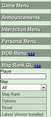
"I don't know when it's my turn to play, or how much time I have left."- I don't understand this complaint, because my layout looks like the below
- Click image to enlarge.

The button turns red when it is your turn, it's grey when it isn't, and the time seems pretty straightforward to me at least, maybe it should be a bit bigger though (added to Solutions). Is this not the same for everyone else?
"The colors clash and it's hard on the eyes" or "I can't see anything as well" - The panels recognize zoom level, and will adjust accordingly, as does the rest of the site. And with Firefox, zoom applies to each website individually- I can have CC at 120% while having Photobucket and Dropbox at 100%. Chrome should be able to do this as well. While this doesn't solve the problem since you will then have too much wasted space, it does help you out if you are truly having a hard time.
"There's not as much information on the screen." - I'll quote the big guy on this one.
bigWham wrote:slankz wrote:I suggest removing the extra space in the box below the last players name. This would allow more of the next level of boxes to be seen...
i can look at it, but it is trickier than it would appear because there is some buffer needed to handle all browsers and configs. i have some right now that go pretty much to the bottom, so there is no space to remove.
having said this in 90% of cases, this layout is more space efficient. it is only not more space efficient if you have a lot of games with low player count... like all 1v1.
Again, you can adjust the zoom to your needs.
"The map is too small." - Well, let's make the name a bit bigger! Posted in Solutions.
owenshooter wrote:i want to know WHEN i have to take my turn by, not only how much time remains...
This was an add-on, probably BOB. The real site never did this.
If you have anything I missed, please let me know, as I want to make this as all-encompassing as possible.
Solutions:
Solution 1: Codie's Solution in the above post- Allows for more games on the screen, and simple to see extra info
Solution 2: Modify the Boxes
- Larger Time Amount left
- Larger Map Name
Or a combination of both may work.
As a final note- any problems that are brought up need to be as specific as possible. "The information is hard to read" is a very general statement, and we don't know what needs changing to make it better. Do the colors not fit right, is the text grainy, is the map not clear enough, is the font and color combination too dim, is it too bright, etc. And "This just sucks so much it doesn't need explaining" doesn't help too much either.
And another note- the CC9 Banner caused Central Command to be buggy, so a release was made to fix the problem. I have read this thread and the GD one, but since some posts were made before the release, it is hard to tell what still is relevant.
Join CrossMapAHolics!
A new era of monthly challenges has begun...
Stephan Wayne wrote:Every day is Fool's Day on CC.
A new era of monthly challenges has begun...
-

JamesKer1
- Posts: 1338
- Joined: Fri Jun 24, 2011 9:47 am
- Location: Good ol' Kentucky


Re: Setting to restore old layout of "My Games"
![]() by codierose on Sat Jan 03, 2015 4:28 pm
by codierose on Sat Jan 03, 2015 4:28 pm
JamesKer1 wrote:Solutions:
Solution 1: Codie's Solution in the above post- Allows for more games on the screen, and simple to see extra info
Solution 2: Modify the Boxes
- Larger Time Amount left
- Larger Map Name
Or a combination of both may work.
And another note- the CC9 Banner caused Central Command to be buggy, so a release was made to fix the problem. I have read this thread and the GD one, but since some posts were made before the release, it is hard to tell what still is relevant.
with my solution and yours you could drop the third row and make what you suggest bigger.
i think it will work out to be about 8 on view instead of 15.
i currently use the left menus as drop down from a script works great
close and open menus on the left by clicking on header for each one
would think the same could be done for each game tab.
regarding the events banner why is it actually in the my games page should it not be in the tournaments tab or the announcement tab
-
codierose
- Posts: 1561
- Joined: Sun Jul 27, 2008 5:50 pm
- Location: RANDOMBULLSHIT.ORG
Re: Setting to restore old layout of "My Games"
![]() by Doc_Brown on Sat Jan 03, 2015 10:05 pm
by Doc_Brown on Sat Jan 03, 2015 10:05 pm
Please don't mandate Codierose's solution. That's going the exact opposite direction of what most people are asking for (reducing information visible). When you have multiple games on the same map, each with different settings, or for different tournaments/different teammates or opponents, the last thing you want to have to do is scroll over each game (or tap on it in the mobile interface) to figure out which game you're looking at.
I realize this thing isn't going away. I hate it, and I really hope someone comes up with a greasemonkey script to make it more useable, but so be it for now. Here are my suggestions:
1) Make the header bar a bit bigger and put the map name underneath (or above) the map icon in the header bar. This kind of mimics the map identification from the old layout and would help with identifying maps easier. This would also allow the time left to expand a bit.
2) Pull the "Enter" to the left a bit, or specify a larger area for it and right justify it. This would allow chat glove to work more cleanly with the interface and not make it look a mess.
3) Allow the game identifier text to wrap over two lines. This is the text I see for a couple of my games right now: "2014 [CL6] Premier Division - Round 6 - TOFU vs" and "2014 [CL6] Premier Division - Round 5 IA vs ". If the longer game labels could wrap, it would remove ambiguity.
4) Please try different font colors for the time remaining. The white text is tough on the eyes. Maybe make the round number white and the time remaining black?
5) Consider using different font colors/faces for different settings categories, or put an outline around sections. # players, game type, and play order go in one section. Spoils and reinforcements in another. Special gameplay (fog, trench) in another, and # round and round length in the last section. I'd also populate all sections for every game (e.g. No fog, No trench, No round limit, 24 hours).

-

Doc_Brown
- Posts: 1318
- Joined: Tue Sep 29, 2009 6:06 pm


Re: Setting to restore old layout of "My Games"
![]() by iAmCaffeine on Sun Jan 04, 2015 9:52 am
by iAmCaffeine on Sun Jan 04, 2015 9:52 am
Sigh. When ignorance becomes arrogance there isn't much you can do. Eventually it will get to the day that BOB no longer works, and that is the day I will leave.
-
iAmCaffeine
- Posts: 11700
- Joined: Mon Apr 01, 2013 5:38 pm
Re: Setting to restore old layout of "My Games"
![]() by willedtowin1 on Sun Jan 04, 2015 10:44 am
by willedtowin1 on Sun Jan 04, 2015 10:44 am
Making something harder for the old gaurd CC members is damn stupid.
There I said it...........................................
There I said it...........................................
-
willedtowin1
- Posts: 651
- Joined: Thu May 12, 2011 4:32 pm
- Location: Halfway between the Boondocks & Timbucktoo
Re: Setting to restore old layout of "My Games"
![]() by willedtowin1 on Sun Jan 04, 2015 11:12 am
by willedtowin1 on Sun Jan 04, 2015 11:12 am
I suppose its time to state the facts about OSA as a clan.
We have lost a core group of our members due to CC instability and volatility.
If CC continues messing with the site there will be more of an exodus.
At present I have 3 people who Ive begged to renew their membership and stay in the past 6 months. Due to this they did renew their premium membership. I have 1 other still sitting on the fence who is thinking of just going freemium. Thats ober 10% of our members.
If we lose any more people this clan will go Kaput.
The amount of change has been over the top. People like to be familiar and comfortable.
The changes have imo been an uncomfortable situation. If you want to attract more people because of change..... you are most likely going to lose more than you receive.
It really is that simple. People are habitual....they like to be comfortable with familiar surroundings.
I might recommend you communicate more with your clan leaders.
That is a solid, intelligent, and steady base of informative people you can work with.
They most likely will communicate more solid, useful, and respectful information
than the general public. Just a thought.......................
-
willedtowin1
- Posts: 651
- Joined: Thu May 12, 2011 4:32 pm
- Location: Halfway between the Boondocks & Timbucktoo
Re: Setting to restore old layout of "My Games"
![]() by codierose on Sun Jan 04, 2015 12:18 pm
by codierose on Sun Jan 04, 2015 12:18 pm
i know what your saying we are suffering the same lost half dozen and another half wont renew membership staying freemium  all given up with the site.
-
codierose
- Posts: 1561
- Joined: Sun Jul 27, 2008 5:50 pm
- Location: RANDOMBULLSHIT.ORG
Re: Setting to restore old layout of "My Games"
![]() by elonpuckhog on Mon Jan 05, 2015 4:48 pm
by elonpuckhog on Mon Jan 05, 2015 4:48 pm
Two things that are problems for me:
1) I want to know when I have to take my turn by, not how much time I have left. I know this was a feature of BOB, and it has been disabled, and it will lead to me missing turns. I don't understand the seemingly high resistance to incorporating parts of BoB and other add ons that members have used for years and that aren't updated anymore.
2) When I have a game that is more than 8 players, and I'm trying to scroll down the list of games, it stops at anyone over 8 players to scroll through the additional players. I don't like that. I want a continuous scroll no matter what.
-
elonpuckhog
- Posts: 1511
- Joined: Wed Jul 11, 2012 9:01 pm


Re: Setting to restore old layout of "My Games"
![]() by morleyjoe on Tue Jan 06, 2015 4:27 pm
by morleyjoe on Tue Jan 06, 2015 4:27 pm
iAmCaffeine wrote:Sigh. When ignorance becomes arrogance there isn't much you can do. Eventually it will get to the day that BOB no longer works, and that is the day I will leave.
Me too. When BoB is gone, I'll no longer want to play. TOO MANY CHANGES!
Last edited by morleyjoe on Tue Jan 06, 2015 7:09 pm, edited 1 time in total.
-

morleyjoe
- Posts: 1682
- Joined: Thu Oct 18, 2007 9:42 pm
- Location: Fenwick Ontario Canada


Re: Setting to restore old layout of "My Games"
![]() by clangfield on Tue Jan 06, 2015 4:55 pm
by clangfield on Tue Jan 06, 2015 4:55 pm
I notice that the 'games awaiting players' screen hasn't changed...is that not a problem that needs fixing too?
Presumably it means the old bit of code is still around, so it can't be too hard to switch between the two.
Presumably it means the old bit of code is still around, so it can't be too hard to switch between the two.
-
clangfield
- Posts: 601
- Joined: Tue Jul 03, 2007 6:57 am
- Location: Kent, UK
Re: Setting to restore old layout of "My Games"
![]() by JamesKer1 on Tue Jan 06, 2015 5:42 pm
by JamesKer1 on Tue Jan 06, 2015 5:42 pm
clangfield wrote:I notice that the 'games awaiting players' screen hasn't changed...is that not a problem that needs fixing too?
Presumably it means the old bit of code is still around, so it can't be too hard to switch between the two.
It will be changed soon, but it is not an immediate priority. Bigger and less controversial things are in the works.
Join CrossMapAHolics!
A new era of monthly challenges has begun...
Stephan Wayne wrote:Every day is Fool's Day on CC.
A new era of monthly challenges has begun...
-
JamesKer1
- Posts: 1338
- Joined: Fri Jun 24, 2011 9:47 am
- Location: Good ol' Kentucky
Re: Setting to restore old layout of "My Games"
![]() by JamesKer1 on Wed Jan 07, 2015 11:18 pm
by JamesKer1 on Wed Jan 07, 2015 11:18 pm
LOCKED at suggestion of OP. If you have any ideas to further TWEAK, rather than remove or make optional, the Central Command page, please go to this suggestion instead.
Join CrossMapAHolics!
A new era of monthly challenges has begun...
Stephan Wayne wrote:Every day is Fool's Day on CC.
A new era of monthly challenges has begun...
-
JamesKer1
- Posts: 1338
- Joined: Fri Jun 24, 2011 9:47 am
- Location: Good ol' Kentucky
44 posts
• Page 2 of 2 • 1, 2
Return to Archived Suggestions
Who is online
Users browsing this forum: No registered users
|
|||||||
| Conquer Club is not associated with RISK online in any way. Copyright © 2006-2024 by Big Wham LLC | |||||||