Page 1 of 1
Facility/Felicity (going on final)

Posted:
Fri Jan 19, 2007 9:29 amby Deesotilio
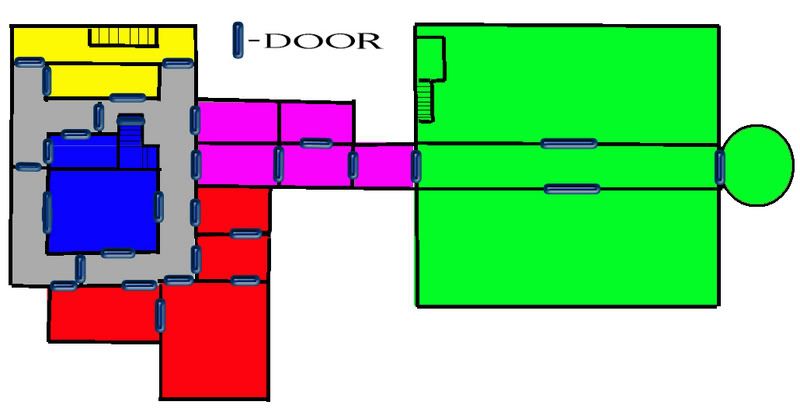
Alright, earlier on today I was watching the Metal hour on TV, and a Nile song came on. So, stifling my vomit, I decided to put on something that actually rocked, so I decided to play Perfect Dark. Well, after some play on Felicity, I decided that the map might be cool for Conquerclub. So, I drew what I could, and then I looked online for a floorplan to compare it to. Here is the result:
Of course, I was thinking of naming it something other than Facility/Felicity, in case I'm in danger of infringing copyright or something

I want to divide the green area up into maybe 4 or 5 territories, maybe change the doors around, and definitely even out the borders. The grey areas (hallways) were kinda difficult, so I left them grey in case anybody had better suggestions on which "continents" they belong to. I was thinking of adding in weapon graphics and maybe having them as a +1 troop bonus or something. Let me know what you all think.
Posted:
Fri Jan 19, 2007 2:53 pmby adam3b58
maybe keep the halls as their own "continent". i dunno if ive seen one continent entirely enclosed by another. could be an interesting dynamic unique to your map. plus it gives you six "continents". i would consider straying away the original format and add another section or two for more playability, or maybe divide the green into two diff continents. but you definitely nee to add more connectors to the right.
Posted:
Fri Jan 19, 2007 3:19 pmby Deesotilio
I've actually already added a network of ventilation shafts (in the vein of the wormholes and warpgates from the space map).
I've also chopped green up into several smaller places, and I've gotta make a choice if I should split it into another continent on its own.
Also, making the halls their own continent is interesting, but I don't know how well it'd work. But, I do have more halls (like the one running through green to the circular room), and it might make for an interesting way of playing. That continent would be almost impossible to hold, though, so I may have to just divide them up into the areas around them
Posted:
Fri Jan 19, 2007 3:25 pmby MR. Nate
What about the bathroom upstairs? I don't know how you'd do that, but it might make it fun, especially with the heating ducts above.
For breaking up the green, you could use the tanks as different countries, or maybe as impassable bariers between countries. I love the dynamic, and I think it'd be a blast to play.
Posted:
Fri Jan 19, 2007 4:37 pmby Deesotilio
The tanks could work
The PD Felicity version had gigantic cement rings, which were cool, too. I've gotta remember how the original Goldeneye version was layed out, too.
As for the bathrooms- I was thinking of doing the bathrooms at first as a little cutaway picture in the corner, but I think it'd cause space issues with everything else. I don't think there's any other way to go than the air ducts that I've added in, just because there'd only be a single choke point between the currently green area and the rest of the level.
Anyways, here's the current version:
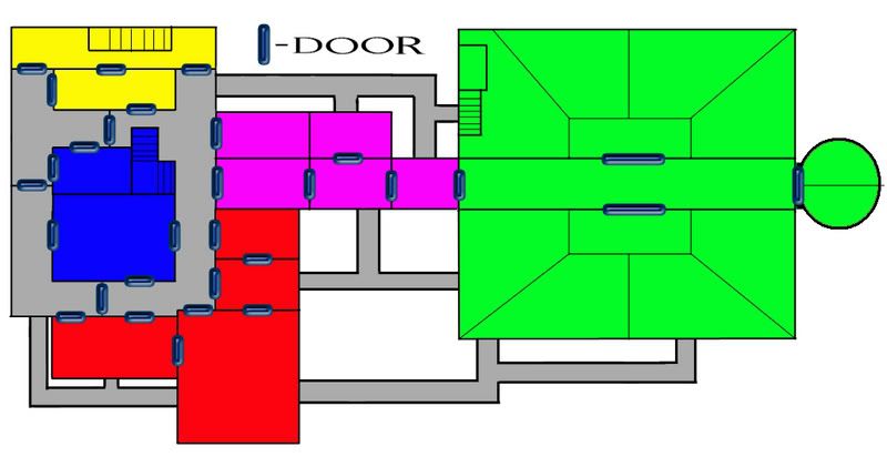
This was before I got the tank suggestion, so I may or may not run with the way it's divided

Also, I was thinking of breaking the vents into a few smaller parts, making the lot of them their own continent, and giving them all simplistic names like "V1" to whatever it ends up being
Posted:
Fri Jan 19, 2007 6:08 pmby Marvaddin
I think you could read the ideas thread looking for another idea... blocky structures are not very attractive to me.
Posted:
Fri Jan 19, 2007 6:42 pmby Deesotilio
Did you ever play Goldeneye or Perfect Dark? It wouldn't be the Facility if it wasn't blocky.
Oh, also, Nate- do you happen to remember if the unlimited guard room was meant to be the room with the tanks (the northernmost green room) in the multiplayer adaption of the arena? It's been a while since I've played Goldeneye- just PD. I was thinking of naming the green area "UNL GRD ROOM" or something
Posted:
Sun Jan 21, 2007 12:33 pmby Deesotilio
Alright, this is it: The final floorplan. I've textured it, moved the bathroom to the first floor, and thrown in a few doors where they don't belong, but this is it. Names, continent bonuses, and troop circles to come soon
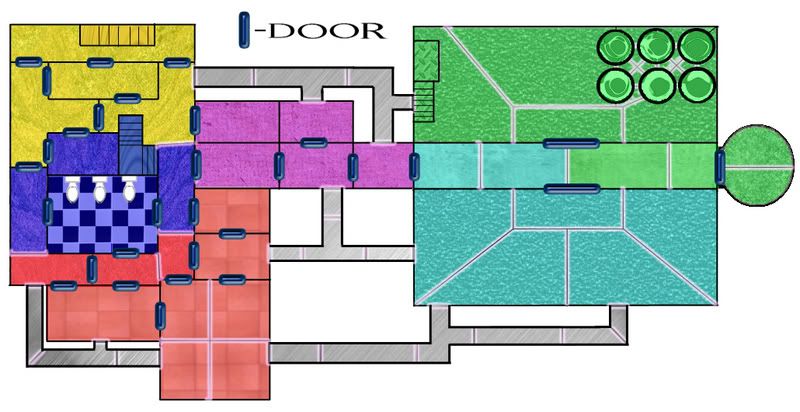
Oh, and the tanks might look a little confusing, but I'm sure they'll work fine. Each can attack adjacent tanks, be they to the left, right, or kitty-corner. They sit between the top and right-hand territories, which won't be all too confusing when they're labelled
Posted:
Tue Jan 23, 2007 3:21 pmby Deesotilio
So, no more feedback on this one? I'll open a poll on it, I guess, since I don't know if enough people would even like it that I should bother setting it the rest of the way up
In case anyone's interested.
Posted:
Sat Jan 27, 2007 2:53 pmby Deesotilio
If you care, here is the next-to-final version of the Facility:
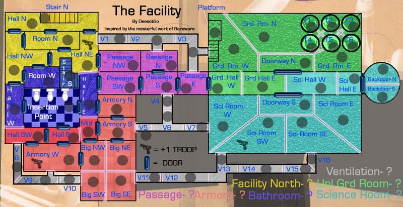
All I need is to figure out how many troops you should get as a continent bonus. Every area looks incredibly difficult to hold, so they should probably be pretty high
Posted:
Sat Jan 27, 2007 2:58 pmby Wisse
i don't like your font and font color, also i don't like the legend
Posted:
Sat Jan 27, 2007 3:06 pmby Deesotilio
The legend's not final
I was planning on slapping on some diamond plate as the background.
And do you have a better suggestion for the font and color?
Posted:
Sat Jan 27, 2007 3:34 pmby MR. Nate
For the font, could you do somthing like the title of PD, a light blue, with white outlines in a sort of futuristic font? May be too hard, I don't know.
Maybe thin the doors out, and thicken the walls, so thatt where you can attack and where you can't is more intuitive. The legand does need work, maybe a gun scope with blood covering it, as a tribute to goldeneye.
Posted:
Sat Jan 27, 2007 3:49 pmby Deesotilio
Thanks for the input
I'm not sure what I have in the way of futuristic fonts, but I do have a HALO font that probably won't fit the theme well enough
And I tried to do the polaroids, files, and ammo in the background for a good Goldeneye reference
And no problem on thinning the doors, but I'm afraid that thickening the walls too much might clutter it

The glowing white borders work well, though, right?
Posted:
Sat Jan 27, 2007 4:14 pmby bedplay
The background needs to be blurred, or made darker, the whole thing just looks confusing the way it is. Also the grey on the background, with it being two colours, makes the space between the vents look like rooms.
Posted:
Sat Jan 27, 2007 4:18 pmby Guiscard
Not commented on this yet but here goes...
Its an OK idea, but the map is very confusing. Lots of colours, textures, the writing is unreadable in some places, some of the features are very confusing (i.e. the tanks and bathrooms)...
Generally needs to be simplified a lot. Could work with the right treatment.
Posted:
Sat Jan 27, 2007 4:31 pmby Deesotilio
That's the kind of feedback I would have appreciated earlier on
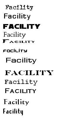
And here's what I have in the way of fonts (at least the ones that I liked for the purpose of the map:
I could mess with the background, no problem.
Oh, and the writing is unreadable in some places because Photobucket automatically resizes pictures. Their compression isn't as great as Photoshop's, unfortunately
And it may be difficult to simplify further, but I'll give it a shot, I guess... The tanks are something I've really wanted to bump down a bit. I was thinking of moving them down to 4 tanks, but I never commited to that
Posted:
Sat Jan 27, 2007 4:33 pmby Guiscard
Its not the size its the colours more than anything.
Posted:
Sun Jan 28, 2007 10:58 amby Marvaddin
Marvaddin wrote:I think you could read the ideas thread looking for another idea... blocky structures are not very attractive to me.
I want to keep my previous feedback. In fact Im surprised you are still working on it. Do you feel any support to this idea? You reached next-to-final version in 1 page!
Please go back to that inferno map, thats much more appealing, dont waste more effort on this one.
Posted:
Sun Jan 28, 2007 11:01 amby Wisse
try to download an other font on
http://www.dafont.com
Posted:
Sun Jan 28, 2007 11:17 amby Deesotilio
Marvin, I'm working on the map because I like it. And now lots of people are giving me feedback on ways it could be better, which probably means that they don't think it would be all that bad. Thanks for your opinion, though.
Posted:
Sun Jan 28, 2007 11:45 amby Enigma
i have to agree with all those who said this map is really comfusing, what with your multiple colours, textures, doors, variety of borders, ventilation system, random +1 troops, w/e those tank things are...
are the doors supossed to be impassable objects, or the only things you can pass through? if theyre impassable they need to cover the entire border and if not then it is impossible to travel through, for example, science, which has no doors inside. if they are just there for looks, they gotta go.
i agree with marv on this one, i dont like it. a good version of dantes inferno would be really cool. but if you really want to continue working on this one you 1st have to realize that it is nowhere near completion. a map doesnt get made in 2 pages. 2nd, get rid of the background, make uniform borders, and clarify your connections. then maybe it will be somewhat possible to understand this map.
Posted:
Sun Jan 28, 2007 2:44 pmby Deesotilio
I'm just wondering why a door would be an impassable border?
:S