Page 1 of 4
CC Master of Magic [Abandoned]

Posted:
Tue Feb 27, 2007 4:11 amby BelJoDoe
Titled: CC Master of Magic (CC-MoM)
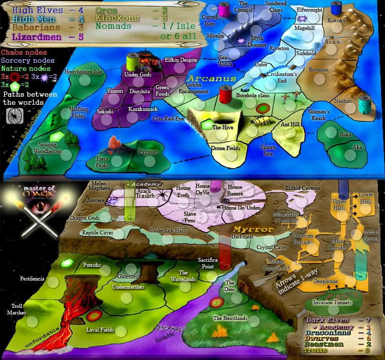
Map so far (12th of July):
POLL: (possibly funny to Pythonists)
71 'countries'.
Used this image (from Wikipedia):
http://upload.wikimedia.org/wikipedia/e ... fmagic.png
- I've placed 4 1-way attack locations on the map, they are marked by arrows.
- I've marked as fordable or unfordable, any borders that might be difficult to tell based on the shoddy artwork (sorry!)
- There are 3 'specials' called nodes. Nodes were a way of generating power in the original MoM game, this power was then used to cast spells and summon things like magical armies. I've represented all three but red, green or blue symbols. If a played controls all three of a particular variety, he will generate 2 extra armies (or at least, that's how it's so far designed).
- Partialy based on an R.A.Salvatore series, named "The Dark Elf Trilogy", I've designed the map to include the academy mantioned in the books. Holding only the academy will generate an additional 1 army a turn but once the full Dark Elf 'continent' is completed, that bonus will instead become 7 armies.
- The last unusual thing on the map are the Nomad Isles. I intend to merge the nomads from the game with the Halflings (also from the game) and some Wood Elves (You can never have too many people with sharp pointed ears... perhaps Spock may make an appearance!?). As such, I've made 3 Islands... holding any of these islands completely will grant an extra 1 army, holding all 3 will give a 6 army boost (though I think holding all 3 will be nightmarishly difficult).
The idea is based around an old game called (unsurprisingly) "
Master of Magic" This was a civ-type, TBS game I enjoyed a great deal and one of the main things which set it apart was the way armies could pass between the two worlds, Arcanus and Myrror (surface world and sub-surface world).
I've made this map as a homage to that old Microprose-made game.
I look forward to your responses.[/b]
Posted:
Tue Feb 27, 2007 4:13 amby santon836
wooooh...
So much needs to be done.
Can you make it some clearer?
I can't seperate things from each other.
The map is so full.
Posted:
Tue Feb 27, 2007 7:51 amby BelJoDoe
I hope so... I don't know why it's displaying at this resolution this is even smaller than my 600 px (across) map :-/
EDIT: Ok, I figured out what the problem was. It should display better now. Right?
Posted:
Tue Feb 27, 2007 8:37 amby Guiscard
Size and copyright are both major issues here...
Posted:
Tue Feb 27, 2007 12:36 pmby BelJoDoe
I've already contacted Infogrames/Atari and the customer services team that I spoke with say that it's not on their lists of potential problem games regarding copyright. Further, one of them told me to, "go right ahead and make [the map]".
Being a homage rather than a critique, I must admit to not expecting anything else from them, the game is, after all, freeware (or maybe it's shareware... not sure about the technical language).
As for the size, I could shorten it a little but because the announcement thread for these forums left issue as "recommended", I thought it might be fine to gauge popular opinion on the length, first. Personally, on the computers I usually use to play, the length is fine (about 1200px), also I feel the length is perhaps quite integral to the map. I suppose if many monitor sizes and/or video cards are not able to handle the size and dislike scrolling, then I can make changes.
The 'Small' (600px wide)version of the map is only 900px long, hence if the length of the full-sized map is difficult for some to deal with, then perhaps they can change to the 'small map'.
Thank you for the comments so far, I hope to continue receiving your opinions.
Posted:
Tue Feb 27, 2007 4:09 pmby bedplay
you need some way to get round the size of the two worlds together...
graphics need improving, but i realise this is just showing people the idea.
I suggest having the mps side by side, and flipping both on there side, so they are next to eachother, other than that it's very interesting, if you can pull it off.
Posted:
Tue Feb 27, 2007 4:16 pmby Backglass
What if it was more of a 3D view, with both maps superimposed on one another, yet staggered. Does that make ANY sense?

That way you could easily visualize the vertical movement. Kinda sorta like this?

Posted:
Tue Feb 27, 2007 4:42 pmby BelJoDoe
Those two are both good ideas! ... Thanks for the constructive feedback

Posted:
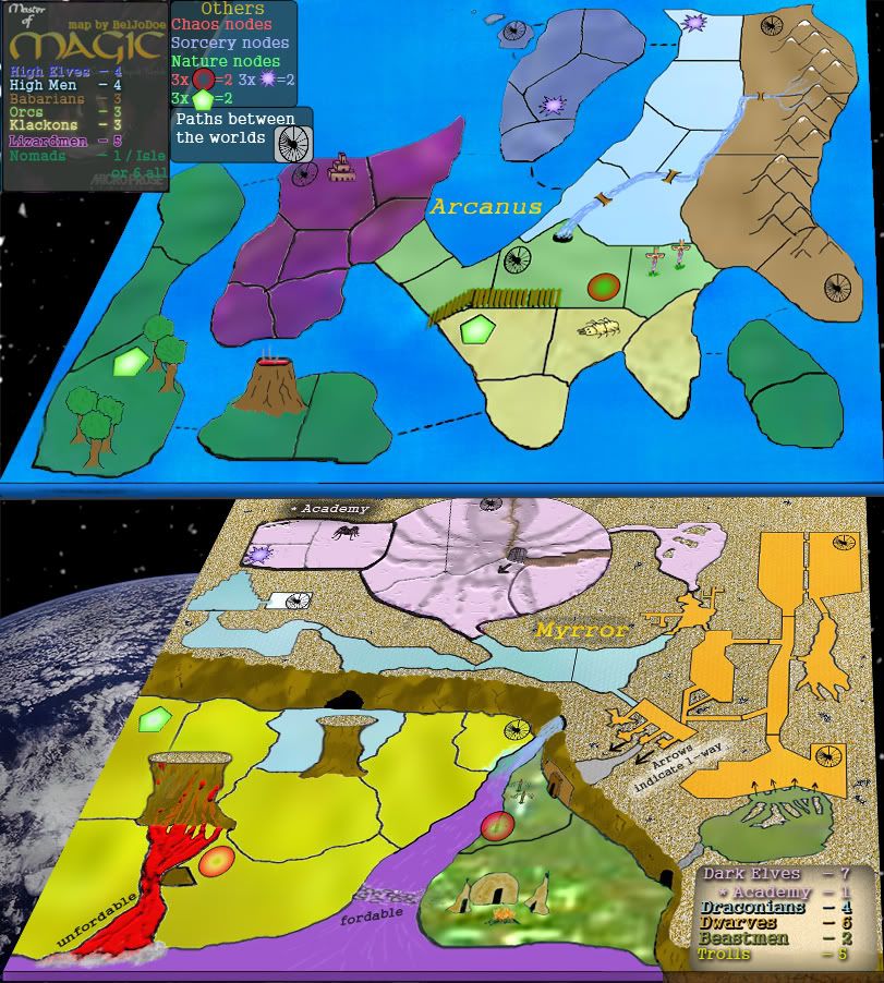
Wed Feb 28, 2007 11:14 pmby BelJoDoe
Update to include new image... (Big thanks to Backglass!)
Posted:
Wed Feb 28, 2007 11:34 pmby Sargentgeneral
wow, i really like the way you put those maps together in 3D. I think the graphics of the map itself needs a lot of work however.
Posted:
Wed Feb 28, 2007 11:37 pmby BelJoDoe
Thanks for the support, Sargent
Please be specific about what you think looks bad. Someone else commented on the "graphics looking bad" but -perhaps because I'm a little too close to the project- I don't think anything looks that bad
Don't worry, I won't take offence at critisism of the artwork but definitely, please tell me what you want me to change
Thanks again! Please, keep your comments coming!
EDIT: If I simply took the non-essential pictures out, would that be enough?
Posted:
Wed Feb 28, 2007 11:51 pmby KEYOGI
While I like the two worlds twist, I don't think it's really an option. The image is too tall and i don't think you'll be able to reduce the images enough make them fit and retain their detail.
I agree with Sargentgeneral, the graphics do need a lot of work. The attempt at a 3D effect is nice, but your image still looks rather flat. For starters, objects in the environment are going to need to cast shadows, there's just no depth to the image.
Beyond that issue, the graphics are just very bland, plain and not overly well represented. Your trees for example don't look very nice.
Posted:
Thu Mar 01, 2007 1:32 amby BelJoDoe
Ok, I made new, small trees using an old tree-template from Corel. I then played with Photoshop and hopefully now the complaints regarding my art skills will subside

... Just kidding but maybe you can be a little nicer regarding the prettiness (or lack of!)

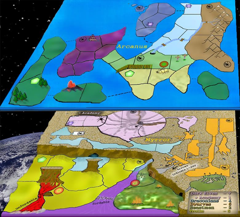
I removed the main legend for now, but I think you have an idea what it would look like, based on the other attempts.
Posted:
Thu Mar 01, 2007 2:25 amby KEYOGI
Nothing personal, but I still don't think this is up to standards graphically. Perhaps see if you can get another foundry member to help you out.
Posted:
Thu Mar 01, 2007 4:14 amby Captain Crash
I'm sorry but I think your graphics are childish at best..compare say "king of the mountains" or even "Conquer 4".
Sort out the graphics and maybe you'll have a playable map.

Posted:
Thu Mar 01, 2007 9:09 amby BelJoDoe
Can you be more specific about the childish graphics?
Also, links to the images for the maps you've mentioned would be nice. The forum's search engine returns 100s of threads of 'matched' searches and the option to select those maps does not appear under "Start Your Own Game".
Please keep in mind that this map is based on a fictional world. I'd hope it to have a light-hearted feeling. I began creating the world because I thought that by including elements such as the nodes, the stairwells and the seperated Islands on Arcanus, I could reduce the effects of luck and a good start.
Posted:
Thu Mar 01, 2007 9:56 amby Guiscard
The maps he mentioned are all in the first 2 pages, just have a look.
As for the graphics, I think he means childish as i n basic and looking like they're done in paint. The colours clash in some places, some of the little graphics just look 'stuck on', as it were... And it's still much much too tall. There is no guideline for height, but you should be able to see the 'begin turn' button without having to scroll down when the map is at the smaller resolution. Take a look at the Philippines map for an example. Any longer than that is too long.
Posted:
Sat Mar 03, 2007 10:37 pmby BelJoDoe
It's now smaller (in terms of height/depth, top->bottom) than many of the maps we're currently using and I've improved the graphics where mentioned. What do we think now?
Posted:
Sat Mar 03, 2007 10:42 pmby everywhere116
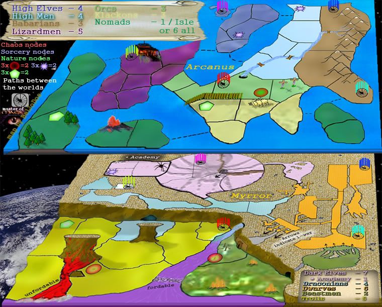
In think that the "paths between worlds" need to be color coded. Well.
Posted:
Sun Mar 04, 2007 1:03 amby BelJoDoe
That's a good idea.
I was actually thinking that players would think in 3-D and see the stairwells as cylinders going down but you're right that a little colour to clarify things is a good idea. Thanks!
EDIT... Edited to incorporate Everywhere116's idea... See the brightly coloured lines on the map
Posted:
Sun Mar 04, 2007 4:43 pmby Danbemp
yeah map definitely needs some work. I REALLY like the idea of the pathways, but they are near impossible to represent or illustrate. The idea of slanted stacks seems plausible, but i dont see it working well. Keep working, but try to restart from a few steps back. Theres alot going on in this map.
Also, "high men" ... hahaha
Posted:
Sun Mar 04, 2007 5:49 pmby Guiscard
Why not just a coloured cylinder set at, I dunno, 30& opacity
Posted:
Sun Mar 04, 2007 7:38 pmby s.xkitten
it looks pretty good...my thing is get rid of that spider...i hate it...i'm arachnophobic, and i would never play this map if it stays...but thats just me personally...
Posted:
Sun Mar 04, 2007 7:58 pmby Guiscard
Colours... The colours are horrid at the moment. Take a look at a colour wheel and try and match colours which 'go' and have them close to each other.
Posted:
Mon Mar 05, 2007 10:19 pmby BelJoDoe
I've changed the stairwells to make cylinders as Guiscard suggested. At the moment I really don't want to change the colours. I chose these colours because they contrasted in parts. I wanted each 'race' to have a distinctive continent and the colours are an integral part of that. I've tried playing around with the colours but it just seems to make the map a little dull and lifeless.
Ultimately, I want to make a map with a completely different feel to anything currently available to play on. I hope that others agree with me about this.
Anyway, here's the 'cylinderized' map.
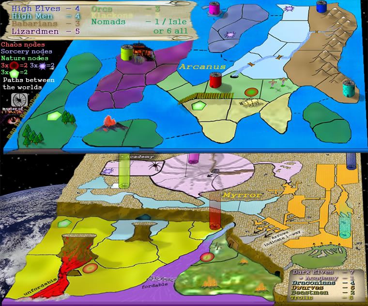
I'll likely change the cylinders to resemble something more akin to towers in the next update, if the feel is popular. I'll also be adding shadows to new cylinders, so no need to complain about that, just yet
Let me know about anything else
Thank you!