Page 1 of 6

Bill of Rights (ex. Torn Parchment) [Vacation]

PostPosted: Tue Mar 06, 2007 2:12 pm
by DiM
here is my latest creation.
i've worked quite a bit on this one so i hope it was worth the effort.

the map has no name yet so feel free to give me some ideas.
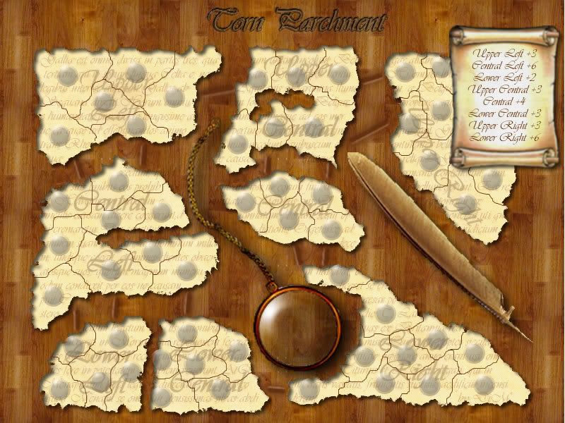
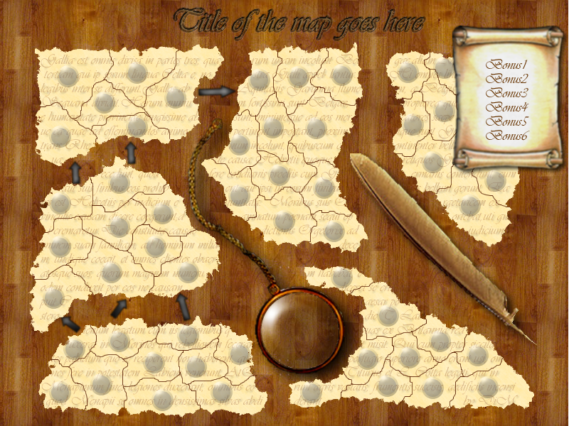
the text in the parchemt is not nonsense jible. it's from Caesar's De Bello Gallico.

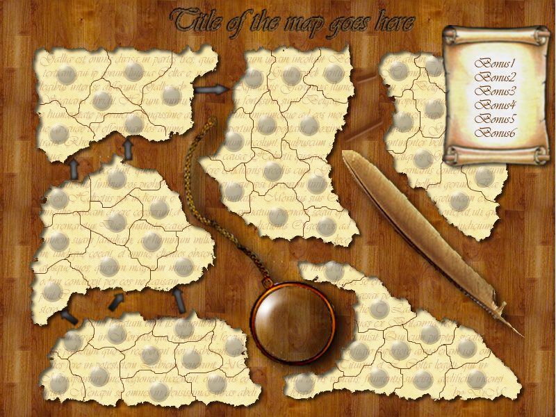
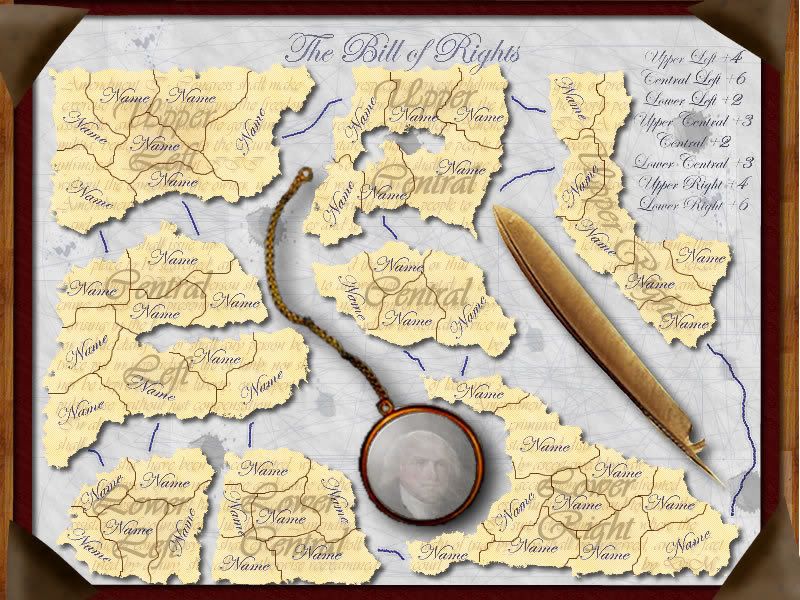
the map is basicaly an old parchment on a table. it is torn to bits and those bits form continents and territories.

5 continents and 45 territories.
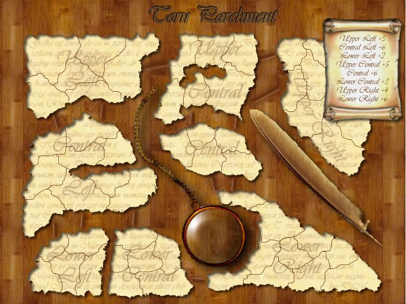
yet another edit// - 11.03.2007
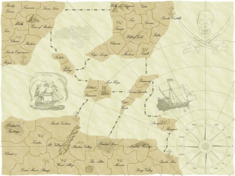
i took the pirate map and turned it into Age of Merchants map. read about it here http://www.conquerclub.com/forum/viewtopic.php?t=14626
this thread will remain about the bill of rights map. last version is on page 6. i'll continue work from there.
sorry about all the changes i know it's a bit confusing :)
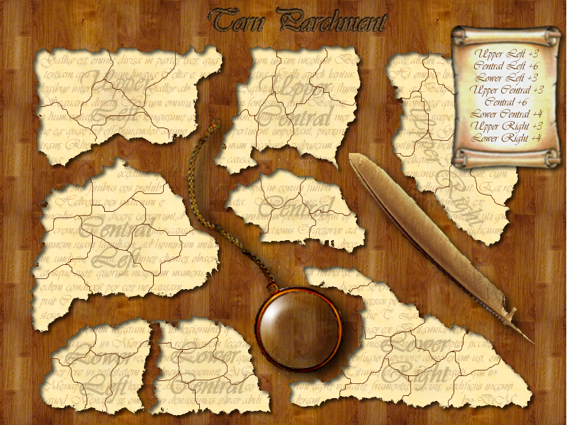
*******************************************************
edit// - 10.03.2007
basicaly a new map. started from scratch. :)


Image


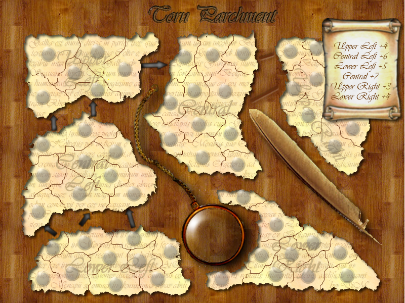
edit// - 08.03.07- New territories better graphics, new name new theme
Image


EDIT// added a poll please vote.
UPDATED PIC (07.03.2007)
Image


the original image:
Image

the one with army dots:
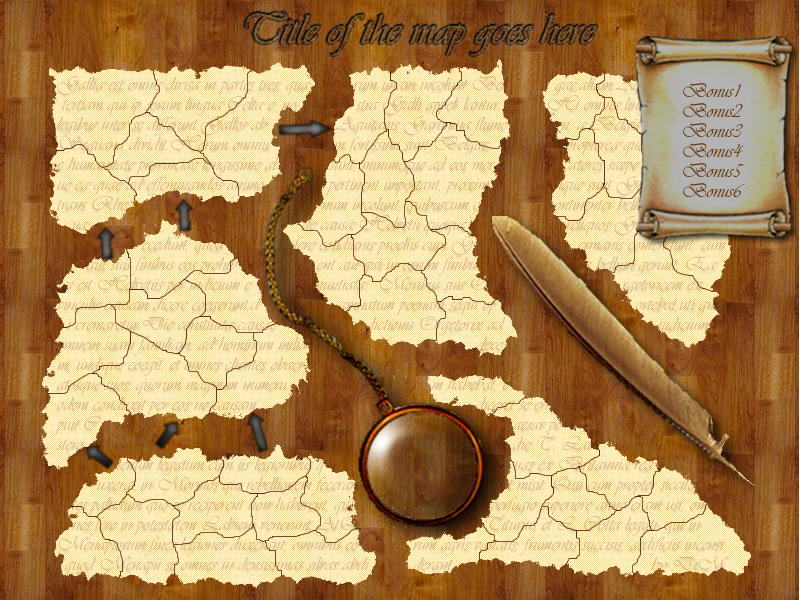
Image

i need:
1. idea for map name
2. opinion on the army shadows
3. opinion on the arrows (i wanted to make the connections as scratches in the table rather than arrows but i have no idea how to do it)
4. opinion on the legend scroll (it looks a bit odd i think)
5. territory and continent names
6. bonuses
7. advices and opinions on the general visuals and playability

to do list:

1. grab a cold glass of pepsi and a marlboro and wait for opinions
2. improve graphics
3. write xml

PostPosted: Tue Mar 06, 2007 2:19 pm
by yeti_c
Your GFX skills have come on immeasurably... good effort...

I'll not comment on the map itself though as I'll leave that to people better qualified!

C.

PostPosted: Tue Mar 06, 2007 2:36 pm
by DiM
thanks yeti for the appreciation. but please share your thoughts any idea is worth mentioning.

here is another one with scratches as territory connections. you can see them above the feather. do they look better than the arrows?

Image

PostPosted: Tue Mar 06, 2007 2:50 pm
by DiM
and i added some shadows:

Image

sorry about the image size but i'm using photobucket and this one does not allow thumbnails :( i would have used imageshack but the upload limit is 1,5M and the images are larger :)

PostPosted: Tue Mar 06, 2007 2:53 pm
by Guiscard
Yeh I agree, your skills have come on a lot. Might it not be good to apply those to one of the ideas in the ideas thread? A recognised theme rather than just a made up map. Those tend to be infinitely more popular.

PostPosted: Tue Mar 06, 2007 2:54 pm
by Molacole
This is a very nice looking map

PostPosted: Tue Mar 06, 2007 2:59 pm
by DiM
Guiscard wrote:Yeh I agree, your skills have come on a lot. Might it not be good to apply those to one of the ideas in the ideas thread? A recognised theme rather than just a made up map. Those tend to be infinitely more popular.


thanks for your appreciation also. i said before i'm a quick learner and i never quit.
i plan on doing lots of maps if i have spare time.
this map came to me after toying with the edges tool, i liked it so much i felt it deserved a special map.
anyway after this parchment thingy map i'll have another go at my termitarium idea and then the brain map. if after i'm done with those i don't get any new ideas (i doubt it) i'll go through the ideas thread.

but if you have anything in particular in mind from that thread give me a pm and i'll look into it.


PS: how the heck can i add a poll to this thread?? i forgot to do it :(

PostPosted: Tue Mar 06, 2007 3:06 pm
by Samus
Playability:

Okay, I count 53 territories total, with a region breakdown of 6, 7, 9, 10, 10, and 11. That's 2 medium regions (one of which is borderline large) and 4 large, with no small. You need to break up at least one of your large regions into two small ones, and since your two medium regions are on the top of the map it needs to be on the bottom. There's a couple of different ways of doing this.

One thing you could do is just split up the bottom right corner into 2 regions. This is the easiest solution, but I'm not sure it's the best as the 2 small regions are now right next to each other in the same corner.

Another thing you could do is to switch the images of the feather and the magnifying glass so that you can reform the bottom two regions into two small in the corners and a larger one in the middle. You'd have to do something to make it interesting, though. Otherwise it will be rather boring, generic gameplay where everyone takes a corner and then plays from there.

You could also split both of the bottom regions, so you're have 6, 4, 6, 4 going across. I think I like this idea the best, but that obviously changes the makeup of the map from mostly large regions to mostly small and medium. I think that's a good thing, but maybe you don't. :)


Visually:

I actually really like the feel of this map, although the problem you've got is that you'd lose a lot of that if you added any color to the regions. I think you need to find another way to identify them. I also don't think barriers drawn into the regions would look very good. Stick to the tattered paper feel, you can add "rips" in the paper to function as impassable objects.

For the connections, I like the idea of adding actual objects holding the pieces of paper together, like paper clips maybe (or something that looks better than that). Like it's all scraps from one big map that you're holding together.

Sticking with that idea, you should make the bonus box as a notepad with scribblings for the bonuses.

I'm not a fan of the dots, and if you stick with that color scheme I don't think they're necessary.

PostPosted: Tue Mar 06, 2007 3:17 pm
by fluffybunnykins
It's a good showcase of your photoshop skills. It looks stunning but the map itself just feels too contrived:-
~ there's an almost visible straight line round the edge of the continents
~ the territory count for each continent (6, 7, 9, 10, 10, 11) means there's not much variety and no 'small' continent(s).
~ what's the story of the map? why does it look like bits of paper torn up and thrown on the dining room floor? why has someone left a reather & a monocle in the middle of it all? It's a bit random! not necessarily a bad thing, but what's the story? what's the engaging factor that makes this different from any other imaginary kingdom type map? People aren't going to latch onto it like they might a map of somewhere they've been/lived/seen in a film/read about. Do you know what I mean?
Sorry, that all seems a bit of a downer... I just don't want those silky skills graphics to go to waste!

[edit... ok, I spent so long writing, that Samus made the same point in the meantime!]

PostPosted: Tue Mar 06, 2007 3:21 pm
by Wisse
DiM wrote:and i added some shadows:

sorry about the image size but i'm using photobucket and this one does not allow thumbnails :( i would have used imageshack but the upload limit is 1,5M and the images are larger :)


save it as .jpg quality 10-12 ;)

PostPosted: Tue Mar 06, 2007 3:22 pm
by fluffybunnykins
Hey Samus, I like some of your ideas!
you could keep all the continents the same colour (as they are) and not need to identify them in the key, or whatever, by adding the names & bonuses (on little strips of paper???) right on or next to the continents themselves...

PostPosted: Tue Mar 06, 2007 3:35 pm
by DiM
here's an update with names and bonuses.
as you can see i have not coloured the continents. i think it would spoil the feeling. but i don't think there's a problem because they're easy to identify.

Image

PostPosted: Tue Mar 06, 2007 3:42 pm
by Wisse
DiM wrote:here's an update with names and bonuses.
as you can see i have not coloured the continents. i think it would spoil the feeling. but i don't think there's a problem because they're easy to identify.


you can make the color a bit transparant ;)

PostPosted: Tue Mar 06, 2007 3:46 pm
by DiM
thanks for the feedback.
here goes:

@samus. continent colours. i don't need them. it spoils the feeling. i've already thought of paper clips but in medevil times there weren't any. that's why i thought scratches on the table would do the trick. but at the moment i'm not satisfied with how the scratches look. you're right about the playability. i'll guess i'll have to tweak around a bit and add some impassable borders. (btw the quilt and the monocle are also impassable)


@fluffybunnykins. i added the names as text on each continent.
the story is that a wise man finds a torn bit of Caesar's De Bello Gallico (that's where the background text comes from) and he's working on the restoration process. he has a magnifing glass to see better (he's an old wise man) and a quilt to rewrite the book. in medevil times there was no xerox :lol: so they had to rewrite old books in order to preserve them.

PostPosted: Tue Mar 06, 2007 3:46 pm
by DiM
Wisse wrote:
DiM wrote:here's an update with names and bonuses.
as you can see i have not coloured the continents. i think it would spoil the feeling. but i don't think there's a problem because they're easy to identify.


you can make the color a bit transparant ;)


what colour? of the continents??

PostPosted: Tue Mar 06, 2007 3:53 pm
by Wisse
DiM wrote:
Wisse wrote:
DiM wrote:here's an update with names and bonuses.
as you can see i have not coloured the continents. i think it would spoil the feeling. but i don't think there's a problem because they're easy to identify.


you can make the color a bit transparant ;)


what colour? of the continents??


yup if you make one red, and make it 90% transparant you still have the map feelings ;)

PostPosted: Tue Mar 06, 2007 4:01 pm
by spinwizard
i dont like eather of the options 4 joining contenents

u could put a colour edge round the contenents 2 make some colour (look at the middle east revamp, some1 posted this idea there with a pic)

PostPosted: Tue Mar 06, 2007 4:15 pm
by DiM
here is another try at balancing the gameplay.

54 teritories and 8 continents.


Image

PostPosted: Tue Mar 06, 2007 4:15 pm
by fluffybunnykins
With the story it starts to come together; adds a bit of romance!
You probably mean quill (feather pen), rather than quilt (feather bed cover) :wink:
I like the no colour option, personally.
Maybe the continents could be shifted and rotated a little bit to make the gap round the edge less uniform and less rectangular?

PostPosted: Tue Mar 06, 2007 4:31 pm
by DiM
fluffybunnykins wrote:With the story it starts to come together; adds a bit of romance!
You probably mean quill (feather pen), rather than quilt (feather bed cover) :wink:
I like the no colour option, personally.
Maybe the continents could be shifted and rotated a little bit to make the gap round the edge less uniform and less rectangular?


yep sorry quill is the right one. :oops:

regarding the continents i don't want to shift them because the wise scholar got the bits and arranged them properly so he could start the copying process. so they sort of form a page.

PostPosted: Tue Mar 06, 2007 4:36 pm
by DiM
@wisse & spinwizard. both methods have their use but not here. on different maps maybe but here no. they take away the page feeling :(
why would torn pieces have coloured edges? this goes well for a map not a manuscript.

and colouring the bits is still no good. even using transparent colurs still kinda screws the image as a whole.


@spinwizard. if you don't like the conectors then give me an idea :) i don't like them either but i can't think of anything :(

PostPosted: Tue Mar 06, 2007 5:22 pm
by Samus
Ah, nice work, this is much improved. :)

Playability:

As far as the bonuses go, I would only give 2 connections to Lower Left and reduce that bonus to +2, just because you've already got 3 other +3 bonuses.

The Central bonus is too high, no region should ever have a bonus larger than the number of territories because in team games, anything can be held with the proper effort (or deployment). Also, while it may be in the middle, it technically only borders 2 other regions with at most 4 connections. I think this bonus should be +4, with connections from the top left territory and top right (not the middle), and both of the bottom two to Lower Right.

The Lower Right bonus is too low for a region with 10 territories, even if it does have only 2 connections. Also, the person in Central will be looking to take that top territory to consolidate 2 defense points into 1, making the Lower Right bonus harder to defend that it seems at first. I'd say +5 for it.

As far as impassable borders (which I still think should be in the form of "rips" in the parchment), I would only add a couple. One in Central Left from the monocle to the middle territory (go slightly in so it's clear what territories don't connect). The other in Upper Central dividing the two top right territories and the bottom left one. I only pick those two territories because they're kind of boring as is. You could also do something to Top Left, but doing much more than that could result in creating choke points, and you don't want one specific part of your map to be way more important than the others.


Visually:

I agree on the continent colors, I told you to do something else before. :) I like the way you have it now, I'm just not crazy about the region names (not sure if those were just test names).

Yeah, I knew that paper clips specifically were a bad idea, I just meant an actual object rather than lines. You'll just have to search for an image of something old that you think fits, perhaps something they might have laying on top of the scraps to hold them down in place.


Great work though, it's coming along nicely. :)

PostPosted: Tue Mar 06, 2007 5:26 pm
by DiM
here is an improved version with connectors and bonuses changed

Image

PostPosted: Tue Mar 06, 2007 5:33 pm
by DiM
i posted a newer version without seeing you wrote again :)

i'll do now some impassable borders as rips in paper.
the continent names are just as tests. to form an idea on how it would look.

PostPosted: Tue Mar 06, 2007 5:45 pm
by DiM
here you go impassable borders as you said.
i'm still searching for things to use as connectors. i was thinking at traces of molten wax. he used a candle to read the parchment and wax fell on the table but i have no idea how to do it. i guess i'll have to try until i come up with something realistic.

Image