Page 1 of 1

Zarkon 7 [04/23/2012]

PostPosted: Mon Apr 23, 2012 7:18 pm
by green2337
Map Name: Zarkon 7
Mapmaker(s): Maggie Green
Number of Territories: 33
Special Features: none
What Makes This Map Worthy of Being Made: It looks interesting, and it has an easy to understand layout.

Map Image:
Click image to enlarge.
image

Re: Zarkon 7 Map (Prototype included)

PostPosted: Mon Apr 23, 2012 8:41 pm
by Victor Sullivan
Whoa! You made that? That's impressive! What was your inspiration exactly?

-Sully

Re: Zarkon 7 Map (Prototype included)

PostPosted: Tue Apr 24, 2012 12:59 am
by ViperOverLord
Thee ViperOverLord approves this map concept. I'll leave it to the experts to find any faults though.

Re: Zarkon 7 Map (Prototype included)

PostPosted: Tue Apr 24, 2012 1:40 am
by koontz1973
[Moved]

This is as close to working draft as it gets. Moved into the drafting room.

A good first draft but I wonder how similar this is to the other two space maps we have. :|

As a first time map maker, can I point you to this little thing to read. ;)
viewtopic.php?f=649&t=150681

Lastly, please can you update your title to show the

maps name [date of last draft] page of last draft.

Good luck.

koontz

Re: Zarkon 7 [04/23/2012]

PostPosted: Tue Apr 24, 2012 5:39 pm
by green2337
Thank you commenters! My inspiration is a board game that a few friends and I have been designing that is similar to Risk, Twilight Empirium and Settlers of Catan, and it's based in space.

I think that Zarkon 7 sets itself apart from the other 2 space maps (Solar System and Space) in that it does not have any special rules like those do. I also think it is easier to read than Solar System, and has a different visual layout with the planets in sections like Classic Risk games. It's really meant to appeal to players who like Classic Risk and want to try a space map that doesn't have any special rules.

I would love to get more feedback. Does anyone think that the little box showing the planet systems bonuses is too small? Are the planet groups recognizeable as a unit? (e.g. yellow planets are one group, giving the one holding that group a +5 bonus?) Any other feedback is appreciated.

Maggie

Re: Zarkon 7 [04/23/2012]

PostPosted: Tue Apr 24, 2012 5:52 pm
by sempaispellcheck
Hi Maggie!

I love the concept - it looks like it would be a really interesting map to play!
However, there are a few things that aren't quite clear to me.

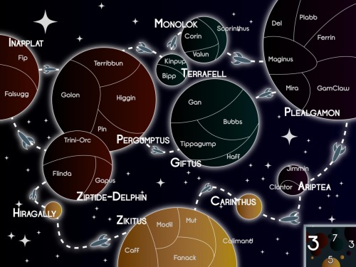
First, are Hiragally and Carinthus part of Zikitus' bonus zone? You have the 5 on Zikitus in the bonus diagram (where the numbers are spread over all planets in the other bonuses), which makes it look kind of like Hiragally and Carinthus are not in Zikitus' zone and Zikitus by itself gives 5.

Secondly, the spaceships each seem to be flying in a certain direction, which gives the impression that all interplanetary assaults are one-way (meaning that Carinthus can attack Mut, but not the other way around). If that is the case, great, but if not, you might want to consider redesigning the ships (or maybe have two ships for every interplanetary connection - one ship flying each way).

Thirdly, the overlap between Trini-Orc, Golon, and Pin is a little confusing. Do they assault each other? If not, you may want to put some visible distance between those 2 planets.

And finally, the text is a bit small, so "i"'s and "l"'s are hard to tell apart, as are "o"'s and "a"'s.

But as I said before, I love the concept, and I look forward to playing this map soon! :D

Best,
sempai

Re: Zarkon 7 [04/23/2012]

PostPosted: Tue Apr 24, 2012 10:37 pm
by koontz1973
green2337, here are some thoughts for you to think about.

About the size of the map, it is a good size but you need to make a small version which would be hard to do know. Make a new version around 15-20% larger than it is. This will allow you room for a bigger bonus box / text /icons.
One way spaceships - are they one way? If not, you need to explain this.
How about some better planets? You can keep the simple design and not go realistic if you want to but right now, I find it hard to tell the difference between then.

koontz

Re: Zarkon 7 [04/23/2012]

PostPosted: Tue Apr 24, 2012 11:31 pm
by army of nobunaga
This has a ton of promise...


gl

Re: Zarkon 7 [04/23/2012]

PostPosted: Tue Apr 24, 2012 11:36 pm
by army of nobunaga
I should add more imput early I guess.... so double post.

shoot me


But I think this needs more sinaz.

yeah its obvious you can get any dull map through CC map program now-a-days but you want to map a make that people are all like "WOW"... not one of these stupid ASS hieroglyphic maps that are played like once every 3 months on cc.


This from a gameplay standpoint (my strength) is outstanding.

From an artistic standpoint , it looks like that other space map that I am the ponly one in cc that plays today.


I would add some snazzy graphics if yo have the time and knowhow.


I am already mapping out your map linearlly on paper and it looks like a beaut.

Re: Zarkon 7 Map (Prototype included)

PostPosted: Thu Apr 26, 2012 1:46 am
by Teflon Kris
koontz1973 wrote:A good first draft but I wonder how similar this is to the other two space maps we have


This map is much less similar to Space or Solar System than the similarities between the 7 Planet Earth maps.

For anyone with imagination, this is different.

For anyone without imagination, it has a black background. :lol:

Go for it - great idea - we need more interstellar exploration.

=D> =D> =D> =D> =D> =D>

Re: Zarkon 7 [04/23/2012]

PostPosted: Thu Apr 26, 2012 11:09 am
by Ekranoplan
This map looks great. I cant wait to play on it!

Re: Zarkon 7 [04/23/2012]

PostPosted: Thu Apr 26, 2012 1:22 pm
by happy2seeyou
Ok, here are my thoughts on how it looks.... There are already two space maps that have plain black background with a few hints of white stars. You have so many possibilities when doing a space style map and no one has made one with colors in the background. How cool would it be to set yourself apart from them and go all out. Space shouldn't be thought of as some boring black and white place.

Image

Image

Image

Image

Image

Re: Zarkon 7 [04/23/2012]

PostPosted: Thu Apr 26, 2012 1:38 pm
by sempaispellcheck
happy2seeyou wrote:Space shouldn't be thought of as some boring black and white place.


+1

Re: Zarkon 7 [04/23/2012]

PostPosted: Thu Apr 26, 2012 1:52 pm
by AndyDufresne
Definitely like this idea. I always have hoped for more Space themed maps, and a simple standard gameplay one would be awesome in my book.

I think you are onto something, so keep it up. Also, keep the small map small in size graphically speaking, and I'll love it forever! :D

Best of luck,


--Andy

Re: Zarkon 7 [04/23/2012]

PostPosted: Sat Apr 28, 2012 7:19 am
by ManBungalow
Very nice, but...

...it has almost twice as many regions as, say, Doodle Earth, and still only has four obtainable bonuses.

Perhaps each planet could be a bonus ?

Re: Zarkon 7 [05/02/2012]

PostPosted: Wed May 02, 2012 4:57 pm
by green2337
Map Name: Zarkon 7
Previous Draft: Zarkon 7 [04/23/2012]
Mapmaker(s): Maggie Green
Number of Territories: 33
Special Features: none
What Makes This Map Worthy of Being Made: It looks interesting, and it has an easy to understand layout.

Click image to enlarge.
image


I've made these changes:
-Added texture to planets
-Omitted the spaceships
-Moved Hiragally so it is more obvious which zone it's in

Would anyone like to second the changing of the font for the sector names? I really like the font, so I'd like one more person to ask me to change it if it needs changing.

I am interested in the +1 for each planet. How should I show that?

Re: Zarkon 7 [04/23/2012]

PostPosted: Wed May 02, 2012 11:18 pm
by koontz1973
green2337, some official things first before the map.

Can you update your first post to show the current draft. Place your first draft (and any subsequent ones) into spoiler tags.
Your thread title needs to include what draft you are on and what page it can be found on. Lastly, replace the date when you update the map so we know how long it has been between drafts.
Zarkon 7 [05/3/2012] V2. Pg2

Map.
I like the textures which you have used but only the 5 and 7 bonus regions work. Both of the 3 bonus zones do not work at all. The earth type one is just a copy of the same image so this needs variation. The gas giants just do not work at all. Try to cover the whole planet with the same texture.
You have given each planet its own name. The first letter of each is in a bolder font apart from Carinthus. Why?
Why not use just one name like this for the whole bonus zone as you have territ names.

This is coming along great.

koontz

Re: Zarkon 7 [04/23/2012]

PostPosted: Thu May 03, 2012 3:32 pm
by AndyDufresne
I kind of liked the direction I thought your first draft was going...I.E. this draft's 'realistic space' in terms of textures and no spaceships instead of the thematic playground of space the earlier draft was.

But I still will probably like this map either way.


--Andy

Re: Zarkon 7 [04/23/2012]

PostPosted: Sun May 06, 2012 1:56 am
by Oneyed
very nice map. I like both versions, the texture gives to map realistic view. but you need change colour of names - the white ones are bad readable somewhere.

AndyDufresne wrote:I kind of liked the direction I thought your first draft was going...I.E. this draft's 'realistic space' in terms of textures and no spaceships instead of the thematic playground of space the earlier draft was.


totaly agreed here...
AndyDufresne wrote:But I still will probably like this map either way.


--Andy


...and disagreed here :D

Oneyed

Re: Zarkon 7 [04/23/2012]

PostPosted: Sat May 19, 2012 7:26 am
by koontz1973
Any word on when the next update is coming for this one?

Re: Zarkon 7 [04/23/2012]

PostPosted: Sat May 26, 2012 2:22 am
by koontz1973
[Moved]


If the mapmaker wants to continue with the map, then one of the Foundry Moderators will be able to help put the thread back into the Foundry system, after an update has been made. ;)

koontz