Page 1 of 3
The Internet...In a series of Tubes! (...Abandoned...)

Posted:
Mon May 21, 2007 7:37 pmby Gilligan

So, any comments?
Posted:
Mon May 21, 2007 7:40 pmby dominationnation
quench! quench! quench!

btw, is this an actuall map idea or a joke?
Posted:
Mon May 21, 2007 7:41 pmby Gilligan
What's wrong with it? And, it is
strikesocom's map.
Posted:
Mon May 21, 2007 7:43 pmby Jack0827
Posted:
Mon May 21, 2007 7:45 pmby Gilligan
This isn't going to help strikesocom.
Posted:
Mon May 21, 2007 7:50 pmby I GOT SERVED
Cool idea.
But the Wikipedia bonus is WAY too high. If you take over YTMND, then it only has 2 borders, with a bonus of 5.
As stated, WAY too high.
Posted:
Mon May 21, 2007 7:51 pmby Gilligan
I GOT SERVED wrote:Cool idea.
But the Wikipedia bonus is WAY too high. If you take over YTMND, then it only has 2 borders, with a bonus of 5.
As stated, WAY too high.
Yeah, I was thinking the same thing, but he hadn't gotten to the update yet.
Posted:
Mon May 21, 2007 7:51 pmby dominationnation
where is random.org and mafia and the zombie game?
Posted:
Mon May 21, 2007 7:52 pmby Gilligan
dominationnation wrote:where is random.org and mafia and the zombie game?
I dunno. He can only include so many.
ABOUT BONUSES!!!
Conquer Club: +2
MySpace: +3
YouTube: +3
Photobucket: +2
Google: +5
eBay: +3
YTMND: +3
Wikipedia: +3
I've told strikesocom to change it to this. Any ideas on bonuses?
Posted:
Mon May 21, 2007 7:55 pmby jnd94
love the Leroooooooyy Jenkins! in the middle
Posted:
Mon May 21, 2007 7:56 pmby Gilligan
jnd94 wrote::lol: love the Leroooooooyy Jenkins! in the middle
Anything else you like? Dislike?
Posted:
Mon May 21, 2007 8:00 pmby DiM
the map is horrid. the visuals are simply bad.
Posted:
Mon May 21, 2007 8:01 pmby Gilligan
DiM wrote:the map is horrid. the visuals are simply bad.
What's wrong with the visuals?
Posted:
Mon May 21, 2007 8:07 pmby AK_iceman
This is like Crossword, only a LOT worse. Scrap it.

Posted:
Mon May 21, 2007 8:07 pmby DiM
first of all the map layout is very poor. it's too tall without any particular reason. if it was a real coutry then it would have been ok but since it's a product of imagination there's no reason to make it so tall and narrow.
second, the actuall graphics are really poor. i don't even know where to begin. it's better to take a look at the recently quenched maps and then at this one. for sure you'll notice a huge difference.

Posted:
Mon May 21, 2007 8:40 pmby wcaclimbing
Shouldnt this have a video game theme? The design is just a crappy re-draw of the super mario games.
I vote scrap it, or at least get a MUCH BETTER theme. Super mario has nothing to do with the internet.
Posted:
Mon May 21, 2007 8:47 pmby mibi
I like the super mario part.
Posted:
Mon May 21, 2007 9:27 pmby Coleman
I love this myself.
Posted:
Mon May 21, 2007 9:40 pmby sfhbballnut
looks like fun, but its a little sloppy at present, doesn't look much like a map yet
Posted:
Mon May 21, 2007 10:19 pmby Backglass
Well, I use the google and know that the internets ARE a series of tubes.
It's not a big truck.
I like it.
Posted:
Tue May 22, 2007 1:54 amby zeppelin90
gonna be pretty hard to get the copyrights to all of this.
Posted:
Tue May 22, 2007 3:26 amby cairnswk
gilligan...i think it's a great concept and a huge change for FUN. Of course the graphics and map size need a lot of work but....onya...for attempting something completely wild...reegardless of whose map it is!
Posted:
Tue May 22, 2007 3:33 amby Iliad
I don't like the background: way too dark and detracts from the actual territories.
Posted:
Tue May 22, 2007 4:00 amby Nerrimus
NO. Graphics are horrible, your continents don't make sense, and it doesn't feel like the Internet.
Here's an idea of a map for the Internet, from the webcomic xkcd :
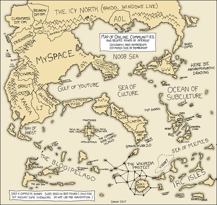 http://www.xkcd.com/c256.html
Now THAT's a map.
Well, no pipes though.

Posted:
Tue May 22, 2007 4:11 amby Iliad
Awesome map!