
Ragnarök (Updated Midgard Pg 9) [Abandoned]
Moderator: Cartographers
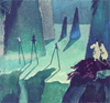
![]() by DiM on Mon Jul 02, 2007 7:04 pm
by DiM on Mon Jul 02, 2007 7:04 pm
the map looks good and has potential. i'll post more when i see the terits so i can get a good look at the gameplay
“In the beginning God said, the four-dimensional divergence of an antisymmetric, second rank tensor equals zero, and there was light, and it was good. And on the seventh day he rested.”- Michio Kaku
-

 DiM
DiM
- Posts: 10415
- Joined: Wed Feb 14, 2007 6:20 pm
- Location: making maps for scooby snacks


![]() by snufkin on Mon Jul 02, 2007 10:13 pm
by snufkin on Mon Jul 02, 2007 10:13 pm
Telvannia wrote:Asgaror...
Migogaror:
Nioavellir:
all of these O:s should be D:s and I dont know from where you picked up migogaror as a name for midgard.
not too sure about nidavellir.. but dwarves were smiths for the black elves of svartalfheimr which sometimes is called nidavellir (but much less common afaik)
The comet cometh!
-
snufkin
- Posts: 206
- Joined: Sun Apr 22, 2007 7:40 am
- Location: borderland of Ranrike


![]() by Telvannia on Tue Jul 03, 2007 4:36 am
by Telvannia on Tue Jul 03, 2007 4:36 am
gimil wrote:can we have some little people walking around
I really want to, also i would love to have it a map where you have night and day, but i dont think i can
I will add them anyway to my next update, but make them easy to remove.
But if animation gets allowed, then i will leave it on.
DiM wrote:the map looks good and has potential. i'll post more when i see the terits so i can get a good look at the gameplay
I'm nowhere near there yet.
snufkin wrote:all of these O:s should be D:s and I dont know from where you picked up migogaror as a name for midgard.
not too sure about nidavellir.. but dwarves were smiths for the black elves of svartalfheimr which sometimes is called nidavellir (but much less common afaik)
Migogaror came for wikipedia, but i always thought it was midgard, but the former sounded more norse.
well both svartalfheimr and nidavellir where down as one the 9 worlds of norse mythology, so i picked randomly which one to use, i will use the other in my next update (when i get down to drawing that part of the map, i will probably do Vanaheimr next.
-

Telvannia
- Posts: 1331
- Joined: Mon Apr 24, 2006 7:19 am


![]() by snufkin on Tue Jul 03, 2007 7:40 am
by snufkin on Tue Jul 03, 2007 7:40 am
Telvannia wrote:Migogaror came for wikipedia, but i always thought it was midgard, but the former sounded more norse.
That´s the problem with wiki - anyone can edit.
Migogaror must have been put there by someone who knows less than you or has severe alexia.
The comet cometh!
-
snufkin
- Posts: 206
- Joined: Sun Apr 22, 2007 7:40 am
- Location: borderland of Ranrike


![]() by gimil on Wed Jul 04, 2007 5:30 pm
by gimil on Wed Jul 04, 2007 5:30 pm
Telvannia wrote:here is part of the animation, it is far from complete.
but you might as well see it as it currently is:
if your doing day adn night you should have the shadows moving with teh sun rather than jsut fading away
but yeah i really like teh animation
What do you know about map making, bitch?
Top Score:2403
natty_dread wrote:I was wrong
Top Score:2403
-

gimil
- Posts: 8599
- Joined: Sat Mar 03, 2007 12:42 pm
- Location: United Kingdom (Scotland)


![]() by KEYOGI on Wed Jul 04, 2007 5:42 pm
by KEYOGI on Wed Jul 04, 2007 5:42 pm
I don't understand why you would be wasting your time with animations when they're not going to be included in the map. Also, I'm not criticising your animations in particular, but an animation should aim to immerse the player further into the map and I think most animations are going to do the complete opposite. To achieve any sort of desirable effect will require a lengthy animation and that's just not practical.
-
KEYOGI
- Posts: 1632
- Joined: Tue Oct 10, 2006 6:09 am


![]() by Telvannia on Thu Jul 05, 2007 3:04 am
by Telvannia on Thu Jul 05, 2007 3:04 am
gimil wrote:if your doing day adn night you should have the shadows moving with teh sun rather than jsut fading away
but yeah i really like teh animation
i think that adding moving shadows will just be a bit to hard at the moment.
KEYOGI wrote:I don't understand why you would be wasting your time with animations when they're not going to be included in the map. Also, I'm not criticising your animations in particular, but an animation should aim to immerse the player further into the map and I think most animations are going to do the complete opposite. To achieve any sort of desirable effect will require a lengthy animation and that's just not practical.
I will leave animation alone until i have a complete map, then i might consider making a long animation, but i think i will work on the rest of the map first.
-
Telvannia
- Posts: 1331
- Joined: Mon Apr 24, 2006 7:19 am
![]() by gimil on Thu Jul 05, 2007 3:31 am
by gimil on Thu Jul 05, 2007 3:31 am
KEYOGI i think you were being a bit harsh. he only jsut learned to do animations. Even if it diesnt get included in the final map at least he had fun and learned something.
you said the same thing to DiM about workign in 3D and he told you the exact same thing.
you said the same thing to DiM about workign in 3D and he told you the exact same thing.
What do you know about map making, bitch?
Top Score:2403
natty_dread wrote:I was wrong
Top Score:2403
-
gimil
- Posts: 8599
- Joined: Sat Mar 03, 2007 12:42 pm
- Location: United Kingdom (Scotland)
![]() by KEYOGI on Thu Jul 05, 2007 4:15 am
by KEYOGI on Thu Jul 05, 2007 4:15 am
Sorry your Majesty. God forbid anyone express an opinion that you don't agree with. 
Look at my post again. I didn't single out Telvannia and his work, I was making a general statement about animations.
Look at the facts. Animation is not currently supported and opinion is pretty divided on the matter. I think if animation is considered in the future it would have to be extremely well done to be justified as an inclusion.
I believe the key to good animation for a map comes down to subtlety and length. Which, then one can argue is there really any point to it all? It has to be subtle as to not be a distraction and for the same reason it would have to be long. All this adds up to large file sizes which are not practical, regardless of your opinion on whether they look good or not.
-
KEYOGI
- Posts: 1632
- Joined: Tue Oct 10, 2006 6:09 am
![]() by DiM on Thu Jul 05, 2007 5:26 am
by DiM on Thu Jul 05, 2007 5:26 am
i partly agree with keyogi.
yes the animations have to be very lengthy in order for them to provide an accurate feeling and they have to be done in taste to not distract attention.
what i don't agree is the file size problem.
let me develop this thought.
we now have small and large maps which are mandatory for a map to get quenched.
i say an OPTIONAL large animated map is good. the map maker creates it and it is added on the site as a third option.
yes it will be a large file but if you have a slow connection you're not forced to play it. just go with small or large. not to mention the animation will take time when you first load it then it is stored in the cache.
“In the beginning God said, the four-dimensional divergence of an antisymmetric, second rank tensor equals zero, and there was light, and it was good. And on the seventh day he rested.”- Michio Kaku
-
DiM
- Posts: 10415
- Joined: Wed Feb 14, 2007 6:20 pm
- Location: making maps for scooby snacks
![]() by Telvannia on Fri Jul 06, 2007 3:02 am
by Telvannia on Fri Jul 06, 2007 3:02 am
i agree with the above two, if i do do an animation then i will have to do a long one, so it does not become repetitive. But as i said i will add the animations later when i have a whole map, then i can do a long one which might look alright, i probably wont do a night and day one because they are obviously repetitive.
I can wait to mess around with animation on the Ragnarök part of the map, i can have people dying everywhere .
.
But until i have a complete map i will leave animation alone.
Quick Question, does everyone like how Asgaror looks at the moment?
if so i will continue my map in that style.
By the way KEYOGI can you delete the poll i want to put up a new one.
I can wait to mess around with animation on the Ragnarök part of the map, i can have people dying everywhere
But until i have a complete map i will leave animation alone.
Quick Question, does everyone like how Asgaror looks at the moment?
if so i will continue my map in that style.
By the way KEYOGI can you delete the poll i want to put up a new one.
-
Telvannia
- Posts: 1331
- Joined: Mon Apr 24, 2006 7:19 am
![]() by DiM on Fri Jul 06, 2007 7:01 am
by DiM on Fri Jul 06, 2007 7:01 am
Telvannia wrote:i agree with the above two, if i do do an animation then i will have to do a long one, so it does not become repetitive. But as i said i will add the animations later when i have a whole map, then i can do a long one which might look alright, i probably wont do a night and day one because they are obviously repetitive.
I can wait to mess around with animation on the Ragnarök part of the map, i can have people dying everywhere
But until i have a complete map i will leave animation alone.
Quick Question, does everyone like how Asgaror looks at the moment?
if so i will continue my map in that style.
By the way KEYOGI can you delete the poll i want to put up a new one.
cool.
yep, asgaror looks good. go on and do the rest.
“In the beginning God said, the four-dimensional divergence of an antisymmetric, second rank tensor equals zero, and there was light, and it was good. And on the seventh day he rested.”- Michio Kaku
-
DiM
- Posts: 10415
- Joined: Wed Feb 14, 2007 6:20 pm
- Location: making maps for scooby snacks

![]() by KEYOGI on Tue Jul 10, 2007 3:44 pm
by KEYOGI on Tue Jul 10, 2007 3:44 pm
I think either the buildings are too blurry or the wooden fence/gate too sharp. Perhaps look into trying to bring one into line with the other.
Early stages yet, but the font is pretty hard to read. At least apply some effects to it to try and make it stand out from the background.
Early stages yet, but the font is pretty hard to read. At least apply some effects to it to try and make it stand out from the background.
-
KEYOGI
- Posts: 1632
- Joined: Tue Oct 10, 2006 6:09 am
![]() by Telvannia on Tue Jul 10, 2007 4:27 pm
by Telvannia on Tue Jul 10, 2007 4:27 pm
KEYOGI wrote:I think either the buildings are too blurry or the wooden fence/gate too sharp. Perhaps look into trying to bring one into line with the other.
Early stages yet, but the font is pretty hard to read. At least apply some effects to it to try and make it stand out from the background.
I will look in to it, maybe that is why it looked funny.
gimil wrote:the latest update is no where near the quality of the 1st part
I know i made it too quickly, i will redo it when i get the chance
-
Telvannia
- Posts: 1331
- Joined: Mon Apr 24, 2006 7:19 am
Return to Melting Pot: Map Ideas
Who is online
Users browsing this forum: No registered users
|
|||||||
| Conquer Club is not associated with RISK online in any way. Copyright © 2006-2024 by Big Wham LLC | |||||||