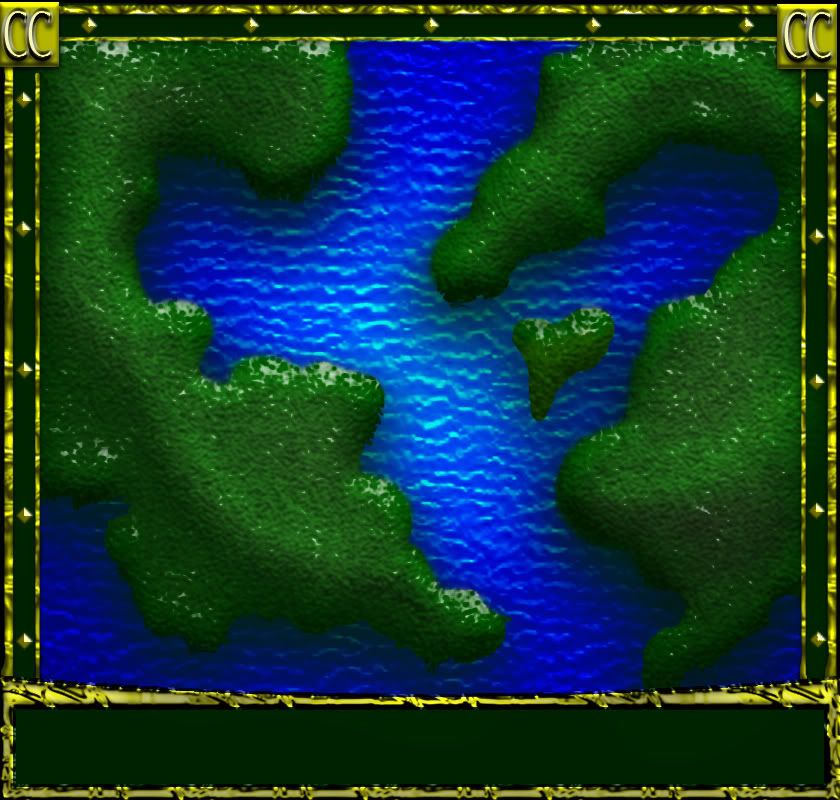
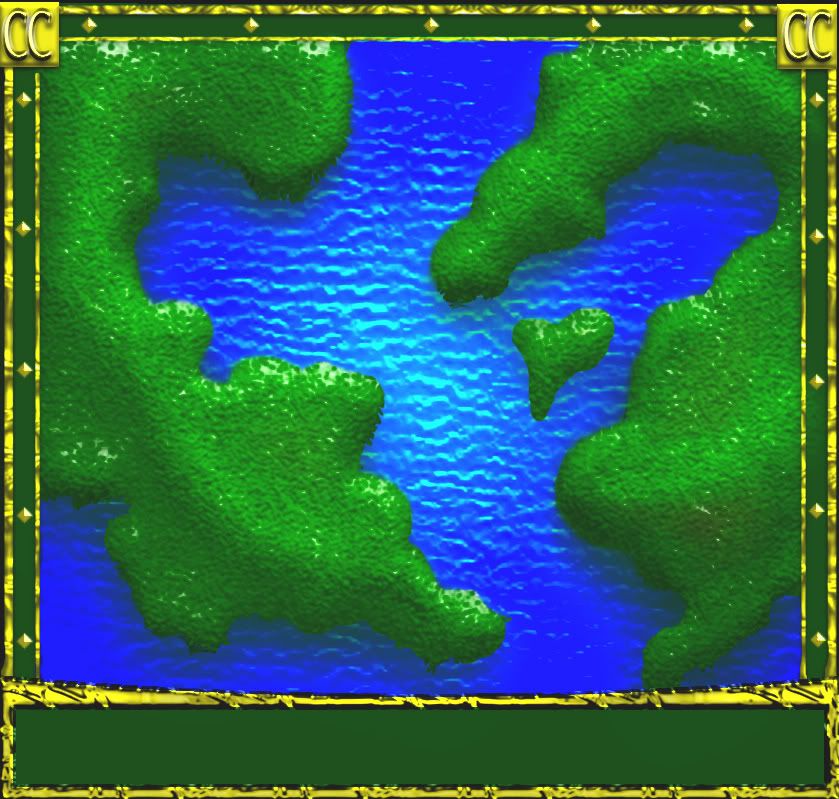
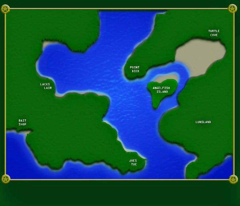
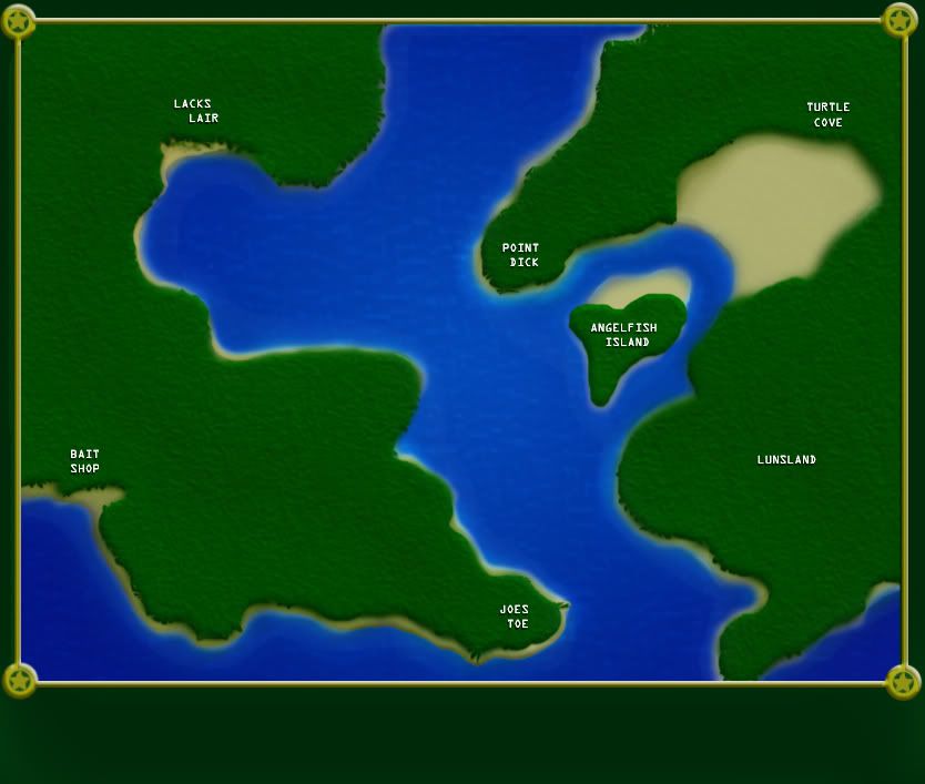
Page 1 of 2

New map

PostPosted: Tue Mar 03, 2009 4:06 am
by porkenbeans
Click image to enlarge.
image


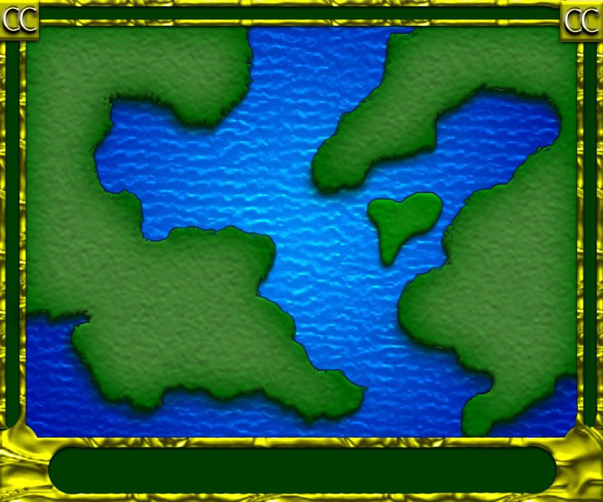
Another map, I am just far enough to post what I've got so far. Its just an idea for a style of graphics. I do not have any game play options worked out yet. Suggestions are always welcome, and if the response warrants, I will take it further. 8-)

Re: New map

PostPosted: Tue Mar 03, 2009 4:47 am
by MrBenn
[Moved]

This map has been moved into the Ideas subforum, as it does not meet the criteria for a Working Draft:

Drafting Room Guidelines

To be considered a Working Draft a project must be more than just an idea; a Draft should have a clear thematic focus, a plan for how the gameplay will work, and a basic image which should include:
    1. Territory Labels - temporary names or numbers will suffice, and are always open to change.
    2. Borders/Paths/Impassables - it should be made clear where territories do/do not connect.
    3. Bonus Areas - where combinations/groups of territories will award a bonus, this should be indicated on the map.
    4. Legend - speculative bonus values and explanations of any attack rules or gameplay features.
Draft images should not be larger than 630x600px (small image) or 840x800px (large image).

Re: New map

PostPosted: Tue Mar 03, 2009 3:29 pm
by RjBeals
well - it looks really cool so far !

Re: New map

PostPosted: Tue Mar 03, 2009 8:19 pm
by porkenbeans
Click image to enlarge.
image


Day two, OK here's the deal, I am not a mapmaker. I am just an artist trying to learn how to paint in photoshop. I see a lot of stuff making it out of the foundry that, pardon me for saying, is not very impressive. I am only talking about the art work.

So here is my proposal, to anyone that knows this foundry process, and wants to take my art work and create a playable game from it, please pm me. I would love to just devote my time to my art. I would be glad to update the graphics as you proceed through the foundrys' hoops.

I re-sized this draft, I hope that it is the correct size. :D

Re: New map

PostPosted: Tue Mar 03, 2009 8:23 pm
by The Neon Peon
1. You should start with the small map, then make a large later. Making a small from a large is a lot harder than the other way around.
2. That much texture is really unnecessary, especially on the land in the new version.
3. Why does land cast a shadow on the sea? Seems a bit unrealistic.

Re: New map

PostPosted: Tue Mar 03, 2009 8:28 pm
by the.killing.44
Way too much on the eyes. Take off that ridiculous amount of shine, texture, and bevel and tone it down some. The water seems very pixelated, and the border … well I'm just not feelin' it.

.44

Re: New map

PostPosted: Tue Mar 03, 2009 8:39 pm
by porkenbeans
The Neon Peon wrote:1. You should start with the small map, then make a large later. Making a small from a large is a lot harder than the other way around.
2. That much texture is really unnecessary, especially on the land in the new version.
3. Why does land cast a shadow on the sea? Seems a bit unrealistic.
I do not quite understand what you mean about the land casting a shadow on the water. It seems realistic to me. And about starting with a small version. I was told that, it s the other way around.

Re: New map

PostPosted: Tue Mar 03, 2009 10:14 pm
by RjBeals
It just depends who you ask. I always start with the large map first.

Re: New map

PostPosted: Tue Mar 03, 2009 10:16 pm
by The Neon Peon
porkenbeans wrote:
The Neon Peon wrote:1. You should start with the small map, then make a large later. Making a small from a large is a lot harder than the other way around.
2. That much texture is really unnecessary, especially on the land in the new version.
3. Why does land cast a shadow on the sea? Seems a bit unrealistic.
I do not quite understand what you mean about the land casting a shadow on the water. It seems realistic to me. And about starting with a small version. I was told that, it s the other way around.

Have you ever seen land cast a shadow on water?

I've only seen that happen near cliffs, which I am doubting you were intending to have running around the whole map. In fact, water lighter when it is shallow, aka. near land.

Re: New map

PostPosted: Tue Mar 03, 2009 10:17 pm
by LED ZEPPELINER
whats with the CC in the corners

Re: New map

PostPosted: Tue Mar 03, 2009 10:58 pm
by porkenbeans
The Neon Peon wrote:
porkenbeans wrote:
The Neon Peon wrote:1. You should start with the small map, then make a large later. Making a small from a large is a lot harder than the other way around.
2. That much texture is really unnecessary, especially on the land in the new version.
3. Why does land cast a shadow on the sea? Seems a bit unrealistic.
I do not quite understand what you mean about the land casting a shadow on the water. It seems realistic to me. And about starting with a small version. I was told that, it s the other way around.

Have you ever seen land cast a shadow on water?

I've only seen that happen near cliffs, which I am doubting you were intending to have running around the whole map. In fact, water lighter when it is shallow, aka. near land.
And tell me about "reflection". :lol:

Shadows cast on water, and land as well. Take a look at sairorseals
avi.

Re: New map

PostPosted: Tue Mar 03, 2009 10:58 pm
by porkenbeans
LED ZEPPELINER wrote:whats with the CC in the corners
Conquer Club.

Re: New map

PostPosted: Tue Mar 03, 2009 11:00 pm
by porkenbeans
Click image to enlarge.
image


Her it is with some different levels.

Re: New map

PostPosted: Wed Mar 04, 2009 3:04 pm
by LED ZEPPELINER
porkenbeans wrote:
LED ZEPPELINER wrote:whats with the CC in the corners
Conquer Club.

no i mean why are they there

Edit: and your first version is better than the others

Re: New map

PostPosted: Wed Mar 04, 2009 3:08 pm
by sailorseal
Think of a theme and then lets see some territs.
Maybe Golden Era?

Re: New map

PostPosted: Wed Mar 04, 2009 3:27 pm
by john9blue
This sort of looks like a painting to me. Land doesn't glitter like that in real life, lol.

It also looks kind of like Age Of Realms 1...

What this really looks like to me, though, is Palau. Search Google Images for "Palau" and you'll see what I mean. I think a map of Palau would be awesome, because it's one of the most beautiful places in the world (or so I hear). Maybe if I make a draft and it gets enough support from the Foundry, I'll ask you to do the graphics. That's a big "maybe" though, as I've got some other maps I'm working on. :)

Re: New map

PostPosted: Wed Mar 04, 2009 3:28 pm
by el-presidente
You can use gifs in maps right? LIke in conquerman? Why not have the water move?

Re: New map

PostPosted: Thu Mar 05, 2009 3:19 am
by porkenbeans
LED ZEPPELINER wrote:
porkenbeans wrote:
LED ZEPPELINER wrote:whats with the CC in the corners
Conquer Club.

no i mean why are they there

Is there a reason why they should not be there ? How about stars instead ?

Re: New map

PostPosted: Thu Mar 05, 2009 3:23 am
by porkenbeans
john9blue wrote:This sort of looks like a painting to me. Land doesn't glitter like that in real life, lol.

It also looks kind of like Age Of Realms 1...

What this really looks like to me, though, is Palau. Search Google Images for "Palau" and you'll see what I mean. I think a map of Palau would be awesome, because it's one of the most beautiful places in the world (or so I hear). Maybe if I make a draft and it gets enough support from the Foundry, I'll ask you to do the graphics. That's a big "maybe" though, as I've got some other maps I'm working on. :)
I will do whatever it takes, to get a map on CC.

Re: New map

PostPosted: Thu Mar 05, 2009 5:58 am
by porkenbeans
Click image to enlarge.
image


OK, here it is without all the texture. 8-)

Re: New map

PostPosted: Thu Mar 05, 2009 3:07 pm
by the.killing.44
Nice dick :lol:

Much better without that texture and shine. I'd still get rid of that border though — it's kinda annoying.

.44

Re: New map

PostPosted: Thu Mar 05, 2009 8:09 pm
by porkenbeans
Click image to enlarge.
image

Normally a lot of texture does NOT work well because it makes it to hard to read the text. This is because people usually make a light colored map, and use black text. But if you are NOT afraid of a little color, you can successfully make a map that has more texture and is far superior to read when you make the text white.

I am interested in suggestions for territory names. I threw up some funny ideas. Make up something funny with your, or someone else' s CC name. :D

Re: New map

PostPosted: Sun Mar 08, 2009 7:00 pm
by Qwert
porkenbeans
Day two, OK here's the deal, I am not a mapmaker.

So what? Im also not a mapmaker, before CC im not make any maps,and also im not study any graphic scools or any programs for creating a maps.
Im here learn how to use Photoshop.
I only can give you one sugestion-take some country to create,because you will have all relevant things to put on map(borders,names), and not strart from some abstract maps.
When you get enough experience with photoshop,then you can try to create something abstract..

Re: New map

PostPosted: Mon Mar 09, 2009 2:01 pm
by miniwally
qwert wrote:
porkenbeans
Day two, OK here's the deal, I am not a mapmaker.

So what? Im also not a mapmaker,


so they decided to put map maker under your name for no reason :P

Re: New map

PostPosted: Mon Mar 09, 2009 2:03 pm
by RjBeals
miniwally wrote:
qwert wrote:
porkenbeans
Day two, OK here's the deal, I am not a mapmaker.

So what? Im also not a mapmaker,


so they decided to put map maker under your name for no reason :P


he added that himself. It's part of his avatar.