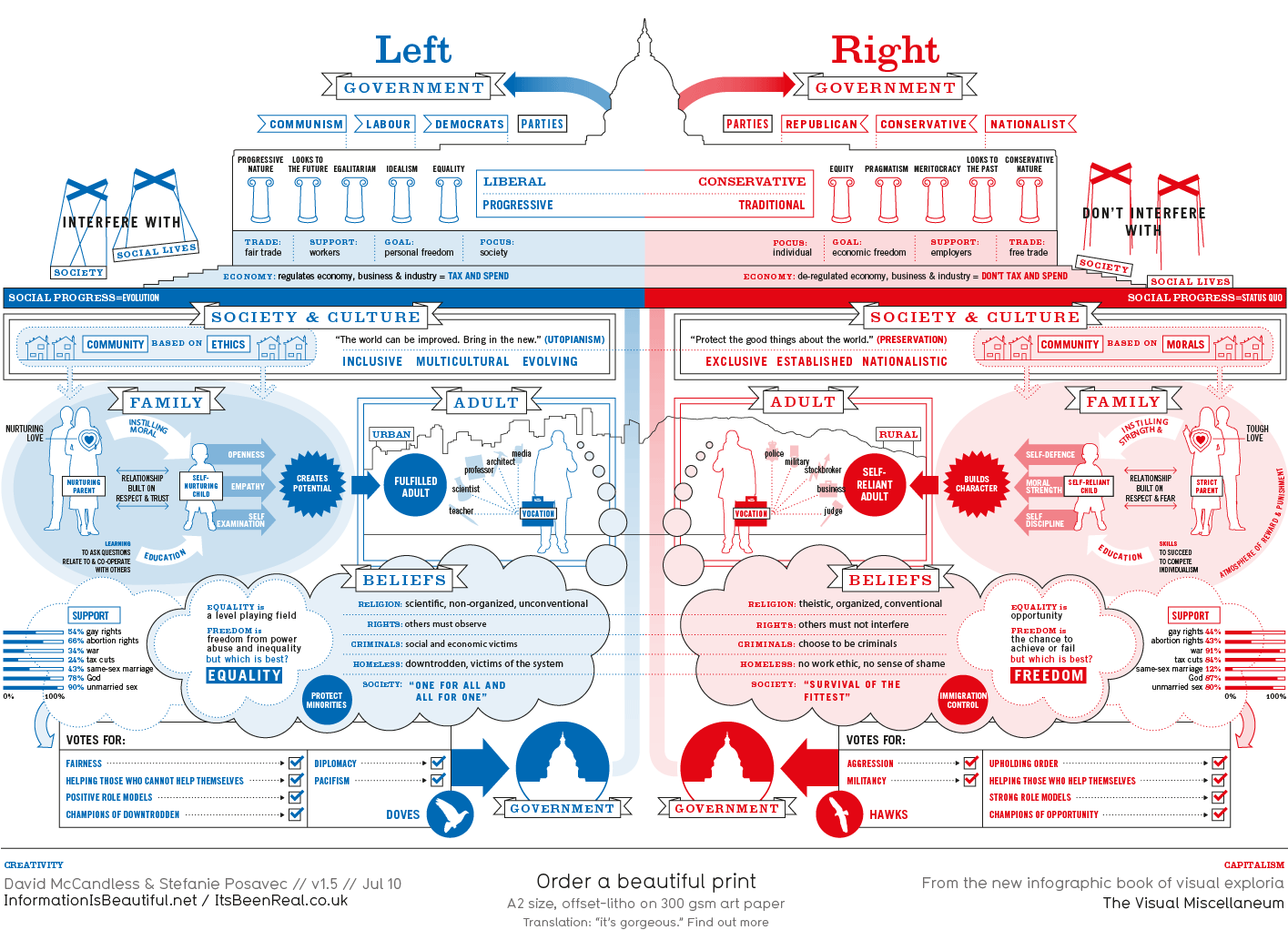
left v right: a diagram
From Information is Beautiful. Here's what the designer David McCandless has to say about it:
Of course, the political spectrum is not quite so polarised. Actually, it’s more of a diamond shape, apparently. But this is how it’s mostly presented via the media – left wing vs. right wing, liberal vs. conservative, Labour vs Tory. And perhaps in our minds too…
Well, certainly in my mind. Researching this showed me that, despite my inevitable journalistic lean to the ‘left’, I am actually a bit more ‘right’ than I suspected.
This kind of visual approach to mapping concepts really excites me. I like the way it coaxes me to entertain two apparently contradictory value systems at the same time. Or, in other words, I like the way it f**ks with my head.
- Click image to enlarge.