i don't like mexico 3.0
I Love mexico 2.0
The colors and everything on 2.0 are just so much better then 3.0
maybe break mexico city into 2 territories or something
also the airport was a great idea
instead of a legend maybe you should have a mini-map?
MÉXICO [BETA] p1/18 --Sep 11th--
Moderator: Cartographers


![]() by fumandomuerte on Sat Feb 23, 2008 4:15 am
by fumandomuerte on Sat Feb 23, 2008 4:15 am
Hey, I didn't notice my thread was moved. This is the first foundry stamp I earn and I think it was too quick  .
.
Now, about the suggestions for the upcoming 4th Version:
2. Answered on 1.
3. OK, I'll fix that.
4. Oh no, that wouldn't be very close to the real political division.
5. Thinking of fog games that wouldn't make the map interesting.
6. Love it, be sure i'm incluiding a little map on next version.
Thanks 4 the suggestions!
Now, about the suggestions for the upcoming 4th Version:
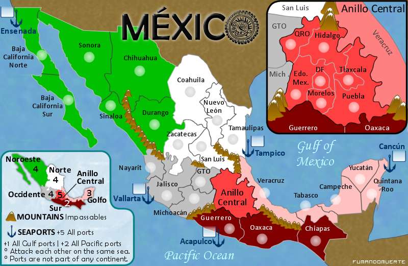
I agree with you because of the small amount of terits.edbeard wrote:I think your bonuses are a bit too high in a few places. My recommendations:
Sur - 2
Norte - 4
Golfo - 3
Occidente - 4
1. I like more 3.0 because the importance of central Mexico.tenio wrote:1. I don't like mexico 3.0
2. I Love mexico 2.0
3. The colors and everything on 2.0 are just so much better then 3.0
4. Maybe break mexico city into 2 territories or something
5. Also the airport was a great idea
6. Instead of a legend maybe you should have a mini-map?
2. Answered on 1.
3. OK, I'll fix that.
4. Oh no, that wouldn't be very close to the real political division.
5. Thinking of fog games that wouldn't make the map interesting.
6. Love it, be sure i'm incluiding a little map on next version.
You are right. I'll change all the army containers to circles.cairnswk wrote:why are you using sqaure and round army circles...consistency shoudl be a priority.
I'll add some darker shadows.yeti_c wrote:Also - your army shadows aren't good on a white background...
Thanks 4 the suggestions!

-

 fumandomuerte
- Posts: 620
- Joined: Sat Dec 29, 2007 1:27 am
- Location: The Cinderella of the Pacific


![]() by iancanton on Mon Feb 25, 2008 8:20 am
by iancanton on Mon Feb 25, 2008 8:20 am
i love v3 of this simple and accurate map that has distinctive national flavour and gameplay. do the continents (regions) have any cultural, ethnic, administrative or traditional meaning, or are they just geographical?
the new bonuses are all good. i’d also reduce the noroeste bonus to +3 (less than occidente) because noroeste has an attractive, quiet location in the corner and is not on anyone’s attack route (while occidente, in the middle, is very easy for anyone to attack).
in anillo central, what is EM? estado de mexico? when i search for that, the website below appears. is edomex a suitable name for estado de mexico on our map, instead of EM, or does only the government use this name?
http://www.edomex.gob.mx/portal/page/portal/edomex
the english name for golfo de mexico is gulf of mexico, not mexican gulf. if u use golfo de mexico, then i think everyone will understand the meaning, although maybe gulf of mexico is better if u are using the english name to explain the port bonuses. what do u think?
ian.
-

iancanton
- Foundry Foreman

- Posts: 2424
- Joined: Fri Jun 01, 2007 5:40 am
- Location: europe


![]() by fumandomuerte on Mon Feb 25, 2008 6:16 pm
by fumandomuerte on Mon Feb 25, 2008 6:16 pm
iancanton wrote:1. Do the continents (regions) have any cultural, ethnic, administrative or traditional meaning, or are they just geographical?
2. The new bonuses are all good. i’d also reduce the noroeste bonus to +3 (less than occidente) because noroeste has an attractive, quiet location in the corner and is not on anyone’s attack route (while occidente, in the middle, is very easy for anyone to attack).
3. In anillo central, what is EM? estado de mexico? when i search for that, the website below appears. is edomex a suitable name for estado de mexico on our map, instead of EM, or does only the government use this name?
4. The english name for golfo de mexico is gulf of mexico, not mexican gulf. if u use golfo de mexico, then i think everyone will understand the meaning, although maybe gulf of mexico is better if u are using the english name to explain the port bonuses. what do u think?
1. The regions I choosed attend the fact that Mexico is a country made of small Mexicos; they try to represent the geographical "people's idiosyncrasy".
2. Bonuses are changing on next map revision.
3. Yes, EM is Estado de México, but because of the size of the name I just put the initials. Maybe I can place an abbreviation like "EdoMex" instead of EM.
4. You are right, I'll change that.
Vladi.
-
fumandomuerte
- Posts: 620
- Joined: Sat Dec 29, 2007 1:27 am
- Location: The Cinderella of the Pacific
![]() by Ogrecrusher on Tue Feb 26, 2008 10:30 am
by Ogrecrusher on Tue Feb 26, 2008 10:30 am
I also much prefer the gameplay of version 3.
Looking great!
Looking great!
-
Ogrecrusher
- Posts: 250
- Joined: Thu Aug 16, 2007 2:55 pm


![]() by oaktown on Tue Feb 26, 2008 11:39 pm
by oaktown on Tue Feb 26, 2008 11:39 pm
Hooray! Finally a Mexico map!
My first thoughts: it will save space and confusion if you called the "Mexico" territory "D.F." I'm sure the chilangos will approve.
Any thought of putting a third port on the gulf side? Isn't Veracruz the biggest port on the east side anyway? It would even out the bonuses on the two sides, and get rid of a the two territory bonus region. And it might not be a bad idea graphically to have a slightly different army square for the ports, but that's minor.
Bonuses need to be brought in line with each other. +5 for Occidente seems really high.
OK, beyond that this is a nice start. Have some fun with the graphics - mas sabor Mexicano!

-

oaktown
- Posts: 4451
- Joined: Sun Dec 03, 2006 9:24 pm
- Location: majorcommand


Version 4
![]() by fumandomuerte on Thu Feb 28, 2008 2:04 am
by fumandomuerte on Thu Feb 28, 2008 2:04 am
VERSION 4 Updated 28/Feb/08
SMALL 600x391
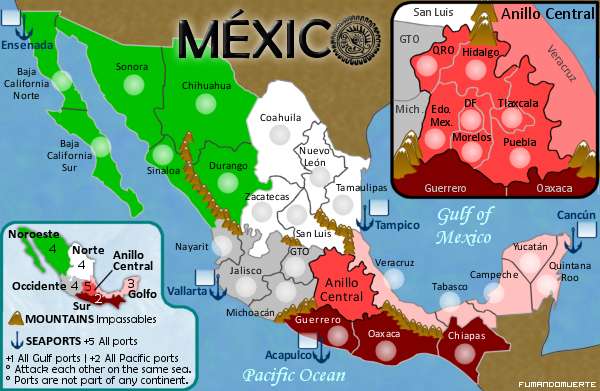
LARGE 800x521
35 Territories
9 Continents (2 sub)
-Adjusted the bonuses.
-Added a mini-map showing bonuses.
-Renamed some terits:
EM > Edo. Mex.
México > DF
SL > San Luis
NL > Nuevo León
QR > Quintana Roo
-Didn't put a port on Veracruz because the Gulf continent has already a port. I know that Veracruz is the most important port of México, but this omittion is thinking on the gameplay.
SMALL 600x391
LARGE 800x521
35 Territories
9 Continents (2 sub)
-Adjusted the bonuses.
-Added a mini-map showing bonuses.
-Renamed some terits:
EM > Edo. Mex.
México > DF
SL > San Luis
NL > Nuevo León
QR > Quintana Roo
-Didn't put a port on Veracruz because the Gulf continent has already a port. I know that Veracruz is the most important port of México, but this omittion is thinking on the gameplay.
-
fumandomuerte
- Posts: 620
- Joined: Sat Dec 29, 2007 1:27 am
- Location: The Cinderella of the Pacific


![]() by fumandomuerte on Thu Feb 28, 2008 9:23 am
by fumandomuerte on Thu Feb 28, 2008 9:23 am
Right click the images and choose properties, you'll see both images are on the limits (600px for the small and 800px for the large).
-
fumandomuerte
- Posts: 620
- Joined: Sat Dec 29, 2007 1:27 am
- Location: The Cinderella of the Pacific
![]() by Ogrecrusher on Thu Feb 28, 2008 9:45 am
by Ogrecrusher on Thu Feb 28, 2008 9:45 am
Maybe it's just me, but the text on the Sur continent on the small map looks like something has gone wrong, like half the pixels are missing. It's fine on the large map though.
-
Ogrecrusher
- Posts: 250
- Joined: Thu Aug 16, 2007 2:55 pm
![]() by Ogrecrusher on Thu Feb 28, 2008 10:10 am
by Ogrecrusher on Thu Feb 28, 2008 10:10 am
FreeMan10 wrote:BTW- I just learned some geometry. I didn't know that Quintana Roo was in Mexico. I always thought it was in Australia or New Zealand.
I hope you mean Geography
-
Ogrecrusher
- Posts: 250
- Joined: Thu Aug 16, 2007 2:55 pm
feedback
![]() by Ninjai Jr on Fri Feb 29, 2008 2:28 am
by Ninjai Jr on Fri Feb 29, 2008 2:28 am
it looks at first glance that "+5 seaports" are auto deploy but after looking at it for a min i see you mean +5 to hold all ports
im not sure how to address it but pointing it out
put more space between the "|" between the gulf and pacific bonus
just my thoughts as i see this map really coming together since v1
im not sure how to address it but pointing it out
put more space between the "|" between the gulf and pacific bonus
just my thoughts as i see this map really coming together since v1
-

Ninjai Jr
- Posts: 55
- Joined: Thu Dec 06, 2007 3:40 pm
- Location: usa


Re: feedback
![]() by iancanton on Thu Mar 13, 2008 5:36 pm
by iancanton on Thu Mar 13, 2008 5:36 pm
i think the original bonus of 6 is suitable for anillo central; the new one of only 5 is too small. anillo central is very similar to iberia's castilla la mancha continent which, just like anillo central, has 7 territories, of which 5 are border territories; also like anillo central, it is located in the middle, so that nearly every continent can attack it directly. castilla la mancha has a bonus of 7.
http://www.conquerclub.com/maps/Iberia.S.jpg
in the anillo central box, the name for veracruz is diagonal. all other names on the map are straight left to right. it'll look better if veracruz also reads straight across from left to right.
i'm liking this map a lot. would some texture improve the look of the land, or would texture make the map less clear?
ian.
-
iancanton
- Foundry Foreman
- Posts: 2424
- Joined: Fri Jun 01, 2007 5:40 am
- Location: europe

Re: feedback
![]() by fumandomuerte on Fri Mar 14, 2008 1:32 am
by fumandomuerte on Fri Mar 14, 2008 1:32 am
iancanton wrote:1. I think the original bonus of 6 is suitable for anillo central; the new one of only 5 is too small.
2. In the anillo central box, the name for veracruz is diagonal. all other names on the map are straight left to right. it'll look better if veracruz also reads straight across from left to right.
3. Would some texture improve the look of the land, or would texture make the map less clear?
1. I feel the same.
2. I guess you're right, I must keep the desinging scheme.
3. Let me try some experiments.
KingPrime wrote:the borders between Noroeste and Norte need a bit of a darker colour.
OK, that will be changed next version.
Thanks for the suggestions to everyone.
-
fumandomuerte
- Posts: 620
- Joined: Sat Dec 29, 2007 1:27 am
- Location: The Cinderella of the Pacific
VERSION 5
![]() by fumandomuerte on Mon Mar 17, 2008 6:50 am
by fumandomuerte on Mon Mar 17, 2008 6:50 am
VERSION 5
SMALL 600x391
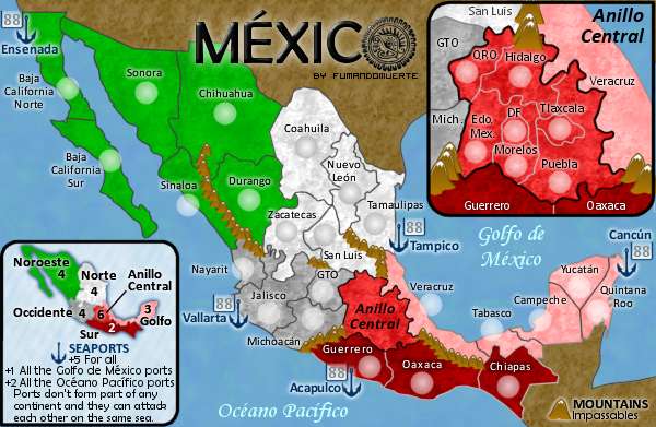
30 Terits
5 Seaports
7 Continents
2 Sub continents
-Changed the bonus for the Anillo Central region from 5 to 6.
-Translated the sea names to the spanish form.
-Added some texture to the land.
-A little touch-up to some graphic elements like the terits names.
-The neutrals are shown (ports).
Is the gameplay OK or should I make a major change?
Have fun and keep coming to the map foundry, Vladi (fumandomuerte).
SMALL 600x391
30 Terits
5 Seaports
7 Continents
2 Sub continents
-Changed the bonus for the Anillo Central region from 5 to 6.
-Translated the sea names to the spanish form.
-Added some texture to the land.
-A little touch-up to some graphic elements like the terits names.
-The neutrals are shown (ports).
Is the gameplay OK or should I make a major change?
Have fun and keep coming to the map foundry, Vladi (fumandomuerte).
Last edited by fumandomuerte on Mon Mar 17, 2008 5:49 pm, edited 1 time in total.
-
fumandomuerte
- Posts: 620
- Joined: Sat Dec 29, 2007 1:27 am
- Location: The Cinderella of the Pacific
![]() by Ogrecrusher on Mon Mar 17, 2008 8:30 am
by Ogrecrusher on Mon Mar 17, 2008 8:30 am
Been waiting for this update! It looks amazing! Love the textures. Having looked for 5 minutes, I honestly can't see anything that needs changing.
-
Ogrecrusher
- Posts: 250
- Joined: Thu Aug 16, 2007 2:55 pm
Who is online
Users browsing this forum: No registered users
|
|||||||
| Conquer Club is not associated with RISK online in any way. Copyright © 2006-2024 by Big Wham LLC | |||||||