Conquer Club

Conquer 4 [Quenched]

Care to peruse completed maps? Take a stroll through the Atlas.

Moderator: Cartographers

Forum rules
Please read the Community Guidelines before posting.

Re: Conquer 4. Page 1 + 2

Postby gimil on Thu May 15, 2008 5:04 pm

cairnswk wrote:
gimil wrote:Ok cairns I believe I addressed all your issues :)

Thanks Gimil.
Now further things...when you're ready!

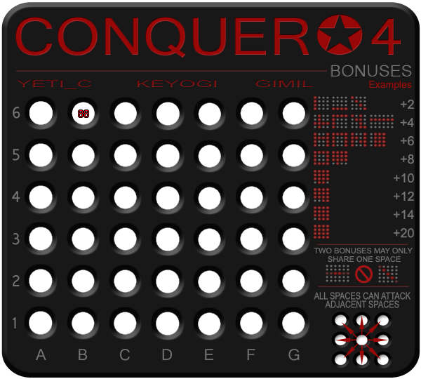
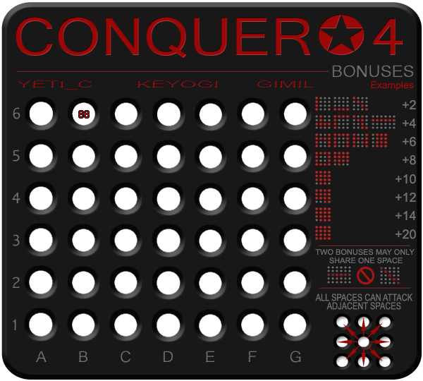
1. The dimensionals appear to be clashing with each other....the outside bevel moves north-west, and the buttons bevel moves south-east...can you experiment to see if they would look better moving in the same direction, or at least so that the lighter edge of the bevel sits in the same corner/orientation.
2. the legend and names is very spaced out across the top, whereas the bonus area is very squashed. can you see if that be amended to perhaps give the bonus area some more space.
3. move the attack diagram down so that the bottom of that is in line with the bottom of the alpha characters.
4. can you move the buttons a little closer to each other horizontally so that there is some more space between the last colums of buttons and the bonus area.i.e. some more eye space.
5. the reds in the bonus area are all legible now, great.
looking good gimil.


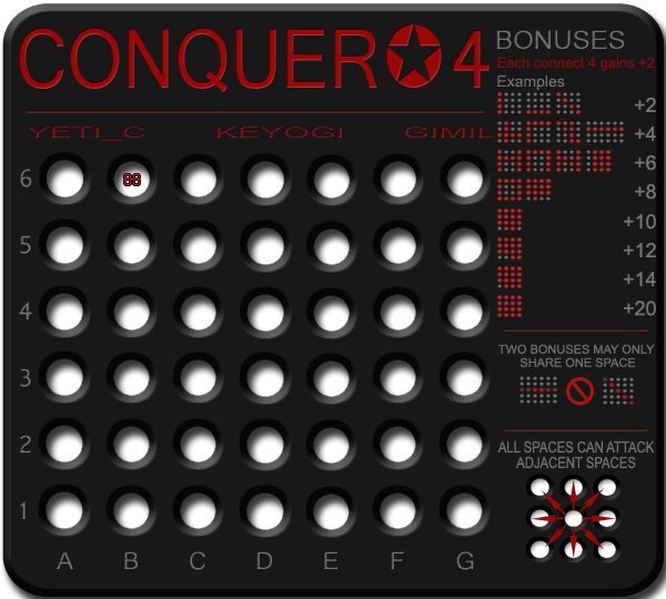
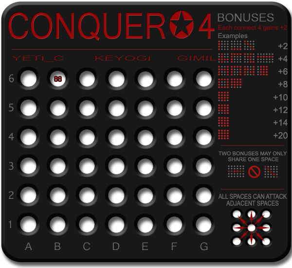
1. The bevel effect in the background is correct and all done in the one layer. The black shape has the holes cut in it that is why they hwat white at different orientations.
2. + 3. I will move the attack directions down and space out the rest of the legends acordingly.
4. Seems like alot of leg work for little gain. I keep it on the back burner if I need the space later on. Sorry cairns but its to much work for the sake of a little eye space :)
5. Excellent.
What do you know about map making, bitch?

natty_dread wrote:I was wrong


Top Score:2403
User avatar
Corporal 1st Class gimil
 
Posts: 8599
Joined: Sat Mar 03, 2007 12:42 pm
Location: United Kingdom (Scotland)

Re: Conquer 4. Page 1 + 2

Postby gimil on Thu May 15, 2008 5:08 pm

cairnswk wrote:
jarrett155 wrote:What is the point in the +20 bonus?
Wouldnt you have won by then?

i don't think so. The bonus is only for a 4 x 4 square. I could be wrong, but i think it probably would be possible to still have players on the board even if you only conquer a 4 x 4 square.

Perhaps the +20 is a little high, given that you get +14 for 15 places.
How about +16 for 16 places?


The problem is the 4 in a row can come in any shape and size across the board. THe ones in the ledgends are jsut examples of bonues. We can tweek bonuses without creating a stupid amount of hard work for yeti to code.
What do you know about map making, bitch?

natty_dread wrote:I was wrong


Top Score:2403
User avatar
Corporal 1st Class gimil
 
Posts: 8599
Joined: Sat Mar 03, 2007 12:42 pm
Location: United Kingdom (Scotland)

Re: Conquer 4. Page 1 + 2

Postby gimil on Thu May 15, 2008 5:09 pm

Image

Here carins next block of concerns :)
What do you know about map making, bitch?

natty_dread wrote:I was wrong


Top Score:2403
User avatar
Corporal 1st Class gimil
 
Posts: 8599
Joined: Sat Mar 03, 2007 12:42 pm
Location: United Kingdom (Scotland)

Re: Conquer 4. Page 1 + 2

Postby ZeakCytho on Thu May 15, 2008 5:11 pm

I feel like the title and the numbers/letters for the grid should either be beveled or embossed (whichever looks better). Not a lot, but just a touch.
User avatar
Captain ZeakCytho
 
Posts: 1251
Joined: Wed Sep 12, 2007 4:36 pm

Re: Conquer 4. Page 1 + 2

Postby gimil on Thu May 15, 2008 5:12 pm

ZeakCytho wrote:I feel like the title and the numbers/letters for the grid should either be beveled or embossed (whichever looks better). Not a lot, but just a touch.


The title is beveled althought its not as noticeable with the new color. I look into it right nowe :)
What do you know about map making, bitch?

natty_dread wrote:I was wrong


Top Score:2403
User avatar
Corporal 1st Class gimil
 
Posts: 8599
Joined: Sat Mar 03, 2007 12:42 pm
Location: United Kingdom (Scotland)

Re: Conquer 4. Page 1 + 2

Postby gimil on Thu May 15, 2008 5:19 pm

Image

Any better with the bevel?
What do you know about map making, bitch?

natty_dread wrote:I was wrong


Top Score:2403
User avatar
Corporal 1st Class gimil
 
Posts: 8599
Joined: Sat Mar 03, 2007 12:42 pm
Location: United Kingdom (Scotland)

Re: Conquer 4. Page 1 + 3

Postby ZeakCytho on Thu May 15, 2008 5:20 pm

Better, but I think it could still be a bit stronger.
User avatar
Captain ZeakCytho
 
Posts: 1251
Joined: Wed Sep 12, 2007 4:36 pm

Re: Conquer 4. Page 1 + 3

Postby gimil on Thu May 15, 2008 6:45 pm

ZeakCytho wrote:Better, but I think it could still be a bit stronger.


its such a thin font if I do much more it wont work.
What do you know about map making, bitch?

natty_dread wrote:I was wrong


Top Score:2403
User avatar
Corporal 1st Class gimil
 
Posts: 8599
Joined: Sat Mar 03, 2007 12:42 pm
Location: United Kingdom (Scotland)

Re: Conquer 4. Page 1 + 3

Postby Ethitts on Thu May 15, 2008 7:16 pm

This looks like a pretty interesting/fun map to play. Keep it up, I look forward to giving it a go
User avatar
Major Ethitts
 
Posts: 220
Joined: Tue Jul 03, 2007 3:53 am

Re: Conquer 4. Page 1 + 3

Postby ZeakCytho on Thu May 15, 2008 7:23 pm

gimil wrote:
ZeakCytho wrote:Better, but I think it could still be a bit stronger.


its such a thin font if I do much more it wont work.


The title font is thin? It looks thick to me; or, at least, it's thick at the size used in the title.

I feel like the title should either be raised out above the "board" or etched into it, like words on a real plastic or metal game board would be, rather than just written on, as one could do on a board with a paper surface.

But, if you say that it looks bad with more bevel, then I'll defer to your judgment.

Did you try embossing it yet? Maybe a sunken/etched look will work better than a raised one.
User avatar
Captain ZeakCytho
 
Posts: 1251
Joined: Wed Sep 12, 2007 4:36 pm

Re: Conquer 4. Page 1 + 3

Postby gimil on Thu May 15, 2008 7:49 pm

ZeakCytho wrote:
gimil wrote:
ZeakCytho wrote:Better, but I think it could still be a bit stronger.


its such a thin font if I do much more it wont work.


The title font is thin? It looks thick to me; or, at least, it's thick at the size used in the title.

I feel like the title should either be raised out above the "board" or etched into it, like words on a real plastic or metal game board would be, rather than just written on, as one could do on a board with a paper surface.

But, if you say that it looks bad with more bevel, then I'll defer to your judgment.

Did you try embossing it yet? Maybe a sunken/etched look will work better than a raised one.


The etched look is what im going for. I have it beveled down at the moment. I can try a little more on the title I was meaning that I cant do much more with the terr names etc
What do you know about map making, bitch?

natty_dread wrote:I was wrong


Top Score:2403
User avatar
Corporal 1st Class gimil
 
Posts: 8599
Joined: Sat Mar 03, 2007 12:42 pm
Location: United Kingdom (Scotland)

Re: Conquer 4. Page 1 + 2

Postby yeti_c on Fri May 16, 2008 8:23 am

This needs to be on the map somewhere...

yeti_c wrote:I think we need to have "Each Line +2" or similar somewhere...

C.


Else the entire map doesn't make sense.

C.
Image
Highest score : 2297
User avatar
Lieutenant yeti_c
 
Posts: 9624
Joined: Thu Jan 04, 2007 9:02 am

Re: Conquer 4. Page 1 + 2

Postby cairnswk on Fri May 16, 2008 1:19 pm

gimil wrote:4. Seems like alot of leg work for little gain. I keep it on the back burner if I need the space later on. Sorry cairns but its to much work for the sake of a little eye space :)

Mmmm...that's exactly what design work is all about gimil...a lot of work for sometimes little gain, but the end overall effect is worth it.
Happy that you'll keep it on the backburner but i think that the bonus column needs to run the entire right side of the board and the title can be constricted to 3/4s of the board. Only my opinion. ;) Your map however, you do what you want.
Image
* Pearl Harbour * Waterloo * Forbidden City * Jamaica * Pot Mosbi
User avatar
Private cairnswk
 
Posts: 11510
Joined: Sat Feb 03, 2007 8:32 pm
Location: Australia

Re: Conquer 4. Page 1 + 2

Postby gimil on Fri May 16, 2008 1:37 pm

cairnswk wrote:
gimil wrote:4. Seems like alot of leg work for little gain. I keep it on the back burner if I need the space later on. Sorry cairns but its to much work for the sake of a little eye space :)

Mmmm...that's exactly what design work is all about gimil...a lot of work for sometimes little gain, but the end overall effect is worth it.
Happy that you'll keep it on the backburner but i think that the bonus column needs to run the entire right side of the board and the title can be constricted to 3/4s of the board. Only my opinion. ;) Your map however, you do what you want.


Im happy to shift about the title area for more space for the legends thou, rather than the buttons :)
What do you know about map making, bitch?

natty_dread wrote:I was wrong


Top Score:2403
User avatar
Corporal 1st Class gimil
 
Posts: 8599
Joined: Sat Mar 03, 2007 12:42 pm
Location: United Kingdom (Scotland)

Re: Conquer 4. Page 1 + 2

Postby zimmah on Fri May 16, 2008 1:51 pm

gimil wrote:Image

Any better with the bevel?


sorry to say but, the white in black is pretty much hurting my eyes.

nice map though
Click image to enlarge.
image
User avatar
Major zimmah
 
Posts: 1652
Joined: Fri Jun 01, 2007 12:43 pm
Location: VDLL

Re: Conquer 4. Page 1 + 2

Postby yeti_c on Fri May 16, 2008 2:16 pm

gimil wrote:
cairnswk wrote:
gimil wrote:4. Seems like alot of leg work for little gain. I keep it on the back burner if I need the space later on. Sorry cairns but its to much work for the sake of a little eye space :)

Mmmm...that's exactly what design work is all about gimil...a lot of work for sometimes little gain, but the end overall effect is worth it.
Happy that you'll keep it on the backburner but i think that the bonus column needs to run the entire right side of the board and the title can be constricted to 3/4s of the board. Only my opinion. ;) Your map however, you do what you want.


Im happy to shift about the title area for more space for the legends thou, rather than the buttons :)


Am I being really dim - but can either of you two explain what the hell you mean by "buttons"?!

C.
Image
Highest score : 2297
User avatar
Lieutenant yeti_c
 
Posts: 9624
Joined: Thu Jan 04, 2007 9:02 am

Re: Conquer 4. Page 1 + 2

Postby ZeakCytho on Fri May 16, 2008 2:23 pm

yeti_c wrote:Am I being really dim - but can either of you two explain what the hell you mean by "buttons"?!

C.


I think they mean the army circles. And I agree that the white is in stark contrast. What if you put a CC star, with very low opacity, in each circle? The center of the star could hold the number, and the rest of it would act as a buffer from the main color to the white. If not a star, then some other design could work.
User avatar
Captain ZeakCytho
 
Posts: 1251
Joined: Wed Sep 12, 2007 4:36 pm

Re: Conquer 4. Page 1 + 2

Postby gimil on Fri May 16, 2008 3:29 pm

yeti_c wrote:
gimil wrote:
cairnswk wrote:
gimil wrote:4. Seems like alot of leg work for little gain. I keep it on the back burner if I need the space later on. Sorry cairns but its to much work for the sake of a little eye space :)

Mmmm...that's exactly what design work is all about gimil...a lot of work for sometimes little gain, but the end overall effect is worth it.
Happy that you'll keep it on the backburner but i think that the bonus column needs to run the entire right side of the board and the title can be constricted to 3/4s of the board. Only my opinion. ;) Your map however, you do what you want.


Im happy to shift about the title area for more space for the legends thou, rather than the buttons :)


Am I being really dim - but can either of you two explain what the hell you mean by "buttons"?!

C.


its not a button sorry its suppose to be a hole. The image is a trasnaprent background PNG, so the holes are transparent not white. I could maybe use so drop shadow to break up the color a little?
What do you know about map making, bitch?

natty_dread wrote:I was wrong


Top Score:2403
User avatar
Corporal 1st Class gimil
 
Posts: 8599
Joined: Sat Mar 03, 2007 12:42 pm
Location: United Kingdom (Scotland)

Re: Conquer 4. Page 1 + 3

Postby gimil on Fri May 16, 2008 3:45 pm

Image

Here some changes with the legends added in that bonus line for yeti and a little drop shadow to the background.

Note: this is a quick update nothing properly aligned in the legends.
What do you know about map making, bitch?

natty_dread wrote:I was wrong


Top Score:2403
User avatar
Corporal 1st Class gimil
 
Posts: 8599
Joined: Sat Mar 03, 2007 12:42 pm
Location: United Kingdom (Scotland)

Re: Conquer 4. Page 1 + 3

Postby Kaplowitz on Fri May 16, 2008 3:47 pm

i think they look more like buttons now
Image
User avatar
Private 1st Class Kaplowitz
 
Posts: 3088
Joined: Tue May 01, 2007 5:11 pm

Re: Conquer 4. Page 1 + 3

Postby ZeakCytho on Fri May 16, 2008 3:56 pm

I like the drop shadow, but I think it's too strong.

See my earlier comment on adding an image to each button/hole/whatever, also.
User avatar
Captain ZeakCytho
 
Posts: 1251
Joined: Wed Sep 12, 2007 4:36 pm

Re: Conquer 4. Page 1 + 3

Postby yeti_c on Fri May 16, 2008 4:00 pm

Kaplowitz wrote:i think they look more like buttons now


Disagree with that - they quite obviously go into the screen - look at the shadow man!

C.
Image
Highest score : 2297
User avatar
Lieutenant yeti_c
 
Posts: 9624
Joined: Thu Jan 04, 2007 9:02 am

Re: Conquer 4. Page 1 + 3

Postby gimil on Fri May 16, 2008 4:15 pm

ZeakCytho wrote:I like the drop shadow, but I think it's too strong.

See my earlier comment on adding an image to each button/hole/whatever, also.


I dont think adding a shape to the the circles is such a great idea. Keeping this image as simple as possible. The simplier the better I think in this case :)
What do you know about map making, bitch?

natty_dread wrote:I was wrong


Top Score:2403
User avatar
Corporal 1st Class gimil
 
Posts: 8599
Joined: Sat Mar 03, 2007 12:42 pm
Location: United Kingdom (Scotland)

Re: Conquer 4. Page 1 + 4

Postby gimil on Fri May 16, 2008 4:22 pm

Image

Edited the drop shadow
What do you know about map making, bitch?

natty_dread wrote:I was wrong


Top Score:2403
User avatar
Corporal 1st Class gimil
 
Posts: 8599
Joined: Sat Mar 03, 2007 12:42 pm
Location: United Kingdom (Scotland)

Re: Conquer 4. Page 1 + 4

Postby cicero on Fri May 16, 2008 4:45 pm

Excuse me jumping late (and admitting I've not read much yet) ...

Having called the map "Conquer*4" ... surely the key should read "each Conquer 4 gains +2" or "each line of 4" ... rather than confusing the issue with "connect 4" ?

"line of 4" = 9 chars, "connect 4" = 9 chars - so no space problem.

Space wise the right edge of the board looks a little cramped where it meets the legend ...

Love & 2cents

Cicero
FREE M-E-Mbership and simple rules. Conquer Club - it's not complicated.

random me statistic @ 13 December 2008 - 1336 posts : 232nd most public posts (not counting Tower of Babble) of all time.
User avatar
Sergeant cicero
 
Posts: 1358
Joined: Wed Mar 07, 2007 1:51 pm
Location: with the infected neutrals ... handing out maps to help them find their way to CC

PreviousNext

Return to The Atlas

Who is online

Users browsing this forum: No registered users