Feudal Epic, L&S, Pg. 49 [D, Gp, Gr]
Moderator: Cartographers
Re: Feudal Epic, L&S, Pg. 45 [D, Gp, Gr]
![]() by gimil on Sun Dec 06, 2009 3:59 pm
by gimil on Sun Dec 06, 2009 3:59 pm
I think we are done 
What do you know about map making, bitch?
Top Score:2403
natty_dread wrote:I was wrong
Top Score:2403
-

 gimil
gimil
- Posts: 8599
- Joined: Sat Mar 03, 2007 12:42 pm
- Location: United Kingdom (Scotland)


Re: Feudal Epic, L&S, Pg. 45 [D, Gp, Gr]
![]() by thenobodies80 on Sun Dec 06, 2009 7:54 pm
by thenobodies80 on Sun Dec 06, 2009 7:54 pm
all the coordinates are ok with 88 and 888.
There's another problem with the xml, maybe it happened when you've changed the names... anyway:
Ga'h 7 on the map is Ga'h 6 in the xml
Ga'h 6 on the map is Ga'h 7 in the xml
After that recheck the borders, i strongly recommend another check by Forza.
Nobodies
There's another problem with the xml, maybe it happened when you've changed the names... anyway:
Ga'h 7 on the map is Ga'h 6 in the xml
Ga'h 6 on the map is Ga'h 7 in the xml
After that recheck the borders, i strongly recommend another check by Forza.
Nobodies
-

thenobodies80
- Posts: 5400
- Joined: Wed Sep 05, 2007 4:30 am
- Location: Milan


Re: Feudal Epic, L&S, Pg. 45 [D, Gp, Gr]
![]() by the.killing.44 on Sun Dec 06, 2009 8:00 pm
by the.killing.44 on Sun Dec 06, 2009 8:00 pm
If you remember, I was the one who fixed the 7 - 8 - 7 issue with a flat image. So, when gim fixed the size issues, his images retained the 7 - 8 - 7 issue. That's an issue with the images. So, for your reference gim:

-

the.killing.44
- Posts: 4724
- Joined: Thu Oct 23, 2008 7:43 pm
- Location: now tell me what got two gums and knows how to spit rhymes


Re: Feudal Epic, L&S, Pg. 45 [D, Gp, Gr]
![]() by yeti_c on Mon Dec 07, 2009 3:12 am
by yeti_c on Mon Dec 07, 2009 3:12 am
Surely 8 & 6 should be swapped though - not 7 & 6?
C.
C.

Highest score : 2297
-

yeti_c
- Posts: 9624
- Joined: Thu Jan 04, 2007 9:02 am


Re: Feudal Epic, L&S, Pg. 45 [D, Gp, Gr]
![]() by gimil on Mon Dec 07, 2009 5:26 am
by gimil on Mon Dec 07, 2009 5:26 am
ok, so which numbers should I be changing?
What do you know about map making, bitch?
Top Score:2403
natty_dread wrote:I was wrong
Top Score:2403
-
gimil
- Posts: 8599
- Joined: Sat Mar 03, 2007 12:42 pm
- Location: United Kingdom (Scotland)
Re: Feudal Epic, L&S, Pg. 45 [D, Gp, Gr]
![]() by yeti_c on Mon Dec 07, 2009 11:00 am
by yeti_c on Mon Dec 07, 2009 11:00 am
No...
8 -> 6
7 -> 8
6 -> 7
Correct
Wrong
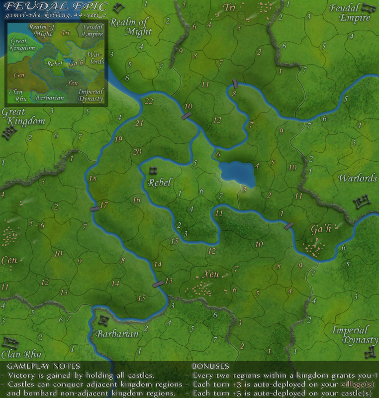
C,
8 -> 6
7 -> 8
6 -> 7
Correct
Wrong
C,
Highest score : 2297
-
yeti_c
- Posts: 9624
- Joined: Thu Jan 04, 2007 9:02 am
Re: Feudal Epic, L&S, Pg. 45 [D, Gp, Gr]
![]() by porkenbeans on Mon Dec 07, 2009 2:16 pm
by porkenbeans on Mon Dec 07, 2009 2:16 pm
- Click image to enlarge.

- Click image to enlarge.
- Click image to enlarge.

-

porkenbeans
- Posts: 2546
- Joined: Mon Sep 10, 2007 4:06 pm


Re: Feudal Epic, L&S, Pg. 45 [D, Gp, Gr]
![]() by the.killing.44 on Mon Dec 07, 2009 4:53 pm
by the.killing.44 on Mon Dec 07, 2009 4:53 pm
Enough with the "let's make it glaring" suggestions already, the map's done except for these numbers.
THESE ARE THE CORRECT NUMBERS GIM
I'll do the XML tonight.
THESE ARE THE CORRECT NUMBERS GIM
I'll do the XML tonight.
-
the.killing.44
- Posts: 4724
- Joined: Thu Oct 23, 2008 7:43 pm
- Location: now tell me what got two gums and knows how to spit rhymes
Re: Feudal Epic, L&S, Pg. 45 [D, Gp, Gr]
![]() by porkenbeans on Mon Dec 07, 2009 8:43 pm
by porkenbeans on Mon Dec 07, 2009 8:43 pm
Since your talking about numbers, please take a closer look and tell me which ones are more clear.
-
porkenbeans
- Posts: 2546
- Joined: Mon Sep 10, 2007 4:06 pm
Re: Feudal Epic, L&S, Pg. 45 [D, Gp, Gr]
![]() by the.killing.44 on Mon Dec 07, 2009 8:49 pm
by the.killing.44 on Mon Dec 07, 2009 8:49 pm
porkenbeans wrote:Since your talking about numbers, please take a closer look and tell me which ones are more clear.
We are talking about which numbers go where to avoid any dropdown confusion. Please do not make me quote the times gim said that he was done editing the image except for official or gameplay issues.
-
the.killing.44
- Posts: 4724
- Joined: Thu Oct 23, 2008 7:43 pm
- Location: now tell me what got two gums and knows how to spit rhymes
Re: Feudal Epic, L&S, Pg. 45 [D, Gp, Gr]
![]() by porkenbeans on Mon Dec 07, 2009 10:06 pm
by porkenbeans on Mon Dec 07, 2009 10:06 pm
Please do not make me tell you that I am a member of the Foundry, and I am allowed my opinions and suggestions. gimil can do what he wishes, but i can make my suggestions, without your harassment. He does not have to take my advice, but he does have to listen to it, and provide a good reason for his decision. ...Just like the rest of us.the.killing.44 wrote:porkenbeans wrote:Since your talking about numbers, please take a closer look and tell me which ones are more clear.
We are talking about which numbers go where to avoid any dropdown confusion. Please do not make me quote the times gim said that he was done editing the image except for official or gameplay issues.
In my opinion either one of the two examples that I put up are clearly better than the current version. They are both easier to read, and therefore deserve consideration. If you can not see that, or disagree, then please state your case. Do not try to hinder me from stating mine.
I understand and appreciate your loyalty to gimil and this project. But I have also been following this project for a while. I have contributed to it, and I will continue to offer my suggestions, if I truly think that I can help to improve this kick-ass map. I do truly believe that these minor adjustments, are just what this map needs to put it over the top. I have learned a lot lately about how the Foundry works. I have had it beaten into my head, and I now know that I have to "listen" to others suggestions. Just as they have to listen to mine. If you would stop for just a moment, and try to understand that I have a lot to offer, and I am only trying to be a part of the team, You might decide to cut me some slack, and "listen" to what I have to say.
Last edited by porkenbeans on Tue Dec 08, 2009 5:23 am, edited 3 times in total.
-
porkenbeans
- Posts: 2546
- Joined: Mon Sep 10, 2007 4:06 pm
Re: Feudal Epic, L&S, Pg. 45 [D, Gp, Gr]
![]() by angola on Mon Dec 07, 2009 11:24 pm
by angola on Mon Dec 07, 2009 11:24 pm
porkenbeans wrote:Please do not make me tell you that I am a member of the Foundry, and I am allowed my opinions and suggestions. gimil can do what he wishes, but i can make my suggestions, without your harassment. He does not have to take my advise, but he does have to listen to it, and provide a good reason for his decision. ...Just like the rest of us.the.killing.44 wrote:porkenbeans wrote:Since your talking about numbers, please take a closer look and tell me which ones are more clear.
We are talking about which numbers go where to avoid any dropdown confusion. Please do not make me quote the times gim said that he was done editing the image except for official or gameplay issues.
In my opinion either one of the two examples that I put up are clearly better than the current version. If you can not see that, or disagree, then please state your case. Do not try to hinder me from stating mine.
You could spell advice right. Or know that "drop down" is two words. Oh, and "game play" is, as well.
And, since I am a member of the foundry, I'm allowed to be a dick like you. Awesome!
Good job killer. Good job gimil.
Hopefully this map can get off the floor. It looks beautiful.
-
angola
- Posts: 2076
- Joined: Tue May 27, 2008 12:56 pm
- Location: Washington state


Re: Feudal Epic, L&S, Pg. 45 [D, Gp, Gr]
![]() by jammyjames on Tue Dec 08, 2009 4:58 am
by jammyjames on Tue Dec 08, 2009 4:58 am
yeti_c wrote:No...
8 -> 6
7 -> 8
6 -> 7
Correct
Wrong
C,
my bad
glad your here yeti

-
jammyjames
- Posts: 1394
- Joined: Tue May 06, 2008 3:17 am


Re: Feudal Epic, L&S, Pg. 45 [D, Gp, Gr]
![]() by Bruceswar on Tue Dec 08, 2009 5:37 am
by Bruceswar on Tue Dec 08, 2009 5:37 am
While the brighter images might be a tad easier to read, this is ready for play sans the 1 or 2 small issues. Lets leave as is, get it fixed and out to play. 
Highest Rank: 26 Highest Score: 3480

-

Bruceswar
- Posts: 9713
- Joined: Sun Dec 23, 2007 12:36 am
- Location: Cow Pastures


Re: Feudal Epic, L&S, Pg. 45 [D, Gp, Gr]
![]() by Incandenza on Tue Dec 08, 2009 9:43 am
by Incandenza on Tue Dec 08, 2009 9:43 am
Sorry, guys, but pork's got a point. I know it's late in the process, but the terit number labels could be a bit larger and brighter. I don't think the map itself needs to be brighter, but, for instance, the 4's look a lot like 1's, especially Cen 4.
For lack of a more flattering way of putting it, it won't be the prettiest map on CC no matter what (but neither is feudal, which proves that killer gameplay is the true arbiter of map popularity), so why not make the terit number labels a bit bigger and, well, shinier?
For lack of a more flattering way of putting it, it won't be the prettiest map on CC no matter what (but neither is feudal, which proves that killer gameplay is the true arbiter of map popularity), so why not make the terit number labels a bit bigger and, well, shinier?
THOTA: dingdingdingdingdingdingBOOM
Te Occidere Possunt Sed Te Edere Non Possunt Nefas Est
Te Occidere Possunt Sed Te Edere Non Possunt Nefas Est
-

Incandenza
- Posts: 4949
- Joined: Thu Oct 19, 2006 5:34 pm
- Location: Playing Eschaton with a bucket of old tennis balls


Re: Feudal Epic, L&S, Pg. 45 [D, Gp, Gr]
![]() by danryan on Tue Dec 08, 2009 2:04 pm
by danryan on Tue Dec 08, 2009 2:04 pm
Second Incandenza's post. Regardless of the way the point was made, the "brighter" map is much easier to read. Please consider using something like the lettering from the "brighter" version.
-
danryan
- Posts: 3418
- Joined: Tue Jan 09, 2007 8:30 pm


Re: Feudal Epic, L&S, Pg. 45 [D, Gp, Gr]
![]() by yeti_c on Tue Dec 08, 2009 2:20 pm
by yeti_c on Tue Dec 08, 2009 2:20 pm
Are you comparing the correct images - I think Gimils is perfectly clear - Killings version is older and less visible...
C.
C.
Highest score : 2297
-
yeti_c
- Posts: 9624
- Joined: Thu Jan 04, 2007 9:02 am
Re: Feudal Epic, L&S, Pg. 45 [D, Gp, Gr]
![]() by porkenbeans on Tue Dec 08, 2009 2:59 pm
by porkenbeans on Tue Dec 08, 2009 2:59 pm
I do not think that it is really a case of enlarging the text. It is only a very small adjustment on the contrast, saturation, brightness, etc. settings. The most critical in this case, is the contrast settings. If you look at the current version, you will notice that all of the colors in the map are the same tonal value. this makes for a "muddy" looking canvas. Take note of the boundary lines. They are not contrasted against the background at all, and the text is muddy and hard to read. At first I thought that the map was just too dark, but after I got it to the editing room at photobucket, I realized that this was not the case at all. If you notice the darker of the two examples that I provided, you will see that it has more darkness in it than the current version. Just check out the boundaries. But it also has some lighter tones in it as well. This variation in tonal value is what "contrast" is all about. It helps to distinguish one thing from another.danryan wrote:Second Incandenza's post. Regardless of the way the point was made, the "brighter" map is much easier to read. Please consider using something like the lettering from the "brighter" version.
This is a very nice map. It is only in need of some fine tuning. It is NOT some big overhaul or something. Please check out photobucket's editing room. They make the fine tuning a piece of cake. You can quickly and easily knock out 2 or 3 versions, and then post them. Then you could have the input of many eyes to help you decide which one is the best.
-
porkenbeans
- Posts: 2546
- Joined: Mon Sep 10, 2007 4:06 pm
Re: Feudal Epic, L&S, Pg. 45 [D, Gp, Gr]
![]() by yeti_c on Tue Dec 08, 2009 3:25 pm
by yeti_c on Tue Dec 08, 2009 3:25 pm
On a different note - Porks last image actually brings out some of the finer details a lot more...
One other thing to consider though is how the actual army numbers look on the images as well...
Sometimes changing the contrast etc can make some numbers less visible...
C.
One other thing to consider though is how the actual army numbers look on the images as well...
Sometimes changing the contrast etc can make some numbers less visible...
C.
Highest score : 2297
-
yeti_c
- Posts: 9624
- Joined: Thu Jan 04, 2007 9:02 am
Re: Feudal Epic, L&S, Pg. 45 [D, Gp, Gr]
![]() by MrBenn on Tue Dec 08, 2009 4:50 pm
by MrBenn on Tue Dec 08, 2009 4:50 pm
I'm a little bit confused, and don;t really know which are the latest images, and which ones are right 


PB: 2661 | He's blue... If he were green he would die | No mod would be stupid enough to do that
-

MrBenn
- Posts: 6880
- Joined: Wed Nov 21, 2007 9:32 am
- Location: Off Duty


Re: Feudal Epic, L&S, Pg. 45 [D, Gp, Gr]
![]() by porkenbeans on Tue Dec 08, 2009 5:35 pm
by porkenbeans on Tue Dec 08, 2009 5:35 pm
Yes, those finer details are exactly what I am talking about. It is also very true that the saturated army numbers will stand out more on a mono-tone, drab, and muddy canvas. Ironically this is due to contrast as well. This map does not have a whole lot of bright colors going on, that it should be any problem though. The adjustments that I made were very slight, and will not produce any problems with the army numbers.yeti_c wrote:On a different note - Porks last image actually brings out some of the finer details a lot more...
One other thing to consider though is how the actual army numbers look on the images as well...
Sometimes changing the contrast etc can make some numbers less visible...
C.
It's all about the fine tuning. This is a perfectly good map, and it only needs to be fine tuned. This is NOT something that needs to cause any hold up in rolling this puppy out. It is only a matter of a few moments spent, dialing it in.
-
porkenbeans
- Posts: 2546
- Joined: Mon Sep 10, 2007 4:06 pm
Re: Feudal Epic, L&S, Pg. 45 [D, Gp, Gr]
![]() by Jace22 on Tue Dec 08, 2009 11:59 pm
by Jace22 on Tue Dec 08, 2009 11:59 pm
porkenbeans wrote:Yes, those finer details are exactly what I am talking about. It is also very true that the saturated army numbers will stand out more on a mono-tone, drab, and muddy canvas. Ironically this is due to contrast as well. This map does not have a whole lot of bright colors going on, that it should be any problem though. The adjustments that I made were very slight, and will not produce any problems with the army numbers.yeti_c wrote:On a different note - Porks last image actually brings out some of the finer details a lot more...
One other thing to consider though is how the actual army numbers look on the images as well...
Sometimes changing the contrast etc can make some numbers less visible...
C.
It's all about the fine tuning. This is a perfectly good map, and it only needs to be fine tuned. This is NOT something that needs to cause any hold up in rolling this puppy out. It is only a matter of a few moments spent, dialing it in.
I'm sure it's a bit more complicated than that
-

Jace22
- Posts: 401
- Joined: Sat Mar 14, 2009 7:02 pm
- Location: Hamilton, Ontario


Re: Feudal Epic, L&S, Pg. 45 [D, Gp, Gr]
![]() by porkenbeans on Wed Dec 09, 2009 12:53 am
by porkenbeans on Wed Dec 09, 2009 12:53 am
I spent no more than 5 or 6 min. to make the two examples that I posted.Jace22 wrote:porkenbeans wrote:Yes, those finer details are exactly what I am talking about. It is also very true that the saturated army numbers will stand out more on a mono-tone, drab, and muddy canvas. Ironically this is due to contrast as well. This map does not have a whole lot of bright colors going on, that it should be any problem though. The adjustments that I made were very slight, and will not produce any problems with the army numbers.yeti_c wrote:On a different note - Porks last image actually brings out some of the finer details a lot more...
One other thing to consider though is how the actual army numbers look on the images as well...
Sometimes changing the contrast etc can make some numbers less visible...
C.
It's all about the fine tuning. This is a perfectly good map, and it only needs to be fine tuned. This is NOT something that needs to cause any hold up in rolling this puppy out. It is only a matter of a few moments spent, dialing it in.
I'm sure it's a bit more complicated than that
-
porkenbeans
- Posts: 2546
- Joined: Mon Sep 10, 2007 4:06 pm
Re: Feudal Epic, L&S, Pg. 45 [D, Gp, Gr]
![]() by Jace22 on Wed Dec 09, 2009 2:23 am
by Jace22 on Wed Dec 09, 2009 2:23 am
porkenbeans wrote:I spent no more than 5 or 6 min. to make the two examples that I posted.Jace22 wrote:porkenbeans wrote:Yes, those finer details are exactly what I am talking about. It is also very true that the saturated army numbers will stand out more on a mono-tone, drab, and muddy canvas. Ironically this is due to contrast as well. This map does not have a whole lot of bright colors going on, that it should be any problem though. The adjustments that I made were very slight, and will not produce any problems with the army numbers.yeti_c wrote:On a different note - Porks last image actually brings out some of the finer details a lot more...
One other thing to consider though is how the actual army numbers look on the images as well...
Sometimes changing the contrast etc can make some numbers less visible...
C.
It's all about the fine tuning. This is a perfectly good map, and it only needs to be fine tuned. This is NOT something that needs to cause any hold up in rolling this puppy out. It is only a matter of a few moments spent, dialing it in.
I'm sure it's a bit more complicated than that
I would say that yours is easier to read, but it is up to gim
-
Jace22
- Posts: 401
- Joined: Sat Mar 14, 2009 7:02 pm
- Location: Hamilton, Ontario
Who is online
Users browsing this forum: No registered users
|
|||||||
| Conquer Club is not associated with RISK online in any way. Copyright © 2006-2024 by Big Wham LLC | |||||||