Italy [Quenched]
Moderator: Cartographers


![]() by RjBeals on Wed Feb 21, 2007 2:03 pm
by RjBeals on Wed Feb 21, 2007 2:03 pm

1) I prefer this water, so I made a executive decision
2) Removed the shaded circles. Seeing all the recent discussion, I started looking more closely at them, and realized I much prefer the map w/out them.
3) Added testing numbers (not XML) to see how the colors looked - I had to adjust some colors in order for the numbers to show up better.
4) Adjusted some borders so numbers would fit "in" the countries. Didn't like to do this as I would prefer to keep the borders as realistic as possible, but since I have city bonuses, the borders are no where near to scale, so I figured it wouldn't hurt to make them even better in order to improve the map.
5) Very slightly changed waterway lines.
----------------------
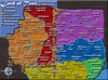
Countries: 36
Color Countries Borders Bonus
Green 7 2 3
Orange 5 2 2
Pink 10 6 5
Purple 8 5 4
Yellow 6 3 4
Comments?

-

 RjBeals
- Posts: 2506
- Joined: Mon Nov 20, 2006 5:17 pm
- Location: South Carolina, USA


![]() by Enigma on Thu Feb 22, 2007 11:00 pm
by Enigma on Thu Feb 22, 2007 11:00 pm
water looks great, wasnt my favorite but is probably better, all things considered.
could you:
-move some of the territory names slightly farther away from the borders, like roma and lazio, so the fuzziness from the labels doesnt affect the border lines?
-make the capitol city colours slightly darker, especially venezia?
-and this isnt very important, but maybe make the flag a little less bold, to fit better with the rest of the colour scheme
i love the unique look of this map- cant wait to play it!
Do you need an excuse to have a war? I mean, who for? Can't you just say "You got lots of cash and land, but I've got a big sword, so divy up right now, chop chop."
Terry Pratchet
Terry Pratchet
-

Enigma
- Posts: 367
- Joined: Mon Jul 03, 2006 10:23 pm
- Location: Classified


![]() by Bad Speler on Thu Feb 22, 2007 11:22 pm
by Bad Speler on Thu Feb 22, 2007 11:22 pm
Three points
- The word Bonus is a bit hard to read when it gets to the white part of the flag.
- The number on Napoli is a bit hard to read for me, try lightening that city a bit.
- For me, Venezia doesnt stand out enough in its continent, try darkening that city a bit.
edit: 1 more point I just noticed, see if you could move the number for Eolie islands a bit so it doesnt cover te sea route.
Last edited by Bad Speler on Thu Feb 22, 2007 11:25 pm, edited 1 time in total.
Highest Score: 2532
Highest Position: 69 (a long time ago)
Highest Position: 69 (a long time ago)
-

Bad Speler
- Posts: 1027
- Joined: Fri Jun 02, 2006 8:16 pm
- Location: Ottawa


![]() by Sargentgeneral on Thu Feb 22, 2007 11:25 pm
by Sargentgeneral on Thu Feb 22, 2007 11:25 pm
there is no way that purple and yellow should have the same bonus. yellow only has to guard 3 boarders while purple has to guard 5! Yellow has 6 countries while purple has 8! 4 countries can attack yellow while 6 can attack purple. i think you could bump yellow down easily to 3 and bump purple up to 5.
Highest score: 1910
Highest rank: 188
Battle of the bands #1 champion: ACDC
Highest rank: 188
Battle of the bands #1 champion: ACDC
-

Sargentgeneral
- Posts: 379
- Joined: Thu Nov 16, 2006 11:55 pm
- Location: On Conquerclub, duh!


![]() by Ruben Cassar on Fri Feb 23, 2007 5:46 am
by Ruben Cassar on Fri Feb 23, 2007 5:46 am
Visually the only things that I do not like are:
1. The font used for Italia. The fact that the small l is bigger than the capital I makes it look a bit weird in my opinion. Can you provide some alternatives maybe?
2. Venezia...I agree with the point made before by someone else. It needs darkening a bit as it does not stand out enough.
Apart from that everything looks fine.
Edit: Maybe the outer lines of the word bonus could be made slightly thicker so that it is clearer on the white stripe of the flag.


-

Ruben Cassar
- Posts: 2160
- Joined: Thu Nov 16, 2006 6:04 am
- Location: Civitas Invicta, Melita, Evropa


![]() by Molacole on Fri Feb 23, 2007 9:58 am
by Molacole on Fri Feb 23, 2007 9:58 am
isole and centro bonus are very unbalanced.
3 borders for a +4 is kind of easy to hold. Plus makes getting roma for a bonus of 5 with 4 borders very easy to accomplish.
6 borders for a 5 is way too hard to hold. It's smack dab right in the middle of the map so it's going to be a nuetral territory not worth fighting over for 5 points.
any chance you could make those sea ports instead of bridges that don't reach the other side?
-

Molacole
- Posts: 552
- Joined: Fri Jun 23, 2006 8:19 am
- Location: W 2.0 map by ZIM

![]() by Bad Speler on Fri Feb 23, 2007 11:00 am
by Bad Speler on Fri Feb 23, 2007 11:00 am
I just noticed Centro has 7 borders to defend...consider upping the bonus a bit.
Highest Score: 2532
Highest Position: 69 (a long time ago)
Highest Position: 69 (a long time ago)
-
Bad Speler
- Posts: 1027
- Joined: Fri Jun 02, 2006 8:16 pm
- Location: Ottawa
![]() by RjBeals on Fri Feb 23, 2007 4:52 pm
by RjBeals on Fri Feb 23, 2007 4:52 pm

* Move some of the territory names slightly farther away from the borders, like roma and lazio, so the fuzziness from the labels doesnt affect the border lines?
* Make the capitol city colours slightly darker, especially venezia?
* Make the flag a little less bold, to fit better with the rest of the colour scheme.
* The word Bonus is a bit hard to read when it gets to the white part of the flag.
* The number on Napoli is a bit hard to read for me, try lightening that city a bit.
* Venezia doesnt stand out enough in its continent, try darkening that city a bit.
* Move the number for Eolie islands a bit so it doesnt cover te sea route.
* Bump yellow down easily to 3 and bump purple up to 5.
Changes:
1) Took "glow" off of country names.
2) Made country names white
3) Changed bonus armies
4) Adjusted colors / positions of some country names. I'm having troble with the dark purple & dark green city colors being too dark. So I made them lighter.
5) Provided some alternate title fonts.
Not Changed:
* Any chance you could make those sea ports instead of bridges that don't reach the other side? Not unless other people want it. I like how it is
* Maybe make San Marina also a capital/city/citta or whatever. I think the new bonus armies should take care of this request.
01
 02
02 03
03
04
 05
05 06
06
07

-
RjBeals
- Posts: 2506
- Joined: Mon Nov 20, 2006 5:17 pm
- Location: South Carolina, USA


![]() by Skittles! on Fri Feb 23, 2007 6:51 pm
by Skittles! on Fri Feb 23, 2007 6:51 pm
2 and 6. Nice map too, btw. I'm not sure about the white names though..
KraphtOne wrote:when you sign up a new account one of the check boxes should be "do you want to foe colton24 (it is highly recommended) "
-

Skittles!
- Posts: 14574
- Joined: Wed Jan 03, 2007 2:18 am


![]() by Guiscard on Fri Feb 23, 2007 7:00 pm
by Guiscard on Fri Feb 23, 2007 7:00 pm
2 and 5 equally. I'm not 100% sure about the white names, however.
Also, just wanted to compliment you on having one of the best couple of maps (graphically) in development at the moment.
Also, just wanted to compliment you on having one of the best couple of maps (graphically) in development at the moment.
qwert wrote:Can i ask you something?What is porpose for you to open these Political topic in ConquerClub? Why you mix politic with Risk? Why you not open topic like HOT AND SEXY,or something like that.
-

Guiscard
- Posts: 4103
- Joined: Fri Dec 08, 2006 7:27 pm
- Location: In the bar... With my head on the bar

![]() by Ruben Cassar on Fri Feb 23, 2007 7:09 pm
by Ruben Cassar on Fri Feb 23, 2007 7:09 pm
Another thing RJ...was there any particular reason for leaving out Milano from the cities because I forgot? Milano is the most important Italian city after Roma and I thought that it deserved to be on an Italia map, but maybe you had some specific reason for not using it?
-
Ruben Cassar
- Posts: 2160
- Joined: Thu Nov 16, 2006 6:04 am
- Location: Civitas Invicta, Melita, Evropa
Who is online
Users browsing this forum: No registered users
|
|||||||
| Conquer Club is not associated with RISK online in any way. Copyright © 2006-2024 by Big Wham LLC | |||||||