Thanks so much guys.
Marshal, I certainly understand and will wait patiently for your feedback.
The map was based on a layout of the tribes during that time period, which did keep pretty much to the current map. There could be some extension into Georgia or something, but not sure if that adds much to the game play, and would love more feedback and ideas.
Tribal War - Florida v14.2 [31 Jan 2012] pg27
Moderator: Cartographers
Re: Tribal War - Florida v3.2(Map Updated 2011-05-24; pg4)
![]() by Seamus76 on Fri May 27, 2011 3:29 pm
by Seamus76 on Fri May 27, 2011 3:29 pm
-

 Seamus76
- Posts: 1574
- Joined: Fri Feb 25, 2011 5:41 pm
- Location: Atlanta, GA


Re: Tribal War - Florida v3.2(Map Updated 2011-05-24; pg4)
![]() by AndyDufresne on Fri May 27, 2011 4:12 pm
by AndyDufresne on Fri May 27, 2011 4:12 pm
Seamus76 wrote:Thanks so much guys.
Marshal, I certainly understand and will wait patiently for your feedback.
The map was based on a layout of the tribes during that time period, which did keep pretty much to the current map. There could be some extension into Georgia or something, but not sure if that adds much to the game play, and would love more feedback and ideas.
Right, I'm not really suggesting adding more regions, just that 'hard borders' don't seem to really be a part of theme of this map.
--Andy
-

AndyDufresne
- Posts: 24919
- Joined: Fri Mar 03, 2006 8:22 pm
- Location: A Banana Palm in Zihuatanejo


Re: Tribal War - Florida v3.2(Map Updated 2011-05-24; pg4)
![]() by iancanton on Mon May 30, 2011 12:05 pm
by iancanton on Mon May 30, 2011 12:05 pm
the conquistador region must reset to the same number of neutrals as the starting number: using the current xml code, starting at 3 and resetting to 2 is not possible.
the three tiny bonus zones at the bottom pose some gameplay difficulties because someone is very likely to pick up one or more of these bonuses from the drop. one way to deal with this situation is for one warrior in each of these tiny bonus zones to start neutral.
the larger zones don't have a big enough bonus to make them attractive relative to the tiny zones, which means the winning strategy will almost always be the same. i suggest +8 or +9 for calusa, +5 for apalachee and +3 or +4 for creek. although throwing in a +15 for the timucua war zone might be irrelevant most of the time, it does seem to be at least as logical as no bonus, as well as making the legend neater.
i still think a bow-and-arrow ought to be different from a tomahawk, even if one is +1 and the other is +2, in which case the +2s can start with one more neutral troop, thereby giving more choices to a player in the war zone. this does not need any more text than u currently have: just replace one of the +1s by a +2.
ian.

-

iancanton
- Foundry Foreman

- Posts: 2423
- Joined: Fri Jun 01, 2007 5:40 am
- Location: europe


Re: Tribal War - Florida v3.2(Map Updated 2011-05-24; pg4)
![]() by Seamus76 on Thu Jun 02, 2011 12:16 am
by Seamus76 on Thu Jun 02, 2011 12:16 am
I have addressed most, if not all of these in the latest update, which follows, but here is more in depth response.
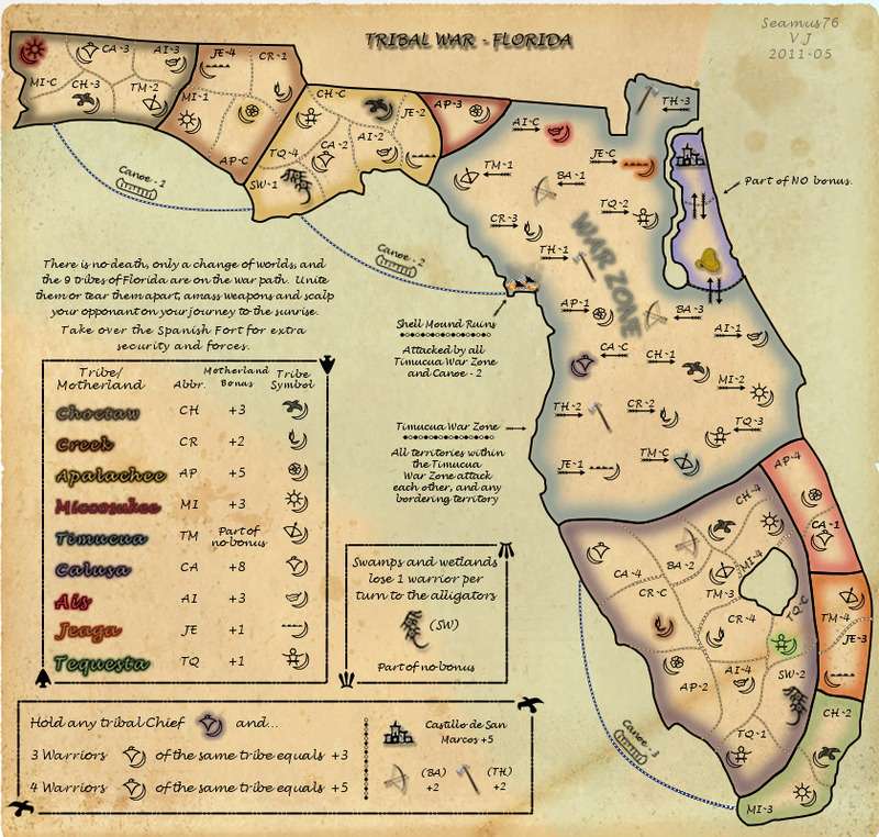
This has been updated on the first page to reflect the conquistador starting at 2 neutral and resetting to 2 neutral. I also made the spanish fort +5 instead of +3 to make it a bonus people might actually go for.
That makes sense. One warrior from each of these zones will be coded neutral. To keep the starting positions at a good number the 3 canoes will now be available as starting positions.
These have been raised, which makes sense. I had a bonus value on timucua very early on but based on discussion it made more sense that it would never be a bonus that some one could hold and should just not have a value.
I thought this was good, and going with the theme i gave the tomahawk an extra 1 because it must have been harder to kill your enemy up close like that rather than from far away with a bow and arrow. I thought making the bow start at 2 neutral was nice to spur some interest in them.
Maybe it's just from looking at this map for so long, but I just don't see where the clarity issues are. I actually think it is one of the more simpler maps there is. I would certainly love more feedback and guidance on this, especially from more people with fresh eyes.
Post by iancanton on Mon May 30, 2011 1:05 pm
the conquistador region must reset to the same number of neutrals as the starting number: using the current xml code, starting at 3 and resetting to 2 is not possible.
This has been updated on the first page to reflect the conquistador starting at 2 neutral and resetting to 2 neutral. I also made the spanish fort +5 instead of +3 to make it a bonus people might actually go for.
the three tiny bonus zones at the bottom pose some gameplay difficulties because someone is very likely to pick up one or more of these bonuses from the drop. one way to deal with this situation is for one warrior in each of these tiny bonus zones to start neutral.
That makes sense. One warrior from each of these zones will be coded neutral. To keep the starting positions at a good number the 3 canoes will now be available as starting positions.
the larger zones don't have a big enough bonus to make them attractive relative to the tiny zones, which means the winning strategy will almost always be the same. i suggest +8 or +9 for calusa, +5 for apalachee and +3 or +4 for creek. although throwing in a +15 for the timucua war zone might be irrelevant most of the time, it does seem to be at least as logical as no bonus, as well as making the legend neater.
These have been raised, which makes sense. I had a bonus value on timucua very early on but based on discussion it made more sense that it would never be a bonus that some one could hold and should just not have a value.
i still think a bow-and-arrow ought to be different from a tomahawk, even if one is +1 and the other is +2, in which case the +2s can start with one more neutral troop, thereby giving more choices to a player in the war zone. this does not need any more text than u currently have: just replace one of the +1s by a +2.
I thought this was good, and going with the theme i gave the tomahawk an extra 1 because it must have been harder to kill your enemy up close like that rather than from far away with a bow and arrow. I thought making the bow start at 2 neutral was nice to spur some interest in them.
Postby MarshalNey on Fri May 27, 2011 5:24 am
Taking a look at this with relatively fresh eyes, I think that:
(2) There are definitely some clarity issues
Maybe it's just from looking at this map for so long, but I just don't see where the clarity issues are. I actually think it is one of the more simpler maps there is. I would certainly love more feedback and guidance on this, especially from more people with fresh eyes.
Last edited by Seamus76 on Thu Jun 02, 2011 12:29 am, edited 1 time in total.
-
Seamus76
- Posts: 1574
- Joined: Fri Feb 25, 2011 5:41 pm
- Location: Atlanta, GA
Re: Tribal War - Florida v3.2(Map Updated 2011-05-24; pg4)
![]() by Seamus76 on Thu Jun 02, 2011 12:18 am
by Seamus76 on Thu Jun 02, 2011 12:18 am
UPDATE INFO-2011-06-02:
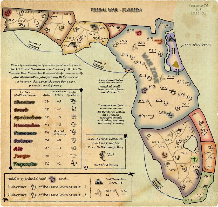
Made updates to the bonus values, which might still need some work, and added AP-4, TM-4, MI-3 to the list of coded neutral territories to avoid bonuses in those on the drop. Removed the 3 canoes from the coded neutral list to keep the starting number at 44. Updated the info to reflect the conquistador starting at 2 neutral and resetting to 2, rather than starting at 3 and resetting to 2. With that i updated the spanish fort from a bonus of +3 to +5 to make it more likely that someone would go for it. Based on other solid feedback the tomahawk has been updated to a bonus of +2, since it is much harder to kill your enemy up close. I have it staying at a starting value of 3 neutral but changed the bow and arrow to start 2 neutral as a little more temptation for players to go after them.
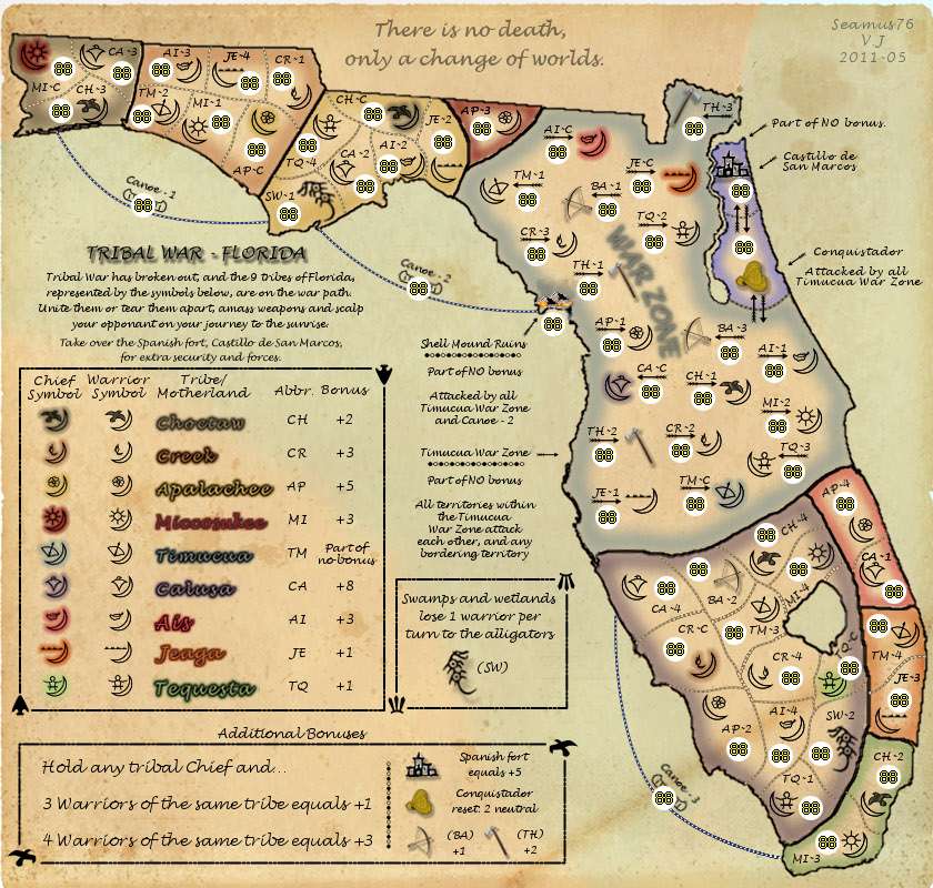
Made updates to the bonus values, which might still need some work, and added AP-4, TM-4, MI-3 to the list of coded neutral territories to avoid bonuses in those on the drop. Removed the 3 canoes from the coded neutral list to keep the starting number at 44. Updated the info to reflect the conquistador starting at 2 neutral and resetting to 2, rather than starting at 3 and resetting to 2. With that i updated the spanish fort from a bonus of +3 to +5 to make it more likely that someone would go for it. Based on other solid feedback the tomahawk has been updated to a bonus of +2, since it is much harder to kill your enemy up close. I have it staying at a starting value of 3 neutral but changed the bow and arrow to start 2 neutral as a little more temptation for players to go after them.
-
Seamus76
- Posts: 1574
- Joined: Fri Feb 25, 2011 5:41 pm
- Location: Atlanta, GA
Re: Tribal War - Florida v3.3(Map Updated 2011-06-02; pg4)
![]() by Seamus76 on Sat Jun 04, 2011 9:25 pm
by Seamus76 on Sat Jun 04, 2011 9:25 pm
Would love to get more thoughts on the map. Very hungry to keep working on it.
-
Seamus76
- Posts: 1574
- Joined: Fri Feb 25, 2011 5:41 pm
- Location: Atlanta, GA
Re: Tribal War - Florida v3.3(Map Updated 2011-06-02; pg4)
![]() by MarshalNey on Sun Jun 05, 2011 2:38 am
by MarshalNey on Sun Jun 05, 2011 2:38 am
I realize that I'm a bit behind on my promised feedback, so I'll send out my thoughts even though I haven't organized them as properly as I would like...
Clarity is a tough one for the mapmaker, I think, because it's all about explaining something that already makes perfect sense to oneself. It's also a bit subjective, but ultimately the lower the bar to understanding without a lot of intimidating clutter, the better. Some people see Waterloo and just flee, for instance, because the legend is everywhere and the region names are all alphanumeric codes and there are many symbols and special rules to boot... it doesn't matter that most of the gameplay is explained just fine, because the map looks too intimidating for some people to even make the attempt.
So, for starters, I think that this is just such a map. From a first glance, it's intimidating (a lot like a certain Zombie Invasion map that I'm still struggling to make... ). I can count 7 different places where there are one or more instructions, and then 2 different places on the map that explain the theme/idea/title. That's a lot of looking, glancing back and forth and just general "busy"-ness.
Advice
Another thing that immediately struck me was all of the little 'quirks' that this map employs. There is a decay, a killer neutral, a free-for-all zone, several 'no bonus' regions, individual bonuses (weapons and the fort), build-a-bonuses (for warriors of the same tribe) and traditional continent bonuses (I think... the legend is unclear to me but more on that later).
Now, there's nothing wrong with having many different gameplay elements as long as they all support the general concept and gameplay framework. However, if an element doesn't unequivocably fit, then it's a good sign that it probably should be cut, just to keep things as simple and clear as possible. For instance, if a decay, killer neutral or other 'obstacle' gameplay element was introduced for the sole purpose of correcting some flaw or imbalance rather than supporting the concept, it's almost certain that a better and simpler way can be found by re-examining your framework (just to be clear, "Concept" is the word I use to mean "What I want the goal of the map to be" and "Framework" is the word I use to mean "A general gamplay plan that describes how I'm going to reach the map goal").
Advice
I have to go to bed, but before I do I want to list one more thing that I think could improve the map's clarity: toning down the symbol madness. This map is littered with symbols. I think that normally symbols aren't used enough, but this map goes the other way. A symbol is only useful if it stands out, otherwise it just becomes white noise. The only symbols that I can readily identify with the naked eye are the Tribal Chiefs, the Tomahawks and the Spanish Conquistador and Fort. I think this is in no small part due to the fact that all of the Tribal symbols have a large crescent moon in them and a smaller unique symbol. It's hard to distinguish them when the most prominent part is the same in all of them.
However, that's likely not the whole problem either. The problem perhaps is that every region on the map has a gameplay-relevant symbol attached to it. Consider if there's any way to use colors, textures or some other visual method to set the tribe members apart (you've already used text with the alphabetical abbreviations, but I don't think that it's enough so I agree that some parallel visual method should be employed). I actually think that Supermax Prison Riot! used a mostly decent system with colored borders on the army circles and different color backgrounds.
Again I apologize for the narrative-style critique rather than a bulleted list, but I figured sooner was better than later.
-- Marshal Ney
P.S. Oip almost forgot to mention my confusion with the continent bonuses... the map lists the chief symbol first, which as it turns out has nothing to do with the bonus listed if my guess is correct... In fact, other than being an essential part of the build-a-bonus, does the chief symbol have any significance whatsoever? If not, I would cut it out of the top legend and simply list them or describe them in the build-a-bonus section.
Clarity is a tough one for the mapmaker, I think, because it's all about explaining something that already makes perfect sense to oneself. It's also a bit subjective, but ultimately the lower the bar to understanding without a lot of intimidating clutter, the better. Some people see Waterloo and just flee, for instance, because the legend is everywhere and the region names are all alphanumeric codes and there are many symbols and special rules to boot... it doesn't matter that most of the gameplay is explained just fine, because the map looks too intimidating for some people to even make the attempt.
So, for starters, I think that this is just such a map. From a first glance, it's intimidating (a lot like a certain Zombie Invasion map that I'm still struggling to make...
Advice
- I'd think about how you could consolidate or even eliminate(more on that later) some of the different areas of the legend. Particularly, it seems unnecessary to have the cool quote at the top of the map separate from the title & the flavorful strategic overview (Btw, I think that the overview can be shortened up a bit- the first sentence is redundant as Tribal war already implies that the tribes are 'on the war path'. Also you don't need to refer to the legend below, the tribe symbols are clearly marked as such in the legend box. So maybe try something like "The nine Tribes of Florida are on the war path. Unite them or tear them apart, amass weapons and scalp your enemies on your journey to the sunrise. Take over the Spanish Fort for extra security and weapons." ... the location and name of the fort can be left out as I think it is pretty obvious.)
Another thing that immediately struck me was all of the little 'quirks' that this map employs. There is a decay, a killer neutral, a free-for-all zone, several 'no bonus' regions, individual bonuses (weapons and the fort), build-a-bonuses (for warriors of the same tribe) and traditional continent bonuses (I think... the legend is unclear to me but more on that later).
Now, there's nothing wrong with having many different gameplay elements as long as they all support the general concept and gameplay framework. However, if an element doesn't unequivocably fit, then it's a good sign that it probably should be cut, just to keep things as simple and clear as possible. For instance, if a decay, killer neutral or other 'obstacle' gameplay element was introduced for the sole purpose of correcting some flaw or imbalance rather than supporting the concept, it's almost certain that a better and simpler way can be found by re-examining your framework (just to be clear, "Concept" is the word I use to mean "What I want the goal of the map to be" and "Framework" is the word I use to mean "A general gamplay plan that describes how I'm going to reach the map goal").
Advice
- Consider if there are any gameplay elements that are 'expendable' and then cut them- be brutal. I'll say more if you want me to, but for now I'd rather that you think upon your concept and framework and make your own decisions. Just be as honest as possible about the purpose for including each of the gameplay elements that I listed and what they contribute. (If you don't have a clearly stated concept or plan of implementation, send me a PM and we'll sort one out
I have to go to bed, but before I do I want to list one more thing that I think could improve the map's clarity: toning down the symbol madness. This map is littered with symbols. I think that normally symbols aren't used enough, but this map goes the other way. A symbol is only useful if it stands out, otherwise it just becomes white noise. The only symbols that I can readily identify with the naked eye are the Tribal Chiefs, the Tomahawks and the Spanish Conquistador and Fort. I think this is in no small part due to the fact that all of the Tribal symbols have a large crescent moon in them and a smaller unique symbol. It's hard to distinguish them when the most prominent part is the same in all of them.
However, that's likely not the whole problem either. The problem perhaps is that every region on the map has a gameplay-relevant symbol attached to it. Consider if there's any way to use colors, textures or some other visual method to set the tribe members apart (you've already used text with the alphabetical abbreviations, but I don't think that it's enough so I agree that some parallel visual method should be employed). I actually think that Supermax Prison Riot! used a mostly decent system with colored borders on the army circles and different color backgrounds.
Again I apologize for the narrative-style critique rather than a bulleted list, but I figured sooner was better than later.
-- Marshal Ney
P.S. Oip almost forgot to mention my confusion with the continent bonuses... the map lists the chief symbol first, which as it turns out has nothing to do with the bonus listed if my guess is correct... In fact, other than being an essential part of the build-a-bonus, does the chief symbol have any significance whatsoever? If not, I would cut it out of the top legend and simply list them or describe them in the build-a-bonus section.
-
MarshalNey
- Posts: 781
- Joined: Mon Sep 28, 2009 9:02 pm
- Location: St. Louis, MO


Re: Tribal War - Florida v3.3(Map Updated 2011-06-02; pg4)
![]() by Seamus76 on Mon Jun 06, 2011 3:19 pm
by Seamus76 on Mon Jun 06, 2011 3:19 pm
Thanks so much for the great feedback. We're digesting now and will get back with questions, updates, concerns, and some general opposition. 
-
Seamus76
- Posts: 1574
- Joined: Fri Feb 25, 2011 5:41 pm
- Location: Atlanta, GA
Re: Tribal War - Florida v3.3(Map Updated 2011-06-02; pg4)
![]() by iancanton on Tue Jun 14, 2011 2:43 am
by iancanton on Tue Jun 14, 2011 2:43 am
the changes made so far are mostly in the right direction. however, bear in mind MarshalNey's comments on simplicity and concept. u do have a lot of features on the map, one or two of which seem to serve no purpose other than to be there as an extra wrinkle. do u really need alligators? if so, then why are there only two and why have u put them in what are already the most difficult bonuses to hold?
the division into the bonus zones that u have is also not ideal: u have two small zones at each end and larger ones toward the middle, which virtually limits the available winning strategies in a multiplayer game to starting at each end and attacking inward. one possible improvement is to move AI3 and TM2 from the creek bonus into the choctaw bonus, so that choctaw isn't indisputably the best position in the north for multiplayer. boosting the miccosukee bonus to +3 for just a single region also makes no sense, since it's better than a tomahawk, bow-and-arrow or chief-with-3-warriors. the chief-with-warriors bonuses need to be doubled to +2 for 3 and +6 for 4 if u want them to play any role in a typical game, otherwise they're so hard to hold that they'll be ignored.
ian.
-
iancanton
- Foundry Foreman
- Posts: 2423
- Joined: Fri Jun 01, 2007 5:40 am
- Location: europe
Re: Tribal War - Florida v3.4(Map Updated 2011-06-17; pg4)
![]() by Seamus76 on Fri Jun 17, 2011 11:05 am
by Seamus76 on Fri Jun 17, 2011 11:05 am
UPDATE INFO-2011-06-17:
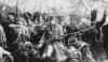
Firstly we removed the army circles, now that I know they will fit, to make the initial look less cluttered. The next main update was to the Choctaw region where I expanded it and made it include AI-3, and TM-2. Because of this I changed the bonus for those regions from +2 for Choctaw to +3, and from +3 for Creek to +2. Next I tried to clean it up a bit by removing some of the redundant info on the right side. I also reworked the legend portion to remove the chief symbol, then added the symbols back to the build-a-bonus section to clarify. This is how it was in v3.1 before changing it to v3.2 based on feedback. These bonuses have been updated as well to make them more worthwhile. Holding the Chief and 3 Warriors will now give a bonus of +3, and holding 4 Warriors is a bonus of +5. Based on good feedback the bonus for the Bow and Arrow is now +2, and the Tomahawk is also +2. The Conquistador resetting to neutral was kind of a waste, and makes more sense to be just a regular territory, so that has been updated in the main post. It will still start 2 neutral, but does not reset. The alligators are there instead of traditional impassables, which we wanted from the beginning but had to evolve this over time, and do serve a good purpose other than just for looks. I am open to making them reset to 2 neutral instead of losing 1 troop per turn, but want to keep them in some fashion. Along those lines they will no longer be needed to hold the region bonus they reside in, which makes it easier to go for these harder regions.
Firstly we removed the army circles, now that I know they will fit, to make the initial look less cluttered. The next main update was to the Choctaw region where I expanded it and made it include AI-3, and TM-2. Because of this I changed the bonus for those regions from +2 for Choctaw to +3, and from +3 for Creek to +2. Next I tried to clean it up a bit by removing some of the redundant info on the right side. I also reworked the legend portion to remove the chief symbol, then added the symbols back to the build-a-bonus section to clarify. This is how it was in v3.1 before changing it to v3.2 based on feedback. These bonuses have been updated as well to make them more worthwhile. Holding the Chief and 3 Warriors will now give a bonus of +3, and holding 4 Warriors is a bonus of +5. Based on good feedback the bonus for the Bow and Arrow is now +2, and the Tomahawk is also +2. The Conquistador resetting to neutral was kind of a waste, and makes more sense to be just a regular territory, so that has been updated in the main post. It will still start 2 neutral, but does not reset. The alligators are there instead of traditional impassables, which we wanted from the beginning but had to evolve this over time, and do serve a good purpose other than just for looks. I am open to making them reset to 2 neutral instead of losing 1 troop per turn, but want to keep them in some fashion. Along those lines they will no longer be needed to hold the region bonus they reside in, which makes it easier to go for these harder regions.
-
Seamus76
- Posts: 1574
- Joined: Fri Feb 25, 2011 5:41 pm
- Location: Atlanta, GA
Re: Tribal War - Florida v3.4(Map Updated 2011-06-17; pg4)
![]() by Industrial Helix on Sat Jun 18, 2011 7:12 am
by Industrial Helix on Sat Jun 18, 2011 7:12 am
Is this still in progress?
Edit: Sorry, i see this is in the gameplay workshop now. I thought it was never moved from the DR.
Edit: Sorry, i see this is in the gameplay workshop now. I thought it was never moved from the DR.
Sketchblog [Update 07/25/11]: http://indyhelixsketch.blogspot.com/
Living in Japan [Update 07/17/11]: http://mirrorcountryih.blogspot.com/
Russian Revolution map for ConquerClub [07/20/11]: viewtopic.php?f=241&t=116575
Living in Japan [Update 07/17/11]: http://mirrorcountryih.blogspot.com/
Russian Revolution map for ConquerClub [07/20/11]: viewtopic.php?f=241&t=116575
-

Industrial Helix
- Posts: 3462
- Joined: Mon Jul 14, 2008 6:49 pm
- Location: Ohio


Re: Tribal War - Florida v3.4(Map Updated 2011-06-17; pg4)
![]() by Bruceswar on Mon Jun 20, 2011 11:54 pm
by Bruceswar on Mon Jun 20, 2011 11:54 pm
Your borders are very pixelated... What happened to them? Those will surely need to be fixed.. Other than that, keep up the good work and looking to see how you take this.
Highest Rank: 26 Highest Score: 3480

-

Bruceswar
- Posts: 9713
- Joined: Sun Dec 23, 2007 12:36 am
- Location: Cow Pastures


Re: Tribal War - Florida v3.4(Map Updated 2011-06-17; pg4)
![]() by Seamus76 on Tue Jun 21, 2011 12:03 pm
by Seamus76 on Tue Jun 21, 2011 12:03 pm
Thanks for the encouragement Bruce. Not sure what happened to the boarders. For the last update I redid the top left regions, which came out a little more sharp. The others are from the original files so maybe that's why.
I'm working on an update and will try to redo those as well. Another main item I am working on is to shrink the "crescent moon" and enlarge the main distinguishing image for each warrior. This will hopefully make them more easily distinguishable at first glance, and throughout the gameplay.
I'm working on an update and will try to redo those as well. Another main item I am working on is to shrink the "crescent moon" and enlarge the main distinguishing image for each warrior. This will hopefully make them more easily distinguishable at first glance, and throughout the gameplay.
-
Seamus76
- Posts: 1574
- Joined: Fri Feb 25, 2011 5:41 pm
- Location: Atlanta, GA
Re: Tribal War - Florida v3.4(Map Updated 2011-06-17; pg4)
![]() by isaiah40 on Thu Jun 23, 2011 12:12 pm
by isaiah40 on Thu Jun 23, 2011 12:12 pm
The river where the conquistador is needs to be widened a bit as so to tell that it is not connected in any way. This will be a problem when you scale down to the small map.
-
isaiah40
- Posts: 3990
- Joined: Mon Aug 27, 2007 7:14 pm


Re: Tribal War - Florida v3.4(Map Updated 2011-06-17; pg4)
![]() by Seamus76 on Thu Jun 23, 2011 11:21 pm
by Seamus76 on Thu Jun 23, 2011 11:21 pm
I will take care of that in this upcoming update. Thanks.
-
Seamus76
- Posts: 1574
- Joined: Fri Feb 25, 2011 5:41 pm
- Location: Atlanta, GA
Re: Tribal War - Florida v3.5(Map Updated 2011-06-25; pg5)
![]() by Seamus76 on Sat Jun 25, 2011 12:27 am
by Seamus76 on Sat Jun 25, 2011 12:27 am
UPDATE INFO-2011-06-25:
Just cosmetic updates for this one, but I think a good one overall. Mainly I reduced the size of the crescent moon shape for each warrior and chief. I have to agree with the feedback provided, this reduction seems to make all of the symbols less harsh on the eye and makes them all more easily identifiable, and distinguishable, from one another. I also slightly reduced the size of the bow and arrows, the tomahawks, and the alligators. For the next update, which should be late Monday or Tuesday, I will have crisper boarders, as well as a wider, more clearly defined river.
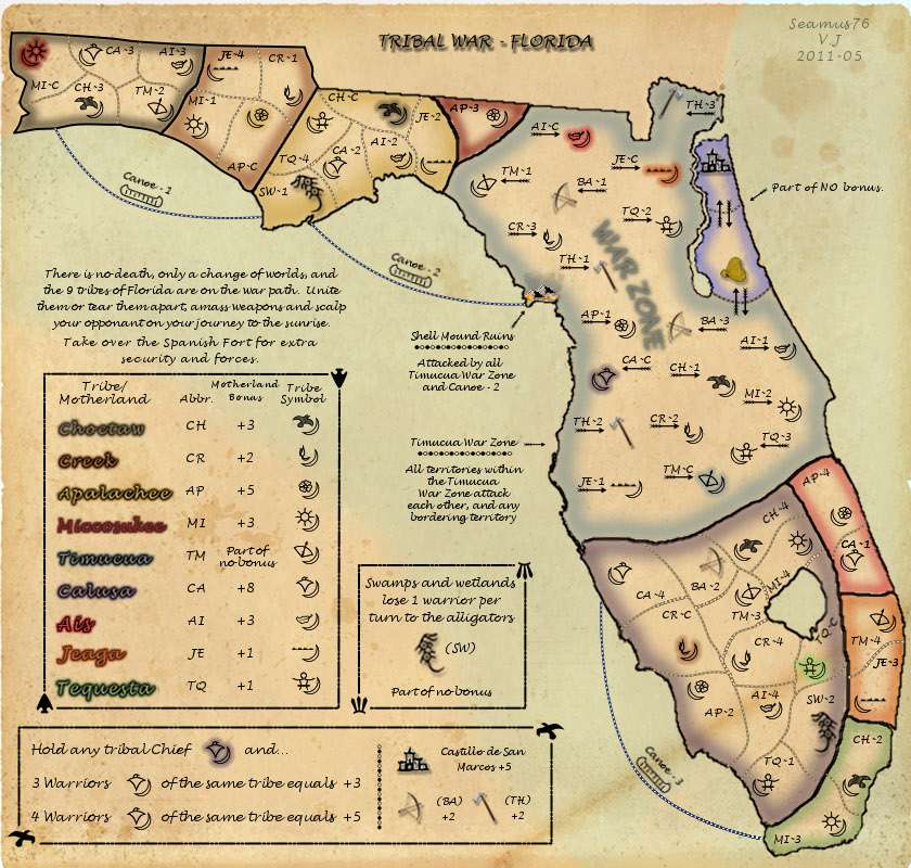
Just cosmetic updates for this one, but I think a good one overall. Mainly I reduced the size of the crescent moon shape for each warrior and chief. I have to agree with the feedback provided, this reduction seems to make all of the symbols less harsh on the eye and makes them all more easily identifiable, and distinguishable, from one another. I also slightly reduced the size of the bow and arrows, the tomahawks, and the alligators. For the next update, which should be late Monday or Tuesday, I will have crisper boarders, as well as a wider, more clearly defined river.
Last edited by Seamus76 on Sat Jun 25, 2011 10:45 pm, edited 1 time in total.
-
Seamus76
- Posts: 1574
- Joined: Fri Feb 25, 2011 5:41 pm
- Location: Atlanta, GA
Re: Tribal War - Florida v3.5(Map Updated 2011-06-25; pg5)
![]() by Bruceswar on Sat Jun 25, 2011 3:49 pm
by Bruceswar on Sat Jun 25, 2011 3:49 pm
What about the redraw of borders? did that get fixed?
Highest Rank: 26 Highest Score: 3480
-
Bruceswar
- Posts: 9713
- Joined: Sun Dec 23, 2007 12:36 am
- Location: Cow Pastures
Re: Tribal War - Florida v3.5(Map Updated 2011-06-25; pg5)
![]() by Seamus76 on Sat Jun 25, 2011 10:49 pm
by Seamus76 on Sat Jun 25, 2011 10:49 pm
As I mentioned in the update post above I'm working on those now and should have another update on Monday or Tuesday. It will include the redrawn boarders and wider river.
-
Seamus76
- Posts: 1574
- Joined: Fri Feb 25, 2011 5:41 pm
- Location: Atlanta, GA
Re: Tribal War - Florida v3.5(Map Updated 2011-06-25; pg5)
![]() by Seamus76 on Mon Jun 27, 2011 1:21 pm
by Seamus76 on Mon Jun 27, 2011 1:21 pm
UPDATE INFO-2011-06-27:
Another big cosmetic update for this one with crisper boarders, as well as a wider, more clearly defined river.
Current Version: v3.6
Another big cosmetic update for this one with crisper boarders, as well as a wider, more clearly defined river.
Current Version: v3.6
-
Seamus76
- Posts: 1574
- Joined: Fri Feb 25, 2011 5:41 pm
- Location: Atlanta, GA
Re: Tribal War - Florida v3.6(Map Updated 2011-06-27; pg5)
![]() by natty dread on Mon Jun 27, 2011 2:04 pm
by natty dread on Mon Jun 27, 2011 2:04 pm
You are learning quickly... those borders look great!

-

natty dread
- Posts: 12877
- Joined: Fri Feb 08, 2008 8:58 pm
- Location: just plain fucked


Re: Tribal War - Florida v3.6(Map Updated 2011-06-27; pg5)
![]() by Seamus76 on Mon Jun 27, 2011 3:03 pm
by Seamus76 on Mon Jun 27, 2011 3:03 pm
Wow, that means a lot. Thank you so much. As you know, it's a labor of love.
-
Seamus76
- Posts: 1574
- Joined: Fri Feb 25, 2011 5:41 pm
- Location: Atlanta, GA
Re: Tribal War - Florida v3.6(Map Updated 2011-06-27; pg5)
![]() by isaiah40 on Mon Jun 27, 2011 4:34 pm
by isaiah40 on Mon Jun 27, 2011 4:34 pm
All I have to say is WOW!! A big improvement!!
-
isaiah40
- Posts: 3990
- Joined: Mon Aug 27, 2007 7:14 pm
Re: Tribal War - Florida v3.6(Map Updated 2011-06-27; pg5)
![]() by DiM on Mon Jun 27, 2011 4:46 pm
by DiM on Mon Jun 27, 2011 4:46 pm
i very much like where this map is going graphically speaking.
just a couple of things that bother me for now:
1. the background behind the parchment is visible and it shouldn't. it's especially disturbing in the top part of the map.
2. some icons are very crisp (tribe symbols) while others are very blurry (alligators, canoe-2 etc)
just a couple of things that bother me for now:
1. the background behind the parchment is visible and it shouldn't. it's especially disturbing in the top part of the map.
2. some icons are very crisp (tribe symbols) while others are very blurry (alligators, canoe-2 etc)
“In the beginning God said, the four-dimensional divergence of an antisymmetric, second rank tensor equals zero, and there was light, and it was good. And on the seventh day he rested.”- Michio Kaku
-

DiM
- Posts: 10415
- Joined: Wed Feb 14, 2007 6:20 pm
- Location: making maps for scooby snacks


Re: Tribal War - Florida v3.6(Map Updated 2011-06-28; pg5)
![]() by Seamus76 on Tue Jun 28, 2011 12:09 pm
by Seamus76 on Tue Jun 28, 2011 12:09 pm
UPDATE INFO-2011-06-28:
Couple of edits but I did not change the version number. The background offset was fixed for the most part. I had to leave a little white to show the tattered edge of the parchment, , but this can be cleaned up in Graphics if need be. I also tried to clean up the alligators, canoes, and the canoe labels.
Current Version: v3.6
-
Seamus76
- Posts: 1574
- Joined: Fri Feb 25, 2011 5:41 pm
- Location: Atlanta, GA
Re: Tribal War - Florida v3.6(Map Updated 2011-06-28; pg5)
![]() by Seamus76 on Thu Jun 30, 2011 7:30 am
by Seamus76 on Thu Jun 30, 2011 7:30 am
I feel like we've addressed most if not all of the comments so far. If there are any other thoughts please let me know. Looking to keep working to move this along.
-
Seamus76
- Posts: 1574
- Joined: Fri Feb 25, 2011 5:41 pm
- Location: Atlanta, GA
Who is online
Users browsing this forum: No registered users
|
|||||||
| Conquer Club is not associated with RISK online in any way. Copyright © 2006-2024 by Big Wham LLC | |||||||