Conquer Club

The Dungeon of Draknor [Vacation]

Have an idea for a map? Discuss ideas and concepts here.

Moderator: Cartographers

Forum rules
Please read the Community Guidelines before posting.

The Dungeon of Draknor [Vacation]

Postby Jota on Tue Jun 20, 2006 8:28 pm

Your sword has had quite a workout today, mowing down the undead minions summoned by the evil sorcerer Draknor to guard his fortress. According to Belegruin, your closest friend and an expert spellcaster, this is the last room before you reach Draknor's lair. While little Garrick -- hired against your better judgement for his quick reflexes and nimble fingers -- checks the final door for traps, you sit back to rest and let the party's healer tend to your wounds.

"Hold it!" shouts Garrick, "It's a trap!"

"Then disable it and pick the lock," you answer wearily. "That's what you're here for."

"No, it's not on the door. It's the whole room. Look at the floor!"

All of you look down. The floor tiles are covered with strange sigils. They mean nothing to you, but Belegruin clearly recognizes them.

"The munchkin is right," he says. "This is a teleportation circle with glyphs of warding around the edges... we're trapped here. This enchantment is too powerful for me to break."

Just then, a deep, maniacal laughter echoes through the chamber. "You thought you might defeat me, adventurers? I am DRAKNOR, the greatest wizard who ever lived! Now you will go where all the others who sought to infiltrate my fortress were sent: into my dungeon maze, a labyrinth of magical portals from which there is no escape! I may consider releasing you, but only if you first prove yourself by conquering the entire dungeon and everything in it..."

Then there is a blinding flash of light. When you can see again, your friends are gone, and your surroundings seem to have changed:

Image

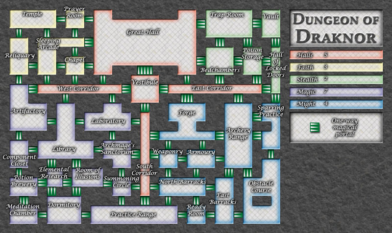
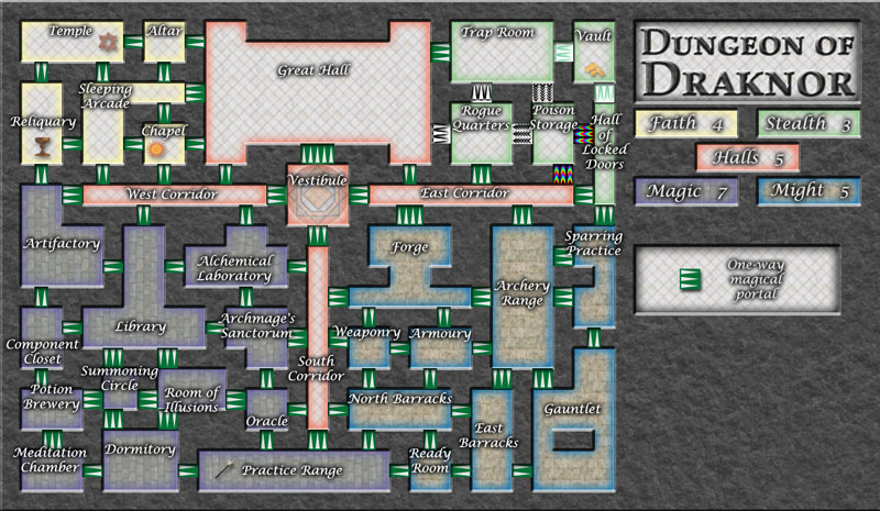
So one thing I haven't used yet in any of my maps is one-way borders. Inspired largely by rocksolid's Chariot Races, I present my take on the concept of a map where all the connections are one-way only. It's got thirty-six countries divided into five continents. Its theme is the fantasy role-playing genre, as typified by Dungeons and Dragons.

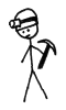
My apologies to kevinc for swiping his very cool coloration style. I plan to add a few decorations to this map and to tweak a few things in the legend and captions, but otherwise, I'm actually pretty pleased with how it looks right now. As usual, constructive criticism is more than welcome.

(Note that the fact that you can't get from the South Corridor to the Vestibule without going through another continent is intentional: it's part of why the Halls have such a high bonus.)

Let the wailing and gnashing of teeth commence...
User avatar
Sergeant 1st Class Jota
 
Posts: 634
Joined: Wed Mar 29, 2006 7:38 pm

Postby HighBorn on Tue Jun 20, 2006 8:30 pm

wow jota instant hit!!!
User avatar
Private 1st Class HighBorn
 
Posts: 3013
Joined: Sat Feb 18, 2006 10:22 pm
Location: Kentucky

Postby hawkeye on Tue Jun 20, 2006 8:37 pm

its great
Cook hawkeye
 
Posts: 2663
Joined: Fri Feb 24, 2006 12:19 am
Location: RAGGLE FRAGGLE!!!

Postby Evil Pope on Tue Jun 20, 2006 8:38 pm

Eh.. It hurts my eyes to look at.. It looks really good, but I mean that its very confusing.. for me anyway..
User avatar
Sergeant Evil Pope
 
Posts: 275
Joined: Fri Jan 13, 2006 8:39 pm

Postby Finsdale on Wed Jun 21, 2006 12:53 am

Flipping.... Sweet....
I can't help but think that some of the continent bonuses are very small, Might in particular. I'm also puzzled by the fact that Stealth and Faith aren't given the same bonuses... And could you make the direction that the one way portals go a little more noticable?
User avatar
Corporal 1st Class Finsdale
 
Posts: 36
Joined: Sun Apr 30, 2006 11:57 pm

Postby Jota on Wed Jun 21, 2006 1:53 am

Whoops, I notice that I accidentally placed one of the exits backward: if you flip the one between the Practice Range and Ready Room, then Might's bonus should make more sense. The main reason Faith and Stealth have different bonuses is because Faith has three countries that can be attacked from other continents (Reliquary, Prayer Room, and Chapel), whereas Stealth only has two (Bedchambers and Poison Storage).

The portal symbol is meant to look like white arrows on a green background, but now that you mention it, I'm suddenly noticing that it wouldn't be hard to misread them as green arrows on a white background. Hmm.
User avatar
Sergeant 1st Class Jota
 
Posts: 634
Joined: Wed Mar 29, 2006 7:38 pm

Postby fluffybunnykins on Wed Jun 21, 2006 6:21 am

maybe make the portals white triangles with a green outline, instead of the green box???
Superman wears 'Fluffybunnykins' pyjamas
User avatar
Corporal 1st Class fluffybunnykins
 
Posts: 385
Joined: Tue May 02, 2006 6:43 am
Location: Liverpool, UK

Postby fluffybunnykins on Wed Jun 21, 2006 6:30 am

sort of like this:-
Image
but smaller!
Superman wears 'Fluffybunnykins' pyjamas
User avatar
Corporal 1st Class fluffybunnykins
 
Posts: 385
Joined: Tue May 02, 2006 6:43 am
Location: Liverpool, UK

Postby rocksolid on Wed Jun 21, 2006 9:59 am

I thought maybe you were going for making the confusingness of the arrows one of the challenges for the map - not sure it's a good idea, but one you should explore before bathwatering - part of what makes it a maze is that you can't figure out quickly which way to go and end up going the wrong way the first time around - interesting, but probably wouldn't be very popular, so yeah, I think you should make the one-ways more conclusive. But you never know.

Neat idea Jota, miles ahead of the crappy castle/dungeon map over at WaW.

Floor pattern is meant to be tiles? Looks like chicken wire right now, though I'd imagine you want to avoid a grid, even thought that's what convincing tiles would look like. Maybe stone flags (not a grid, but irregular rectangles) with a stone texture?

Maybe give the walls a thick and impenetrable feel. Right now they just kind of feel like empty space that armies could punch through if they weren't being so polite.

Another potentially unpopular suggestion - muck with the xml on the room of illusions so that rather than attack the rooms it seems to attack, its one-ways actually go to other spots around the map. These locations would only become apparent to whoever holds that room, and perhaps not even to them if they're not savvy with the drop-down lists. Yeah, bad idea...

And I know you were tempted to make the room of locked doors have no routes out...consider me the evil voice on your left shoulder: "Dooo it, Jota, dooo it..."
User avatar
Lieutenant rocksolid
 
Posts: 625
Joined: Sat Mar 18, 2006 10:00 pm
Location: Mowwwnt Reeeal

Postby Haydena on Wed Jun 21, 2006 12:34 pm

Looks good, reminds me of Undermountain below Waterdeep in Faerun.

Just a question Jota, how? How do you do it?
User avatar
Sergeant 1st Class Haydena
 
Posts: 634
Joined: Sun Mar 19, 2006 2:43 pm
Location: Sussex, England

Postby Finsdale on Wed Jun 21, 2006 1:03 pm

I agree with rocksolid about the hall of locked doors... but I think it should be moved if you decide to do that... lol
Edit: Scratch that, I don't want to get trapped in there
User avatar
Corporal 1st Class Finsdale
 
Posts: 36
Joined: Sun Apr 30, 2006 11:57 pm

Postby AndyDufresne on Wed Jun 21, 2006 1:33 pm

**Sniffs the air like a wolf before howling at a full moon....**

What's this I smell....a new map? **Tears into it ferociously**


Well I must say this is a unique idea. Honestly I think this might be more popular than your previous map (CCU)...everyone loves Triple D's (Dark Dank Dungeons) :P.


---As for the map this reminds me of your idea to make a Text Adventure map into a graphic map...which seems to what you have done. So far it has turned out better than I thought it would.

---I'd have to agree with Rock about perhaps increasing the thickness of the walls to give it more of a dungeon feel. Really you've pushed yourself pretty far in this first draft. There isn't a whole lot for people to comment on, visual wise. I'm glad you learned a few things from the CCU map...not all the buildings are the same shape and size.

---Are you thinking of doing some sort of image work below the legend? (I'd assume so since it's quite a large open space, and if not I'd move the title and legend down a little)

---As for game play mechanics...hm. The one ways are quite a unique idea...and a whole map of them will sure make for interesting game play. I feel escalating lovers might have trouble in this map--can't just deploy all your troops in one area perhaps.
    One thing I am concerned about is the bonuses. Take Stealth for example. It has 2 borders that it can't attack from [Bed Chambers & Poison Chamber] but in order to actually do anything productive you'd atleast have troops in the Hall of Locked Doors (if you don't make it inescapable) or the Trap Room. Essentially you almost have 1-2 more 'border's. So perhaps you should take each bonus and bump it up at least 1. (though perhaps not magic, but others I might look into).

---Also, I know you are probably pretty set on names, but I've a few suggestions anyways...
    Faith
  • Seminary
  • Altar
  • Shrine
  • Crypt
    Stealth
  • Rock Wall
  • Rogue Quarters
    Magic
  • Alchemist's Shop(or change Lab to Alchemy Lab)
  • Oracle
    Might
  • Wrestling Pits
  • Gauntlet


--Andy
User avatar
Corporal 1st Class AndyDufresne
 
Posts: 24919
Joined: Fri Mar 03, 2006 8:22 pm
Location: A Banana Palm in Zihuatanejo

Postby spiesr on Wed Jun 21, 2006 1:33 pm

This just won't work!
User avatar
Captain spiesr
 
Posts: 2809
Joined: Mon May 08, 2006 10:52 am
Location: South Dakota

Postby Jota on Wed Jun 21, 2006 1:50 pm

Lots of responses, so I'll respond in shifts, starting with the earlier comments:

rocksolid wrote:Floor pattern is meant to be tiles? [...] Maybe stone flags (not a grid, but irregular rectangles) with a stone texture?


This floor texture worked better than most of the ones I was trying, since A) it was at a nice diagonal, and B) it actually tessellated right. But I've got a couple others I can try out too.

Maybe give the walls a thick and impenetrable feel.


Hmm. I've made them as wide as the corridors right now, so I'm guessing that's not the kind of thickness you're referring to. Maybe increasing the apparent depth would better give the "ten feet of solid granite" feel I was looking for.

And I know you were tempted to make the room of locked doors have no routes out...


Heh, you're actually the second person to mention something like that to me. I initially wanted to avoid stealing the idea from the Bermuda Triangle, but I guess this is sufficiently different from that.

I don't know about using the HoLD for it, though: it holds an important position in the border structure between Stealth and its neighbors. But I can see other appropriate places I might use instead...

Haydena wrote:Just a question Jota, how? How do you do it?


The ideas or the execution? I'm still trying to figure out how to make the ideas stop. I was already brainstorming the map that I plan to work on after this back when I was working on CCU, and had the inspiration for it while doing USApoc...
User avatar
Sergeant 1st Class Jota
 
Posts: 634
Joined: Wed Mar 29, 2006 7:38 pm

Postby Banana Stomper on Wed Jun 21, 2006 1:53 pm

i like it. No time for critique, but i like it
User avatar
Corporal 1st Class Banana Stomper
 
Posts: 422
Joined: Thu Mar 16, 2006 4:39 pm
Location: Richmond, Virginia

Re: The Dungeon of Draknor

Postby qeee1 on Wed Jun 21, 2006 2:58 pm

Jota wrote:(Note that the fact that you can't get from the South Corridor to the Vestibule without going through another continent is intentional: it's part of why the Halls have such a high bonus.)


*cough*stolen idea*cough*

Aside from my sudden coughing fit...

I like it. I think this is one map in particular that could use an offline playthrough, as there are many potential pitfalls are strongpoints that you might not realise exist, due to the confusing nature of it.

The graphics seem ok to me, the arrows seem pretty obvious, though maybe the tiling could use some work.
Frigidus wrote:but now that it's become relatively popular it's suffered the usual downturn in coolness.
User avatar
Colonel qeee1
 
Posts: 2904
Joined: Sun Feb 05, 2006 12:43 pm
Location: Ireland

Postby Jota on Wed Jun 21, 2006 5:44 pm

AndyDufresne wrote:As for the map this reminds me of your idea to make a Text Adventure map into a graphic map...


It is kinda similar, but I think this idea works much better.

Really you've pushed yourself pretty far in this first draft. There isn't a whole lot for people to comment on, visual wise.


I actually considered posting my first digital draft of the map, but I decided pretty it up a bit first. (Although I do think that earlier version has a certain charm to it.)

Are you thinking of doing some sort of image work below the legend?


Yeah, I've got a couple thoughts I'm considering there.

[Stealth] has 2 borders that it can't attack from [Bed Chambers & Poison Chamber] but in order to actually do anything productive you'd atleast have troops in the Hall of Locked Doors (if you don't make it inescapable) or the Trap Room.


That's a good point. I'll look into tweaking the bonuses a bit.

qeee1 wrote:*cough*stolen idea*cough*


Yes! I mentioned rock and kevinc, but I totally forgot to credit you too. I'm sorry about that. I think I stole almost everything in here from someone... I guess that's what makes it seem so original.

I like it. I think this is one map in particular that could use an offline playthrough, as there are many potential pitfalls are strongpoints that you might not realise exist, due to the confusing nature of it.


That's true. Unfortunately, I don't have any Risk-playing friends in the area, so I can't do that myself. If anyone else would like to try it out, I'd be happy to hear how it works out for them.
User avatar
Sergeant 1st Class Jota
 
Posts: 634
Joined: Wed Mar 29, 2006 7:38 pm

Postby Rakonas on Wed Jun 21, 2006 8:29 pm

Wow your good...
Cadet Rakonas
 
Posts: 5
Joined: Thu Mar 23, 2006 3:14 pm

Postby Jota on Wed Jun 21, 2006 9:52 pm

Image

Changes in this revision:
  • Tried making the walls look "thicker"
  • Tweaked some exits around the Ready Room and the (relocated) Summoning Circle
  • Provided a couple new floor textures (Magic and Might) for comparison
  • Likewise with the portals in Stealth
  • Revised some bonuses
  • Added some decorative icons
  • Played with the legend


I'll be fiddling with the legend some more before the next revision, so while you're free to comment on it, it'll probably be different the next time you see it anyway. The icons in Faith are the kind of decorations I plan to add to the rest of the map. They have no mechanical significance; I'm going to be adding them to about half the rooms, wherever they look best.

The design of the portals is probably the most important thing to look at right now. Once I change them all, I really don't want to change them again, since that's the single most labor-intensive aspect of doing this map. Consequently, I want to be sure that the portals I have are the best choice before I place them everywhere. Also, I'm a little concerned about the text: is it still easily legible at this resolution?
User avatar
Sergeant 1st Class Jota
 
Posts: 634
Joined: Wed Mar 29, 2006 7:38 pm

Postby AndyDufresne on Wed Jun 21, 2006 10:22 pm

Just a quick little thing...

---The names are pretty legible...though it is a bit hard for me. I've a request...could you post a link to a larger version of the map, simply so I and other can look at it in more detail and see the finer points?


--Andy
User avatar
Corporal 1st Class AndyDufresne
 
Posts: 24919
Joined: Fri Mar 03, 2006 8:22 pm
Location: A Banana Palm in Zihuatanejo

Postby Jota on Wed Jun 21, 2006 10:33 pm

Not a problem: here you go. However, keep in mind that anything important that can't be clearly seen in the small version should probably be mentioned here.
User avatar
Sergeant 1st Class Jota
 
Posts: 634
Joined: Wed Mar 29, 2006 7:38 pm

Postby AndyDufresne on Wed Jun 21, 2006 10:36 pm

Danke! I must say though, that current small version seems a bit too small for my eyes...hopefully now I'll be abke to comment a little more.


--Andy
User avatar
Corporal 1st Class AndyDufresne
 
Posts: 24919
Joined: Fri Mar 03, 2006 8:22 pm
Location: A Banana Palm in Zihuatanejo

Postby AndyDufresne on Thu Jun 22, 2006 12:30 am

Well lets see...


---For the one way portal image...stay away from the multi-colored rainbow. I don't think they fit this map, and they strain the eyes a bit, for me at least. And those light colored ones don't seem very effective. So far I vote the original green ones. But I would like seeing the different arrow style that is near the poison room, but instead of gray...use the original green with that design.

---The walls...uh...don't really feel much more thicker...perhaps I missed something?

---As for the floor tile...I rather like the original chain link fence design...but I think the other versions would look much better if they were similar in brightness to the original floor color. The other areas seem to make this map too dark.

---I like the little images that are added about, a simple little touch. And the Vestibule is quite elegant looking. And I see you used a few of my suggested names! :) Glad they could be of some use.

---As for the legend...I don't really like the current pyramid layout. The original version seemed to work the best, but it'd be nice to see any other ideas, and hear other feedback.

---I really like the font, though as I stated the small version has a few issues. Perhaps look into making the title look even more ominous and foreboding.


Look into seeing more of this map! And again, as with CCU, if you can keep the army shadows off this map...I think it will help it greatly.


--Andy
User avatar
Corporal 1st Class AndyDufresne
 
Posts: 24919
Joined: Fri Mar 03, 2006 8:22 pm
Location: A Banana Palm in Zihuatanejo

Postby Marvaddin on Thu Jun 22, 2006 1:03 am

You REALLY like boxes, huh, Jota? But, again, you can add different shapes, as in CCU, right?

This idea isnt a GREAT one, but much better than CCU, that was really sad. Anyway, I want to say: I hate one-way.

The map really is better with different floors. You should use one to each continent, I believe. And until now the first arrows are the best. But I dislike the small symbols. They should mean anything, or they are useless and players can misunderstand them. What do you mean by Summoning Circle? And maybe we should think about new names to the continents too. Im my opinion, "faith" or "might", argh, ridiculous names!

Put the continents analysis and we can comment the bonuses better.
Image
User avatar
Major Marvaddin
 
Posts: 2545
Joined: Thu Feb 09, 2006 5:06 pm
Location: Belo Horizonte, Brazil

Postby hawkeye on Thu Jun 22, 2006 1:08 am

what if sumbudy got them selve stuck untouchable in the hall of locked doors that wood suck :( :(
Cook hawkeye
 
Posts: 2663
Joined: Fri Feb 24, 2006 12:19 am
Location: RAGGLE FRAGGLE!!!

Next

Return to Melting Pot: Map Ideas

Who is online

Users browsing this forum: No registered users