by n.n. on Tue Sep 20, 2011 4:30 am
Hi,
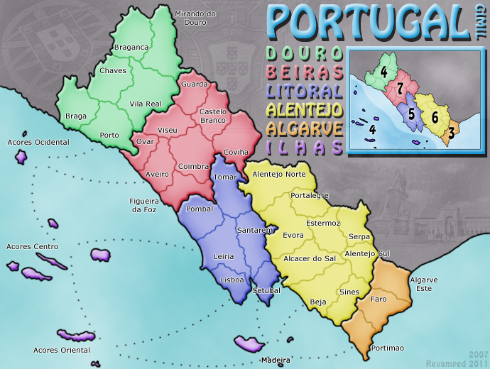
The bad:
- some dotted lines, islands, labels etc. are simply too close to the image border, leave more margins for improved visibility.
- Same goes for continent list and minimap - also too close to each other.
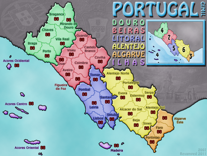
- The border around the minimap is very ugly, should be changed into something more elegant, almost any other box border template example would work better graphically, same goes for the shadow below it - not really working...
- Label positioning should be corrected a little, for example, Portimao, letter p is over the border, Alentejo Sul - "Sul" and some others are not really readable enough, Mirando do Douro i saw existing only after looking at the map for 15 minutes...
- Dotted lines do not start and end properly or on proper places, for example, Acores Oriental - Lisboa - dot too close to land at Lisboa end, also all lines start from a imagined circle all of which are positioned very loosely so it is not really good looking nor clear enough in my opinion (add the IMHO to all thoughts here please). So i would reposition the lines, get them out of the imaginary circle scheme (drop the scheme itself), maybe add a little design to them (outline, color, shading, relief, make dots bigger, etc.)
Some ideas:
- You may try to put a little more relief to the land outside portugal
- maybe "raise" portugal a little (shadow/outline/bevel/something)
- maybe create a 50% transparent or in other way designed border around islands that are in one territory (it cant be circle but thats ok, just treat them like they are - custom shapes - not clear geometrical shapes like circle, square...)
- consider putting the continent names around the continents themselves, theres a lot of free space to do that and if designed well, could work
- maybe add something "Portugal" - flag, coat of arms, colors (red, green)... ?
The Good:
This is a very clean map, with obvious borders and gameplay, easy and fun to play as a classic "risk" game and the design should stay that way - so, no extensive reliefs, grunge stuff or major redesign is needed but the mapmaker is right in wanting to improve the graphics.
Live long and prosper.