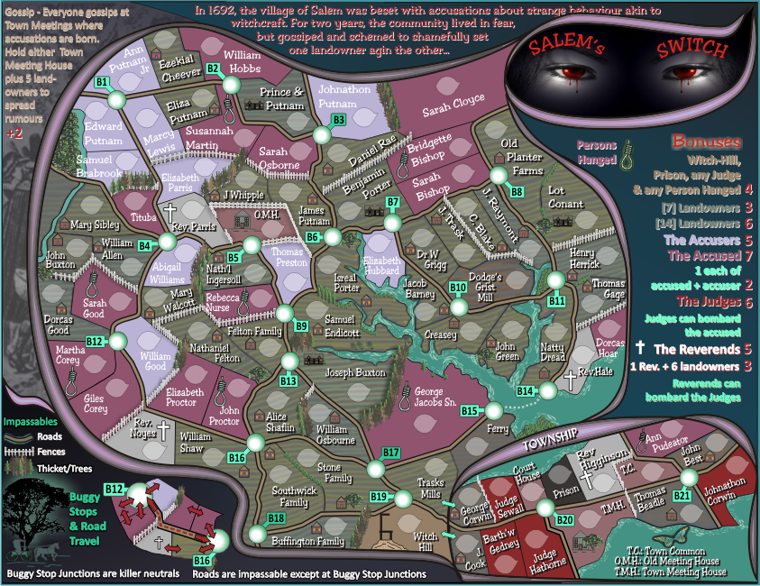
natty_dread wrote:Eyes look good now.
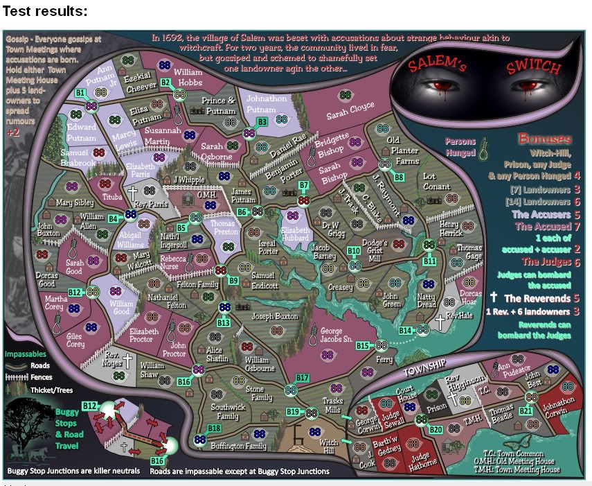
Good!
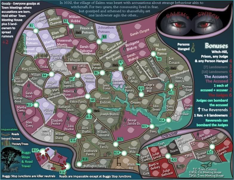
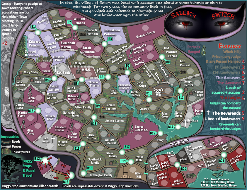
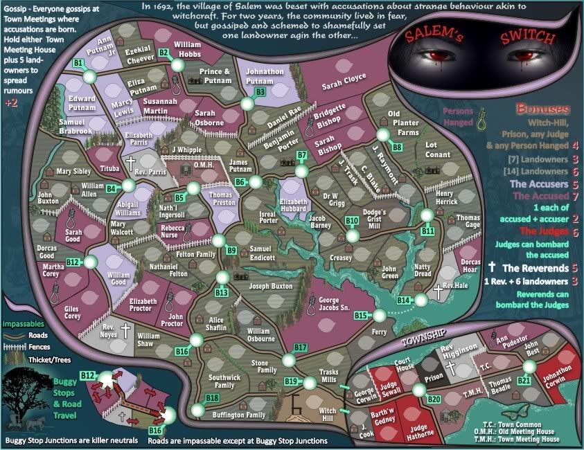
ender516 wrote:I find the black backing on the fonts too strong, especially under the names of the Accusers. I much prefer any of the looks on Version 22, where the backing was lighter (see Ann Putnam Jr) or where there was no backing at all (Ezekial Cheever, William Hobbs). Granted, with white text, it may be better with a backing than without (compare Ann Putnam Jr with Edward Putnam), but really, the text without the backing works well enough, and you could use a dark text for the Accusers (Johnathon Putnam).
AndyDufresne wrote:I've always thought that the text on the legend, or mapboard areas, would look much better with some sort of outline stroke.
--Andy
ender516, i did the whole lot in response to above from Andy, I have not done the legend areas.
Perhaps those accusers only need the backing text lightened as you say, i'll see.
I'd prefer to have some consistency with the front text being all white, so the background will have to be manipulated.