Feudal Epic, L&S, Pg. 49 [D, Gp, Gr]
Moderator: Cartographers
Re: Feudal Epic *The sequal to Feudal War!* Pg. 20 [I, Gp]
![]() by Kotaro on Fri Mar 13, 2009 2:31 pm
by Kotaro on Fri Mar 13, 2009 2:31 pm
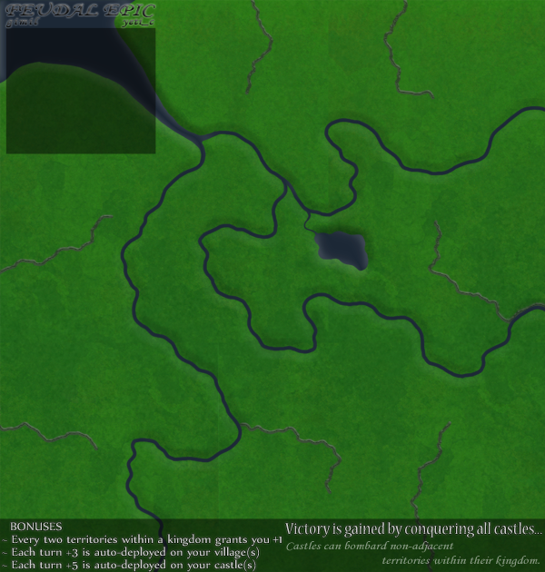
The new colors look terrible. Half the land is dying, the water appears to have been heavily polluted by "navy blue" coloring dye, and the letters are less visible now.
Lakad Matataaag!
Normalin, normalin.

Normalin, normalin.
TheJonah wrote:I`m not really that arsed. Just supporting my mucker.
-

 Kotaro
- Posts: 3465
- Joined: Sat Mar 03, 2007 2:31 pm
- Location: TheJonah: You`re a fucking ruthless, little cunt!


Re: Feudal Epic *The sequal to Feudal War!* Pg. 20 [I, Gp]
![]() by hecter on Sat Mar 14, 2009 4:44 pm
by hecter on Sat Mar 14, 2009 4:44 pm
I like the darker look, but not with those colours... I agree, the land looks dead. Need something more... forest-greeny. More natural. Less dead.
In heaven... Everything is fine, in heaven... Everything is fine, in heaven... Everything is fine... You got your things, and I've got mine.

-

hecter
- Posts: 14632
- Joined: Tue Jan 09, 2007 6:27 pm
- Location: Tying somebody up on the third floor


Re: Feudal Epic *The sequal to Feudal War!* Pg. 20 [I, Gp]
![]() by GrimReaper. on Sat Mar 14, 2009 7:13 pm
by GrimReaper. on Sat Mar 14, 2009 7:13 pm
i like Gimils version but can you make the numbers more visible? Thats the only problem i see

When the first Atom bomb test was complete a colleague of Oppenheimer said: "What an Awesome and Foul display of Power." a moment later he added, "Now we are all sons of bitches"
-

GrimReaper.
- Posts: 913
- Joined: Mon Jul 07, 2008 10:15 pm
- Location: everywhere


Re: Feudal Epic *The sequal to Feudal War!* Pg. 20 [I, Gp]
![]() by danfrank on Sun Mar 15, 2009 9:42 pm
by danfrank on Sun Mar 15, 2009 9:42 pm
i like the darker blue.. I also thought maybe the mountains could also be a bit darker ... that would define each realm rather nicely 

-
danfrank
- Posts: 611
- Joined: Mon Dec 24, 2007 1:19 am


Re: Feudal Epic *The sequal to Feudal War!* Pg. 20 [I, Gp]
![]() by thenobodies80 on Sun Mar 22, 2009 8:26 pm
by thenobodies80 on Sun Mar 22, 2009 8:26 pm
i like the dark version, but some names are difficult to see. (the darker names and numbers)
in this darker map the minimap could be usefull for names (or necessary? )
)
the trees and castles lose the beautiful effect they have in the lighter map, is possible for you mix them ?
Darker territories with lighter objects, names and numbers.
And finally probably you have to fix the map title that disappear in the dark blue in the top right corner.
Great map!
thenobodies80
p.s.
in this darker map the minimap could be usefull for names (or necessary?
the trees and castles lose the beautiful effect they have in the lighter map, is possible for you mix them ?
Darker territories with lighter objects, names and numbers.
And finally probably you have to fix the map title that disappear in the dark blue in the top right corner.
Great map!
thenobodies80
p.s.
- you don't need a legend for this map, everybody know how feudal works.
Are gimil and yeti_c going to "franchise" these maps ?
-

thenobodies80
- Posts: 5400
- Joined: Wed Sep 05, 2007 4:30 am
- Location: Milan


Re: Feudal Epic *The sequal to Feudal War!* Pg. 20 [I, Gp]
![]() by mibi on Sun Mar 22, 2009 10:03 pm
by mibi on Sun Mar 22, 2009 10:03 pm
Yeah I could really pimp this out if I had the PSD.
Jus'sayin.
Jus'sayin.
-

mibi
- Posts: 3350
- Joined: Thu Mar 01, 2007 8:19 pm
- Location: The Great State of Vermont


Re: Feudal Epic *The sequal to Feudal War!* Pg. 20 [I, Gp]
![]() by tlane on Sun Mar 22, 2009 10:35 pm
by tlane on Sun Mar 22, 2009 10:35 pm
i have been watching this map and the new colors are bad, go back to the darker version, or at least make the impassible a darker.
tlane
tlane
-
tlane
- Posts: 309
- Joined: Wed Oct 22, 2008 7:11 pm
- Location: NYC - sint maarten(sometimes)

Re: Feudal Epic *The sequal to Feudal War!* Pg. 20 [I, Gp]
![]() by gimil on Mon Mar 23, 2009 6:10 am
by gimil on Mon Mar 23, 2009 6:10 am
I think I am going to start the graphics again with a little more saturation and darkness:
What do you know about map making, bitch?
Top Score:2403
natty_dread wrote:I was wrong
Top Score:2403
-

gimil
- Posts: 8599
- Joined: Sat Mar 03, 2007 12:42 pm
- Location: United Kingdom (Scotland)


Re: Feudal Epic *The sequal to Feudal War!* Pg. 20 [I, Gp]
![]() by thenobodies80 on Mon Mar 23, 2009 7:13 am
by thenobodies80 on Mon Mar 23, 2009 7:13 am
water a little less dark.
Terrain color is ok in my opinion
Remember the title
Terrain color is ok in my opinion
Remember the title
-
thenobodies80
- Posts: 5400
- Joined: Wed Sep 05, 2007 4:30 am
- Location: Milan
Re: Feudal Epic *The sequal to Feudal War!* Pg. 20 [I, Gp]
![]() by n00blet on Mon Mar 23, 2009 11:19 am
by n00blet on Mon Mar 23, 2009 11:19 am
Starting from scratch after all that work?
Dang....that's dedication!
Dang....that's dedication!
-

n00blet
- Posts: 688
- Joined: Sun Nov 18, 2007 7:09 pm
Re: Feudal Epic *The sequal to Feudal War!* Pg. 20 [I, Gp]
![]() by daydream on Tue Mar 24, 2009 7:02 am
by daydream on Tue Mar 24, 2009 7:02 am
gimil wrote:I think I am going to start the graphics again with a little more saturation and darkness:
best looking of all yet.

-

daydream
- Posts: 922
- Joined: Sun Mar 04, 2007 9:02 am
- Location: Germany


Re: Feudal Epic *The sequal to Feudal War!* Pg. 20 [I, Gp]
![]() by aequitas08 on Tue Mar 24, 2009 3:47 pm
by aequitas08 on Tue Mar 24, 2009 3:47 pm
It looks like there are different shades of green on the land that do not fit with the positions of the cliffs.
"Water" looks dark gray more then blue.
From what I've read and seen this map will complement the current "feudal" very nicely, keep up the good work.
-aequitas08
"Water" looks dark gray more then blue.
From what I've read and seen this map will complement the current "feudal" very nicely, keep up the good work.
-aequitas08
-
aequitas08
- Posts: 28
- Joined: Tue Jan 20, 2009 1:41 pm
Re: Feudal Epic *The sequal to Feudal War!* Pg. 20 [I, Gp]
![]() by gimil on Mon Mar 30, 2009 4:14 pm
by gimil on Mon Mar 30, 2009 4:14 pm
Before I go any further, how does these numbers look on the new background?
What do you know about map making, bitch?
Top Score:2403
natty_dread wrote:I was wrong
Top Score:2403
-
gimil
- Posts: 8599
- Joined: Sat Mar 03, 2007 12:42 pm
- Location: United Kingdom (Scotland)
Re: Feudal Epic *The sequal to Feudal War!* Pg. 20 [I, Gp]
![]() by sailorseal on Mon Mar 30, 2009 4:17 pm
by sailorseal on Mon Mar 30, 2009 4:17 pm
I would like to see the blue of the water be darken so it sticks apart better from the land. Also make the edge of the land seem more of a border, a a quick glance it seems the land just begins to turn blue
Great Map
Great Map
-

sailorseal
- Posts: 2735
- Joined: Sun May 25, 2008 1:49 pm
- Location: conquerclub.com


Re: Feudal Epic *The sequal to Feudal War!* Pg. 20 [I, Gp]
![]() by ZeakCytho on Mon Mar 30, 2009 4:22 pm
by ZeakCytho on Mon Mar 30, 2009 4:22 pm
sailorseal wrote:I would like to see the blue of the water be darken so it sticks apart better from the land. Also make the edge of the land seem more of a border, a a quick glance it seems the land just begins to turn blue
Great Map
Disagree on both counts. The water's brightness is fine - if anything, saturate it a tiny bit more (but not much!). And the shading clearly shows that rivers are in valleys.
The numbers and borders both look lovely, gimil. I'm not terribly fond of the cliffs, though.
-

ZeakCytho
- Posts: 1251
- Joined: Wed Sep 12, 2007 4:36 pm

Re: Feudal Epic *The sequal to Feudal War!* Pg. 20 [I, Gp]
![]() by the.killing.44 on Mon Mar 30, 2009 4:43 pm
by the.killing.44 on Mon Mar 30, 2009 4:43 pm
ZeakCytho wrote:sailorseal wrote:I would like to see the blue of the water be darken so it sticks apart better from the land. Also make the edge of the land seem more of a border, a a quick glance it seems the land just begins to turn blue
Great Map
Disagree on both counts. The water's brightness is fine - if anything, saturate it a tiny bit more (but not much!). And the shading clearly shows that rivers are in valleys.
Agree with Zeak on both here. But one thing: not sure if this is just temporary, but I liked it better when all the borders had glow, although I do understand why you did it. But maybe just a smaller amount of glow on the borders that are non-area dividing?
And I hate the title, even on Feudal — as well as the font in general — but for the Feudal continuity it's fine if you keep it.
Numbers look great, nicely done!
.44
-

the.killing.44
- Posts: 4724
- Joined: Thu Oct 23, 2008 7:43 pm
- Location: now tell me what got two gums and knows how to spit rhymes


Re: Feudal Epic *The sequal to Feudal War!* Pg. 20 [I, Gp]
![]() by thenobodies80 on Thu Apr 02, 2009 1:47 pm
by thenobodies80 on Thu Apr 02, 2009 1:47 pm
Numbers are fine
-
thenobodies80
- Posts: 5400
- Joined: Wed Sep 05, 2007 4:30 am
- Location: Milan
Re: Feudal Epic *The sequal to Feudal War!* Pg. 20 [I, Gp]
![]() by TaCktiX on Fri Apr 03, 2009 4:40 pm
by TaCktiX on Fri Apr 03, 2009 4:40 pm
ZeakCytho wrote:The numbers and borders both look lovely, gimil. I'm not terribly fond of the cliffs, though.
The cliffs need work, but I agree with him.
-

TaCktiX
- Posts: 2392
- Joined: Mon Dec 17, 2007 8:24 pm
- Location: Rapid City, SD


Re: Feudal Epic *The sequal to Feudal War!* Pg. 20 [I, Gp]
![]() by Humrlmo on Tue Apr 07, 2009 12:33 pm
by Humrlmo on Tue Apr 07, 2009 12:33 pm
TaCktiX wrote:ZeakCytho wrote:The numbers and borders both look lovely, gimil. I'm not terribly fond of the cliffs, though.
The cliffs need work, but I agree with him.
Looks great! Anxious for it's release.
I have to agree that the "cliffs" or walls should all look like the ones at Imperial or Warlords.
As for the colors, I think all the player colors will work well on the background (should actually be able to distinguish between green & grey on a map for a change!).
Highest:  - 3205 - #T-51

- 3205 - #T-51-

Humrlmo
- Posts: 333
- Joined: Wed May 07, 2008 11:38 am
- Location: Villa Leyson, Cebu City, Cebu, Philippines


Re: Feudal Epic *The sequal to Feudal War!* Pg. 20 [I, Gp]
![]() by Caymanmew on Fri Apr 17, 2009 10:17 pm
by Caymanmew on Fri Apr 17, 2009 10:17 pm
i love it one enterecen per casle will help me defend
-

Caymanmew
- Clan Director

- Posts: 3228
- Joined: Tue Feb 10, 2009 7:54 am
- Location: Ottawa


Re: Feudal Epic *The sequal to Feudal War!* Pg. 20 [I, Gp]
![]() by iambligh on Tue Apr 21, 2009 8:47 am
by iambligh on Tue Apr 21, 2009 8:47 am
Looks great, can't wait for beta.
-
iambligh
- Posts: 144
- Joined: Thu Jul 17, 2008 7:15 pm

Re: Feudal Epic *The sequal to Feudal War!* Pg. 20 [I, Gp]
![]() by sailorseal on Wed Apr 22, 2009 7:38 pm
by sailorseal on Wed Apr 22, 2009 7:38 pm
I would darken the numbers just to make them more visible. I like the new idea of darker water but I would go further with it. Maybe try this as Feudal War in the dark ages, darken up the whole map in style and play 
I also feel it is a bit squeezed into a cube. Maybe widen it a little and give each territory a little more space.
I for see big problems when armies hit three digits, even two digits, they will just seem like a long large number, I am not sure how to fix this but keep it in mind.
Love the Map!
I also feel it is a bit squeezed into a cube. Maybe widen it a little and give each territory a little more space.
I for see big problems when armies hit three digits, even two digits, they will just seem like a long large number, I am not sure how to fix this but keep it in mind.
Love the Map!
-
sailorseal
- Posts: 2735
- Joined: Sun May 25, 2008 1:49 pm
- Location: conquerclub.com
Re: Feudal Epic *The sequal to Feudal War!* Pg. 20 [I, Gp]
![]() by dolomite13 on Thu Apr 23, 2009 4:49 pm
by dolomite13 on Thu Apr 23, 2009 4:49 pm
This map looks really good, I like feudal but I think this map looks like it will play even better.
Where Have I Been? ... Testing a prototype board game that I co-designed called Alien Overrun!
-

dolomite13
- Posts: 1379
- Joined: Mon Aug 18, 2008 5:54 pm


Re: Feudal Epic *The sequal to Feudal War!* Pg. 20 [I, Gp]
![]() by MoB Deadly on Thu Apr 23, 2009 7:58 pm
by MoB Deadly on Thu Apr 23, 2009 7:58 pm
I definitely think there should be at least 2 entrances for each castle, since this is a sequel I really think the gameplay should be improved to negate bombarding and just sitting tactic that's popular now.
Maybe just all the new territories added will be enough though!
Maybe just all the new territories added will be enough though!

-

MoB Deadly
- Posts: 2381
- Joined: Sun Jan 11, 2009 2:07 am


Re: Feudal Epic *The sequal to Feudal War!* Pg. 20 [I, Gp]
![]() by gimil on Sun May 03, 2009 9:55 am
by gimil on Sun May 03, 2009 9:55 am
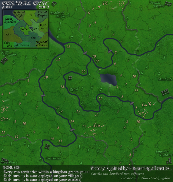
I have some creativity flowing through me, so lets try and help me get this finished foundry! 
- Click image to enlarge.
What do you know about map making, bitch?
Top Score:2403
natty_dread wrote:I was wrong
Top Score:2403
-
gimil
- Posts: 8599
- Joined: Sat Mar 03, 2007 12:42 pm
- Location: United Kingdom (Scotland)
Who is online
Users browsing this forum: No registered users
|
|||||||
| Conquer Club is not associated with RISK online in any way. Copyright © 2006-2025 by Big Wham LLC | |||||||