Official: Central America Competition - complete!
Moderator: Cartographers
Forum rules
Please read the community guidelines before posting.
Please read the community guidelines before posting.
Official: Central America Comp, Rnd 1 thread
Round 2 is up and has been moved!
The new Round 2 voting can be found over here...
http://www.conquerclub.com/forum/viewto ... 31&start=0
Entry #1 Entry #2 Entry #3 Entry #4 Entry #5 Entry #6 Links to round 1 drafts, if anybody cares to compare...
Entry #1: http://i141.photobucket.com/albums/r76/ ... /map01.png
Entry #2: http://i141.photobucket.com/albums/r76/ ... /map02.jpg
Entry #3: http://i141.photobucket.com/albums/r76/ ... /map03.jpg
Entry #4: http://i141.photobucket.com/albums/r76/ ... /map04.jpg
Entry #5: http://i141.photobucket.com/albums/r76/ ... /map05.png
Entry #6 was not included in round 1.
Re: Official: Central America Competition - VOTE!
I have no idea who made which one 
- wcaclimbing
- Posts: 5598
- Joined: Fri May 12, 2006 10:09 pm
- Location: In your quantum box....Maybe.
- Contact:
Re: Official: Central America Competition - VOTE!
Its difficult with new mapmakers... I can't match any styles to anyone without other maps to look at.ZeakCytho wrote:I have no idea who made which one
I'll put a bit of thought into figuring out who is who later tonight.
And I have voted.

Re: Official: Central America Competition - VOTE!
It was tough between 2 and 5 for me... I thought of 3, but then I thought of how it could hurt the eyes after a while.

- the.killing.44
- Posts: 4724
- Joined: Thu Oct 23, 2008 7:43 pm
- Gender: Male
- Location: now tell me what got two gums and knows how to spit rhymes
- Contact:
Re: Official: Central America Competition - VOTE!
I had the same thought process as Gilligan, actually  .
.
Broke the tie
Broke the tie
Re: Official: Central America Competition - VOTE!
I appreciate that 3 has a completely unique look and a different perspective on the region... I think that if the "bump" texture is softened it would make a really nice map.Gilligan wrote:I thought of 3, but then I thought of how it could hurt the eyes after a while.
Beyond that, they're all pretty clean entries.
Re: Official: Central America Competition - VOTE!
looks like we've got three groups here.
the greens
the blands
the favourite
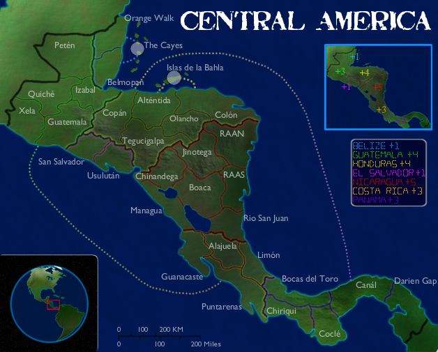
1. at first glance it's very forgettable. did the person who did this draw the land? if so, I wish this was more defined throughout.
the problem here for me is lack of colour. it would've been nice to see more detail on the land with some colour. perhaps coloured borders or names and the numbered territories detracts quite a bi.
could be a lot better but in a "has potential" way
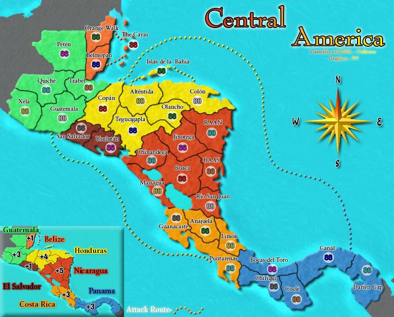
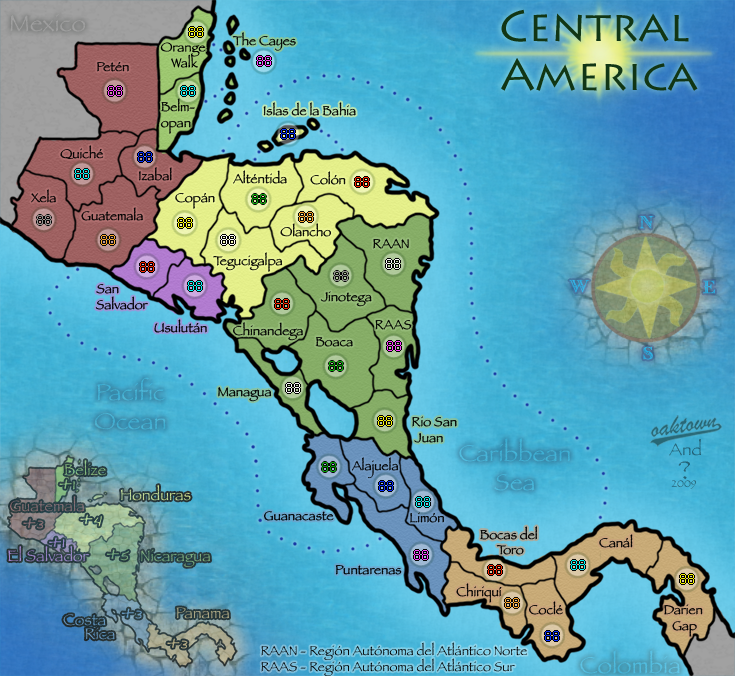
2. to be harsh, it's a bland map. it's definitely passable by foundry standards but nothing special. the best part is the colours except for the southern two. puke and pink don't fit well.
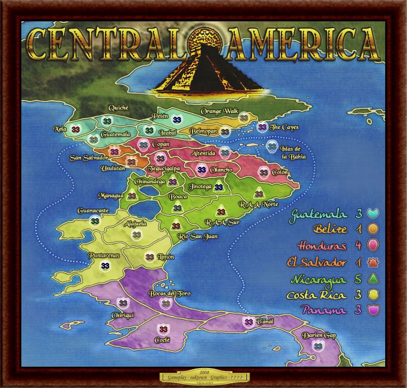
3. the favourite. unique style and viewpoint. great symbols for army circles.
problems. viewability in a few spots is "tough" either because of the colours which I wish were same throughout each continent.
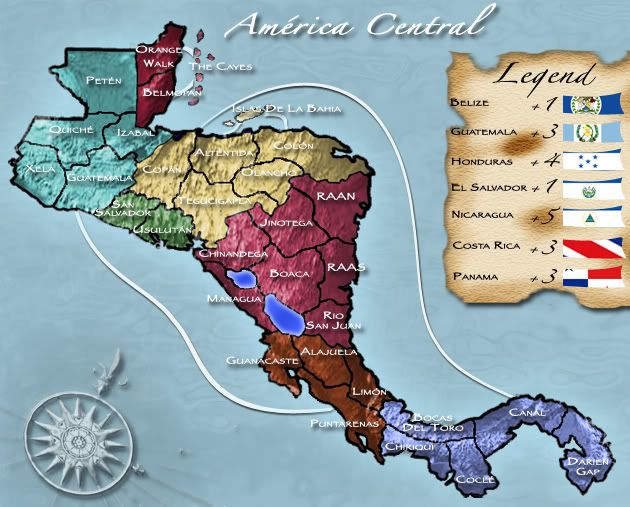
4. looks familiar
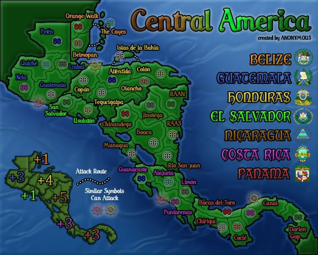
don't like the floating map. don't like the green. just not for me. don't like that a few of the colours are too close. green in honduras and el salvador (maybe even costa rica). orange/brown for belize and nicaragua.
like the symbols for the continents. like the legend a lot. title is cool too with the fading colour. perhaps this could be used on the land?
5. I realize this won't be helpful and will be somewhat telling about my feelings about this map but I don't have anything to say
again this is passable by foundry standards but nothing special about it.
If I had to rank them I'd go 3, 4, 1, 5, 2. If 1 and 4 team up for 1 to do the landscape but more detailed and 4 to add the flavour, you'd have quite a nice map. if not on this map perhaps on something else in the future.
3 really has to work on legibility issues throughout the map. this comes down to colour choice (blue is a VERY BAD choice for that northern continent), font choice, and although the perspective you chose is awesome, it does present problems with spacing in the north. not sure you can do anything about that.
- Incandenza
- Posts: 4949
- Joined: Thu Oct 19, 2006 5:34 pm
- Gender: Male
- Location: Playing Eschaton with a bucket of old tennis balls
Re: Official: Central America Competition - VOTE!
#3 is definitely the most distinctive and creative of the lot, and it's a lot easier to scale back a design and improve legibility than it would be to pump up any of the other four (tho if I had a second-place vote, it would probably be for #4).
Very nice work by all 5 entrants!
Very nice work by all 5 entrants!
THOTA: dingdingdingdingdingdingBOOM
Te Occidere Possunt Sed Te Edere Non Possunt Nefas Est
Te Occidere Possunt Sed Te Edere Non Possunt Nefas Est
- The Neon Peon
- Posts: 2342
- Joined: Sat Jun 14, 2008 12:49 pm
- Gender: Male
Re: Official: Central America Competition - VOTE!
I am surprised I was the first to vote for #4. In my opinion, a simple color change will do for it, best graphics style of them all in my opinion.
Too bad I didn't have the map making skill to enter, it would take me forever to make something half as good as any of those entries.
Too bad I didn't have the map making skill to enter, it would take me forever to make something half as good as any of those entries.
Re: Official: Central America Competition - VOTE!
I've been hanging out for one of these comps to come around again and then when one does I have no time to submit an entry  .
.
Well done to the entrants, I shall follow the progress of the comp with great interest.
Well done to the entrants, I shall follow the progress of the comp with great interest.
-
whitestazn88
- Posts: 3128
- Joined: Mon Feb 05, 2007 2:59 pm
- Gender: Male
- Location: behind you
- Contact:
Re: Official: Central America Competition - VOTE!
the reason i didn't really like 4 is because it didn't touch any borders, central america isn't really an island, which is what 4 made it seem like
i voted for <mod edit> because it was mine... but hey, if thats how i gotta win, thats what i'm gonna do
i voted for <mod edit> because it was mine... but hey, if thats how i gotta win, thats what i'm gonna do
Last edited by MrBenn on Thu Dec 11, 2008 4:12 am, edited 1 time in total.
Reason: anonymity
Reason: anonymity
Re: Official: Central America Competition - VOTE!
it's still early and I'm not sure if we're having a person's friends vote for them or something but I hope we start seeing more votes based on potential. 2 and 5 might be the most "playable" but they're definitely the most bland as well. I think those two have met their full potential. sure those two have the possibility of adding uniqueness/flavour but that's something others have already done which is very important. The others can be way better with tinkering but 2 and 5 need a new approach/perspective to improve. this is the reason I wish everyone was given a chance to edit their maps.
Re: Official: Central America Competition - VOTE!
Don't you get it whitestazn? You're not supposed to say what entry is yours.

-
whitestazn88
- Posts: 3128
- Joined: Mon Feb 05, 2007 2:59 pm
- Gender: Male
- Location: behind you
- Contact:
Re: Official: Central America Competition - VOTE!
i was just joking buddy.... i stated in the overall competition thread that i have been busy with finals this week and last week, so i didn't have time to make a map. but i did vote for 3, i like the new perspective a lotGilligan wrote:Don't you get it whitestazn? You're not supposed to say what entry is yours.
Re: Official: Central America Competition - VOTE!
Well... Then I apologize, but still wouldn't be good to saywhitestazn88 wrote:i was just joking buddy.... i stated in the overall competition thread that i have been busy with finals this week and last week, so i didn't have time to make a map. but i did vote for 3, i like the new perspective a lotGilligan wrote:Don't you get it whitestazn? You're not supposed to say what entry is yours.

- wcaclimbing
- Posts: 5598
- Joined: Fri May 12, 2006 10:09 pm
- Location: In your quantum box....Maybe.
- Contact:
Re: Official: Central America Competition - VOTE!
I voted for #3 (but changed my vote to #5.)
I like the simplicity of #5. 3 is good, but there is too much going on visually, I think.
I like the simplicity of #5. 3 is good, but there is too much going on visually, I think.
Last edited by wcaclimbing on Wed Dec 10, 2008 9:42 pm, edited 1 time in total.

Re: Official: Central America Competition - VOTE!
We were pretty flexible with the last competition - instead of letting two maps into the final rounds as stated we let three, and the changes made before the final round of voting made a significant difference in the outcome. If people vote for the map that they think has the most potential to be a great map, we can give two or three weeks to make a second draft based on the feedback we give this week. And of course changes can and will be made in the foundry after all voting is over.edbeard wrote:...I wish everyone was given a chance to edit their maps.
Re: Official: Central America Competition - VOTE!
what you've just stated makes the case for everyone being able to make changes
"the changes made before the final round of voting made a significant difference in the outcome"
HEEELLLLOOOO!
/thoughts on this
"the changes made before the final round of voting made a significant difference in the outcome"
HEEELLLLOOOO!
/thoughts on this
- Natewolfman
- Posts: 4599
- Joined: Wed Aug 29, 2007 6:37 pm
- Gender: Male
- Location: omaha, NE
Re: Official: Central America Competition - VOTE!
voted 3 for the uniqueness of it, we have plenty of color based graphical maps, but 3 with some small tweeks i think has the most potential
Re: Official: Central America Competition - VOTE!
3 is just too illegible for me to even consider playing on. The perspective is a cool idea, but function should come before form.
Is there going to be an announcement on the main page for the competitions?
Is there going to be an announcement on the main page for the competitions?
Re: Official: Central America Competition - VOTE!
I didn't disagree with you. It's extremely hard to make a map in a vacuum - I'm so used to making maps publicly and getting feedback with every step that the when I present a competition entry map I have no idea if it is a piece of shit or not. I think it's a good idea to run a map past at least one or two other sets of eyes and solicit feedback before the deadline, and nothing stopped any mapmaker from doing so.edbeard wrote:what you've just stated makes the case for everyone being able to make changes
Note please that the rules of this competition do not specify how many maps will go on to the final round... this was a deliberate omission. Maybe out of the five maps we have here, there are clearly only two that people would like to see worked on. Or perhaps the feedback and voting will suggest that there are three. Or all five? Those maps that show a significant level of interest should be given the chance to tinker and improve.
Just as nothing was stopping a mapmaker from showing his/her map to others, the rules didn't bar anybody from asking another CC user to post his/her map a week ago and solicit feedback. The next time we do a competition (and I truly hope we do more!) we can certainly encourage mapmakers to find a buddy to post early versions of the map, or we could even come up with a system of anonymously displaying the maps a few days before launching the vote... it just means extra work for whoever is hosting the maps and starting the thread. Had this been suggested a week ago, instead of an hour ago, we could have done it this time around.
Re: Official: Central America Competition - VOTE!
1: It's okay. Very clean look with the dark green land & black borders. I like the cool blue outline around the beach areas against the dark blue ocean. I would rather have seen the territory names on the map, rather than the key listing. Overall - nice, but not my vote. I think what people like are the mountain reliefs blended on the the terrain, and the brownish / yellowish areas on it. Makes it feel like a real satellite map. Nice - but not my vote.
2: More vibrant colors (i like them). The font style could use some work, and the title is really bad. A gradient fill and drop shadow don't make a good title. The compass rose sort of doesn't fit either. Also - I'm not a big fan of the bevel on the land. Good effort - but not my vote.
3: I love it. what a unique style! It reminds me of an old school conquer club map. I like how the map is sort of skewed so it's more vertical. I love the dot texture background. Very nice. The fonts are a bit hard to read, and I really don't care for the shaped army circles, but that stuff could be sorted out in the foundry. Great colors, great style, great title, and a great Central American feel that stands out from the rest. Well done - This Has My Vote !
4: A good clean map that I'm sure would get little complaints if won. The crest symbols beside the region names are cool. The ocean pattern is cool and the minimap in that oval is a nice touch also. I always like the minimaps. The title is boring (search some free font pages for a cool font, then add your own touch to it). That very light inner stoke on the borders is also nice. But overall, a little bland.
5: I like the pastel colors (;)) I would almost think you don't need army circles with colors this light. The ocean is a little boring. The borders on this map are excellent. Somebody knows the potential of the pen tool. Territory font could be worked on a bit - and again the title is just boring. Good base map that has potential. If this doesn't win, whomever the maker is should use this style on a different project. Nice work.
Great work on all the entries. I was hoping for more than just 5 entries, and a little more variety - but at any rate, I'm happy with what we have. My vote is for #3. I think another valuable take-away is what the 5 cartographers learned from creating their entries. No matter who wins, we've got 5 potential map makers who have honed their skills just a bit more.

Re: Official: Central America Competition - VOTE!
2 and 5 use very similar compases!???
i like the clarity in 5, and the colours of 2....
but my heart lies with 3....once again a 3D production, i very much like the theme of this although the texture is slightly harsh in its present form particularly the sea.
i like the clarity in 5, and the colours of 2....
but my heart lies with 3....once again a 3D production, i very much like the theme of this although the texture is slightly harsh in its present form particularly the sea.

* Pearl Harbour * Waterloo * Forbidden City * Jamaica * Pot Mosbi
- wcaclimbing
- Posts: 5598
- Joined: Fri May 12, 2006 10:09 pm
- Location: In your quantum box....Maybe.
- Contact:
Re: Official: Central America Competition - VOTE!
I changed my vote to 5.
I like how simple it is.
#3 just had too much happening visually for me. Still a good map, but not my favorite.
I like how simple it is.
#3 just had too much happening visually for me. Still a good map, but not my favorite.

-
WidowMakers
- Posts: 2774
- Joined: Mon Nov 20, 2006 9:25 am
- Gender: Male
- Location: Detroit, MI
Re: Official: Central America Competition - VOTE!
3,4,2,5,1
But 3 is by far the best. A new style and look. It easily separates itself. But with that, the colors are to BOLD and as said before, they HURT your eyes.
I say cleanup the borders, soften the color and texture.
WM
But 3 is by far the best. A new style and look. It easily separates itself. But with that, the colors are to BOLD and as said before, they HURT your eyes.
I say cleanup the borders, soften the color and texture.
WM


