Ace Rimmer wrote:darth emperor wrote:IcePack wrote:grifftron wrote:The above is way badass... but comon guys.. lets just make our own maps instead of going after old maps to get medals. If you got the skills... make your own map, unless our maps have a serious problem and are un-playable because of some old graphic glitch... leave em alone.
-griff
+1
+2
-3 bitches.
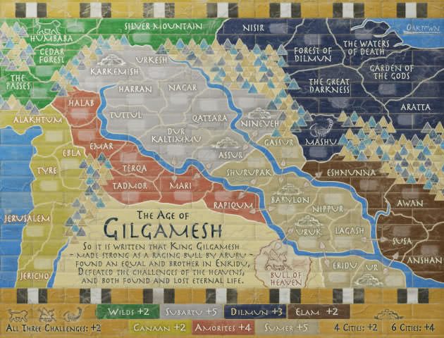
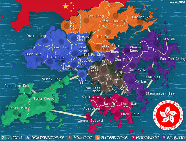
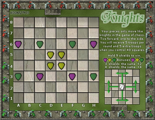
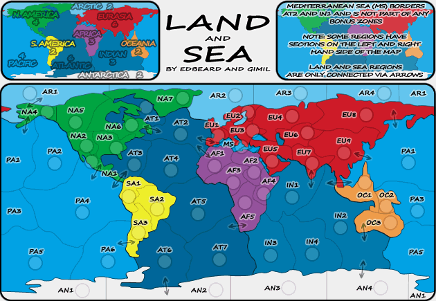
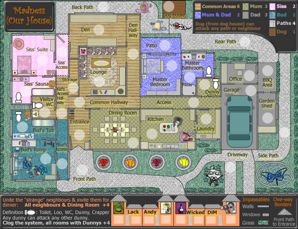
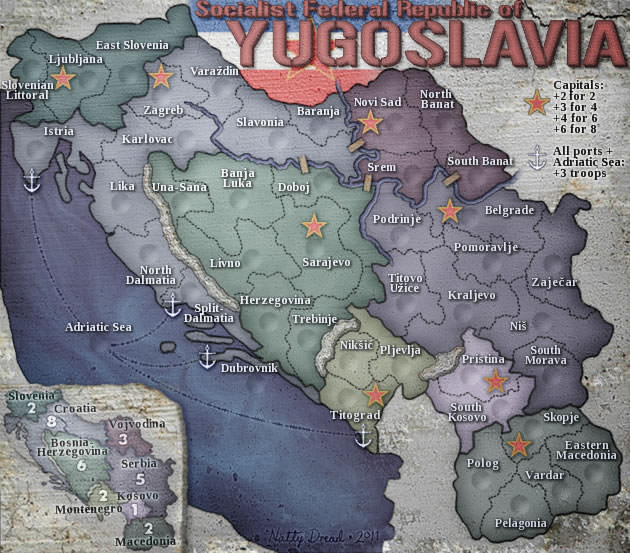
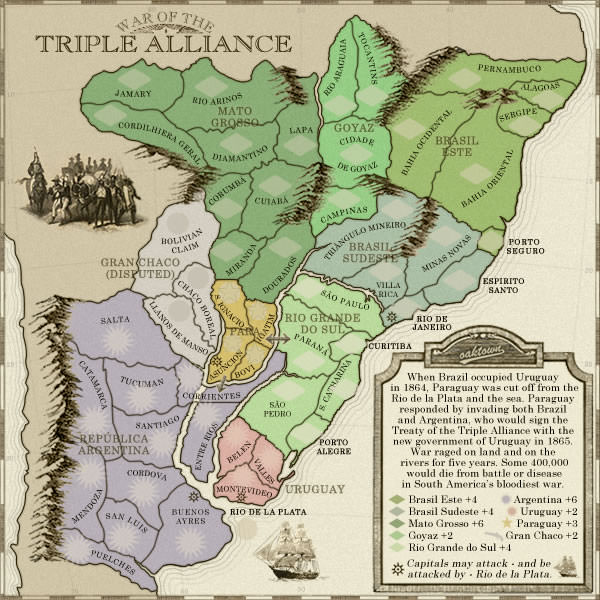
I highly doubt ManB is doing this for a medal. I think it's more likely he realizes what a good map this is to play on, but it sucks graphics wise. You know, like North America did, and that's why they revamped it.
So what if he chooses to spend his time making a map with fine gameplay better? It's his choice, not yours. People are harping about how the aesthetic of this website is very 1996 still, so why don't we focus on the maps that look like they were made back then and correct them so they look nice?
I didn't like also the revamp of NA map. True, that the aesthetic of the website is very 1996. But new maps come, and they will look more modern. But if you feel more nostalgic than you can play this old maps.
We have many maps, and not every map should be equal. Game play is different, image is different, style is different, why should we have the same "modern" aesthetics. It should be more variate. In 3 years, you'll say the same of the new maps, and you'll be revamping all the maps.