With haste, Sir Ney!MarshalNey wrote:Ahhh, excellent! The starting positions look most satisfactory to me now. Into the bulletin with this map!
-Sully
Moderator: Cartographers

With haste, Sir Ney!MarshalNey wrote:Ahhh, excellent! The starting positions look most satisfactory to me now. Into the bulletin with this map!
Excellent, glad i meet your deadlineMarshalNey wrote:Ahhh, excellent! The starting positions look most satisfactory to me now. Into the bulletin with this map!

I think it's unnecessary, and in fact, I'd advise against it. I think what you have is good and adding more would risk some loss in gossip effect of the gameplay. I think what you have is pretty spot-on.cairnswk wrote:Further discussion on gameplay....
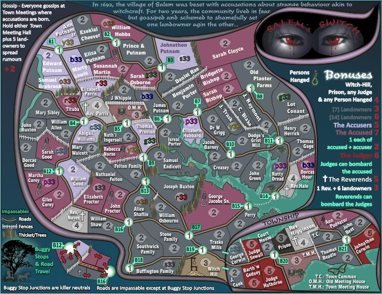
At present there are only 24 starting positions.
I think that another 8 could be added to take up some of those other vacant landowners.
Thoughts anyone?
OK thanks Sully, just thought i'd check one last time before we go to stamping.Victor Sullivan wrote:I think it's unnecessary, and in fact, I'd advise against it. I think what you have is good and adding more would risk some loss in gossip effect of the gameplay. I think what you have is pretty spot-on.cairnswk wrote:Further discussion on gameplay....
At present there are only 24 starting positions.
I think that another 8 could be added to take up some of those other vacant landowners.
Thoughts anyone?
-Sully


Thanks for the stamp MarshalNey.MarshalNey wrote:A well-deserved stamp seems in order...
Of course, this does not mean that any discussion of gameplay is over, but the focus has now moved to graphics since the map has met or exceeded the minimum Foundry standard.
Congrats carins!
-- Marshal Ney
P.S. Now let's get this thing rolling into Beta in time for Halloween
Thanks Natty.natty_dread wrote:Hey, congrats on the gp stamp...
Natty, could identify which ones you're referring to please.On to graphics then... the trees, which apparently are impassables, seem to sort of get lost in the background at some places... could they be tweaked to make them stand out better? I don't know, maybe make them darker or lighter, or add some sort of shadow or glow to them...
Mmm. not sure what you're referring to there, i'll have to check, coz they're vectors, unless they're getting pixelated in the translation.Also the noose icons look a little pixelated... is there a way to smooth them out a bit?
I'll see what i can do with that.And the water could use some more contrast against the land areas.

Top Score:2403natty_dread wrote:I was wrong
gimil, thanks. i had forgotten about your concern, but haven't got around to doing they eyes yet.gimil wrote:Hi cairns,
Can I remind you that I ad a concern earlier in the production. The one about the eyes being overly detailed in comparison to the simplistic flat colours of the rest of the map?
Cheers,
gimil
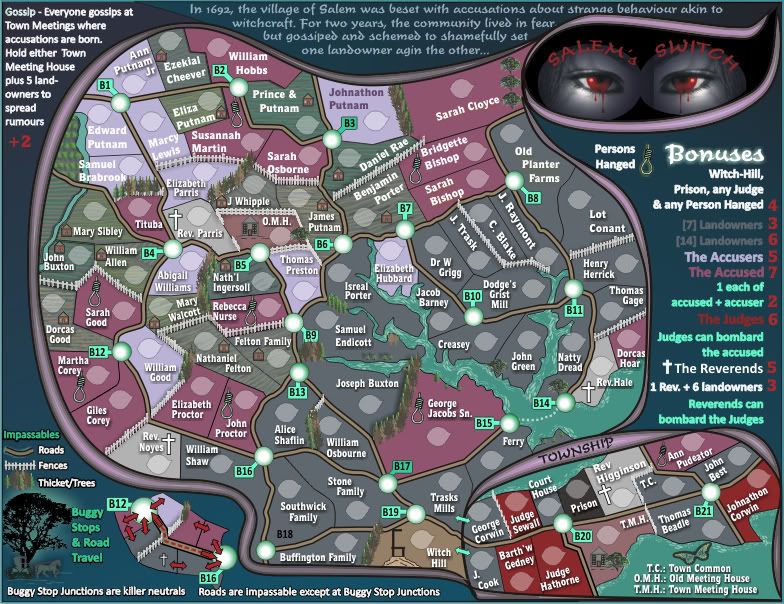
Natty, could identify which ones you're referring to please.On to graphics then... the trees, which apparently are impassables, seem to sort of get lost in the background at some places... could they be tweaked to make them stand out better? I don't know, maybe make them darker or lighter, or add some sort of shadow or glow to them...
I've asked two questions and got no replies, where is everyone, still AWOL?cairnswk wrote:I want to know if the texture on the land that is done on half the map is working for anyone.
I propose only to do the landowners with this texture and leave the accused and accusers as they are now.
Thosw little houses will also be added to all lots where possible if room permits.
thanks isaiah40 for your response there.isaiah40 wrote:The separate backgrounds are okay with me. Just at the right level, you can see it but not distracting.
yes, i have a glow around it so it will stand out on the legend, i'll see what i can do about that also along with the other nooses.One thing I noticed was the noose in the legend, it has some sort of weird glow around it whereas it doesn't in the playable area.
thanks isaiah40 for your response there.isaiah40 wrote:The separate backgrounds are okay with me. Just at the right level, you can see it but not distracting.
ender516 wrote:I like the textures on the land. It can and should be used to emphasize the separate plots of land, allowing the boundary lines to remain knife-edge thin.
Mmmm Natty, You've given feedback on the trees, thanks...but i haven't yet altered the water.natty_dread wrote:Well, now that I look at it... I'm sorry, but I don't think the trees really fit the style of the map.
Perhaps if you could make them more like that black tree in the bottom left corner?
The water looks pretty good now, but maybe you could try making it a bit darker?
the big dark black oaks as for effect only in the legend, but will also be used to a small extent on the map also but in real colours not black.ender516 wrote:Well, if the trees can be made more attractive, I guess that is a good thing, but I suspect that the reality is that conifers like the ones now on the map are exactly the type of trees planted in that area as natural fences and windbreaks.