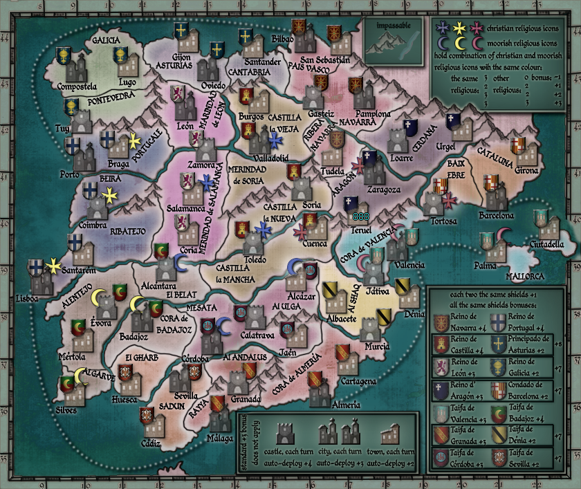
o.k. I look at the map and have some notices. I agree with natty with some.
1, sea is too dark for me
2, also legends are too dark, and maybe they should have another colour/tone
3, the same for border around map
4, maybe all map needs less opacity...?
5, some shields are too dark (aragon, badajoz...)
6, do not know what is with navarra shield by Tudela, looks as has less opacity as others
7, the pink religious icons are great, but blue and yellow needs be darker...?
it is on you if you send me file with layers and I will try to edit it, or you will do some changes if you agree with any of notices.
it is amazing what you did with settlements icons in legend, I love them

all at all again great work.