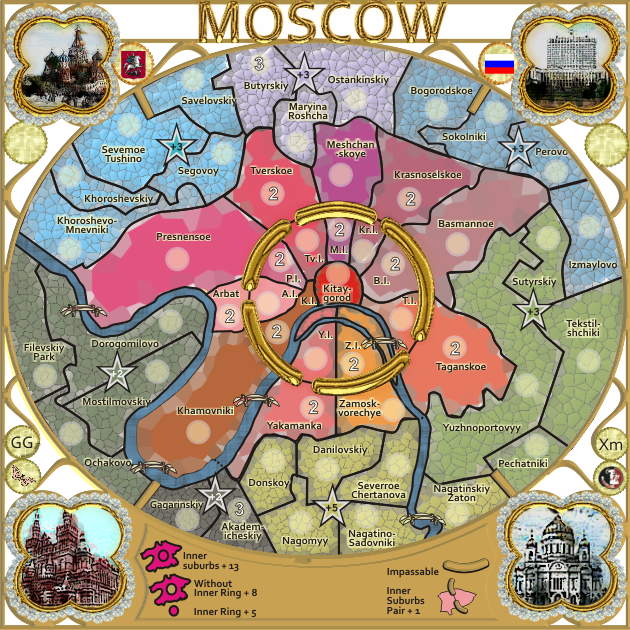
1. Title moved above the frame
2. image top right replaced.
Moderator: Cartographers
![]() by cairnswk on Mon Jun 25, 2012 4:17 pm
by cairnswk on Mon Jun 25, 2012 4:17 pm


![]() by Oneyed on Mon Jun 25, 2012 4:38 pm
by Oneyed on Mon Jun 25, 2012 4:38 pm


![]() by cairnswk on Mon Jun 25, 2012 4:56 pm
by cairnswk on Mon Jun 25, 2012 4:56 pm
Oneyed wrote:I think it was good decision to make all map in English.
the bridges look nice, but I think the map is from modern era and they look as stone/wood bridges. maybe something modern or any of Moscow bridges should be better?
just idea.
...
Oneyed
![]() by nolefan5311 on Tue Jun 26, 2012 12:23 pm
by nolefan5311 on Tue Jun 26, 2012 12:23 pm


![]() by cairnswk on Tue Jun 26, 2012 1:15 pm
by cairnswk on Tue Jun 26, 2012 1:15 pm
nolefan5311 wrote:We'll go ahead and get this one moved up to Graphics.
Congrats cairns!
![]() by nolefan5311 on Tue Jun 26, 2012 1:19 pm
by nolefan5311 on Tue Jun 26, 2012 1:19 pm
![]() by cairnswk on Tue Jun 26, 2012 1:29 pm
by cairnswk on Tue Jun 26, 2012 1:29 pm
nolefan5311 wrote:I assume so. He hasn't posted with any concerns.
![]() by nolefan5311 on Tue Jun 26, 2012 1:47 pm
by nolefan5311 on Tue Jun 26, 2012 1:47 pm
![]() by cairnswk on Tue Jun 26, 2012 1:49 pm
by cairnswk on Tue Jun 26, 2012 1:49 pm
nolefan5311 wrote:I've pm'ed him about it and posted in the CA forums that I was getting ready to stamp it. You can PM him yourself and let him know you're not ready to move on to the next stage until you hear from him though. There's not really much more I can do.
![]() by koontz1973 on Wed Jun 27, 2012 12:19 am
by koontz1973 on Wed Jun 27, 2012 12:19 am


![]() by iancanton on Wed Jun 27, 2012 1:00 am
by iancanton on Wed Jun 27, 2012 1:00 am


![]() by cairnswk on Wed Jun 27, 2012 2:37 am
by cairnswk on Wed Jun 27, 2012 2:37 am
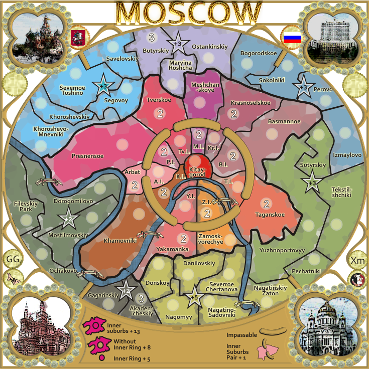
koontz1973 wrote:cairnswk, these areas are now good in my opinion but you do need to polish them all up.
Title, good to see the whole thing now. But needs the polish.
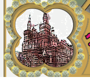
Picture (top right) far better. Bottom rights sky is too light, darken that with some blue.
Bridges, some of the best and really work with this style.
The rest of the map, and that is everything, will need to be gone over with a fine tooth comb, changed altered and just generally brought up to standard. Sorry to be blunt about that.
iancanton wrote:sorry for the delay. i confirm nolefan's conclusion that the gameplay is solid, so u can feel free to progress the graphics without fear that the borders need to change for gameplay reasons. the only additional suggestions i have are for the green bonus to be reduced from +4 to +3 and for the inner ring neutrals to be amended from n3 to n2, both to encourage more play in the middle; these do not require graphic changes.
ian.

![]() by isaiah40 on Wed Jun 27, 2012 5:17 pm
by isaiah40 on Wed Jun 27, 2012 5:17 pm


![]() by cairnswk on Wed Jun 27, 2012 5:38 pm
by cairnswk on Wed Jun 27, 2012 5:38 pm
isaiah40 wrote:Before I make any comments on this, I have one question. What style/theme are you going for?
![]() by Nola_Lifer on Thu Jun 28, 2012 1:16 pm
by Nola_Lifer on Thu Jun 28, 2012 1:16 pm
cairnswk wrote:isaiah40 wrote:Before I make any comments on this, I have one question. What style/theme are you going for?
Russian jewellry


![]() by cairnswk on Thu Jun 28, 2012 3:59 pm
by cairnswk on Thu Jun 28, 2012 3:59 pm
Nola_Lifer wrote:cairnswk wrote:...
Russian jewellry
Faberge eggs?
![]() by cairnswk on Thu Jun 28, 2012 4:14 pm
by cairnswk on Thu Jun 28, 2012 4:14 pm
![]() by cairnswk on Thu Jun 28, 2012 6:06 pm
by cairnswk on Thu Jun 28, 2012 6:06 pm
koontz1973 wrote:cairnswk, these areas are now good in my opinion but you do need to polish them all up.
Title, good to see the whole thing now. But needs the polish.
Picture (top right) far better. Bottom rights sky is too light, darken that with some blue.
Bridges, some of the best and really work with this style.
The rest of the map, and that is everything, will need to be gone over with a fine tooth comb, changed altered and just generally brought up to standard. Sorry to be blunt about that.
![]() by isaiah40 on Thu Jun 28, 2012 7:40 pm
by isaiah40 on Thu Jun 28, 2012 7:40 pm

![]() by koontz1973 on Mon Jul 02, 2012 6:23 am
by koontz1973 on Mon Jul 02, 2012 6:23 am
![]() by cairnswk on Mon Jul 02, 2012 6:26 am
by cairnswk on Mon Jul 02, 2012 6:26 am
koontz1973 wrote:Like the title in gold, is the rest of the frame going to be like that?
![]() by cairnswk on Thu Jul 19, 2012 7:25 pm
by cairnswk on Thu Jul 19, 2012 7:25 pm
![]() by cairnswk on Thu Jul 26, 2012 5:49 pm
by cairnswk on Thu Jul 26, 2012 5:49 pm
isaiah40 wrote:Russian Jewels?? My first thought on the playable area was stained glass, but doesn't look like stained glass.
The jewels around each picture, get rid of the glow or whatever it is around them.
There is some brown protruding out from underneath the frame area, top, top left and left side.
There is a little blip here:
![]() by cairnswk on Thu Jul 26, 2012 6:46 pm
by cairnswk on Thu Jul 26, 2012 6:46 pm
![]() by nolefan5311 on Thu Jul 26, 2012 9:26 pm
by nolefan5311 on Thu Jul 26, 2012 9:26 pm
Users browsing this forum: No registered users
|
|||||||
| Conquer Club is not associated with RISK online in any way. Copyright © 2006-2025 by Big Wham LLC | |||||||