[Abandoned] Alamo
Moderator: Cartographers
Re: Alamo map 11/30(pg 25)
![]() by degaston on Sun Dec 01, 2013 10:29 am
by degaston on Sun Dec 01, 2013 10:29 am
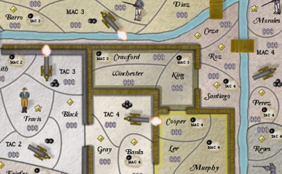
Here's a quick and dirty example of some cannons firing. It could be done better, but I don't think it looks bad. The cannons could be moved if there's a concern about the blasts looking like a break in the wall.
-

 degaston
- Posts: 989
- Joined: Fri Apr 01, 2011 10:12 am


Re: Alamo map 11/30(pg 25)
![]() by generalhead on Sun Dec 01, 2013 11:46 am
by generalhead on Sun Dec 01, 2013 11:46 am
koontz1973 wrote:GH, this is now looking pretty damn good. A long way from the start and only loks like the final touches need to be done now. So a few from me again.
Your frame is now aligned in a couple of places. It looks like you used a copy and paste job that was too small for the map and needed to improvise.
The Alamo legend, it looks like a layer from the rope is still turned on. It looks like a ghost image on the right.
Alamo title can go smaller (25%) and darker.
Jones needs to be sorted out. The target does not fit inside the region.
Legend text could be a tad darker.
From Degaston, I like the idea of the smudge giving direction, but the cannon firing, unless this is done really well, would look odd. Leave the clouds as they are though.
Once again, great work GH.
Thanks buddy, could not have done it without you and the rest of the members and visitors of the foundry.
I will make sure to fix all of the stuff you listed.
Last edited by generalhead on Sun Dec 01, 2013 12:03 pm, edited 1 time in total.
-
generalhead
- Posts: 806
- Joined: Mon Apr 26, 2010 10:09 pm


Re: Alamo map 11/30(pg 25)
![]() by generalhead on Sun Dec 01, 2013 11:56 am
by generalhead on Sun Dec 01, 2013 11:56 am
degaston wrote:Here's a quick and dirty example of some cannons firing. It could be done better, but I don't think it looks bad. The cannons could be moved if there's a concern about the blasts looking like a break in the wall.
I like the suggestion, I just don't know how realistic it looks. I think that there was more smoke coming out of the end of the barrel of canons when
they were fired more than fire. with the balls already at the target too the smoke would have dissipated. I do like the idea of having the balls in motion though.
-
generalhead
- Posts: 806
- Joined: Mon Apr 26, 2010 10:09 pm
Re: Alamo map 11/30(pg 25)
![]() by ManBungalow on Thu Dec 05, 2013 1:11 pm
by ManBungalow on Thu Dec 05, 2013 1:11 pm
The whole image looks a little blurry now (especially compared to the previous version). Any reason for this? Did you change your compression settings?

-
ManBungalow
- Posts: 3431
- Joined: Sun Jan 13, 2008 7:02 am
- Location: On a giant rock orbiting a star somewhere


Re: Alamo map 11/30(pg 25)
![]() by koontz1973 on Thu Dec 05, 2013 1:27 pm
by koontz1973 on Thu Dec 05, 2013 1:27 pm
Reload the map GH, that would be the image holders problem you have got there.

-

koontz1973
- Posts: 6960
- Joined: Thu Jan 01, 2009 10:57 am


Re: Alamo map 11/30(pg 25)
![]() by degaston on Thu Dec 05, 2013 2:45 pm
by degaston on Thu Dec 05, 2013 2:45 pm
It looks like he shrank the entire map in order to accommodate the new border. This is mostly obvious in the territory digits, which won't be in the final map, but it also had some effect on the soldier and cannon images. He probably needs to go back to the originals for those images and rescale them before putting them on the map.
Also, GH, your version on page 25 is different from V31 shown on page 1. Page 1 should be kept up-to-date with the latest version. And Including a date for each map on page 1 would be nice, too.
One last word in defense of cannon fire. These are obviously rapid-fire cannons if they all have 3-4 cannonballs impacting the dirt at the same time, so the cannon flash is for the next round that is being fired.
-
degaston
- Posts: 989
- Joined: Fri Apr 01, 2011 10:12 am
Re: Alamo map 11/30(pg 25)
![]() by generalhead on Fri Dec 06, 2013 12:19 pm
by generalhead on Fri Dec 06, 2013 12:19 pm
I have finals next week so I will comment and have updates in a week or so.
-
generalhead
- Posts: 806
- Joined: Mon Apr 26, 2010 10:09 pm
Re: Alamo map 11/30(pg 25)
![]() by RedBaron0 on Tue Jan 07, 2014 10:56 pm
by RedBaron0 on Tue Jan 07, 2014 10:56 pm
[Moved]
Seems the progress of this map has stalled. Should the mapmaker wish to continue this project please let any CA know your desire to continue, after an update has been made. This map will be considered to be on vacation for a period of no longer than months, after which if the mapmaker hasn't yet updated it will be considered abandoned. Any updated standards of gameplay during the vacation time may require further gameplay vetting up to and including revoking the current gameplay stamp.(if necessary)
Seems the progress of this map has stalled. Should the mapmaker wish to continue this project please let any CA know your desire to continue, after an update has been made. This map will be considered to be on vacation for a period of no longer than months, after which if the mapmaker hasn't yet updated it will be considered abandoned. Any updated standards of gameplay during the vacation time may require further gameplay vetting up to and including revoking the current gameplay stamp.(if necessary)


-

RedBaron0
- Posts: 2657
- Joined: Sun Aug 19, 2007 12:59 pm
- Location: Pennsylvania


Who is online
Users browsing this forum: No registered users
|
|||||||
| Conquer Club is not associated with RISK online in any way. Copyright © 2006-2025 by Big Wham LLC | |||||||