
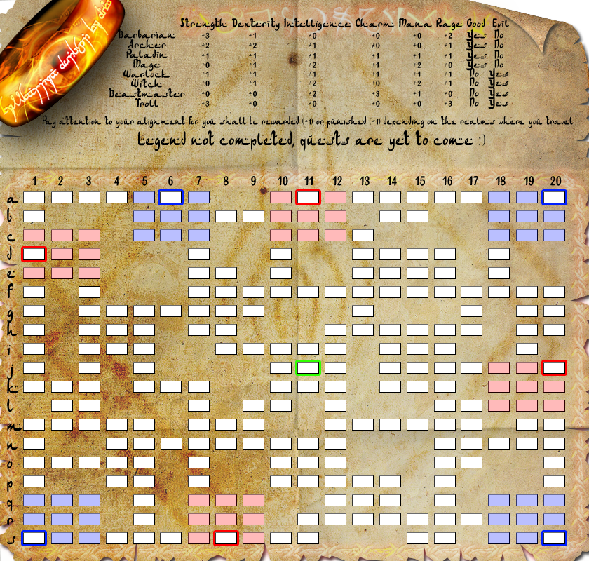
CURRENT VERSION:
V7.
font changed all over the map
changed map name to Age of Quests (temporary until a better alternative is found)
[bigimg]http://i178.photobucket.com/albums/w250/DiM-topia/RPGcopy-13.png[/bigimg]
CURRENT DISCUSSION FOCUS
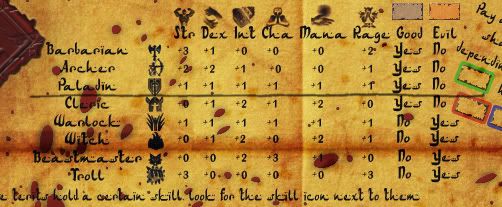
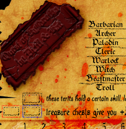
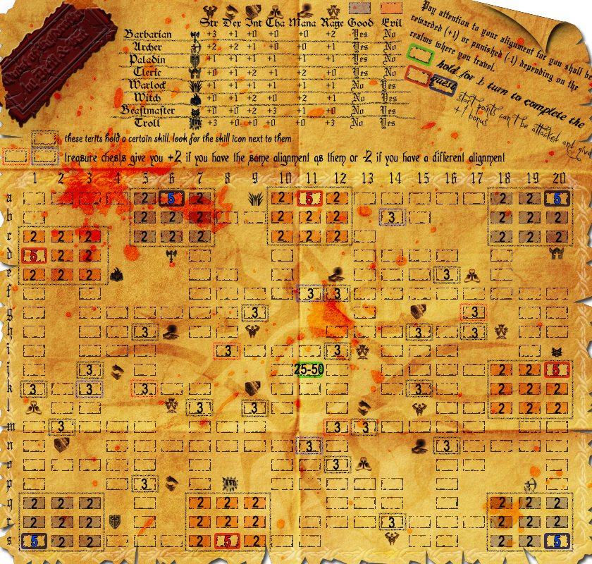
1. placement of skills and treasure chests around the map. as this has a big impact on gameplay i need to make sure all starting locations are balanced and no character has an advantage when it comes to obtaining bonuses. please make sure you check the legend as the skills offer various bonuses depending on character
2. visibility. overall the map has perfect visibility of the army numbers. tested it on small and large versions and yes even on the blood splatters the red army numbers are perfectly visible. my main concern on this subject is the font used in the legend. i can read it but i'm not sure others can. so input is needed here. solved?
3. bonuses.
i'm thinking this:
starting location +1 (on hand, this will basically be the terit bonus which is set to a minimum of 1)
each terit of same alignment +1 (on hand)
each terit of different alignment -1 (decay - autodeployed)
treasure chest +/-2 depending on alignment (autodeployed)
skill terits are as seen on the chart in the legend
4. starting neutrals. everything except the starting locations (which will have 5 troops) is neutral and i'm thinking of the following values:
alignment terits (the ones near the starting locations) will have 2 neutrals
skill terits and treasure chests will start with 3 neutrals
all the non important terits will start with 1 to allow smooth movement
the objective will have 25 neutrals as i don't want it to be too high but not too low either
5. name of the map. right now it is Quest of Kylldrotha but i'm open for suggestions
so get talking and give me feedback.
PREVIOUS VERSIONS:
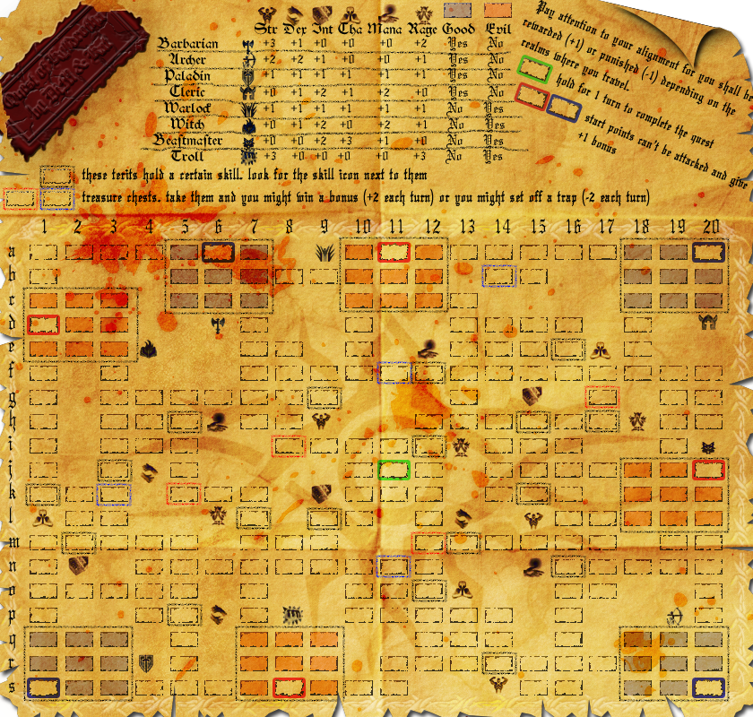
V6.
redid the wax seal
removed the curl in top right corner to make room for text
added explanation that there are no diagonal attacks
changed text on map (except chart numbers)
[bigimg]http://i178.photobucket.com/albums/w250/DiM-topia/RPGcopy-11.png[/bigimg]
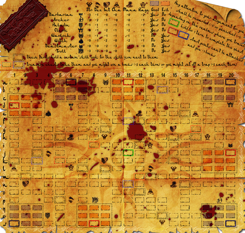
V5.
made the blood stain a tad more red
added various font types please tell me which one you like best.
reworded the treasure chest explanation. hope it's more clear now.
made the map just a bit darker. it should be halfway between V4 and V3
added neutral values and starting locations values. the terits that don't have a number on them have a 1 neutral army. i was too lazy to add so many numbers
to do:
fix curl
fix the wax seal (when foregone tells me what's wrong with the broken edges)
decide on font type
decide on a name
http://i178.photobucket.com/albums/w250 ... copy-8.png
V4
made the blood look as a stain to improve visibility and make it more real (used to have the text layer above the blood layer and it wasn't real)
fixed blood coming off the map
added lines in the legend (yes i made them jiggly on purpose)
made the map lighter
made the seal edges broken and added a wax stain where those edges were supposed to be.
changed font all over the place (except for the seal which is waiting for a new name)
fixed letters and stuff going off the map
http://i178.photobucket.com/albums/w250 ... copy-7.png
V3:
completely redid the terits
completely changed the paper background to one that's better for the eye.
removed the ring and replaced it with a wax seal
added a full legend
added icons for skills and characters
placed skills around the map (need thoughts on placement)
added blood
various grunges and stuff
http://i178.photobucket.com/albums/w250 ... copy-6.png
V2:
terit layout
terit naming
starting locations
bla bla
http://i178.photobucket.com/albums/w250 ... copy-2.png
V1:
basic layout
partial legend
various artwork
http://i178.photobucket.com/albums/w250 ... PGcopy.png
ORIGINAL POST:
DiM wrote:i love RPG games. (if you don't know what RPG stands for then google it)
so i was thinking why not combine RPG with CC and get a brand new map with a brand new gameplay?
imagine 8 characters (wizard, barbarian, paladin, archer, warlock, etc) in a fantasy realm going on a quest to find the Holy CC star ()
the beauty part is where the RPG meets Risk.
i have been gone for long and i don't know what is or isn't possible with xml or if any new xml features have been/will be added so bare with me and post your thoughts.
the idea is to get a character and develop it as you would do in any RPG game. to do this you have a HUGE dungeon (have the size limits been increased?) where these characters roam and do quests. i'm thinking somewhere around 400 terits (maybe more) in a grid shape. each charachter will get a beacon (the starting location) and then advance in the maze. the beacons can't be conquered (so you can only win by holding the objective). i need this because each character will have personalized quests. i don't know if it is possible but it's something like this:
quest for warrior: go defeat the Yeti monster and bring it's claws to the Den of Damnation. this actually translates into the xml like this: hold the yeti terit and the Den terit to get the bonus. and to make the quest personalized you also have to hold the warrior beacon. since the beacon can't be taken by other players it means you're the only one that can do that quest. (from what i remember this is possible to be coded in the xml)
now, let's talk about character traits and items. using the beacon holding in the xml other bonuses can also be coded for specific players.
for example a warlock takes a terit in a blessed zone he can get an automatic decay bonus for that terit (because he is an evil character in a good zone) .
or a paladin takes a treasure terit wich gives him a 2 army autodeploy because that terit plus the paladin beacon = "the shield of life"
but if an archer takes that terit it might do nothing because an archer can't equip a shild or even worse an evil character taking that terit gets a negative bonus (alignment incompatibility)
same goes for the traits. let's say you have a terit called dexterity, if an archer takes this terit he gets 2 armies per turn cause he's a dexterity based character. if a paladin takes it he gets just +1 and if a barbarian holds it he gets nothing. that goes for all other traits (intelligence power, etc)
and of course in the middle of the map there's the quest item with lots of neutrals take it hold it and you win.
now most important of all i need to know if what i said is possible to be coded in the xml.
then i need to know your thoughts on the gameplay idea and everything.
i will try to put a graphic mock-up as soon as possible.
i think i must inlcude some info:
number of terits: 261, with 8 starting positions and the rest neutral
gimmicks: objective based map, starting locations, decay, weird bonuses, quests, and other technical mumbo jumbo


