Conquer Club

1982 [Quenched]

Care to peruse completed maps? Take a stroll through the Atlas.

Moderator: Cartographers

Forum rules
Please read the Community Guidelines before posting.

Re: 1982 [30/12] Latest images Page 1/15 (large only)

Postby Flapcake on Fri Dec 30, 2011 7:41 am

I understand your point.

colors: Black always goes with every ohter color, the ligth blue looks gay (have nothing against gays) but its a war map not a love parade :lol:

Suggestion, go with black background in all text frames, then differend colors text, mehh your icons are somewhat black, is it necessary to explain what the impassebles are ?
ohterewise army green for the frame with icons ;)
User avatar
Private 1st Class Flapcake
 
Posts: 756
Joined: Tue Jan 11, 2011 8:22 am
Location: beyond the unknown

Re: 1982 [30/12] Latest images Page 1/15 (large only)

Postby koontz1973 on Fri Dec 30, 2011 8:19 am

The trees and mountains not so much, but the mines are normal impassables, so they have to be explained. The icons for mountains and trees needs to change since they have a new style. I will think of something tonight.
Image
User avatar
Lieutenant koontz1973
 
Posts: 6960
Joined: Thu Jan 01, 2009 10:57 am

Re: 1982 [30/12] Latest images Page 1/15 (large only)

Postby natty dread on Fri Dec 30, 2011 10:54 am

koontz1973 wrote:natty mentioned Arms race. I understand what he wants but both maps are different in lots of things. This legend has far more info in it.


Look, the current legend you have is... unacceptable. Quite honestly, it looks like something you did in 5 minutes with the rectangle selection tool + the text tool. It does not fit the style of the map, it does not look like something "real"... It doesn't look like it belongs in the same image as the playable part of the map.

The brown frame between all the text boxes is way too simple and bland. Size is no excuse, look at again the legend of Arms Race... the "frame" of the legend, the thing that has the screws, takes very little space compared to the actual legend. Yet it manages to look like an actual piece of equipment, with a few simple things. Try to do something similar, in that you'll have something that looks like a dashboard or a frame between monitors, and not a simple 5-minute rectangle-selection job.

And the text boxes themselves - same thing, they're just rectangles of solid colour. What you should do is give them a surface, maybe like a glossy one... a texture of some kind? Try out different things, experiment with them, heck, google for tutorials for gimp and peruse them for ideas...
Image
User avatar
Sergeant 1st Class natty dread
 
Posts: 12877
Joined: Fri Feb 08, 2008 8:58 pm
Location: just plain fucked

Re: 1982 [30/12] Latest images Page 1/15 (large only)

Postby DiM on Fri Dec 30, 2011 12:21 pm

i haven't looked at this in a while and i'm digging the style that you're aiming for with the whole radar screen thing.
a few thoughts in random order:
1. there's a strange line on the left side: http://gyazo.com/af20ec6cf0cf0299e9ecd84072efa8a9.png?1325264284
2. the forests and mountains are too glowy. if anything should have a slight glow, it should be the various points of interest you have on the map (ships, mines, subs)
3. increase the size a bit (50px should do) and add a border and go for a metal frame radar console thing (and also add some grain cover on the screen, or some scan lines)


or if you want one other style you could go for would be to turn the image into an aerial photo and make the scene like an open folder with the photo on one side and some notes (with the legend) spread around.
“In the beginning God said, the four-dimensional divergence of an antisymmetric, second rank tensor equals zero, and there was light, and it was good. And on the seventh day he rested.”- Michio Kaku
User avatar
Major DiM
 
Posts: 10415
Joined: Wed Feb 14, 2007 6:20 pm
Location: making maps for scooby snacks

Re: 1982 [30/12] Latest images Page 1/15 (large only)

Postby koontz1973 on Fri Dec 30, 2011 12:55 pm

DiM wrote:i haven't looked at this in a while and i'm digging the style that you're aiming for with the whole radar screen thing.
a few thoughts in random order:
1. there's a strange line on the left side: http://gyazo.com/af20ec6cf0cf0299e9ecd84072efa8a9.png?1325264284
2. the forests and mountains are too glowy. if anything should have a slight glow, it should be the various points of interest you have on the map (ships, mines, subs)
3. increase the size a bit (50px should do) and add a border and go for a metal frame radar console thing (and also add some grain cover on the screen, or some scan lines)


or if you want one other style you could go for would be to turn the image into an aerial photo and make the scene like an open folder with the photo on one side and some notes (with the legend) spread around.

Hi DiM, thanks for popping in.
Strange line is gone.
The mountains and forests are all I really want to be highlighted. Looked at lots of images and they all seem to show the high ground as highlights. Someone before suggested the ships, arrows etc etc and it turned out to green glowie, if you get my meaning. I placed a green layer over the image to give it a green tint and that seemed to work better than trying to highlight to many things.
I have added a border around the image that matches the legend and am now looking for a style for that. I really do not want to increase size unless it become absolutely necessary.

As for the photo idea, it is on my to do list but for a different map.
Image
User avatar
Lieutenant koontz1973
 
Posts: 6960
Joined: Thu Jan 01, 2009 10:57 am

Re: 1982 [30/12] Latest images Page 1/15 (large only)

Postby koontz1973 on Fri Dec 30, 2011 1:56 pm

New image.
Click image to enlarge.
image


natty, do not get me wrong here as I do value your opinion on my maps but please take into considerstion one thing. If you look at the post made by DiM and the ones made by Flapcake. They have both given constructive criticism and ideas on how to proceed. All you seem to do to my maps is
"Do not like that, change it"
"Still do not like it"
"Nope, still not there"
This is all I here from you. you say to look at the Arms race map and I did.
3 black flat screen. :?
Different coloured texts :?:
Small boxes surrounded by a large border. I have large amounts of text with small borders. :-s
How to fit a square peg into a round hole? I am more than open to hear your ideas and will be very happy to add them to the map.
Image
User avatar
Lieutenant koontz1973
 
Posts: 6960
Joined: Thu Jan 01, 2009 10:57 am

Re: 1982 [30/12] Latest images Page 1/16 (large only)

Postby natty dread on Fri Dec 30, 2011 2:22 pm

koontz1973 wrote:natty, do not get me wrong here as I do value your opinion on my maps but please take into considerstion one thing. If you look at the post made by DiM and the ones made by Flapcake. They have both given constructive criticism and ideas on how to proceed. All you seem to do to my maps is
"Do not like that, change it"
"Still do not like it"
"Nope, still not there"


Are you reading my posts? I've been giving plenty of feedback on what exactly is wrong with the legend. I can't hold your hand all the way of the process... I can't do your graphics for you. All I can do is try to point out to you where the problem (as I perceive it) is, how you fix it is up to you.

koontz1973 wrote:This is all I here from you. you say to look at the Arms race map and I did.
3 black flat screen. :?
Different coloured texts :?:


Please don't get hung up on one single thing I say, take it in context. I'm not saying you should emulate the arms race map exactly. I'm just using it as an example, I could use any number of maps as an example here, the main point I'm trying to make is this:


The way your legend is drawn is too simplistic, it doesn't fit the style of the rest of the map. You need to make it look REAL. What I see you doing is simple, solid colours, lines and dots, something that you could just as well do with MS paint.

This is the main point, and the main problem. You need to step up the graphics of the legend. I don't want to bring up arms race again, so I'll just use some other map, let's say... Clandemonium. Now, don't take this literally like you have to do the exact same thing as on that map. I could pick any map with a legend of this type. But look at the legend on Clandemonium, it has a feeling of a "real" surface, it looks REAL. It looks like an actual metal dashboard, it's not just a rectangle of solid colour with lines and dots, instead it looks like actual metal. THIS is what you need to strive for, to make your legend look REAL.

Can you dig what I'm saying, bro?
Image
User avatar
Sergeant 1st Class natty dread
 
Posts: 12877
Joined: Fri Feb 08, 2008 8:58 pm
Location: just plain fucked

Re: 1982 [30/12] Latest images Page 1/16 (large only)

Postby Flapcake on Fri Dec 30, 2011 2:37 pm

The frame: This is surely the right way, it's very 80's style. I think you should stick with the style.
I really like the rivets and the rounded corners, there is also something marine in to it.

according to the headline then your radar is 30 years old, so with a little rust and patina on it will come to look very real
User avatar
Private 1st Class Flapcake
 
Posts: 756
Joined: Tue Jan 11, 2011 8:22 am
Location: beyond the unknown

Re: 1982 [30/12] Latest images Page 1/16 (large only)

Postby DiM on Fri Dec 30, 2011 4:25 pm

just a quick something to get inspired. i think this has a more real feel to it.
i made the metal back look like metal, kept the rivets idea but made them natural, not just black dots. added depth to the screens instead of keeping them flat and also drained the image. added some dials and stuff to further enhance the feel. also worked on saturation/levels/contrast/hue/etc.
if you want the psd tell me and i'll upload that. it's easier than explaining every little detail of what i did :)

Click image to enlarge.
image
“In the beginning God said, the four-dimensional divergence of an antisymmetric, second rank tensor equals zero, and there was light, and it was good. And on the seventh day he rested.”- Michio Kaku
User avatar
Major DiM
 
Posts: 10415
Joined: Wed Feb 14, 2007 6:20 pm
Location: making maps for scooby snacks

Re: 1982 [30/12] Latest images Page 1/16 (large only)

Postby natty dread on Fri Dec 30, 2011 4:41 pm

^ Now that is what I'm talking about. Something like that is what you should try for.
Image
User avatar
Sergeant 1st Class natty dread
 
Posts: 12877
Joined: Fri Feb 08, 2008 8:58 pm
Location: just plain fucked

Re: 1982 [30/12] Latest images Page 1/16 (large only)

Postby Flapcake on Fri Dec 30, 2011 5:27 pm

You have read my mind :lol:
User avatar
Private 1st Class Flapcake
 
Posts: 756
Joined: Tue Jan 11, 2011 8:22 am
Location: beyond the unknown

Re: 1982 [30/12] Latest images Page 1/16 (large only)

Postby koontz1973 on Sat Dec 31, 2011 1:08 am

Very good DiM, now where are the aircraft? An essential part of the GP. Also it seems a little dark compared to the navy grey that I wanted. But I do like the idea. Will give it a go.
Image
User avatar
Lieutenant koontz1973
 
Posts: 6960
Joined: Thu Jan 01, 2009 10:57 am

Re: 1982 [30/12] Latest images Page 1/16 (large only)

Postby koontz1973 on Sat Dec 31, 2011 2:13 am

Click image to enlarge.
image

Been playing around.

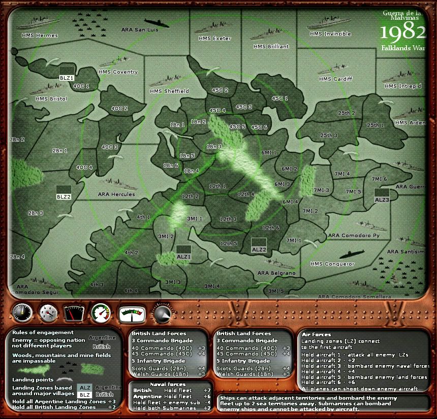
DiM, I like the look you gave it but I have my doubts about it. The screen is to dark for my liking and some of the names, territs are obscured. It would also be nesscery to add army circles to the whole board because of the grey 88's. Not really in keeping with a radar image are they.
The brown you chose for the borders is to brown. No navy as far as I know uses brown for coverings and if it is rusted, then it should be in dry dock and not in a war zone.
The dials as I have said before are wasted space. They may look nice but I see no reason for them to go on apart from decoration.
Image
User avatar
Lieutenant koontz1973
 
Posts: 6960
Joined: Thu Jan 01, 2009 10:57 am

Re: 1982 [31/12] Latest images Page 1/16 (large only)

Postby koontz1973 on Sat Dec 31, 2011 3:09 am

More effects. ;)
Click image to enlarge.
image
Image
User avatar
Lieutenant koontz1973
 
Posts: 6960
Joined: Thu Jan 01, 2009 10:57 am

Re: 1982 [31/12] Latest images Page 1/16 (large only)

Postby natty dread on Sat Dec 31, 2011 4:15 am

Getting better... the aircraft squares don't quite look right yet. Maybe the bevel is too thick on them.
Image
User avatar
Sergeant 1st Class natty dread
 
Posts: 12877
Joined: Fri Feb 08, 2008 8:58 pm
Location: just plain fucked

Re: 1982 [31/12] Latest images Page 1/16 (large only)

Postby Flapcake on Sat Dec 31, 2011 4:17 am

natty_dread wrote:Getting better... the aircraft squares don't quite look right yet. Maybe the bevel is too thick on them.


or goin the wrong way, make them go downwards instead, will give an impresion of the frame being on top
User avatar
Private 1st Class Flapcake
 
Posts: 756
Joined: Tue Jan 11, 2011 8:22 am
Location: beyond the unknown

Re: 1982 [31/12] Latest images Page 1/16 (large only)

Postby natty dread on Sat Dec 31, 2011 4:24 am

Well, if the aircraft squares are supposed to be small screens, then they should be convex, not concave. Flat screens weren't invented in the 80:s...
Image
User avatar
Sergeant 1st Class natty dread
 
Posts: 12877
Joined: Fri Feb 08, 2008 8:58 pm
Location: just plain fucked

Re: 1982 [31/12] Latest images Page 1/16 (large only)

Postby Flapcake on Sat Dec 31, 2011 4:32 am

natty_dread wrote:Well, if the aircraft squares are supposed to be small screens, then they should be convex, not concave. Flat screens weren't invented in the 80:s...


true ;)
User avatar
Private 1st Class Flapcake
 
Posts: 756
Joined: Tue Jan 11, 2011 8:22 am
Location: beyond the unknown

Re: 1982 [31/12] Latest images Page 1/16 (large only)

Postby koontz1973 on Sat Dec 31, 2011 4:49 am

They are supposed to be buttons or counters on the console.
Hows this. You might have to look hard as it is only 1 pixel wide.
Click image to enlarge.
image
Image
User avatar
Lieutenant koontz1973
 
Posts: 6960
Joined: Thu Jan 01, 2009 10:57 am

Re: 1982 [31/12] Latest images Page 1/16 (large only)

Postby DiM on Sat Dec 31, 2011 7:24 am

here's the psd file. the layers aren't labeled and there are no folders for better organization cause i made it in a rush.
http://www.mediafire.com/?6pb2uulf4smm1uo
“In the beginning God said, the four-dimensional divergence of an antisymmetric, second rank tensor equals zero, and there was light, and it was good. And on the seventh day he rested.”- Michio Kaku
User avatar
Major DiM
 
Posts: 10415
Joined: Wed Feb 14, 2007 6:20 pm
Location: making maps for scooby snacks

Re: 1982 [31/12] Latest images Page 1/16 (large only)

Postby koontz1973 on Sat Dec 31, 2011 9:00 am

Thanks DiM. Think I managed to replicate it a different way. As I said, I do not want it as dark as your image, but it is coming along.
Image
User avatar
Lieutenant koontz1973
 
Posts: 6960
Joined: Thu Jan 01, 2009 10:57 am

Re: 1982 [31/12] Latest images Page 1/16 (large only)

Postby DiM on Sat Dec 31, 2011 9:05 am

koontz1973 wrote:Thanks DiM. Think I managed to replicate it a different way. As I said, I do not want it as dark as your image, but it is coming along.


you have 3 adjustment layers in the psd file. hide them and the image will be much lighter.
“In the beginning God said, the four-dimensional divergence of an antisymmetric, second rank tensor equals zero, and there was light, and it was good. And on the seventh day he rested.”- Michio Kaku
User avatar
Major DiM
 
Posts: 10415
Joined: Wed Feb 14, 2007 6:20 pm
Location: making maps for scooby snacks

Re: 1982 [31/12] Latest images Page 1/16 (large only)

Postby natty dread on Sat Dec 31, 2011 9:07 am

DiM wrote:
koontz1973 wrote:Thanks DiM. Think I managed to replicate it a different way. As I said, I do not want it as dark as your image, but it is coming along.


you have 3 adjustment layers in the psd file. hide them and the image will be much lighter.


Koontz is using Gimp, and gimp doesn't have adjustment layers. I don't know how exactly gimp reads adjustment layers in psd files, possibly they get applied on actual layers or ignored alltogether.
Image
User avatar
Sergeant 1st Class natty dread
 
Posts: 12877
Joined: Fri Feb 08, 2008 8:58 pm
Location: just plain fucked

Re: 1982 [31/12] Latest images Page 1/16 (large only)

Postby koontz1973 on Sat Dec 31, 2011 9:08 am

DiM wrote:
koontz1973 wrote:Thanks DiM. Think I managed to replicate it a different way. As I said, I do not want it as dark as your image, but it is coming along.


you have 3 adjustment layers in the psd file. hide them and the image will be much lighter.

looking at them right this second. ;) Well not really, looking at the keyboard typing this out, but yes, am looking at them. :P
Image
User avatar
Lieutenant koontz1973
 
Posts: 6960
Joined: Thu Jan 01, 2009 10:57 am

Re: 1982 [31/12] Latest images Page 1/16 (large only)

Postby DiM on Sat Dec 31, 2011 9:16 am

natty_dread wrote:
DiM wrote:
koontz1973 wrote:Thanks DiM. Think I managed to replicate it a different way. As I said, I do not want it as dark as your image, but it is coming along.


you have 3 adjustment layers in the psd file. hide them and the image will be much lighter.


Koontz is using Gimp, and gimp doesn't have adjustment layers. I don't know how exactly gimp reads adjustment layers in psd files, possibly they get applied on actual layers or ignored alltogether.


get photoshop it's better and it can also be free :twisted:
“In the beginning God said, the four-dimensional divergence of an antisymmetric, second rank tensor equals zero, and there was light, and it was good. And on the seventh day he rested.”- Michio Kaku
User avatar
Major DiM
 
Posts: 10415
Joined: Wed Feb 14, 2007 6:20 pm
Location: making maps for scooby snacks

PreviousNext

Return to The Atlas

Who is online

Users browsing this forum: No registered users