Chinese Checkers [Quenched] May '07 re-opener?
Moderator: Cartographers


![]() by EvilOtto on Sat Mar 03, 2007 7:30 pm
by EvilOtto on Sat Mar 03, 2007 7:30 pm
socralynnek wrote:I don't know how many colorblind people play CC.
But they might nt know where "Purple C" is on the board.
Maybe yu could write "Purple Triangle" on the outside of it. Maybe just the small word "Purple" in a small font on the left line of each triangle?
If the decision is to help the color-blind, what about a small color guide in the bottom left corner... it would just be a tiny version of the board with a single letter in each triangle (P, B, G, Y, O, R, and W in the center)? I think that would look cleaner than writing the color names around the actual board. Less distracting for color-sighted players also.
-

 EvilOtto
- Posts: 132
- Joined: Wed Dec 06, 2006 9:39 pm
- Location: San Francisco
![]() by Guiscard on Sat Mar 03, 2007 7:34 pm
by Guiscard on Sat Mar 03, 2007 7:34 pm
EvilOtto wrote:socralynnek wrote:I don't know how many colorblind people play CC.
But they might nt know where "Purple C" is on the board.
Maybe yu could write "Purple Triangle" on the outside of it. Maybe just the small word "Purple" in a small font on the left line of each triangle?
If the decision is to help the color-blind, what about a small color guide in the bottom left corner... it would just be a tiny version of the board with a single letter in each triangle (P, B, G, Y, O, R, and W in the center)? I think that would look cleaner than writing the color names around the actual board. Less distracting for color-sighted players also.
Yes I definitely agree with this one. There's enough space in the bottom left, or inbetween the title and legend as well if you do a bit of shifting around to make it balanced.
qwert wrote:Can i ask you something?What is porpose for you to open these Political topic in ConquerClub? Why you mix politic with Risk? Why you not open topic like HOT AND SEXY,or something like that.
-

Guiscard
- Posts: 4103
- Joined: Fri Dec 08, 2006 7:27 pm
- Location: In the bar... With my head on the bar

![]() by EvilOtto on Sat Mar 03, 2007 7:36 pm
by EvilOtto on Sat Mar 03, 2007 7:36 pm
yeti_c wrote:I'm not sure the orange triangle country label text is that easy to read?
Esp E & F...
C.
But I think it is obvious that the letter pattern is identical in all six triangles. Even if it was harder to distinguish the E and F in the orange triangle (and I don't think it's that bad right now) the location would be completely clear from the rest of the board. E is always centered on the border.
Seems like oak tried white text on orange a while back...
Last edited by EvilOtto on Sat Mar 03, 2007 7:56 pm, edited 1 time in total.
-
EvilOtto
- Posts: 132
- Joined: Wed Dec 06, 2006 9:39 pm
- Location: San Francisco
![]() by KEYOGI on Sat Mar 03, 2007 7:38 pm
by KEYOGI on Sat Mar 03, 2007 7:38 pm
oaktown, why don't you make a list of all the changes made or refuted and post them in an update. It's what I'm going to do with Conquer 4 since I keep getting repetative posts about the bonuses, xml, etc. I understand why people don't read through a whole thread to see if their idea has been suggested before, but it can get annoying for us cartographers having to explain the same thing over and over. 
-
KEYOGI
- Posts: 1632
- Joined: Tue Oct 10, 2006 6:09 am


![]() by oaktown on Sat Mar 03, 2007 8:00 pm
by oaktown on Sat Mar 03, 2007 8:00 pm
map itself hasn't changed, but some teaks to the graphics:
- text in orange is darker, and background softened behind F to make it clear
- outline around title/credit... I can take it or leave it
- outline around legend a bit darker, and background shifted down and colors darkened around legend to make it easier to read
- color keys added next to each triangle... I think it's important for the color-challenged players, and i think these keys are more subtle than previous attempts
I don't really mind revisiting old changes if it makes the map better. I'll continue to ignore any rehashes that I don't think are improvements, like the damned dragon.

-

oaktown
- Posts: 4451
- Joined: Sun Dec 03, 2006 9:24 pm
- Location: majorcommand


![]() by Enigma on Sat Mar 03, 2007 9:44 pm
by Enigma on Sat Mar 03, 2007 9:44 pm
i like it better with no outline on both the title and the labels...the words blend with the map better... *cowers*
Do you need an excuse to have a war? I mean, who for? Can't you just say "You got lots of cash and land, but I've got a big sword, so divy up right now, chop chop."
Terry Pratchet
Terry Pratchet
-

Enigma
- Posts: 367
- Joined: Mon Jul 03, 2006 10:23 pm
- Location: Classified


![]() by oaktown on Sun Mar 04, 2007 1:50 am
by oaktown on Sun Mar 04, 2007 1:50 am
Enigma wrote:i like it better with no outline on both the title and the labels...the words blend with the map better... *cowers*
You're cool enigma, I don't know where you live. Heh heh.
Right now I kind of appreciate the outlines, especially on the labels... at first i thought I'd want them light and subtle, but I think the lighter and thus slightly blurry text is actually more distracting to the eye than the cleaner outlined text. Plus it's just nice to keep everything consistant.
-
oaktown
- Posts: 4451
- Joined: Sun Dec 03, 2006 9:24 pm
- Location: majorcommand
![]() by Wisse on Sun Mar 04, 2007 3:43 am
by Wisse on Sun Mar 04, 2007 3:43 am
i love this map  its getting better and better
i don't know anything that would make it better, well done
i think you only need to make the cordinates perfect and your done
i don't know anything that would make it better, well done
i think you only need to make the cordinates perfect and your done


-

Wisse
- Posts: 4448
- Joined: Fri Oct 13, 2006 2:59 pm
- Location: The netherlands, gelderland, epe


![]() by Jarunik on Sun Mar 04, 2007 6:17 am
by Jarunik on Sun Mar 04, 2007 6:17 am
I don't understand the text:
"Center six places may attack each other."
There are lines so its obvious that they can attack each others. Why this explanation then
But hey, i like the map.
"Center six places may attack each other."
There are lines so its obvious that they can attack each others. Why this explanation then
But hey, i like the map.
Last edited by Jarunik on Sun Mar 04, 2007 6:19 am, edited 2 times in total.
-

Jarunik
- Posts: 7
- Joined: Thu Jan 04, 2007 9:56 am
- Location: Switzerland
![]() by Wisse on Sun Mar 04, 2007 6:19 am
by Wisse on Sun Mar 04, 2007 6:19 am
Jarunik wrote:I don't understand the text:
"Center six places may attack each other."
There are lines so its obvious that they can attack each others. Why this explanation then
because some people are not so smart as you
-
Wisse
- Posts: 4448
- Joined: Fri Oct 13, 2006 2:59 pm
- Location: The netherlands, gelderland, epe
![]() by oaktown on Sun Mar 04, 2007 12:31 pm
by oaktown on Sun Mar 04, 2007 12:31 pm
Jarunik wrote:I don't understand the text:
"Center six places may attack each other."
There are lines so its obvious that they can attack each others. Why this explanation then
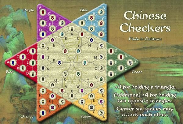
Actually, it would seem you understand the text, but not the need for the text. It's there so that nobody ever says "wtf, how did you attack G from R?" You know, like the first time somebody snuck into Italy via Croatia on the Europe map.
By the way, here's the small map with armies.
-
oaktown
- Posts: 4451
- Joined: Sun Dec 03, 2006 9:24 pm
- Location: majorcommand
![]() by AndyDufresne on Sun Mar 04, 2007 1:13 pm
by AndyDufresne on Sun Mar 04, 2007 1:13 pm
- Final Forge
---The Chinese Checkers Map has reached the ‘Final Forge’ Stage. I've revived this thread from the pits of the Foundry furnace and have examined the contents. Nearly every major concern has been addressed. If there are any other current concerns, please make your voice heard. There will be at least two days (but may extend pass that) for you to post any objections; if no one has posted any protest after two days the map will be deemed finished with the 'Foundry Brand' of approval and will be submitted for live play. If after two days there is still discussion going on it may continue until said discussion has reached the conclusion that the map has reached its final and polished version.
Post questions and concerns if any.
--Andy
-

AndyDufresne
- Posts: 24919
- Joined: Fri Mar 03, 2006 8:22 pm
- Location: A Banana Palm in Zihuatanejo


![]() by AndyDufresne on Sun Mar 04, 2007 1:14 pm
by AndyDufresne on Sun Mar 04, 2007 1:14 pm
Hm, could you consider making the 'F's in the triangles a little more...prominent? I know that if you look, you will see the pattern of location for each of the letters in the triangles, but see if you can maybe make it slightly clearer.
Also, consider moving the 'center six' text down slightly, so it doesn't blend together with bonus information. A little more space is needed I think, or perhaps some sort of bar/line/decorative thing to space the two.
--Andy
Also, consider moving the 'center six' text down slightly, so it doesn't blend together with bonus information. A little more space is needed I think, or perhaps some sort of bar/line/decorative thing to space the two.
--Andy
Last edited by AndyDufresne on Sun Mar 04, 2007 1:24 pm, edited 1 time in total.
-
AndyDufresne
- Posts: 24919
- Joined: Fri Mar 03, 2006 8:22 pm
- Location: A Banana Palm in Zihuatanejo
![]() by johloh on Sun Mar 04, 2007 1:21 pm
by johloh on Sun Mar 04, 2007 1:21 pm
i agreeAlso, consider moving the 'Hold all center six' down slightly, so it doesn't blend together with bonus information. A little more space is needed I think, or perhaps some sort of bar/line/decorative thing to space the two.
and congrats!
-

johloh
- Posts: 472
- Joined: Mon Dec 04, 2006 12:58 pm
- Location: San Francisco


![]() by spinwizard on Sun Mar 04, 2007 4:37 pm
by spinwizard on Sun Mar 04, 2007 4:37 pm
will it fit if u put 2 or even 3 numbers in the army circles? can u try???

-

spinwizard
- Posts: 5016
- Joined: Sun Dec 10, 2006 9:52 am


![]() by Wisse on Sun Mar 04, 2007 4:39 pm
by Wisse on Sun Mar 04, 2007 4:39 pm
spinwizard wrote:will it fit if u put 2 or even 3 numbers in the army circles? can u try???
no army circles can hold 3, but i don't know if the small one can hold 2 (try number 88 )
-
Wisse
- Posts: 4448
- Joined: Fri Oct 13, 2006 2:59 pm
- Location: The netherlands, gelderland, epe
![]() by oaktown on Mon Mar 05, 2007 12:48 am
by oaktown on Mon Mar 05, 2007 12:48 am
wow, final forge... *sniff sniff* I'm touched guys, really.
Keep tossing your thoughts at me and I'll sit down and make some changes later this week. Not sure about changing the lines again - the current line colors were the result of much input.
Here's the small map with random army counts. I think the two digits are readable. I was just using eights because it was the easiest way to consistantly align the coordinates.
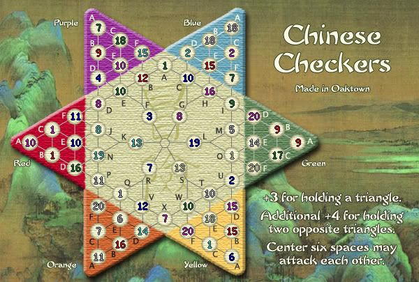
-
oaktown
- Posts: 4451
- Joined: Sun Dec 03, 2006 9:24 pm
- Location: majorcommand
Who is online
Users browsing this forum: No registered users
|
|||||||
| Conquer Club is not associated with RISK online in any way. Copyright © 2006-2024 by Big Wham LLC | |||||||