Japan - 日本 - Quenched
Moderator: Cartographers
Re: Japan - 日本 (D, Gp) V12.0 (Upd 12-13)pg42 Time's almost up!
![]() by isaiah40 on Sun Dec 13, 2009 12:06 pm
by isaiah40 on Sun Dec 13, 2009 12:06 pm
I now hereby declare this map stamped (but only in my mind)! 
-
 isaiah40
- Posts: 3990
- Joined: Mon Aug 27, 2007 7:14 pm


Re: Japan - 日本 (D, Gp) V12.0 (Upd 12-13)pg42 Time's almost up!
![]() by RedBaron0 on Sun Dec 13, 2009 12:07 pm
by RedBaron0 on Sun Dec 13, 2009 12:07 pm
You know, if I squint really hard I can even see it. 
 Thanks though.


-

RedBaron0
- Posts: 2657
- Joined: Sun Aug 19, 2007 12:59 pm
- Location: Pennsylvania


Re: Japan - 日本 (D, Gp) V12.1 (Upd 12-13)pg42 Time's almost up!
![]() by captainwalrus on Sun Dec 13, 2009 12:37 pm
by captainwalrus on Sun Dec 13, 2009 12:37 pm
Mr Benn, give this kind gentleman a stamp, pronto!
I think this is really great, it is good that we can finally get a japan map.
Personally, I thought the new text was fine enough to read, but I like this text too.
I think this is really great, it is good that we can finally get a japan map.
Personally, I thought the new text was fine enough to read, but I like this text too.
~ CaptainWalrus
-

captainwalrus
- Posts: 1018
- Joined: Sun Nov 11, 2007 3:19 pm
- Location: Finnmark


Re: Japan - 日本 (D, Gp) V12.1 (Upd 12-13)pg42 Time's almost up!
![]() by jpcloet on Sun Dec 13, 2009 12:41 pm
by jpcloet on Sun Dec 13, 2009 12:41 pm
There are still some text issues on the small map. Some text is almost identical to the territory lines like Niigata and Yamagata. Almost a perfect overlay. Hard to read.
-

jpcloet
- Posts: 4317
- Joined: Sat Mar 17, 2007 9:18 am
- Location: Greater Toronto Area


Re: Japan - 日本 (D, Gp) V12.1 (Upd 12-13)pg42 Time's almost up!
![]() by RedBaron0 on Sun Dec 13, 2009 11:06 pm
by RedBaron0 on Sun Dec 13, 2009 11:06 pm
jpcloet wrote:There are still some text issues on the small map. Some text is almost identical to the territory lines like Niigata and Yamagata. Almost a perfect overlay. Hard to read.
The country outline underneath those territories, and a couple others, were erased to prevent just that. The letters in most cases are completing the outline. Would it be better if the outline didn't touch the letters?
-
RedBaron0
- Posts: 2657
- Joined: Sun Aug 19, 2007 12:59 pm
- Location: Pennsylvania
Re: Japan - 日本 (D, Gp) V12.1 (Upd 12-13)pg42 Time's almost up!
![]() by PepeAtila on Mon Dec 14, 2009 6:43 am
by PepeAtila on Mon Dec 14, 2009 6:43 am
It is hard this way developping map, so just I wanted to show you my support for your work.

Also wish you happy hollidays.
PS: I got your XML code to study it
Also wish you happy hollidays.
PS: I got your XML code to study it
PepeAtila

-

PepeAtila
- Posts: 1134
- Joined: Wed Apr 29, 2009 3:11 am


Re: Japan - 日本 (D, Gp) V12.1 (Upd 12-13)pg42 Time's almost up!
![]() by Gilligan on Mon Dec 14, 2009 7:12 am
by Gilligan on Mon Dec 14, 2009 7:12 am
Speaking of XML, where is the Tokyo army going?

-

Gilligan
- Posts: 12478
- Joined: Thu May 11, 2006 4:59 pm
- Location: Providence, RI


Re: Japan - 日本 (D, Gp) V12.1 (Upd 12-13)pg42 Time's almost up!
![]() by RedBaron0 on Mon Dec 14, 2009 3:16 pm
by RedBaron0 on Mon Dec 14, 2009 3:16 pm
Thanks guys, some of the coordinates are off since I changed the positions, but most are in the right spot still.
Tokyo's XML coords will likely be in Tokyo Bay
Tokyo's XML coords will likely be in Tokyo Bay
-
RedBaron0
- Posts: 2657
- Joined: Sun Aug 19, 2007 12:59 pm
- Location: Pennsylvania
Re: Japan - 日本 (D, Gp) V12.1 (Upd 12-13)pg42 Time's almost up!
![]() by Industrial Helix on Thu Jan 07, 2010 6:09 pm
by Industrial Helix on Thu Jan 07, 2010 6:09 pm
RedBaron0 wrote:jpcloet wrote:There are still some text issues on the small map. Some text is almost identical to the territory lines like Niigata and Yamagata. Almost a perfect overlay. Hard to read.
The country outline underneath those territories, and a couple others, were erased to prevent just that. The letters in most cases are completing the outline. Would it be better if the outline didn't touch the letters?
For what its worth, I think it would be better.
Sketchblog [Update 07/25/11]: http://indyhelixsketch.blogspot.com/
Living in Japan [Update 07/17/11]: http://mirrorcountryih.blogspot.com/
Russian Revolution map for ConquerClub [07/20/11]: viewtopic.php?f=241&t=116575
Living in Japan [Update 07/17/11]: http://mirrorcountryih.blogspot.com/
Russian Revolution map for ConquerClub [07/20/11]: viewtopic.php?f=241&t=116575
-

Industrial Helix
- Posts: 3462
- Joined: Mon Jul 14, 2008 6:49 pm
- Location: Ohio


Re: Japan - 日本 (D, Gp) V12.1 (Upd 12-13)pg42 Time's almost up!
![]() by pamoa on Fri Jan 08, 2010 6:18 am
by pamoa on Fri Jan 08, 2010 6:18 am
oh boy you did a great job on this one
graphics are gorgeous
finally a Japan map which seems able to go live
graphics are gorgeous
finally a Japan map which seems able to go live
De gueules à la tour d'argent ouverte, crénelée de trois pièces, sommée d'un donjon ajouré, crénelé de deux pièces
Gules an open tower silver, crenellated three parts, topped by a apertured turret, crenellated two parts
Gules an open tower silver, crenellated three parts, topped by a apertured turret, crenellated two parts
-

pamoa
- Posts: 1242
- Joined: Sat Sep 01, 2007 3:18 am
- Location: Confederatio Helvetica


Re: Japan - 日本 (D, Gp) V12.2 (Upd 1-9)pg43 Sushi anyone?
![]() by RedBaron0 on Sat Jan 09, 2010 1:53 am
by RedBaron0 on Sat Jan 09, 2010 1:53 am
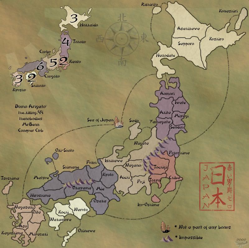
Version 12.2
Large:
Small:
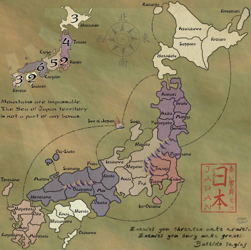
Text should be cleared up pieces of the outer border deleted around letters crossing it.
Mountain tips in deep purple deleted.
Ring in the new year sweetness!
Large:
- Click image to enlarge.
Small:
- Click image to enlarge.
Text should be cleared up pieces of the outer border deleted around letters crossing it.
Mountain tips in deep purple deleted.
Ring in the new year sweetness!
-
RedBaron0
- Posts: 2657
- Joined: Sun Aug 19, 2007 12:59 pm
- Location: Pennsylvania
Re: Japan - 日本 (D, Gp) V12.2 (Upd 1-9)pg43 Sushi anyone?
![]() by Industrial Helix on Sat Jan 09, 2010 9:05 am
by Industrial Helix on Sat Jan 09, 2010 9:05 am
Looks great, the test reads much better without the lines touching it.
For Oki-shoto, the border seems too dark. Is it a separate file than the rest of the borders?
Kunashiri's connector line looks like it got cut short on the large map.
And Izu-Oshima's connector line could use some darkening.
You should probably post a test of the map with the numbers to show that they all fit, something more for XML really, but it was one of the things Benn was holding my map back for. I dunno where your last file with 888s is otherwise I'd have a look.
Anyway, these are all minor, minor tidbits... I guess I'm just looking for something to say and kill my morning free time.
Sketchblog [Update 07/25/11]: http://indyhelixsketch.blogspot.com/
Living in Japan [Update 07/17/11]: http://mirrorcountryih.blogspot.com/
Russian Revolution map for ConquerClub [07/20/11]: viewtopic.php?f=241&t=116575
Living in Japan [Update 07/17/11]: http://mirrorcountryih.blogspot.com/
Russian Revolution map for ConquerClub [07/20/11]: viewtopic.php?f=241&t=116575
-
Industrial Helix
- Posts: 3462
- Joined: Mon Jul 14, 2008 6:49 pm
- Location: Ohio
Re: Japan - 日本 (D, Gp) V12.2 (Upd 1-9)pg43 Sushi anyone?
![]() by natty dread on Sat Jan 09, 2010 9:26 am
by natty dread on Sat Jan 09, 2010 9:26 am
I don't know if anyone agrees with me, but the "Mountains are impassable" etc. text is still really reallly bothering me.
It looks like someone took random letters of the text and changed them into bold...
It doesn't look as bad in the small version, but the small version has a typo: "Mountains are impassible"...
It looks like someone took random letters of the text and changed them into bold...
It doesn't look as bad in the small version, but the small version has a typo: "Mountains are impassible"...

-

natty dread
- Posts: 12877
- Joined: Fri Feb 08, 2008 8:58 pm
- Location: just plain fucked


Re: Japan - 日本 (D, Gp) V12.2 (Upd 1-9)pg43 Sushi anyone?
![]() by The Neon Peon on Sat Jan 09, 2010 2:06 pm
by The Neon Peon on Sat Jan 09, 2010 2:06 pm
I would really like to see the Bushido saying and the "Mountains... bonus" text in the same font. (although please don't use the font of the Bushido saying, it doesn't fit in with the rest of the map)
Also, might you edit out all the white around your plane? Or perhaps expand the white areas around it into a circle?
As a side note, this would make it perfect for me, although I realize that it is not what others will see as an improvement, so I don't expect you to do it, just throwing it out there.
1. Getting rid of the "mountains are impassable... sea of japan... bonus" text.
2. Getting rid of the Bushido saying.
3. In the bottom right corner, where the Bushido saying now is:
[image of a mountain you have one the map] "Impassable" " " [Sea of Japan ship icon] "Not part of any bonus
-

The Neon Peon
- Posts: 2342
- Joined: Sat Jun 14, 2008 12:49 pm


Re: Japan - 日本 (D, Gp) V12.2 (Upd 1-9)pg43 Sushi anyone?
![]() by natty dread on Sat Jan 09, 2010 2:23 pm
by natty dread on Sat Jan 09, 2010 2:23 pm
I agree with ^ except for the Bushido saying, I think it should stay.
-
natty dread
- Posts: 12877
- Joined: Fri Feb 08, 2008 8:58 pm
- Location: just plain fucked
Re: Japan - 日本 (D, Gp) V12.2 (Upd 1-9)pg43 Sushi anyone?
![]() by fumandomuerte on Sat Jan 09, 2010 2:37 pm
by fumandomuerte on Sat Jan 09, 2010 2:37 pm
The Neon Peon wrote:I would really like to see the Bushido saying and the "Mountains... bonus" text in the same font. (although please don't use the font of the Bushido saying, it doesn't fit in with the rest of the map)
Also, might you edit out all the white around your plane? Or perhaps expand the white areas around it into a circle?
As a side note, this would make it perfect for me, although I realize that it is not what others will see as an improvement, so I don't expect you to do it, just throwing it out there.
1. Getting rid of the "mountains are impassable... sea of japan... bonus" text.
2. Getting rid of the Bushido saying.
3. In the bottom right corner, where the Bushido saying now is:
[image of a mountain you have one the map] "Impassable" " " [Sea of Japan ship icon] "Not part of any bonus
Seconded... Everything

-

fumandomuerte
- Posts: 620
- Joined: Sat Dec 29, 2007 1:27 am
- Location: The Cinderella of the Pacific


Re: Japan - 日本 (D, Gp) V12.4 (Upd 1-10)pg43 Sushi anyone?
![]() by RedBaron0 on Sun Jan 10, 2010 3:51 am
by RedBaron0 on Sun Jan 10, 2010 3:51 am
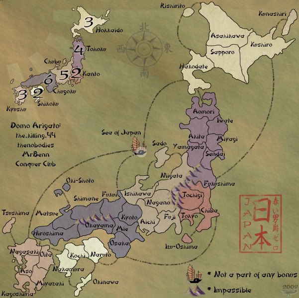
Version 12.4
Large:
Small:
big 888 test
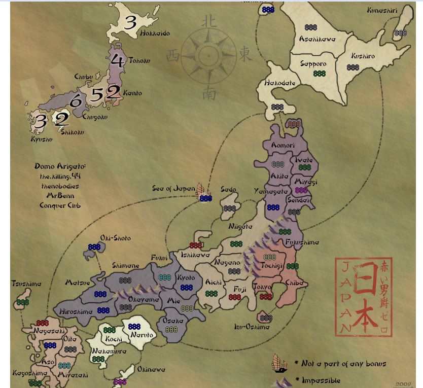
small 888 test
All implemented... sleep now. Discuss. Might have to think about putting army circles or something under the coordinates. Bushido quote off for the moment. I had planned to add the thanks at some point, but couldn't figure out where... without the quote I've got a hole to fill.
Only thing I didn't change was my signature.... it is my stylized signature. I think its like a watermark and is best as is, with out the whitish halo it'd look more like a stamp, which didn't look as good before.
Large:
- Click image to enlarge.
Small:
- Click image to enlarge.
big 888 test
small 888 test
All implemented... sleep now. Discuss.
Only thing I didn't change was my signature.... it is my stylized signature. I think its like a watermark and is best as is, with out the whitish halo it'd look more like a stamp, which didn't look as good before.
-
RedBaron0
- Posts: 2657
- Joined: Sun Aug 19, 2007 12:59 pm
- Location: Pennsylvania
Re: Japan - 日本 (D, Gp) V12.4 (Upd 1-10)pg43 Sushi anyone?
![]() by natty dread on Sun Jan 10, 2010 6:25 am
by natty dread on Sun Jan 10, 2010 6:25 am
The thanks are too big... Personally, I wouldn't mind if there was nothing at all in that spot. The idea that every empty spot needs to be filled with something kinda goes against all the simplistic Japanese aesthetics...
I'd suggest making the text 1-2px smaller and moving it more to the side, so it doesn't bother so much. Since it actually has nothing to do with the gameplay it shouldn't be given so much attention.
Or just removing the text altogether, and sending your thanks by PM:s.
I'd suggest making the text 1-2px smaller and moving it more to the side, so it doesn't bother so much. Since it actually has nothing to do with the gameplay it shouldn't be given so much attention.
Or just removing the text altogether, and sending your thanks by PM:s.
-
natty dread
- Posts: 12877
- Joined: Fri Feb 08, 2008 8:58 pm
- Location: just plain fucked
Re: Japan - 日本 (D, Gp) V12.4 (Upd 1-10)pg43 Sushi anyone?
![]() by Peter Gibbons on Sun Jan 10, 2010 4:42 pm
by Peter Gibbons on Sun Jan 10, 2010 4:42 pm
"Impassable" is spelled incorrectly on the map.
-

Peter Gibbons
- Posts: 1077
- Joined: Wed Sep 10, 2008 9:21 am
- Location: Washington, DC


Re: Japan - 日本 (D, Gp) V12.4 (Upd 1-10)pg43 Sushi anyone?
![]() by captainwalrus on Sun Jan 10, 2010 5:01 pm
by captainwalrus on Sun Jan 10, 2010 5:01 pm
I liked the saying that was in the corner! Don't take it away!
I'm sure you can fit it in there somewhere.
I'm sure you can fit it in there somewhere.
~ CaptainWalrus
-
captainwalrus
- Posts: 1018
- Joined: Sun Nov 11, 2007 3:19 pm
- Location: Finnmark
Re: Japan - 日本 (D, Gp) V12.4 (Upd 1-10)pg43 Sushi anyone?
![]() by The Neon Peon on Sun Jan 10, 2010 9:39 pm
by The Neon Peon on Sun Jan 10, 2010 9:39 pm
Love it. Final Forge, anyone?
captainwalrus wrote:I liked the saying that was in the corner! Don't take it away!
I'm sure you can fit it in there somewhere.
Disagree.
-
The Neon Peon
- Posts: 2342
- Joined: Sat Jun 14, 2008 12:49 pm
Re: Japan - 日本 (D, Gp) V12.5 (Upd 1-11)pg43 Sushi anyone?
![]() by RedBaron0 on Mon Jan 11, 2010 12:41 am
by RedBaron0 on Mon Jan 11, 2010 12:41 am
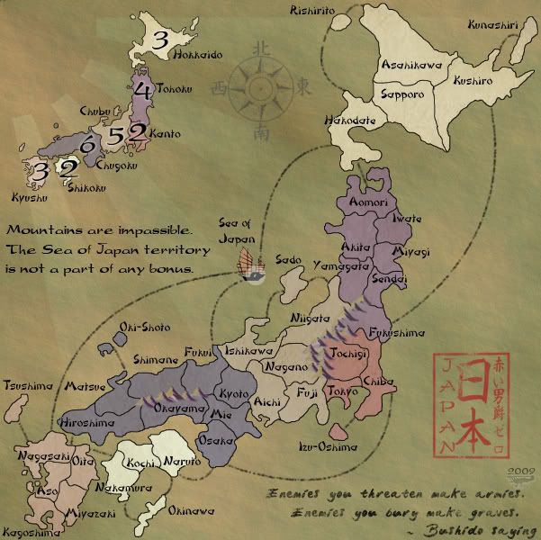
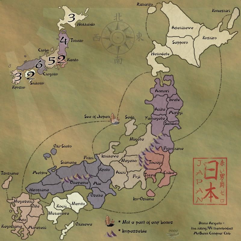
Version 12.5
Large:
Small:
This should clear up the little issues.
I liked the quote too, but I think it all goes together best this way. With the big chunk of the Sea of Japan opened up you can see more of the faded rising sun coming out of the corner.
Large:
- Click image to enlarge.
Small:
- Click image to enlarge.
This should clear up the little issues.
I liked the quote too, but I think it all goes together best this way. With the big chunk of the Sea of Japan opened up you can see more of the faded rising sun coming out of the corner.
-
RedBaron0
- Posts: 2657
- Joined: Sun Aug 19, 2007 12:59 pm
- Location: Pennsylvania
Re: Japan - 日本 (D, Gp) V12.5 (Upd 1-11)pg43 Sushi anyone?
![]() by Peter Gibbons on Mon Jan 11, 2010 2:14 am
by Peter Gibbons on Mon Jan 11, 2010 2:14 am
Even though there's been a massive shift since I last took a look at this map (I was wondering what was taking so long!), I still love this one a lot. Can't wait to play it.
One small nitpick, and I suppose it can go either way--and is totally up to you--but should the map be dated "2009" still, since it will be quenched in 2010? Other than that, this map is more than ready. Hopefully it will fly through Final Forge.
One small nitpick, and I suppose it can go either way--and is totally up to you--but should the map be dated "2009" still, since it will be quenched in 2010? Other than that, this map is more than ready. Hopefully it will fly through Final Forge.
-
Peter Gibbons
- Posts: 1077
- Joined: Wed Sep 10, 2008 9:21 am
- Location: Washington, DC
Re: Japan - 日本 (D, Gp) V12.5 (Upd 1-11)pg43 Sushi anyone?
![]() by lostatlimbo on Mon Jan 11, 2010 2:55 am
by lostatlimbo on Mon Jan 11, 2010 2:55 am
wow. this map has improved a lot. love the new look.
-

lostatlimbo
- Posts: 1386
- Joined: Wed Mar 28, 2007 3:56 pm
- Location: Portland, OR


Re: Japan - 日本 (D, Gp) V12.5 (Upd 1-11)pg43 Sushi anyone?
![]() by thenobodies80 on Tue Jan 12, 2010 2:06 pm
by thenobodies80 on Tue Jan 12, 2010 2:06 pm
First of all I must say that this map has made great improvements since I saw it in the drafting room for the first time.
A nice work Baron!
Whereas in my opinion the final forge is around the corner, I see very few (and small) things to fix:
Nobodies
A nice work Baron!
Whereas in my opinion the final forge is around the corner, I see very few (and small) things to fix:
- The new layout works well with the large image, but in the small on i think that the lower right corner is a bit too much crowded.
- Oki-shoto / Matsue connection can be done better IMO (maybe with troops looks different?).
- Not a big fan of Hiroshima / Nagasaki connection, it's very small, the problem is that you could fix it easily on the large version moving a bit the sea of japan/nagasaki connection and using the free space to rewrite the link, but i don't know if you have the space on the small version to do this (where it seems that the fix is more needed
 ).
). - Not a real issue....you've forgot to type my 80

Nobodies
-

thenobodies80
- Posts: 5400
- Joined: Wed Sep 05, 2007 4:30 am
- Location: Milan


Who is online
Users browsing this forum: No registered users
|
|||||||
| Conquer Club is not associated with RISK online in any way. Copyright © 2006-2024 by Big Wham LLC | |||||||