I really like the graphics you have going. I'd change the mountains though---make them more of a simple line drawing kind of thing---since the rest of the map has the feeling as well (Compare your Sea of Japan style to the current Mountain style)
--Andy
Japan - 日本 - Quenched
Moderator: Cartographers
Re: Japan - 日本 (D, Gp) V12.5 (Upd 1-11)pg43 Sushi anyone?
![]() by AndyDufresne on Tue Jan 12, 2010 2:11 pm
by AndyDufresne on Tue Jan 12, 2010 2:11 pm
-

 AndyDufresne
- Posts: 24919
- Joined: Fri Mar 03, 2006 8:22 pm
- Location: A Banana Palm in Zihuatanejo


Re: Japan - 日本 (D, Gp) V12.5 (Upd 1-11)pg43 Sushi anyone?
![]() by jefjef on Thu Jan 14, 2010 2:14 pm
by jefjef on Thu Jan 14, 2010 2:14 pm
The shades on the bonus map are a smidgen lighter than the main map. Looks like anyway.
On Hokkaido maybe place a small cluster of mountains at the junction of Sapporo - Kushiru - Asahikawa. Think it would liven up that part of the map. Bet it would look pretty good too.
btw. I like your mountains RB0.
On Hokkaido maybe place a small cluster of mountains at the junction of Sapporo - Kushiru - Asahikawa. Think it would liven up that part of the map. Bet it would look pretty good too.
btw. I like your mountains RB0.
This post was made by jefjef who should be on your ignore list.

drunkmonkey wrote:I'm filing a C&A report right now. Its nice because they have a drop-down for "jefjef".
-

jefjef
- Posts: 6026
- Joined: Mon Feb 23, 2009 8:41 pm
- Location: on my ass


Re: Japan - 日本 (D, Gp) V12.6 (Upd 1-14)pg44 Sushi anyone?
![]() by RedBaron0 on Thu Jan 14, 2010 5:33 pm
by RedBaron0 on Thu Jan 14, 2010 5:33 pm
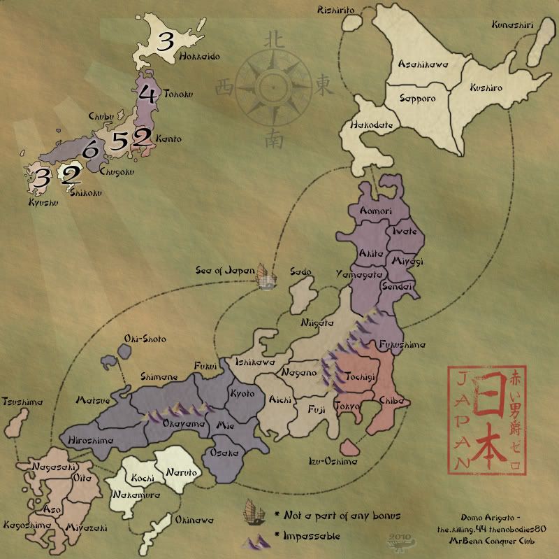
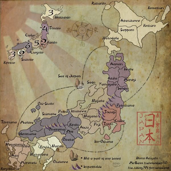
Version 12.6
Large:
Small:
Alright, some changes made at least. I might have been able to make a change that satisfies hopefully for Hiroshima to Nagaski. The line is longer in a diagonal manor.
For the Matsue/Oki-shoto connection the test image I made shows what it looks like with the armies on it. I can change the angle, or even curve the line if that looks better?
Fixed the 80 part. I wondering if there is precedent to putting "thanks" on just 1 image of a map, in this case larger, considering the congestiness of the small map's bottom corner.
I really would hate to have to do the mountains... again. So I've fiddled with the Sea of Japan junk to fall more in-line with the look of the mountains.
jefjef, I'm hesitant to adding more mountains, especially if they have no function as an impassable. Could create confusion to thinking 1 or more of those territories don't connect. Function over form here.
Large:
- Click image to enlarge.
Small:
- Click image to enlarge.
Alright, some changes made at least. I might have been able to make a change that satisfies hopefully for Hiroshima to Nagaski. The line is longer in a diagonal manor.
For the Matsue/Oki-shoto connection the test image I made shows what it looks like with the armies on it. I can change the angle, or even curve the line if that looks better?
Fixed the 80 part.
I really would hate to have to do the mountains... again. So I've fiddled with the Sea of Japan junk to fall more in-line with the look of the mountains.
jefjef, I'm hesitant to adding more mountains, especially if they have no function as an impassable. Could create confusion to thinking 1 or more of those territories don't connect. Function over form here.


-

RedBaron0
- Posts: 2657
- Joined: Sun Aug 19, 2007 12:59 pm
- Location: Pennsylvania


Re: Japan - 日本 (D, Gp) V12.6 (Upd 1-14)pg44 Sushi anyone?
![]() by natty dread on Thu Jan 14, 2010 6:46 pm
by natty dread on Thu Jan 14, 2010 6:46 pm
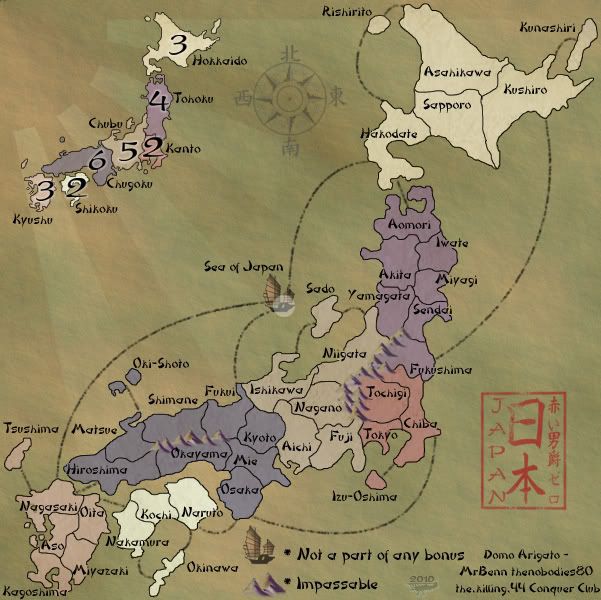
How about shrinking that text for the small image. The "not part of a bonus" & "impassables" texts can certainly be safely shrunk a few notches while still keeping it legible.

-

natty dread
- Posts: 12877
- Joined: Fri Feb 08, 2008 8:58 pm
- Location: just plain fucked


Re: Japan - 日本 (D, Gp) V12.6 (Upd 1-14)pg44 Sushi anyone?
![]() by jefjef on Fri Jan 15, 2010 4:51 pm
by jefjef on Fri Jan 15, 2010 4:51 pm
The shades on the bonus map are a smidgen lighter than the main map. Looks like it to me anyway.
This post was made by jefjef who should be on your ignore list.
drunkmonkey wrote:I'm filing a C&A report right now. Its nice because they have a drop-down for "jefjef".
-
jefjef
- Posts: 6026
- Joined: Mon Feb 23, 2009 8:41 pm
- Location: on my ass
Re: Japan - 日本 (D, Gp) V12.6 (Upd 1-14)pg44 Sushi anyone?
![]() by RedBaron0 on Fri Jan 15, 2010 9:13 pm
by RedBaron0 on Fri Jan 15, 2010 9:13 pm
Okay, I'll turn off the minimap's texturing, being that small it's probably over lightening the colors. Smaller text is a simple fix.
-
RedBaron0
- Posts: 2657
- Joined: Sun Aug 19, 2007 12:59 pm
- Location: Pennsylvania
Re: Japan - 日本 (D, Gp) V12.6 (Upd 1-14)pg44 Sushi anyone?
![]() by porkenbeans on Sat Jan 16, 2010 12:44 am
by porkenbeans on Sat Jan 16, 2010 12:44 am
Hey Red,
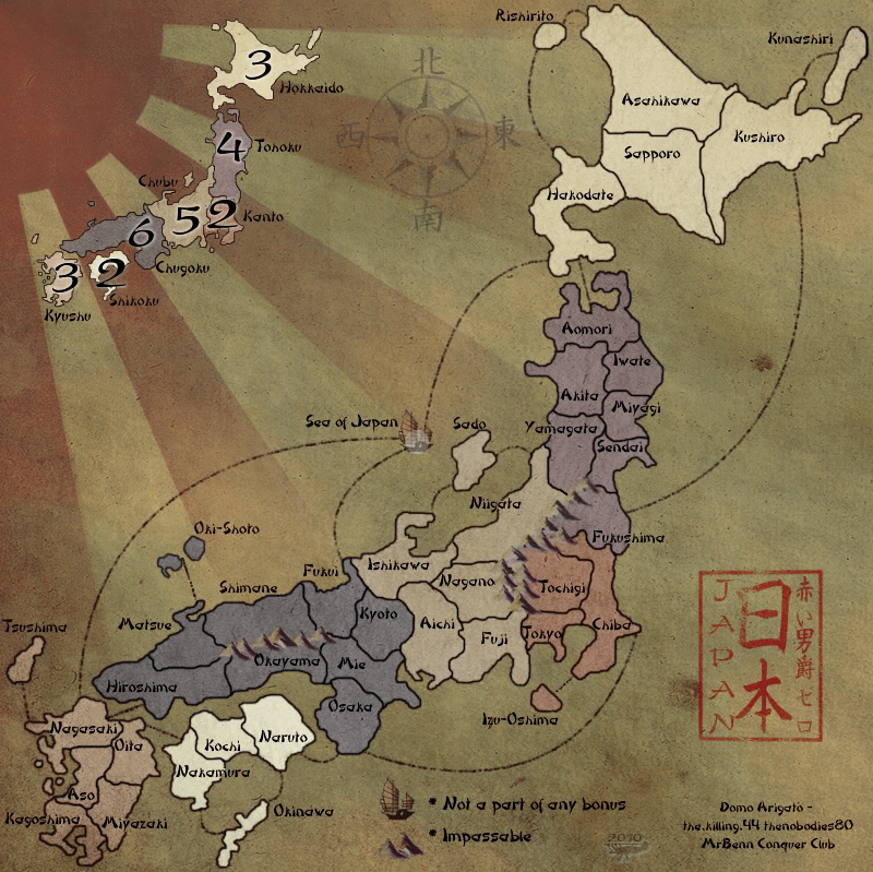
was farting around in photoshop today, and I had some fun playing around with your map. Not really serious with any suggs, but I thought I would show you anyways. Maybe it might give you some ideas.
was farting around in photoshop today, and I had some fun playing around with your map. Not really serious with any suggs, but I thought I would show you anyways. Maybe it might give you some ideas.
- Click image to enlarge.

-

porkenbeans
- Posts: 2546
- Joined: Mon Sep 10, 2007 4:06 pm


Re: Japan - 日本 (D, Gp) V12.6 (Upd 1-14)pg44 Sushi anyone?
![]() by AndyDufresne on Sat Jan 16, 2010 3:43 pm
by AndyDufresne on Sat Jan 16, 2010 3:43 pm
I'm kind of fond of the grunge and the enhanced red in pork's version...
--Andy
--Andy
-
AndyDufresne
- Posts: 24919
- Joined: Fri Mar 03, 2006 8:22 pm
- Location: A Banana Palm in Zihuatanejo
Re: Japan - 日本 (D, Gp) V12.6 (Upd 1-14)pg44 Sushi anyone?
![]() by Bones2484 on Sat Jan 16, 2010 3:53 pm
by Bones2484 on Sat Jan 16, 2010 3:53 pm
The grunge is nice, but the red is a bit overpowering.
-

Bones2484
- Posts: 2307
- Joined: Mon Sep 17, 2007 11:24 am
- Location: Los Angeles, CA (G1)

Re: Japan - 日本 (D, Gp) V12.6 (Upd 1-14)pg44 Sushi anyone?
![]() by porkenbeans on Sat Jan 16, 2010 4:07 pm
by porkenbeans on Sat Jan 16, 2010 4:07 pm
Well, I like the direction this map has taken. I only kinda felt that the background seemed 200 years old, but the Islands were pristine, and looked like they were drawn yesterday on top of some antique paper. The darker red on the rising sun was an attempt to bring the two more together in this respect. The grunge is to help the Islands look more in step with the background.Bones2484 wrote:The grunge is nice, but the red is a bit overpowering.
-
porkenbeans
- Posts: 2546
- Joined: Mon Sep 10, 2007 4:06 pm
Re: Japan - 日本 (D, Gp) V12.6 (Upd 1-14)pg44 Sushi anyone?
![]() by Riazor on Sat Jan 16, 2010 4:20 pm
by Riazor on Sat Jan 16, 2010 4:20 pm
I like the red! I also like the grunge on the background... However, i do think the grunge on the actual map/country is a bit much. Hmmm.

-

Riazor
- Posts: 327
- Joined: Mon Apr 09, 2007 8:57 am
- Location: On the scoreboard


Re: Japan - 日本 (D, Gp) V12.6 (Upd 1-14)pg44 Sushi anyone?
![]() by Peter Gibbons on Sun Jan 17, 2010 4:56 pm
by Peter Gibbons on Sun Jan 17, 2010 4:56 pm
It's definitely RedBaron's call, but I tend to agree with this assessment. The territories themselves looked like they were still from the "modern," high-colored version of the map that was originally being constructed. It was like a mixture of old and new, which isn't necessarily a bad thing--but I do personally prefer the look porkenbeans just went with.porkenbeans wrote:Well, I like the direction this map has taken. I only kinda felt that the background seemed 200 years old, but the Islands were pristine, and looked like they were drawn yesterday on top of some antique paper. The darker red on the rising sun was an attempt to bring the two more together in this respect. The grunge is to help the Islands look more in step with the background.
That being said, I view this as a totally subjective decision--it should be made rather quickly, and shouldn't hold up the final forging of this map.
-

Peter Gibbons
- Posts: 1077
- Joined: Wed Sep 10, 2008 9:21 am
- Location: Washington, DC


Re: Japan - 日本 (D, Gp) V12.6 (Upd 1-14)pg44 Sushi anyone?
![]() by porkenbeans on Sun Jan 17, 2010 6:16 pm
by porkenbeans on Sun Jan 17, 2010 6:16 pm
- Click image to enlarge.

- Click image to enlarge.

When I first started to play with this map, I was just trying to improve the sun image, Then I got carried away and added the parchment texture. Here are both layers, so you can use them if you want Red.
-
porkenbeans
- Posts: 2546
- Joined: Mon Sep 10, 2007 4:06 pm
Re: Japan - 日本 (D, Gp) V12.6 (Upd 1-14)pg44 Sushi anyone?
![]() by RedBaron0 on Sun Jan 17, 2010 11:01 pm
by RedBaron0 on Sun Jan 17, 2010 11:01 pm
Thanks porken, I'll put some of these into effect the better parchmenty background is certainly a winner, but the red's a bit strong for my taste. I've been working a enhancing it and like the results I have so far.
-
RedBaron0
- Posts: 2657
- Joined: Sun Aug 19, 2007 12:59 pm
- Location: Pennsylvania
Re: Japan - 日本 (D, Gp) V12.8 (Upd 1-18)pg45 Sushi anyone?
![]() by RedBaron0 on Mon Jan 18, 2010 1:22 am
by RedBaron0 on Mon Jan 18, 2010 1:22 am
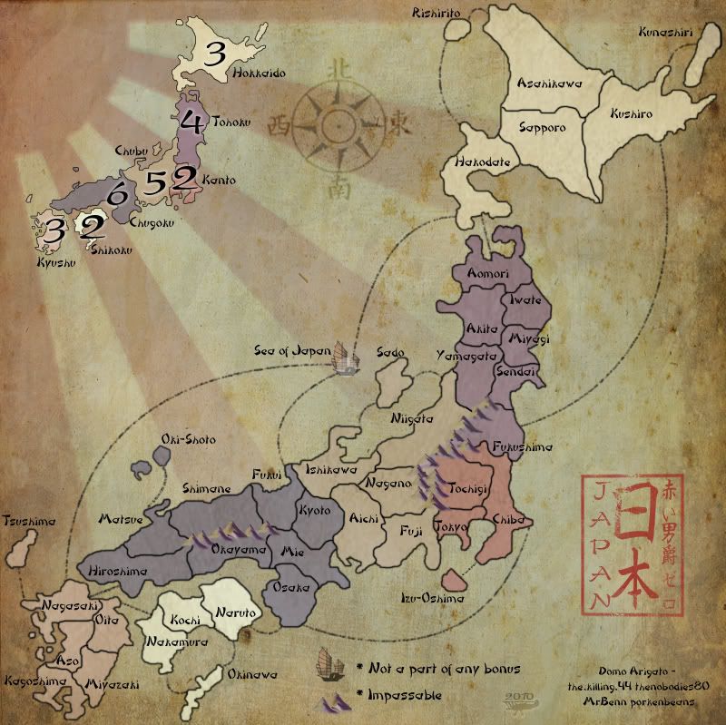
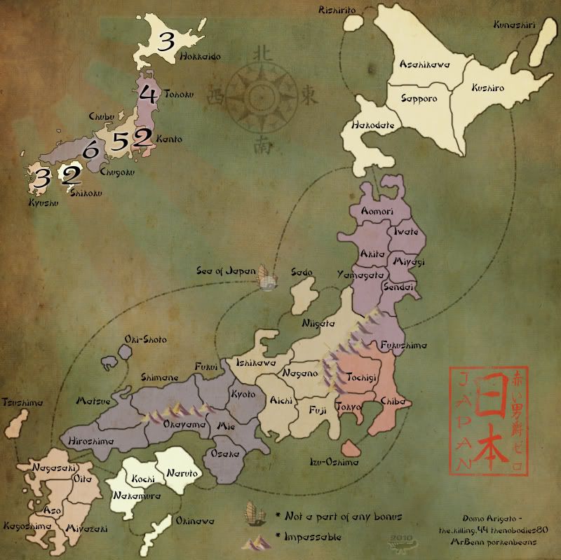
Version 12.8
Large:
Small:
adapted porkenbeans version to my liking
fixed connector to Oki-shoto
text shrunk on small map instructions, a bit more space there now.
Large:
- Click image to enlarge.
Small:
- Click image to enlarge.
adapted porkenbeans version to my liking
fixed connector to Oki-shoto
text shrunk on small map instructions, a bit more space there now.
-
RedBaron0
- Posts: 2657
- Joined: Sun Aug 19, 2007 12:59 pm
- Location: Pennsylvania
Re: Japan - 日本 (D, Gp) V12.8 (Upd 1-18)pg45 Sushi anyone?
![]() by Peter Gibbons on Mon Jan 18, 2010 1:39 am
by Peter Gibbons on Mon Jan 18, 2010 1:39 am
I like it a lot. My only nitpick is the parchment smudge just south of Naruto seems to obscure the line connecting that territory to Osaka (on the small map only). Perhaps it can be moved or removed.
-
Peter Gibbons
- Posts: 1077
- Joined: Wed Sep 10, 2008 9:21 am
- Location: Washington, DC
Re: Japan - 日本 (D, Gp) V12.8 (Upd 1-18)pg45 Sushi anyone?
![]() by RedBaron0 on Mon Jan 18, 2010 1:44 am
by RedBaron0 on Mon Jan 18, 2010 1:44 am
yeah, I just noticed that too, I might have to redo the connector between Chiba and Izu-Oshima on the big map too.
-
RedBaron0
- Posts: 2657
- Joined: Sun Aug 19, 2007 12:59 pm
- Location: Pennsylvania
Re: Japan - 日本 (D, Gp) V12.8 (Upd 1-18)pg45 Sushi anyone?
![]() by Lone.prophet on Mon Jan 18, 2010 5:46 am
by Lone.prophet on Mon Jan 18, 2010 5:46 am
looking good, i only think the army circle on the ship and the chubu region could pop up more

-
Lone.prophet
- Posts: 1467
- Joined: Thu Oct 12, 2006 4:37 pm
- Location: Your basement Muahaha

Re: Japan - 日本 (D, Gp) V12.8 (Upd 1-18)pg45 Sushi anyone?
![]() by natty dread on Mon Jan 18, 2010 5:50 am
by natty dread on Mon Jan 18, 2010 5:50 am
Now the compass is covered by the sun... Don't know why but it bothers me. Maybe move the compass down and to the left a bit?
-
natty dread
- Posts: 12877
- Joined: Fri Feb 08, 2008 8:58 pm
- Location: just plain fucked
Re: Japan - 日本 (D, Gp) V12.8 (Upd 1-18)pg45 Sushi anyone?
![]() by Industrial Helix on Mon Jan 18, 2010 10:32 am
by Industrial Helix on Mon Jan 18, 2010 10:32 am
eh, I think its too distracting... it keeps drawing my eye to the upper left.
Overall, yeah it looks cool.... but this is a game map and I think it pulls too much away.
Overall, yeah it looks cool.... but this is a game map and I think it pulls too much away.
Sketchblog [Update 07/25/11]: http://indyhelixsketch.blogspot.com/
Living in Japan [Update 07/17/11]: http://mirrorcountryih.blogspot.com/
Russian Revolution map for ConquerClub [07/20/11]: viewtopic.php?f=241&t=116575
Living in Japan [Update 07/17/11]: http://mirrorcountryih.blogspot.com/
Russian Revolution map for ConquerClub [07/20/11]: viewtopic.php?f=241&t=116575
-

Industrial Helix
- Posts: 3462
- Joined: Mon Jul 14, 2008 6:49 pm
- Location: Ohio


Re: Japan - 日本 (D, Gp) V12.8 (Upd 1-18)pg45 Sushi anyone?
![]() by natty dread on Mon Jan 18, 2010 11:05 am
by natty dread on Mon Jan 18, 2010 11:05 am
You're right I.H, I also think the opacity of the sun could be tuned down a couple notches.
-
natty dread
- Posts: 12877
- Joined: Fri Feb 08, 2008 8:58 pm
- Location: just plain fucked
Re: Japan - 日本 (D, Gp) V12.8 (Upd 1-18)pg45 Sushi anyone?
![]() by porkenbeans on Mon Jan 18, 2010 12:00 pm
by porkenbeans on Mon Jan 18, 2010 12:00 pm
You can shift the parchment layer around to wherever you think it looks best. I think you need to put it over the top of all the existing layers, so as to help the Islands look a little less pristine. Try experimenting with the transfer modes on it. An overlay, or color burn setting would probably work. Then adjust the opacity. You can even experiment with an inside shadow to make the outside edges of the map have a darker, more worn look. This effect will also help to draw the eye to the center of the map. But the main problem in my opinion is to make the Islands look as old as the background, so that it all comes together in a homogeneous and coherent fashion. As it is now, the two styles are in conflict with each other. The Islands look modern, and the background looks ancient.
Although you can make it look like a modern over old on purpose if you want, but I would suggest that you go back to the drop shadow on the Islands. That would sell it. And besides, That drop shadow really looks fantastic, if you ask me.
Although you can make it look like a modern over old on purpose if you want, but I would suggest that you go back to the drop shadow on the Islands. That would sell it. And besides, That drop shadow really looks fantastic, if you ask me.
Last edited by porkenbeans on Mon Jan 18, 2010 12:07 pm, edited 1 time in total.
-
porkenbeans
- Posts: 2546
- Joined: Mon Sep 10, 2007 4:06 pm
Re: Japan - 日本 (D, Gp) V12.8 (Upd 1-18)pg45 Sushi anyone?
![]() by AndyDufresne on Mon Jan 18, 2010 12:02 pm
by AndyDufresne on Mon Jan 18, 2010 12:02 pm
I like the current version.
On the small map, some of the territory connection lines don't seem to touch land---like they do on the large map.
But I'm liking this map, and am excited to see a well crafted version of a Japan map finely.
--Andy
On the small map, some of the territory connection lines don't seem to touch land---like they do on the large map.
But I'm liking this map, and am excited to see a well crafted version of a Japan map finely.
--Andy
-
AndyDufresne
- Posts: 24919
- Joined: Fri Mar 03, 2006 8:22 pm
- Location: A Banana Palm in Zihuatanejo
Re: Japan - 日本 (D, Gp) V12.8 (Upd 1-18)pg45 Sushi anyone?
![]() by porkenbeans on Mon Jan 18, 2010 2:16 pm
by porkenbeans on Mon Jan 18, 2010 2:16 pm
- Click image to enlarge.

I originally was only trying to help, by fixing the rising sun. It was out of shape, and the circle was oval instead of round. And, the rays were a little off. I made this by hand, if you want to use it, here it is. You can adjust the opacity and transfer modes to your liking.
-
porkenbeans
- Posts: 2546
- Joined: Mon Sep 10, 2007 4:06 pm
Re: Japan - 日本 (D, Gp) V12.9 (Upd 1-18)pg45 Sushi anyone?
![]() by RedBaron0 on Mon Jan 18, 2010 4:45 pm
by RedBaron0 on Mon Jan 18, 2010 4:45 pm
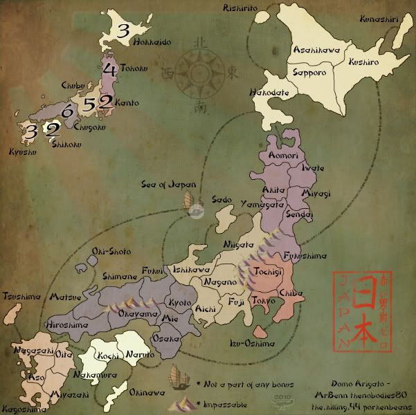
Version 12.9
Large:
Small:
yeah.... the circle may seem a little off, but that 's mainly because the circle is bigger and part of the curvature of the circle is missing in the rays. I may use it if there is more people that have a problem with it, but for now the rising sun I have is more than fine.
Hopefully the sea connectors are cleared up on the small map.
I've blended together 3 backgrounds(porken's parchment grunge/my parchment+a canvasy texture/dark blue&black marbly ocean) which I like, but might be too dark.
I may want to change the coordinates of the Sea of Japan so the singular circle doesn't cover the junk.
Didn't move the compass rose, yet. I wanted to see the reaction of where it currently is with the different background, it may shill need to be moved, but that is a quick fix.
Large:
- Click image to enlarge.
Small:
- Click image to enlarge.
yeah.... the circle may seem a little off, but that 's mainly because the circle is bigger and part of the curvature of the circle is missing in the rays. I may use it if there is more people that have a problem with it, but for now the rising sun I have is more than fine.
Hopefully the sea connectors are cleared up on the small map.
I've blended together 3 backgrounds(porken's parchment grunge/my parchment+a canvasy texture/dark blue&black marbly ocean) which I like, but might be too dark.
I may want to change the coordinates of the Sea of Japan so the singular circle doesn't cover the junk.
Didn't move the compass rose, yet. I wanted to see the reaction of where it currently is with the different background, it may shill need to be moved, but that is a quick fix.
-
RedBaron0
- Posts: 2657
- Joined: Sun Aug 19, 2007 12:59 pm
- Location: Pennsylvania
Who is online
Users browsing this forum: No registered users
|
|||||||
| Conquer Club is not associated with RISK online in any way. Copyright © 2006-2024 by Big Wham LLC | |||||||