Nordic Countries [Quenched]
Moderator: Cartographers
Re: Nordic Countries [Graphics Revamp] [17.8.11]
![]() by koontz1973 on Fri Aug 19, 2011 7:28 am
by koontz1973 on Fri Aug 19, 2011 7:28 am
Me like, but do you like them.

-

 koontz1973
- Posts: 6960
- Joined: Thu Jan 01, 2009 10:57 am


Re: Nordic Countries [Graphics Revamp] [17.8.11]
![]() by gimil on Fri Aug 19, 2011 12:02 pm
by gimil on Fri Aug 19, 2011 12:02 pm
I think if you brought down the tone of the mountains so it is the same shade of white/grey as Iceland the new mountains will look fab.
Last edited by gimil on Fri Aug 19, 2011 12:09 pm, edited 1 time in total.
What do you know about map making, bitch?
Top Score:2403
natty_dread wrote:I was wrong
Top Score:2403
-

gimil
- Posts: 8599
- Joined: Sat Mar 03, 2007 12:42 pm
- Location: United Kingdom (Scotland)


Re: Nordic Countries [Graphics Revamp] [17.8.11]
![]() by isaiah40 on Fri Aug 19, 2011 12:07 pm
by isaiah40 on Fri Aug 19, 2011 12:07 pm
Fast posted by gimil! I agree with gimil, this looks much better! I think this can be stickied for now, until this minor tweak gets done, and we await any other graphical concerns.
-
isaiah40
- Posts: 3990
- Joined: Mon Aug 27, 2007 7:14 pm


Re: Nordic Countries [Graphics Revamp] [19.8.11]
![]() by natty dread on Fri Aug 19, 2011 12:21 pm
by natty dread on Fri Aug 19, 2011 12:21 pm
gimil wrote:I think if you brought down the tone of the mountains so it is the same shade of white/grey as Iceland the new mountains will look fab.
I don't know... I tried it, and if I bring the contrast too low, they lose all of their depth... nullifying all the things DiM and you wanted me to do for the mountains.
But I tweaked them a bit, also small version:
- Click image to enlarge.

- Click image to enlarge.


-

natty dread
- Posts: 12877
- Joined: Fri Feb 08, 2008 8:58 pm
- Location: just plain fucked


Re: Nordic Countries [Graphics Revamp] [19.8.11]
![]() by isaiah40 on Fri Aug 19, 2011 12:35 pm
by isaiah40 on Fri Aug 19, 2011 12:35 pm
That I can deal with! Good job natty!
-
isaiah40
- Posts: 3990
- Joined: Mon Aug 27, 2007 7:14 pm
Re: Nordic Countries [Graphics Revamp] [19.8.11]
![]() by gimil on Fri Aug 19, 2011 12:47 pm
by gimil on Fri Aug 19, 2011 12:47 pm
Those sit nicely with me natty, good job.
What do you know about map making, bitch?
Top Score:2403
natty_dread wrote:I was wrong
Top Score:2403
-
gimil
- Posts: 8599
- Joined: Sat Mar 03, 2007 12:42 pm
- Location: United Kingdom (Scotland)
Re: Nordic Countries [Graphics Revamp] [19.8.11]
![]() by TaCktiX on Fri Aug 19, 2011 1:02 pm
by TaCktiX on Fri Aug 19, 2011 1:02 pm
Agreed on the look, it's a major improvement over the original, my only niggle about the mountains. I realize that your current technique has its limits, but if it's possible to make them a smidge darker to match the darker theme of the entire map? I realize this sounds counter-intuitive with the icy colors on the map, but I think the contrast will be good.
-

TaCktiX
- Posts: 2392
- Joined: Mon Dec 17, 2007 8:24 pm
- Location: Rapid City, SD


Re: Nordic Countries [Graphics Revamp] [19.8.11]
![]() by natty dread on Fri Aug 19, 2011 1:06 pm
by natty dread on Fri Aug 19, 2011 1:06 pm
TaCktiX wrote:Agreed on the look, it's a major improvement over the original, my only niggle about the mountains. I realize that your current technique has its limits, but if it's possible to make them a smidge darker to match the darker theme of the entire map? I realize this sounds counter-intuitive with the icy colors on the map, but I think the contrast will be good.
You mean like this?
- Click image to enlarge.

-
natty dread
- Posts: 12877
- Joined: Fri Feb 08, 2008 8:58 pm
- Location: just plain fucked
Re: Nordic Countries [Graphics Revamp] [19.8.11]
![]() by isaiah40 on Fri Aug 19, 2011 1:12 pm
by isaiah40 on Fri Aug 19, 2011 1:12 pm
One other thing, can you blur the edges just a smidgen to make them blend in a little more? You don't need much.
-
isaiah40
- Posts: 3990
- Joined: Mon Aug 27, 2007 7:14 pm
Re: Nordic Countries [Graphics Revamp] [19.8.11]
![]() by natty dread on Fri Aug 19, 2011 1:19 pm
by natty dread on Fri Aug 19, 2011 1:19 pm
You mean like the very 1st version of mountains I had on this map? The one RjBeals asked me to change because the mountains looked too blurry?
This is getting ridiculous. Did you guys even notice that my last post had the previous version of the map posted again, you know... the one before gimil asked me to make the mountains lighter?
This stuff is just going in circles now. I'm not doing any more edits unless some actual, valid, non-made-up concerns are brought up.
-
natty dread
- Posts: 12877
- Joined: Fri Feb 08, 2008 8:58 pm
- Location: just plain fucked
Re: Nordic Countries [Graphics Revamp] [19.8.11]
![]() by isaiah40 on Fri Aug 19, 2011 1:21 pm
by isaiah40 on Fri Aug 19, 2011 1:21 pm
No, no no! Just the edges, just a smidgen so they look more on the map. But it's your call, and if no one else thinks they need that then ...
-
isaiah40
- Posts: 3990
- Joined: Mon Aug 27, 2007 7:14 pm
Re: Nordic Countries [Graphics Revamp] [19.8.11]
![]() by natty dread on Fri Aug 19, 2011 2:02 pm
by natty dread on Fri Aug 19, 2011 2:02 pm
isaiah40 wrote:No, no no! Just the edges, just a smidgen so they look more on the map. But it's your call, and if no one else thinks they need that then ...
Yeah, the 1st mountains only had blurred edges. I don't think it would work for the map. The style of the map is very much about sharp, defined lines and shapes. If you look around the map, there aren't many places with blurred or smooth transitions between colours, all the edges between colours are pretty well defined. The outer bevel around the land is probably the only exception.
Don't get me wrong, I appreciate all the feedback and suggestions. I really do... but at this point, it seems like the suggestions are starting to go around in circles - gimil asks me to make the mountains lighter, I do it, and along comes Tacktix and asks me to make them darker... this, I think, is usually a pretty good indication that a map or visual element of a map has reached an optimal stage, where all that's left is subjective opinion about different options. In which case it falls on the mapmaker to decide which option to use.
-
natty dread
- Posts: 12877
- Joined: Fri Feb 08, 2008 8:58 pm
- Location: just plain fucked
Re: Nordic Countries [Graphics Revamp] [19.8.11]
![]() by TaCktiX on Fri Aug 19, 2011 2:40 pm
by TaCktiX on Fri Aug 19, 2011 2:40 pm
Sorry about that. From habit I don't look back through anything since the last update. Didn't mean to make you edit in circles.
-
TaCktiX
- Posts: 2392
- Joined: Mon Dec 17, 2007 8:24 pm
- Location: Rapid City, SD
Re: Nordic Countries [Graphics Revamp] [19.8.11]
![]() by kiwi3 on Fri Aug 19, 2011 5:58 pm
by kiwi3 on Fri Aug 19, 2011 5:58 pm
i have played nordic countries map several times. i have enjoyed the gameplay. i like the revamped graphics. I think that the enhanced colors will increase the gameplay and make it more attractive to those seeking maps to play.
-
kiwi3
- SoC Training Adviser
- Posts: 391
- Joined: Sun Jul 25, 2010 5:26 pm
- Location: Virginia


Re: Nordic Countries [Graphics Revamp] [19.8.11]
![]() by Victor Sullivan on Sat Aug 20, 2011 4:06 am
by Victor Sullivan on Sat Aug 20, 2011 4:06 am
Things look Okey McSmokey to me.
-Sully
-Sully
Beckytheblondie: "Don't give us the dispatch, give us a mustache ride."
Scaling back on my CC involvement...
Scaling back on my CC involvement...
-

Victor Sullivan
- Posts: 6010
- Joined: Mon Feb 08, 2010 8:17 pm
- Location: Columbus, OH


Re: Nordic Countries [Graphics Revamp] [20.8.11]
![]() by natty dread on Sat Aug 20, 2011 12:39 pm
by natty dread on Sat Aug 20, 2011 12:39 pm
Ok, since we're close to finish, I saved the images as png:s - I don't want the jpg artifacts to accumulate...
Also redid the sig again, it was a bit chunky.
Also redid the sig again, it was a bit chunky.
- Click image to enlarge.

- Click image to enlarge.

-
natty dread
- Posts: 12877
- Joined: Fri Feb 08, 2008 8:58 pm
- Location: just plain fucked
Re: Nordic Countries [Graphics Revamp] [20.8.11]
![]() by gimil on Sat Aug 20, 2011 2:05 pm
by gimil on Sat Aug 20, 2011 2:05 pm
Wow your image seems to look fresher as a PNG, remember though that lack tends to resize images before uploading maps. Otherwise he will end up with huge amounts of used bandwidth.
What do you know about map making, bitch?
Top Score:2403
natty_dread wrote:I was wrong
Top Score:2403
-
gimil
- Posts: 8599
- Joined: Sat Mar 03, 2007 12:42 pm
- Location: United Kingdom (Scotland)
Re: Nordic Countries [Graphics Revamp] [20.8.11]
![]() by natty dread on Sat Aug 20, 2011 2:17 pm
by natty dread on Sat Aug 20, 2011 2:17 pm
gimil wrote:Wow your image seems to look fresher as a PNG, remember though that lack tends to resize images before uploading maps. Otherwise he will end up with huge amounts of used bandwidth.
I know. But if I save it as JPEG, and then lack compresses it into a smaller JPEG, then the JPEG artifacts from the first conversion accumulate - it's like taking a photo-copy of a photo-copy... by saving it as a PNG, then letting lack do the conversion directly from it, there will be less quality loss and artifacts.
Yes, maybe the difference is minute, but since we're forced to have our work converted into low quality JPEG:s, every small thing helps.
-
natty dread
- Posts: 12877
- Joined: Fri Feb 08, 2008 8:58 pm
- Location: just plain fucked
Re: Nordic Countries [Graphics Revamp] [20.8.11]
![]() by gimil on Sat Aug 20, 2011 2:55 pm
by gimil on Sat Aug 20, 2011 2:55 pm
natty_dread wrote:gimil wrote:Wow your image seems to look fresher as a PNG, remember though that lack tends to resize images before uploading maps. Otherwise he will end up with huge amounts of used bandwidth.
I know. But if I save it as JPEG, and then lack compresses it into a smaller JPEG, then the JPEG artifacts from the first conversion accumulate - it's like taking a photo-copy of a photo-copy... by saving it as a PNG, then letting lack do the conversion directly from it, there will be less quality loss and artifacts.
Yes, maybe the difference is minute, but since we're forced to have our work converted into low quality JPEG:s, every small thing helps.
Fair play!
What do you know about map making, bitch?
Top Score:2403
natty_dread wrote:I was wrong
Top Score:2403
-
gimil
- Posts: 8599
- Joined: Sat Mar 03, 2007 12:42 pm
- Location: United Kingdom (Scotland)
Re: Nordic Countries [Graphics Revamp] [20.8.11]
![]() by sannemanrobinson on Sun Aug 21, 2011 3:49 am
by sannemanrobinson on Sun Aug 21, 2011 3:49 am
Looking sublime Natty. What is the glow above Aland and Bornholm?
-
sannemanrobinson
- Posts: 255
- Joined: Mon Dec 20, 2010 6:35 am


Re: Nordic Countries [Graphics Revamp] [20.8.11]
![]() by natty dread on Sun Aug 21, 2011 3:50 am
by natty dread on Sun Aug 21, 2011 3:50 am
For the army numbers. Blue numbers won't show up too well without them. If this suggestion ever goes through, I can remove the glows.
-
natty dread
- Posts: 12877
- Joined: Fri Feb 08, 2008 8:58 pm
- Location: just plain fucked
Re: Nordic Countries [Graphics Revamp] [20.8.11]
![]() by isaiah40 on Sun Aug 21, 2011 7:56 am
by isaiah40 on Sun Aug 21, 2011 7:56 am
Just noticed one little thing:
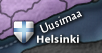
Can you move Helsinki down about 2 px and to the left about 2px. You need to place Uusimaa horizontal and up and to the right a few px to fit the 888 in there. this is only on the small. I believe the names will be covered by the 888's. So fix this and baring anything else, I've moved this and give you this again.

Can you move Helsinki down about 2 px and to the left about 2px. You need to place Uusimaa horizontal and up and to the right a few px to fit the 888 in there. this is only on the small. I believe the names will be covered by the 888's. So fix this and baring anything else, I've moved this and give you this again.
-
isaiah40
- Posts: 3990
- Joined: Mon Aug 27, 2007 7:14 pm
Re: Nordic Countries [Graphics Revamp] [20.8.11]
![]() by natty dread on Sun Aug 21, 2011 8:00 am
by natty dread on Sun Aug 21, 2011 8:00 am
Nope, they aren't.
...wow. The JPEG loss of colour depth is really noticeable with the army numbers... I don't know why we bother sometimes, doing all these maps with clean, vibrant colours, when the JPEG format invariably turns them into grey, drab mush...
- Click image to enlarge.

...wow. The JPEG loss of colour depth is really noticeable with the army numbers... I don't know why we bother sometimes, doing all these maps with clean, vibrant colours, when the JPEG format invariably turns them into grey, drab mush...
Last edited by natty dread on Sun Aug 21, 2011 8:03 am, edited 1 time in total.
-
natty dread
- Posts: 12877
- Joined: Fri Feb 08, 2008 8:58 pm
- Location: just plain fucked
Re: Nordic Countries [Graphics Revamp] [20.8.11]
![]() by isaiah40 on Sun Aug 21, 2011 8:02 am
by isaiah40 on Sun Aug 21, 2011 8:02 am
Then we're good to go then!
-
isaiah40
- Posts: 3990
- Joined: Mon Aug 27, 2007 7:14 pm
Re: Nordic Countries [Graphics Revamp] [20.8.11]
![]() by natty dread on Sun Aug 21, 2011 8:12 am
by natty dread on Sun Aug 21, 2011 8:12 am
Yay, my 3rd graphics stamp for this map! Thanks isaiah 
-
natty dread
- Posts: 12877
- Joined: Fri Feb 08, 2008 8:58 pm
- Location: just plain fucked
Who is online
Users browsing this forum: No registered users
|
|||||||
| Conquer Club is not associated with RISK online in any way. Copyright © 2006-2024 by Big Wham LLC | |||||||