San Francisco [Quenched]
Moderator: Cartographers


![]() by EvilOtto on Fri Apr 13, 2007 12:33 pm
by EvilOtto on Fri Apr 13, 2007 12:33 pm
johloh wrote:are the bridges better now? or should I keep trying other things? (i know the dashes arent perfect, i just wanted to see if people liked them or not, i can straighten the pixels easily)
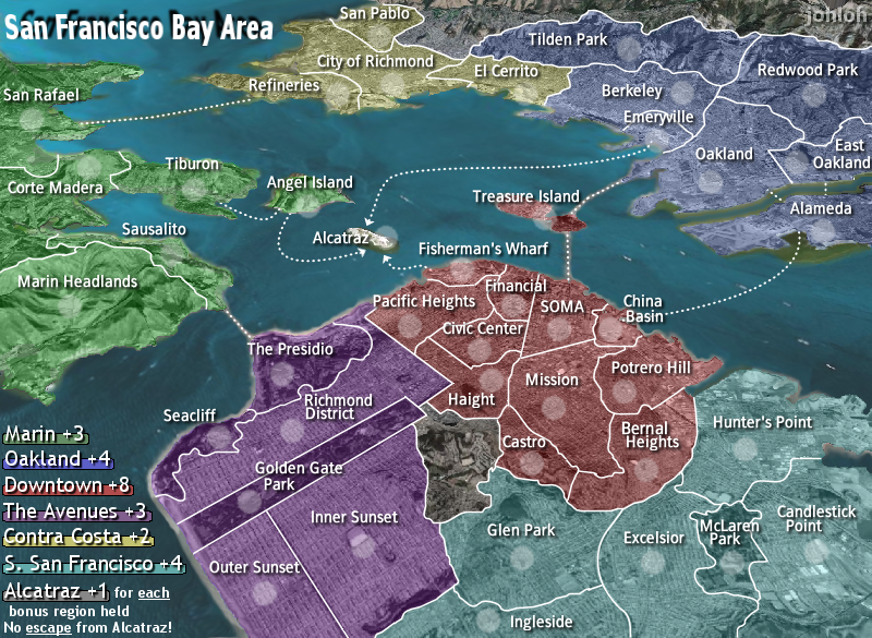
The dashes are an improvement. As you say they need to be cleaned up, and I think they are a bit heavy, but they clearly distinguish the bridges from the ferries. However, if you aren't familiar with SF you don't know which is which. You need a little legend somewhere (maybe just little bridge and ferry icons, as oak suggested?).
Also, I'd prefer if the ferry lines were all smooth curves. The one from Alameda to China Basin is cool... although it'd be better if it wasn't covered up by the word "Basin". The other ferry lines are either crooked or cramped. I'd rather see them deviate from reality (longer lines that go out of their way) to show up better on the map. Maybe Tiberon-Angel Island could go over the top? Angel Island-Alcatraz could leave from left of the army shadow and loop under "Alcatraz? Bigger arcs for both of those? Etc.
-

 EvilOtto
- Posts: 132
- Joined: Wed Dec 06, 2006 9:39 pm
- Location: San Francisco
![]() by johloh on Fri Apr 13, 2007 12:42 pm
by johloh on Fri Apr 13, 2007 12:42 pm
by heavy do you mean each dash is too 'thick' or each dash is too 'long'and I think they are a bit heavy
I dont like the icons on the paths, i think it makes it looked cluttered...BUT, I could have a legend with an icon for each and the path for each...ill try that...You need a little legend somewhere (maybe just little bridge and ferry icons, as oak suggested?).
ill smooth those out and make them a little more fancy in their paths...The other ferry lines are either crooked or cramped.
They are straight lines, the ones that have kinks in them, are because in real life the bridge does that...but I think you mean a non-dashed line? i thought about that...but i think it makes it look too much like the region borders that are near some of the bridges...i think the bridges should be a straight line. it would give a definitive distinction between the two
what do you guys think about the 'for each' alcatraz text being moved? should i keep it or switch it back?
my new site - http://www.spritestitch.com/ - A video game craft weblog...
-

johloh
- Posts: 472
- Joined: Mon Dec 04, 2006 12:58 pm
- Location: San Francisco


![]() by EvilOtto on Fri Apr 13, 2007 12:58 pm
by EvilOtto on Fri Apr 13, 2007 12:58 pm
johloh wrote:what do you guys think about the 'for each' alcatraz text being moved? should i keep it or switch it back?
It works for me. Maybe indent "bonus region held"? Also you lost your underlines and "No" should be capitalized.
-
EvilOtto
- Posts: 132
- Joined: Wed Dec 06, 2006 9:39 pm
- Location: San Francisco
![]() by luckiekevin on Fri Apr 13, 2007 2:37 pm
by luckiekevin on Fri Apr 13, 2007 2:37 pm
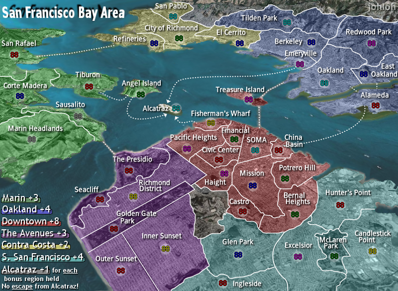
I was the one who made the suggestion of using different graphics for the bridge than the ferries and I actually don't like it.
It's making the map too busy. I'd like to see the other suggestions but am beginning to regret my own suggestion as I've always liked the ferry routes and bridges from the beginning.
It's making the map too busy. I'd like to see the other suggestions but am beginning to regret my own suggestion as I've always liked the ferry routes and bridges from the beginning.
-

luckiekevin
- Posts: 272
- Joined: Fri Oct 13, 2006 10:08 pm
- Location: California
![]() by KEYOGI on Fri Apr 13, 2007 2:45 pm
by KEYOGI on Fri Apr 13, 2007 2:45 pm
I prefer the dotted lines. There's no guess work or need for a legend, plus it was consistent across the whole map. I think you'll be hard pressed to come up with a way to represent the bridges in a style that compliments the ferry routes and the rest of the map.
-
KEYOGI
- Posts: 1632
- Joined: Tue Oct 10, 2006 6:09 am

![]() by johloh on Fri Apr 13, 2007 2:47 pm
by johloh on Fri Apr 13, 2007 2:47 pm
I agree. I see no reason to change them...however, enough people asked for me to warrant giving it a try...I have the old layer still there, so it will take me approx. 5 seconds to switch it back at any point...lets see how it turns out, and if people like it or not once I get a good looking product up there...I'd like to see the other suggestions but am beginning to regret my own suggestion as I've always liked the ferry routes and bridges from the beginning.
my new site - http://www.spritestitch.com/ - A video game craft weblog...
-
johloh
- Posts: 472
- Joined: Mon Dec 04, 2006 12:58 pm
- Location: San Francisco


![]() by Guiscard on Fri Apr 13, 2007 3:20 pm
by Guiscard on Fri Apr 13, 2007 3:20 pm
KEYOGI wrote:I prefer the dotted lines. There's no guess work or need for a legend, plus it was consistent across the whole map. I think you'll be hard pressed to come up with a way to represent the bridges in a style that compliments the ferry routes and the rest of the map.
Definitely. Two different graphics for what is, game wise, one thing seems slightly pointless. Unless you're going to actually draw in the real bridges (which it doesn't need really) then they should be uniform, in my opinion, and you should go back to dots.
qwert wrote:Can i ask you something?What is porpose for you to open these Political topic in ConquerClub? Why you mix politic with Risk? Why you not open topic like HOT AND SEXY,or something like that.
-

Guiscard
- Posts: 4103
- Joined: Fri Dec 08, 2006 7:27 pm
- Location: In the bar... With my head on the bar

![]() by johloh on Fri Apr 13, 2007 3:28 pm
by johloh on Fri Apr 13, 2007 3:28 pm
ok, decision made! we're going back to the dots!
(its a lot less work for me anyway)
(its a lot less work for me anyway)
my new site - http://www.spritestitch.com/ - A video game craft weblog...
-
johloh
- Posts: 472
- Joined: Mon Dec 04, 2006 12:58 pm
- Location: San Francisco
![]() by johloh on Fri Apr 13, 2007 3:31 pm
by johloh on Fri Apr 13, 2007 3:31 pm
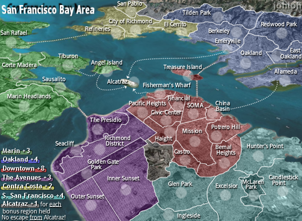
I am however going to still work on how the ferry routes are drawn...I think evil has a good point on that...
upcoming
-bringin' back the dots
-redrawing the ferry routes less realistically, more 'swooping' curves
-indenting second line of alcatraz text
-capitalizing N in No escape!
upcoming
-bringin' back the dots
-redrawing the ferry routes less realistically, more 'swooping' curves
-indenting second line of alcatraz text
-capitalizing N in No escape!
my new site - http://www.spritestitch.com/ - A video game craft weblog...
-
johloh
- Posts: 472
- Joined: Mon Dec 04, 2006 12:58 pm
- Location: San Francisco
![]() by johloh on Fri Apr 13, 2007 6:47 pm
by johloh on Fri Apr 13, 2007 6:47 pm

-indented second line of alcatraz text
-capitalized N in 'No escape from Alcatraz!'
-brought back underlines that I lost somehow...
-redrew 'angel island' to 'alcatraz'
-redrew two versions of 'tiburon' to 'angel island'
so which of the two tiburon to angel island ferry routes do you like the best?? top or bottom?
my new site - http://www.spritestitch.com/ - A video game craft weblog...
-
johloh
- Posts: 472
- Joined: Mon Dec 04, 2006 12:58 pm
- Location: San Francisco
-

wrightfan123
- Posts: 601
- Joined: Sat Jan 06, 2007 2:58 pm
- Location: Looking over every baseball team's schedule to try to determine who will win the World Series.


![]() by luckiekevin on Fri Apr 13, 2007 7:07 pm
by luckiekevin on Fri Apr 13, 2007 7:07 pm
I have no preference on the angel island line
Is there any way to eliminate the haze around the bay and golden gate bridge lines? Might make the lines even more uniform.
And should the line, "bonus region held", be moved back a little bit so that it aligns with the rest of the text?
Is there any way to eliminate the haze around the bay and golden gate bridge lines? Might make the lines even more uniform.
And should the line, "bonus region held", be moved back a little bit so that it aligns with the rest of the text?
-
luckiekevin
- Posts: 272
- Joined: Fri Oct 13, 2006 10:08 pm
- Location: California
![]() by luckiekevin on Fri Apr 13, 2007 7:09 pm
by luckiekevin on Fri Apr 13, 2007 7:09 pm
wrightfan123 wrote:I like the top, and I don't like the map
Twins suck about as much as your taste in maps
-
luckiekevin
- Posts: 272
- Joined: Fri Oct 13, 2006 10:08 pm
- Location: California


![]() by johloh on Fri Apr 13, 2007 7:32 pm
by johloh on Fri Apr 13, 2007 7:32 pm
I can play around with that...its part of the background ocean image, but I can use the nudge tool to try and clear it up...we'll see...the waves around the land will be pretty easy to get rid of...itll be harder to do the bridges...ill try.Is there any way to eliminate the haze around the bay and golden gate bridge lines?
I moved it out because someone said it should be indented...thats two opinions now...And should the line, "bonus region held", be moved back a little bit so that it aligns with the rest of the text?
anyone else have an opinion on the second line of text?
i agree. the top one has a 3d cartoon jump look to it...I prefer the bottom Tiburon/Angel Island connection, the top one looks as though someone has jumped across the water.
my new site - http://www.spritestitch.com/ - A video game craft weblog...
-
johloh
- Posts: 472
- Joined: Mon Dec 04, 2006 12:58 pm
- Location: San Francisco
![]() by johloh on Fri Apr 13, 2007 7:35 pm
by johloh on Fri Apr 13, 2007 7:35 pm
oh yeah and the twins do suck, but so do the poor giants this year...and you gotta give him credit for having kirby...the puck was awesome, I remember watching him when I was growing up.Twins suck
my new site - http://www.spritestitch.com/ - A video game craft weblog...
-
johloh
- Posts: 472
- Joined: Mon Dec 04, 2006 12:58 pm
- Location: San Francisco

![]() by DiM on Fri Apr 13, 2007 7:44 pm
by DiM on Fri Apr 13, 2007 7:44 pm
mibi wrote:i was bored.
go do the barbican if you're bored
“In the beginning God said, the four-dimensional divergence of an antisymmetric, second rank tensor equals zero, and there was light, and it was good. And on the seventh day he rested.”- Michio Kaku
-

DiM
- Posts: 10415
- Joined: Wed Feb 14, 2007 6:20 pm
- Location: making maps for scooby snacks


![]() by johloh on Fri Apr 13, 2007 8:03 pm
by johloh on Fri Apr 13, 2007 8:03 pm
-took off top ferry route (i can put it back if more people vote it back)
-took away a lot of the 'blur' (waves) around bridges and along the coast...I can push it back even farther on the coast if need be too...
my new site - http://www.spritestitch.com/ - A video game craft weblog...
-
johloh
- Posts: 472
- Joined: Mon Dec 04, 2006 12:58 pm
- Location: San Francisco
![]() by luckiekevin on Fri Apr 13, 2007 8:08 pm
by luckiekevin on Fri Apr 13, 2007 8:08 pm
great improvement. I don't think the text alignment is that big of a deal.
The Puck was great, but I have three Willy's that I would take over the puck any day
Willy Mays
Willy McCovey
and my favorite Will Clark (clutch)
The Puck was great, but I have three Willy's that I would take over the puck any day
Willy Mays
Willy McCovey
and my favorite Will Clark (clutch)
-
luckiekevin
- Posts: 272
- Joined: Fri Oct 13, 2006 10:08 pm
- Location: California
![]() by johloh on Sat Apr 14, 2007 4:58 pm
by johloh on Sat Apr 14, 2007 4:58 pm


XML: http://robothq.org/~johloh/sfbayb.xml
well, not getting a lot of comments...so here are all the copies and updated xml...
anything more?
my new site - http://www.spritestitch.com/ - A video game craft weblog...
-
johloh
- Posts: 472
- Joined: Mon Dec 04, 2006 12:58 pm
- Location: San Francisco
![]() by EvilOtto on Sat Apr 14, 2007 5:25 pm
by EvilOtto on Sat Apr 14, 2007 5:25 pm
johloh wrote:well, not getting a lot of comments...so here are all the copies and updated xml...
anything more?
Can we get a smooth path for the Emeryville->Alcatraz ferry route? It is a little 'elbowy'.
Thanks for moving that Corte Madera army shadow! I'm very pleased.
-
EvilOtto
- Posts: 132
- Joined: Wed Dec 06, 2006 9:39 pm
- Location: San Francisco
Who is online
Users browsing this forum: No registered users
|
|||||||
| Conquer Club is not associated with RISK online in any way. Copyright © 2006-2024 by Big Wham LLC | |||||||